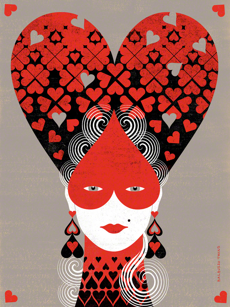
This piece interested me cause it reminded me of Alice in Wonderland, but with less wonder and more elegance. I think that the use of black, red, white and the shade of grey brings out the silhouette of the woman. The illustrators used Gouache, and some digital media. This is one installment in a four part series in which the illustrators created four high hairstyles with Queen cards symbols: hearts, diamonds, clubs, spades. The illustrators were inspired by Women’s Hairstyles of the 18th Century. This was considered as a Personal project for them.
I’ve learned that the illustrators are known as Balbusso Twins are internationally recognized award winning italian illustrators team. They have a unique signature ANNA+ELENA=BALBUSSO TWINS. Their work has been published by major international publishers and companies through out the world on various media types such as book jackets, magazines, newspapers. They have illustrated over 40 books and have received more than 60 international Awards. I saw this piece at the Society of Illustrators in New York where they have been members since 2009. they have also been recognized by Society of Illustrators of Los Angeles and have been members since 2015.
I have also learned they have a three step process when making illustrations after they gather information. theses steps differ on what medium they are doing the art for conceptual illustration or book projects. My opinion on this piece is that when I looked at it my eye wasn’t captivated in one spot but it was a whole piece. I thought the art flowed instead of having one singular object stand out.

