I chose this location because so love sea food and and Maine is the main por of seafood supplies. Main is as beautiful as the food tastes delicious..
Category Archives: Uncategorized
Final Drawing Assignment Location- Silvia N.
The place I decided to draw for our final take home assignment was my local church, Our Lady of Fatima in East Elmhurst. It was an ideal spot because it had a lot of interesting architectural structures. It was convenient for me also because it is a block away from my home and it was indoors, which was perfect because it was freezing cold that day. I forgot to take the picture that day so I went back on Saturday for the selfie.
Outside of the church
Interior of church (side where i based my drawing)
Drawing location
Creative Perspective Ch 2 & 3
Below is your required reading of the week.
READ THESE 2 CHAPTERS ON VALUE BEFORE YOU DO YOUR HOME WORK!
Creative Perspective Chapter 5
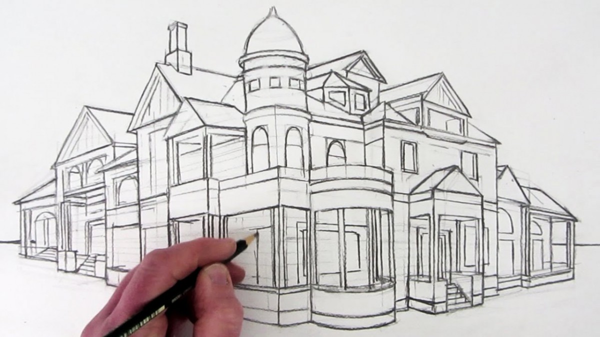
Hello Class! Welcome to the exciting world of TWO POINT PERSPECTIVE!
One Point Perspective or Parallel Perspective point perspective works well for situations like the one below, where the viewer is oriented directly in front of a set of parallel lines like railroad tracks or a long hallway.
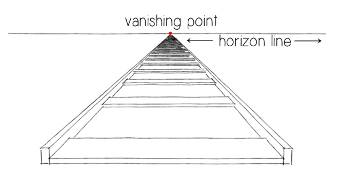
But what if you want to show the viewer something from an angle?
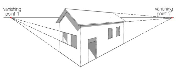
Two point perspective uses two vanishing points set well apart on the horizon line. The rule of thumbs here is sets of parallel lines must be either vertical or recede toward one of the two vanishing points.
READ CHAPTER 5 of Creative layout for Artists to learn more!
chapter-5-two-point-perspective
AND … Here are a couple of additional tutorials to get you started!
Happy Drawing!
AND a slightly more advanced one…
Creative Perspective Chapter 4
Hello Class! Welcome to ONE POINT PERSPECTIVE!
To create a drawing from One Point Perspective you need to know a few basic things. One Point Perspective is also called Parallel Perspective because YOU are parallel to the objects that you will be drawing. Also, vertical lines are parallel and horizontal lines are parallel and the back edges of objects that recede in the distance are parallel to the front edges of those objects.

Below is your required reading of the week.
READ THIS CHAPTER BEFORE YOU DO YOUR HOME WORK!
Foundation Drawing: Value Sketchbook Assignment Hoa Vu
Ugh… the title’s not showing up… again.
Titles:
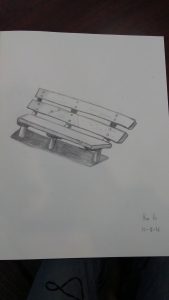
Top Left: Park Bench On a Not So Sunny Day (I thought I could catch the bench at 12:00 where the sun is practically exploding through the sky but what I didn’t realize until I was about halfway was that there was a handball court/wall blocking the sunlight)
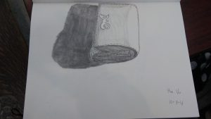
Top Right: My Bulky Wallet (Self Explanatory)
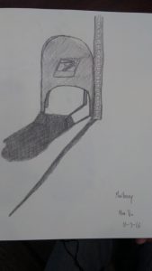
Bottom Left: Mailboxy (It looked like he had character. Dignity comes with remaining in position)
Bottom Right: The Forgotten One (Once you see what I did on the archivable paper you’ll see why he’s the forgotten one. And yes, he’s real. I know, I have a picture of him if you don’t believe me)
The aim for this assignment was so that way we could see how value affects the objects and how they can also relate to each other. And as the Professor said, shading makes anything look good.
The only thing that I really struggled with was the “shiny effect” of an object. What do I mean by that? Well, for instance Mailboxy had a little shine coming from the top, from where the sun bounced off. I didn’t know how to have that “shiny effect” so I just left that part white. Also for the My Bulky Wallet the logo that is on the wallet was also shiny so I didn’t know how to give that the “shiny effect”. Otherwise, I think I did okay. Another thing was my lines are never straight. The Professor gave me a tip and whenever I try it it just doesn’t work. Maybe it just takes practice. Lots, and lots of practice.
Uploading Instructions
Upload photographs of your assignment drawings from this semester in the Drawings Category on this site and also in your ePortfolio.
Be sure to give the drawings a title. On our class site, write brief descriptions of the drawings, and be sure to reference the drawings’ titles. Your descriptions should include what you feel the aim of each drawing was, what you learned from making it, and what was challenging to do. Of course you may write other comments as well. For instance, you may ask questions for other students to answers.
How to Post to our class: On this class site, go to Post located on the left > Give your drawing a title in the subject line like this: Assignment 1, contour drawing: “My Converse Sneakers” > Write a brief description of the drawing in the Comments space > Just above your title click on the Add Media icon (it looks like a camera on top of a music note) and browse for your file > Click Insert > Click Drawings in the list of Categories on the right > Click Publish at the top right.
Your description should include what you feel the aim of the drawing was, what you learned from making it, and what was challenging to do. Of course you may include other thoughts as well.
How to Post to your ePortfolio: Go to Dashboard > New Page > Pages > Add New > Locate “Parent” in the Page Attributes > choose “Academics” from the pull-down menu. In the Title area of your ePortfolio, be sure to write the name of our class (Foundation Drawing) or our course code (COMD1103). Also be sure to Publish, and invite me to join your ePortfolio. In settings, be sure to state either “Public” or “Private>visible to City Tech members.” Otherwise no one will be able to see what you’ve posted.
To take the photo, find a spot with even light so that you will have no shadows or strange light gradations across the drawing. Frame the drawing so there is a small even frame on all sides. Optimize the file, or reduce it to 72 dpi, with a file size no more than 1MB (about 8-9 inches on one side). Rotate it if necessary to it uploads right-side-up. If you have access to any photo-correcting program, see if you can increase the contrast so that delicate drawing lines are visible.
Welcome to Foundations Drawing!
Hello!
Welcome to Foundations Drawing. Our goal in this course will be to give you the tools and confidence you need to draw accurately from life! During the first few weeks of this course our aim will be to help you examine how you perceive the world and to develop our observational skills.
On this site you will have access to materials presented in class, your weekly assignment pages, and additional helpful resources. Here you will also post your assignment images to share with your classmates. Carefully read the directions in the UPLOADING INSTRUCTIONS POST on how to post to this site and to your ePortfolio.
— Happy Drawing!


