Ugh… the title’s not showing up… again.
Titles:
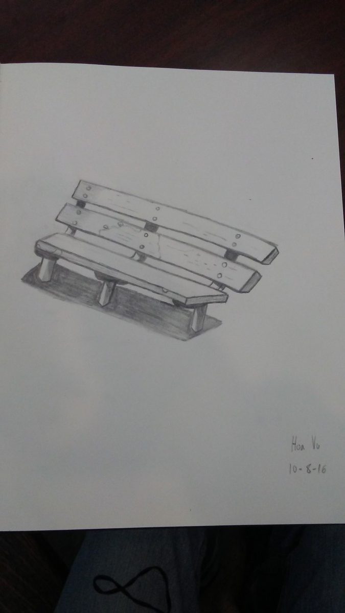
Top Left: Park Bench On a Not So Sunny Day (I thought I could catch the bench at 12:00 where the sun is practically exploding through the sky but what I didn’t realize until I was about halfway was that there was a handball court/wall blocking the sunlight)
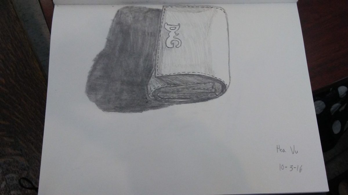
Top Right: My Bulky Wallet (Self Explanatory)
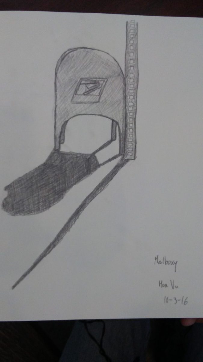
Bottom Left: Mailboxy (It looked like he had character. Dignity comes with remaining in position)
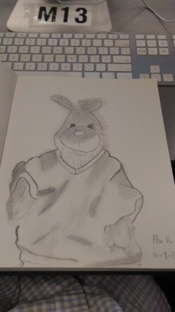
Bottom Right: The Forgotten One (Once you see what I did on the archivable paper you’ll see why he’s the forgotten one. And yes, he’s real. I know, I have a picture of him if you don’t believe me)
The aim for this assignment was so that way we could see how value affects the objects and how they can also relate to each other. And as the Professor said, shading makes anything look good.
The only thing that I really struggled with was the “shiny effect” of an object. What do I mean by that? Well, for instance Mailboxy had a little shine coming from the top, from where the sun bounced off. I didn’t know how to have that “shiny effect” so I just left that part white. Also for the My Bulky Wallet the logo that is on the wallet was also shiny so I didn’t know how to give that the “shiny effect”. Otherwise, I think I did okay. Another thing was my lines are never straight. The Professor gave me a tip and whenever I try it it just doesn’t work. Maybe it just takes practice. Lots, and lots of practice.

