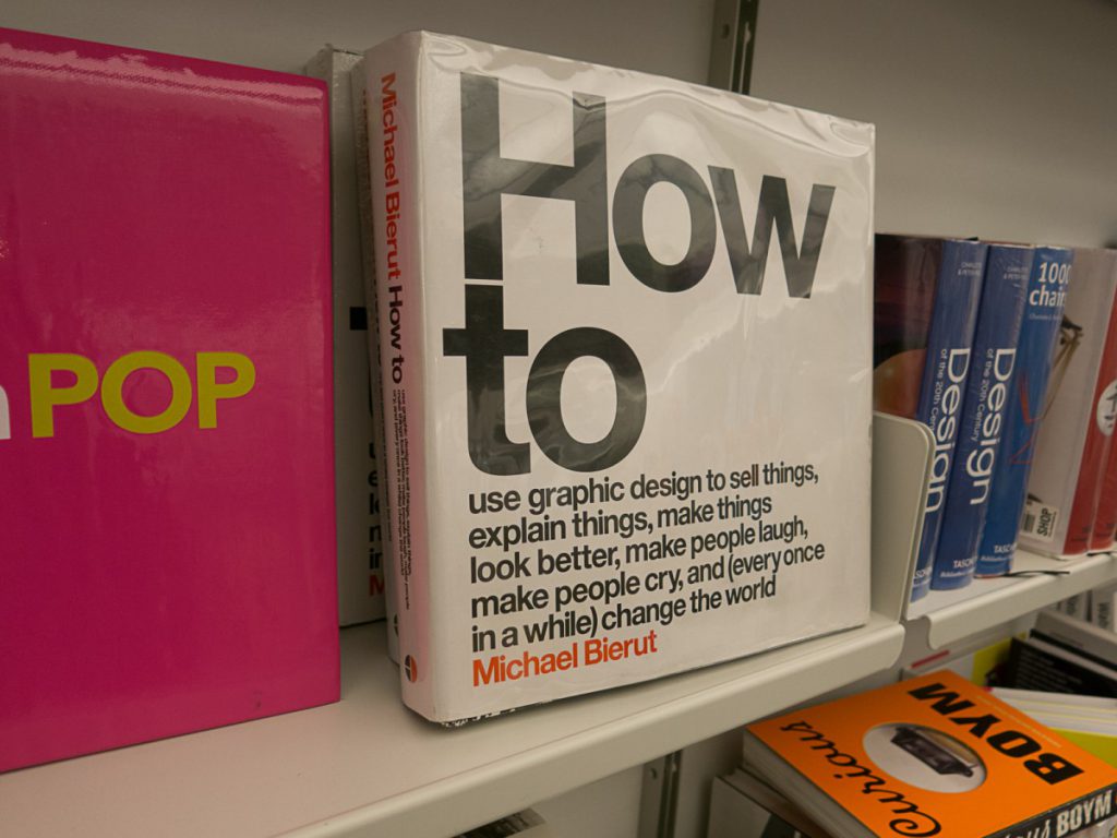
The visit to the Cooper Hewlett Design Museum.
New York. April 24th, 2017.
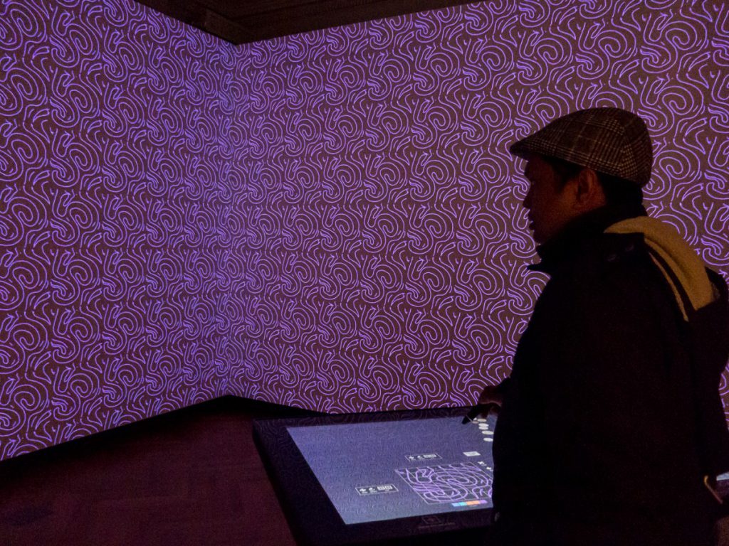
It was a fine Monday morning that I visited the Cooper Hewlett Design Museum for the first time. It is facing to the entrance of the Central Park, such a beautiful location, and also close to the iconic Guggenheim Museum. Cooper Hewlett is a design museum specialize and their main focus is anything related to design. Before writing about their cool exhibits, I would like to address something special and unique about this museum. It is the data retrieval pen, designed from this museum.
As I am a museum goer, who love to visit museums all over the places, I have visited a decent number of the museums. My interests include Aviation, science, history, design, art and photography. I used to carry a small good low light shooting camera and a notebook. Still, I knew it is very tedious when it comes to note taking and retrieving the subject of my interest. When it comes to Cooper Hewlett, there is no longer with the note taking issue. The unique Pen solves all these problems. This is why it is so important and useful for me.
How does the pen work?
The museum will provide you the pen when you purchase the ticket. You can use this pen to write on some large digital touch screen display, which looks like a huge iPad. The display will also interactively show you some related design and exhibits. There is also a room dedicated for wallpapers. You can create your own design and see instantly projected as wallpaper. Sometimes you can also find related exhibits using the pen on the digital display. After all, you can save your own drawings or the related exhibits from the display. This is one of the best interactive features of the museum. The pen also assists to save all my saved exhibits and I can retrieve them back by visiting the museum website with the login code provided on the ticket. This is the most organized way that I ever experienced and this type of pen should be a standard equipment for all other museums in the future.
To read more about the Pen, please visit the link below.
https://www.cooperhewitt.org/new-experience/designing-pen/
This is how my notes look like on the museum webpage. Do Not forget the password that they provide on the ticket.
Interesting Exhibits:
1) Radios
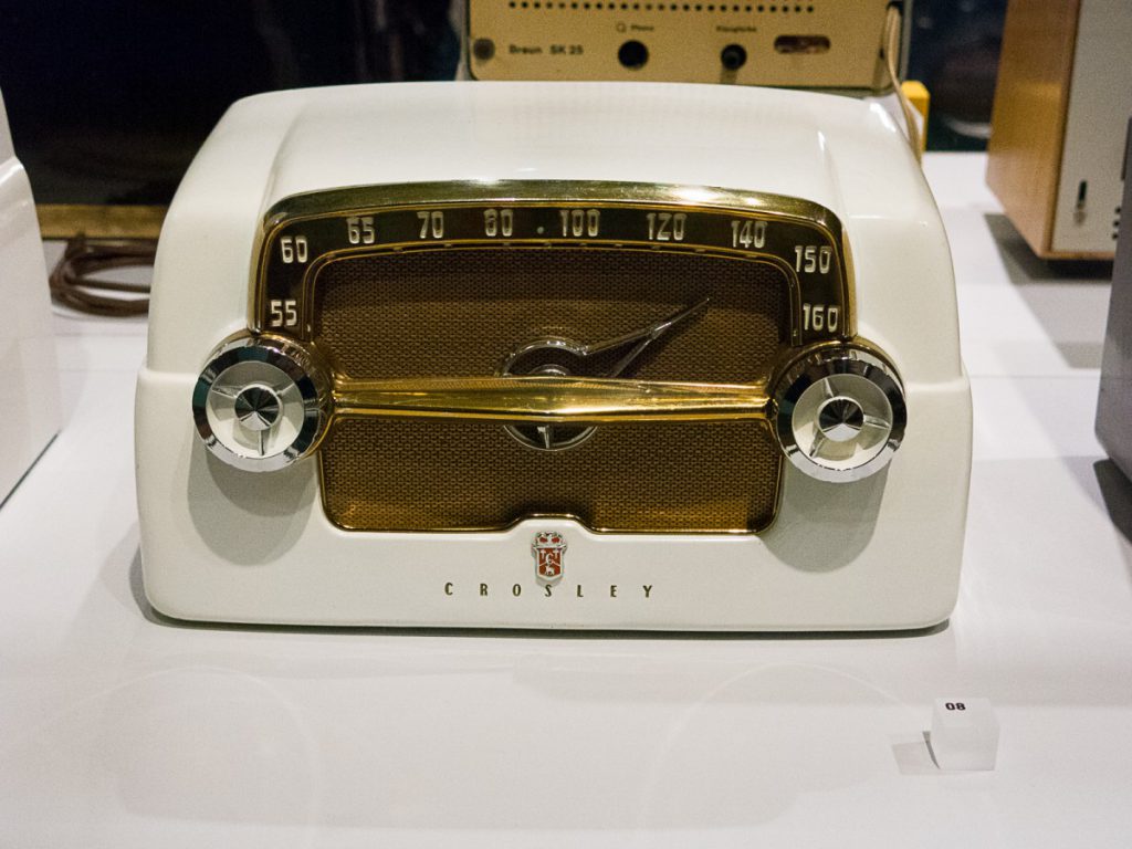
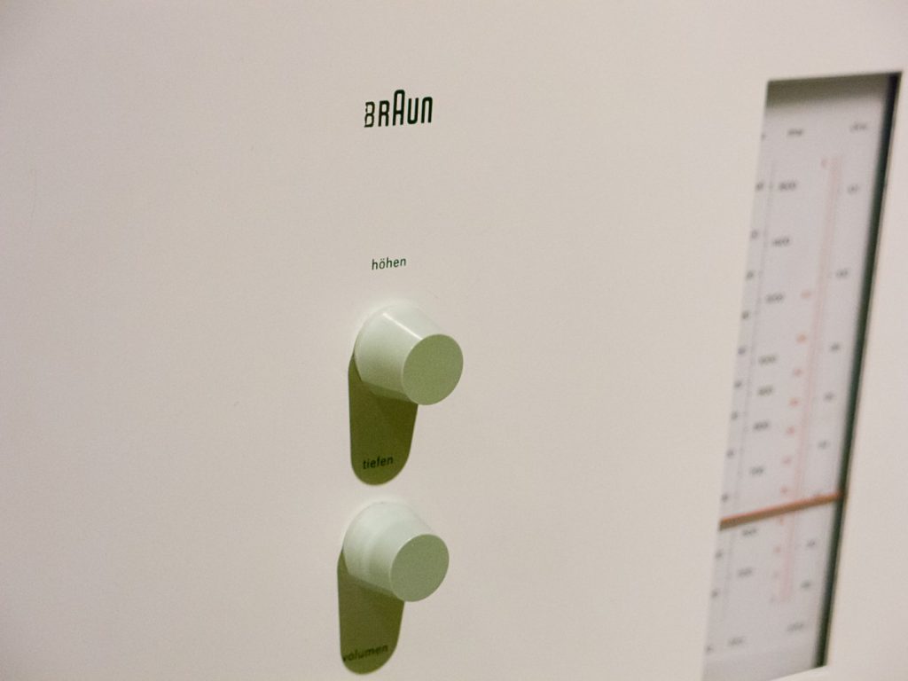
I love how the shapes of the radios reflecting the era of the were produced. From the 1920s radio looks like skyscrapers to the minimalist design of the 1960s. Not only the shape of the radio were changed, the typography used to label the buttons and knobs are also changed interestingly. These are some of my close-up shots to note down the typography on these radios.
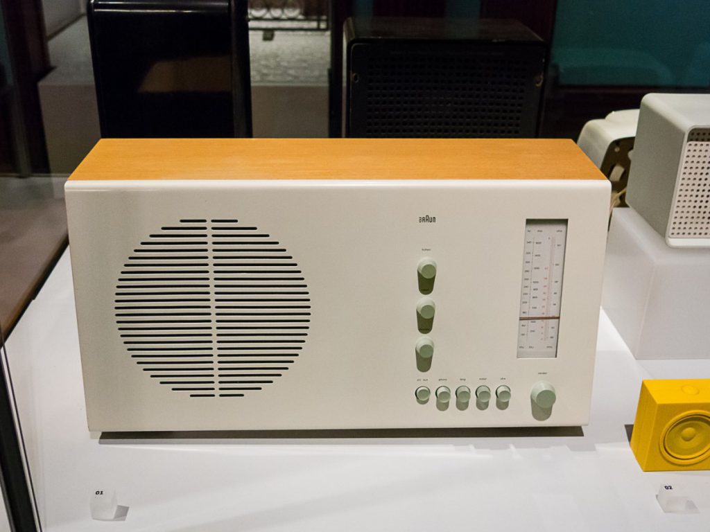
The minimalist geometric design of the 1960s, which reminds me the high modernist or Swiss and international typographic styles.

Close up of a realistic hand rendering of a radio. Note the lettering and typography seen on the cars of the same era. © Win Naing 2017
2) The Cubisms
I have study painting for 3 years in an Art School before and I still practice painting. So I have seen cubism in painting and sculpture for a number of times.But I have a Wow moment when I saw cubism inspired the industrial design of 1927 Cubic coffee set. It is so unique and beautiful.
3) Flying
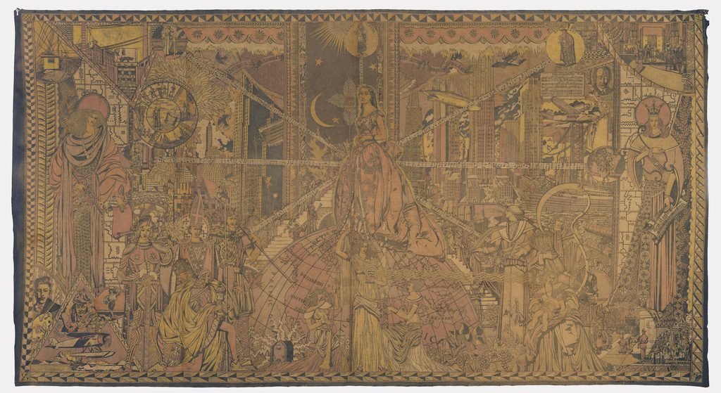
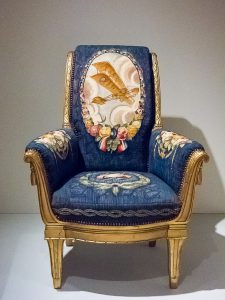
There is no direct exhibit about Airplanes but I saw a big number of Aircrafts including airships in different ways. The featured exhibit was called the Jazz Age, which is the period from the 1920s to the Great Depression. It must be the big time for flying since Wright Brothers started the successful flight in 1903. Most of the design products were inspired by some kind of aircraft. A silver cocktail shaker was designed to be lookalike as the shape of an airship. A biplane was printed or weaved on the backrest of a classic looking chair (Bergere, L’Avation, 1922-25). Also, there are streamline shape inspired refrigerators and radios too, although a refrigerator will never make a move like airplanes and cars. In the 1934 Mural, “The World of Radio,” I noticed four of aircraft including airships and seaplanes, ironically compare to only one tiny radio spotted in the lower left. I love this mural very much because I can glimpse how the word looks like in the 30s.
I would conclude, this museum visit is unique and rewarding for me. Now I can retrieve back all of my notes that I have saved them on the museum website.
Other Museum Photos:
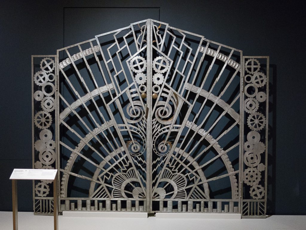
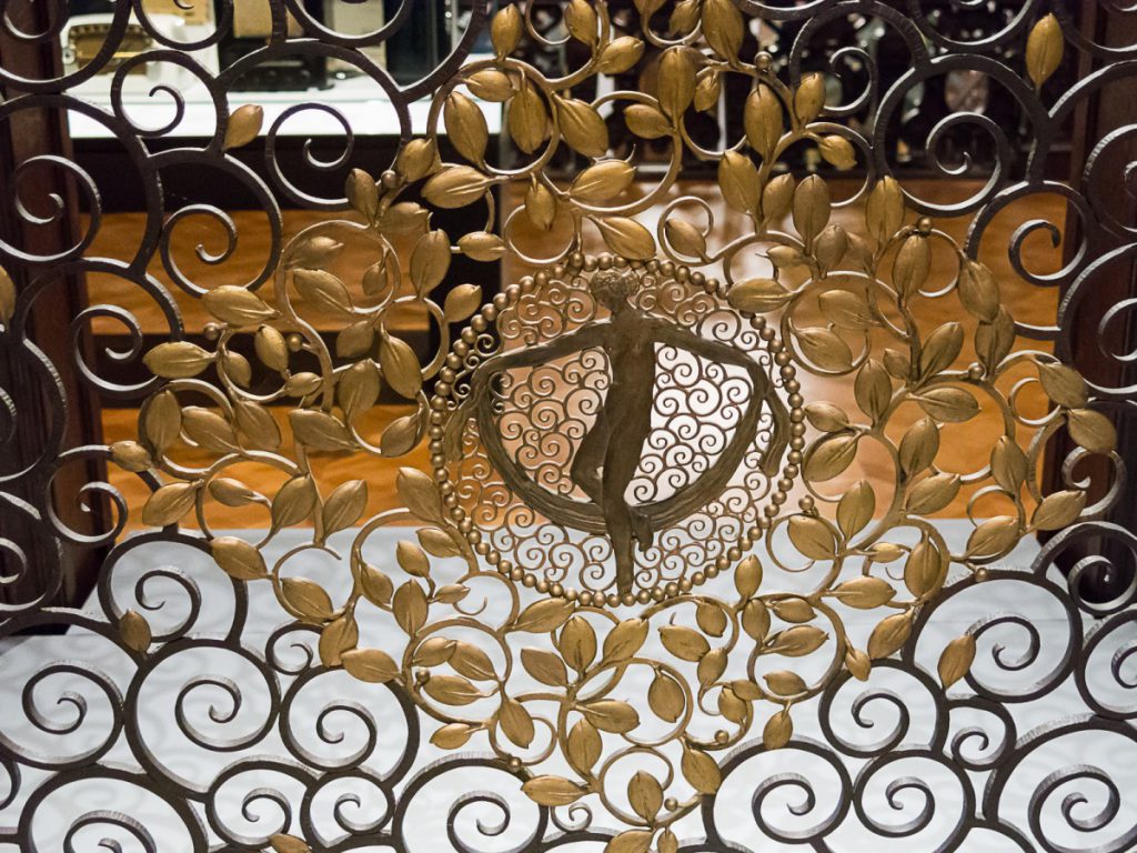
From this iron-work of the pinions and gears on the gate door, I can understand the machines were taken seriously in those days. © Win Naing 2017
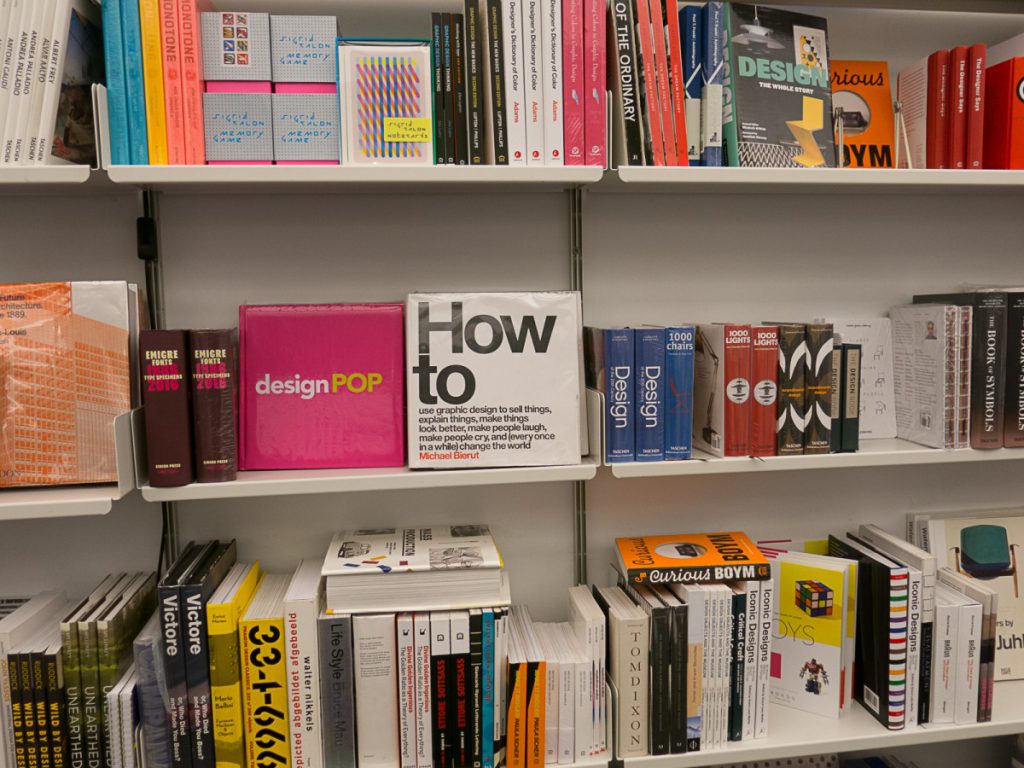
Interesting book at the museum shop. I find Michael Bierut’s book. I have been to his talk show at the SVA and it was great.

