The Museum of Illustrators doesn’t look like much from the outside. It appears as an ordinary brownstone building, making it difficult to find. Once you walk inside and you see a milk carton as the centerpiece of the main floor, you know you are going to see some weird things in this place. As I explored the many floors of this place I came across three pieces of art that stood out clearly.
The first piece of art that I found interesting was “No Ads No News” one in which a man was sitting down reading the newspaper but the advertisements had been cut out of the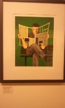 paper. The artist, Brian Stauffer, designed this piece using a mixed media technique. The man was set in a green background, which I believe makes the cutouts in the newspaper more visible. Also, the man was a white man dressed casually which is the typical because as the world was, only white men read. Also, he was sitting on the original design for a bench, which is a wooden bench. What I was able to conclude from this piece of art was that if the world was not filled with people trying to sell you things everywhere you looked, their wouldn’t be much to look at. Also, that our world is powered by the use of commercialism and without it we are spotty like the newspaper itself in this piece. The final purpose of this piece is not clear to me but the category of the piece could suggest that it was used for an institute of some sort but I am not clear in which one or for what purpose.
The next piece of art that I liked because I found it to be a little odd was a piece by David Plunkert. This piece of art was an advertisement for a film by Henri-Goerges Clouzot. The artwork itself features a head of a man being pushed down into a pool of water by a red hand that is trying to drown the man who trying to resist drowning. (Although I am not sure what typeface the artist used) DIABOLIQUE is written in a curve going along with the flow of the puddle of water. Then under that he has placed the film creators name in the same manner as the title, in curve with the puddle. What I can get with from this piece from the name of the film and the image of the advertisement is that the devil is always trying to keep us down and drown us in his lies, but we have to fight and resist until we are freed from him, we cannot give up and let him drown us. But that is not what the film is about. The film is actually about a man who is having an affair and is not very discrete about it; so the two women find out and instead of hating each other put their hatred toward the man who is abusing and mistreating them and come up with a sinister plan to make him pay. Also because this piece was done with the purpose of advertising a film I believe that this was done with ink on canvas.
The final piece that I found is simple to explain because of its easy to follow message that the artist Chris Buzelli portrays. This piece of art was done oil on panel with the purpose of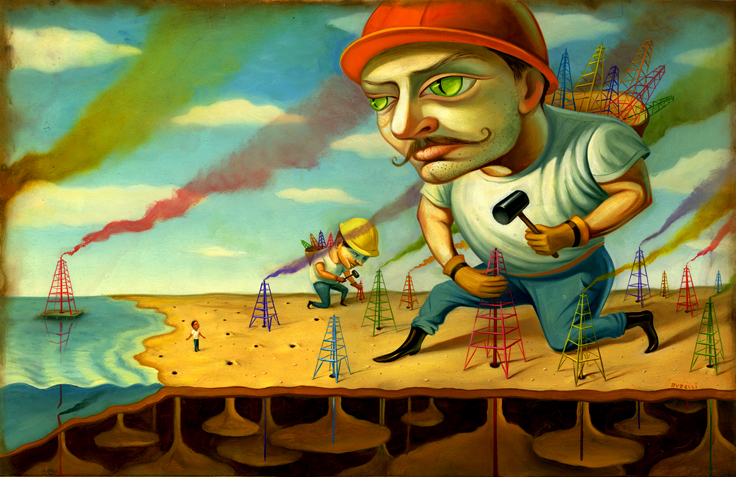 showing the truth about how the world is run. This piece was from the twelve tales from the world of energy calendar agency: DDB Tribal Group Berlin Client Entegna, which is a German eco-energy company. The reason behind this calendar is to show that there are many ways of getting energy that is more environmentally friendly, this is just turns out to be one of the worst ways because it is draining the Earth. What I can perceive form this piece of art is that the corporations with all of its greed is destroying our world. In this portrait, the evil-eyed corporations are big and strong and are sucking our world’s oil dry. The artist drew one man standing alone trying to reason with this huge monster but the monster didn’t seem interested. Also, the artist drew curly diabolical mustaches on each of the monsters drilling for oil symbolizing that they are evil. What I think this piece means is that no matter how many people stand up to evil corporations they are still going to destroy our worlds with their greed and there is nothing we can do about it except watch.
After this visit to the museum and being able witness all of these creative paintings I would say that this was a very joyous experience and I would recommend visiting this museum to anyone and everyone, not just to people who are interested in this field of work. It is a good way to see how creative people’s minds truly are and to show that there are many ways to display a message when combing the art of typography with other visual arts. The pieces found at this museum can inspire everyone because they are very creative in design and presentation. There are a few paintings that will make you laugh and a few that will make you say wow this is great. But the only way to find out for sure if you’ll like it is to go see it for yourself. I know I won’t forget this experience and I am glad I went.

