Our class project was to choose a quote and come up with three visual concepts to enhance the meaning of the quotation. I chose a quote that I found on a website that was stated by the all famous poet and story writer, Robert Frost . He has many quotes credited to his name but the one that I chose was “Happiness makes up in height what it lacks in length.” I liked this quote because of what it stands for. Happiness is short lived but at the moment it is being experienced it feels great. Below I have posted the three visual concepts that I think displays the meaning of this quote quite nicely.
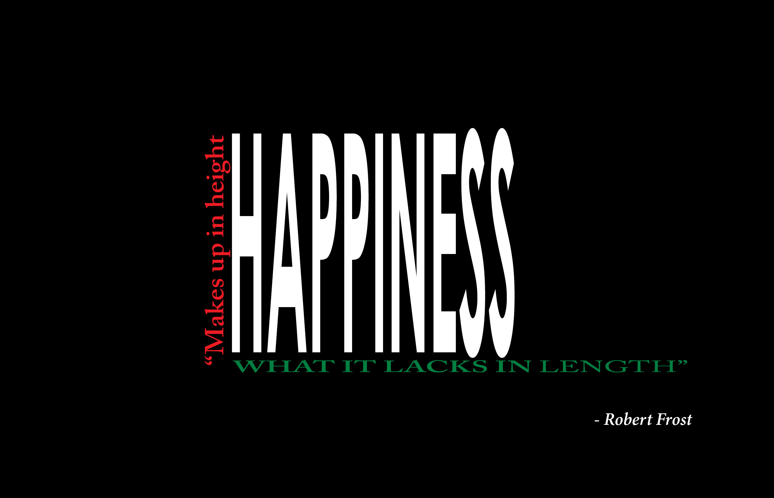
In the first concept, I played with words in the quote. I broke the quote up into three pieces. The word happiness was made short and tall to signify that it makes up in height what it lacks in length. Then the part of the quote “makes up in height” runs up the side of the word happiness in red to show that it’s tall and to make it the second thing you pay attention to. The part of the quote that talks about length “what it lacks in length” went under the word happiness in green to show that happiness is short but it is tall and so that it would be the last thing you focus on. The colors that where chosen are there for the specific purpose of directing your eye to each of the words in order as you notice white first then red then green with a black background to make everything stand out more.
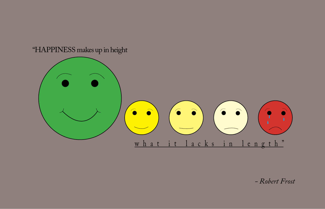
The second concept was a giant happy face with the word “happiness in all caps shows how happiness is amazing when its first being felt followed by makes up in height in regular form and the color green was chosen for the face to symbolize traffic because who isn’t happy when they have a green light. Then as time progresses the green light starts changing into yellow and by this point your feeling ok but green is still better. The last face is red because when you have to come to a stop you are sadder than when the light is green. Then “what it lacks in length” goes underline and under the other faces because with time the faces change from happy to less happy or yellow to red and the underline shows time in length. Finally background was just a neutral color that let everything stand out without it having to be white.
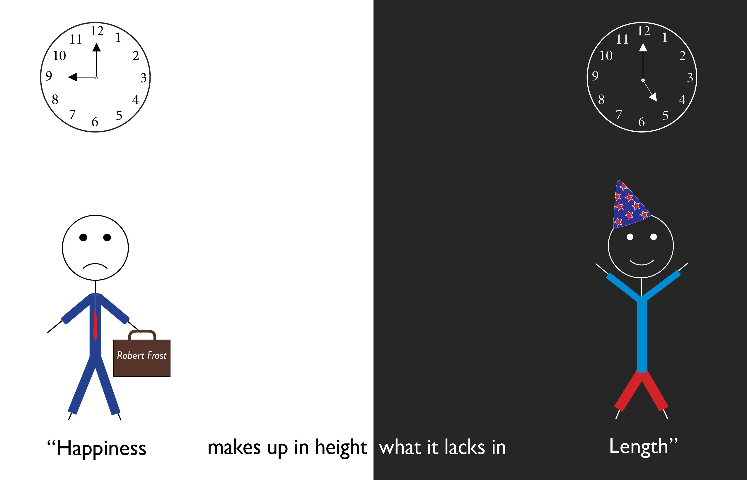
The final concept was poorly constructed with stick figures. Basically the clock on the right is at five o’clock pm which is when people are happiest in my opinion because you get to relax after work or school and the background is black on this side because it s night time. So the stick man looks like he is about to party with his party clothes and his party hat. The clock on the left is at 9 o’clock am and the background is white because it is daytime and the day is starting. At this point the stick man is sad because he has to go to work with his suit and his suitcase at hand but as the day goes on he does get to his happy point eventually.