Saturation Studies: Phase 3

The temperature of my group was cool and we also got the poster named “Ween”. My group decided to have the word soft echo. The sense relating to Soft was the sense of touch and the sense relating to echo was the sense of sound. For a cool temperature some would usually think of blue of green but I thought of the color white and orange. The color white is known to reflect heat is that was the reasoning behind picking white. The color orange may seem like its the color that relates to heat but I look at it as a cool breeze while the sunset is coming closer toward the ocean breeze. I wanted to use a Helvetica font but for some reason my computers fonts were not changing my word into the font I wanted. But al in all this is the poster we thought of.
Saturation Studies: Phase 4
This project taught me the most so far, i’ve never really studied colors, or color theory, and i went in knowing very little. I think from what i learned, it can help me better understand the themes that i repeat on in my personal work. For this project , i think i could have done phase 2 a little neater? maybe i should’ve just used more tape, but overall i’m pretty content with everything done.
Saturation Studies: Phase 3
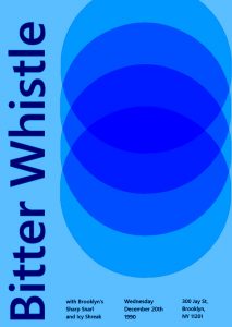
the prompt we were given was ‘Cold’, so we went with band name that would showcase that, we all chose ‘Bitter Whistle’ because not only did it match our prompt, but i feel like you can almost feel it, i would describe it more as a cold wind. We also chose Icy Shriek and Sharp Snarl, to match. To further evoke this feeling of a cold temperature, i went with lighter blues, and a navy blue for the text. While working on the poster, what i struggled with was the circular design. I wanted it to be near black in the center, but i couldn’t figure out how.

Saturation Studies: Phase 4
This project taught me the different aspects of the color wheel and the different shades of color. There are more to color than we all think that there is. Color reflects senses and also reflect our past and future. I also learned new terms that I wasn’t as familiar with in my past knowledge on art. I had a difficult time mixing the colors in phase 2 of the project because to me I guess it was a bit confusing. The other parts had its fair share but all in all this project wasn’t as hard as I thought it would be.
Saturation Studies: Phase 3
The temperature of my group was cool and we also got the poster named “Ween”. My group decided to have the word soft echo. The sense relating to Soft was the sense of touch and the sense relating to echo was the sense of sound. For a cool temperature some would usually think of blue of green but I thought of the color white and orange. The color white is known to reflect heat is that was the reasoning behind picking white. The color orange may seem like its the color that relates to heat but I look at it as a cool breeze while the sunset is coming closer toward the ocean breeze. I wanted to use a Helvetica font but for some reason my computers fonts were not changing my word into the font I wanted. But al in all this is the poster we thought of.
Time: This part of the phase took me about 2 hours because there was a lot of thought put into deception and alignment.
Saturation Studies: Phase 4
This project taught me a lot about the color wheel in general, and how much of a difference it makes when you change the saturation or value of a color. The painting and the poster taught me more about that, and how tone, saturation, and value can set a type of mood. I struggled a lot with the painting part of this project because it took a lot of times to start over. However, the digital part of this project was pretty easy to me only because of me knowing how to do it. I think I enjoyed this project a little, and it taught me a lot about the differences of mixing colors with not just white and black and actually using different colors.
Phase 2
Saturation Studies: Phase 3
Time: 2 hrs
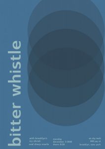
The temperature my group was cool, and we got the swiss poster called Pavement. My group decided to have the bitter whistle as our main word, and as our “featured bands” the names icy shriek, and sharp snarle. For a cool temperature you instantly think of blue, and especially of our words we wanted to have a blue poster. This particular poster didn’t use the font of “Universalis”, like how Professor Spevack’s was. Instead the other swiss font it had was called “Switzera”. The only thing i struggled with was that because it was the Switzera font for some reason I had to adjust the point size to what I thought was exact as the poster because it wasn’t exactly the same. Especially, since the word bitter whistle is longer than pavement.
Saturation Studies: Phase 1
Time: 1 HR
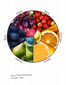
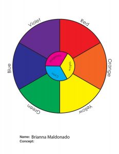
The image on the right is the original color wheel, and my unique color wheel was centered around the concept of fruits. I knew some fruits off the top of my head that fit in the color wheel, especially for the “rare” colors like magenta and cyan. Just so you can know those fruits aren’t just photoshopped to the color you can look up the fruits for magenta & cyan, which are dragonfruit and blue quandong.
Saturation Studies: Phase 4
This Project thought me a lot about warm and cool colors and how to represent them. It also thought me a lot about the different ways to combine colors to achieve each level of saturation and value. I also learned a lot about visual weight, balance, and symmetry. This was a very interesting project, one that I will look back on when creating future work.


