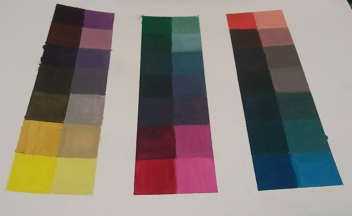
I spent 5 hours and 30 minutes on this. I struggled to see the difference between the two last ones so I needed to check in with some people I knew. I still can’t see the difference so I’m getting that checked.

First Year Learning Community
I spent 5 hours and 30 minutes on this. I struggled to see the difference between the two last ones so I needed to check in with some people I knew. I still can’t see the difference so I’m getting that checked.
I learned that colors have “physical facts and physic effect. Factual color is how we first perceive a color through experience. Actual color is achieved because “seeing one color makes our eye want to compensate by seeing its complement” That’s why when we see the two X’s there appears to be two colors when it’s actually three, the yellow, purple/gray and the X. Optical mixture changes the way we perceive color too, changing one color can make the whole image look different (brick example). She says a quote “Practice before theory” which basically means you have two types of knowledge. Knowledge by description (direct knowledge through background knowledge) and knowledge by an acquaintance – perform it via experience (as you see/perceive it) (Color in context)
The article is about how our brain there’s an afterimage effect. Our brain likes to stick with what it expects which is why we see an illusion. In the audio Alber says “The majority of the people miss the true reality” which means our brain is wired to perceive things quickly just enough for our survival that we don’t stare long enough to actually “see through” what’s happening around us. In the article, if you stare long enough at the dot, you can see yellow diamonds on the right because of the contrast reversal. What I learned from this is that if we stare hard enough and try to pay attention to detail, we can see colors that others normally wouldn’t see at first glance. (The Magic and Logic of Color)
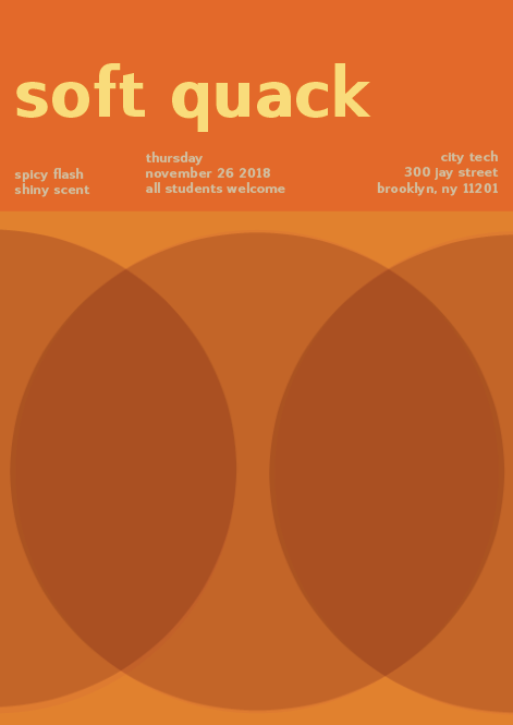
In this project, I learned how to desaturate colors and mute them without using black and how to utilize them in CYMK. I could have done the painting portion better if I was more patient before removing the tape. I also needed to be more careful with the water. When I paint in the future I may set up a table with nothing but the materials to prevent accidents like that. It was suggested that I moved the title (soft quack) higher so that it wouldn’t touch Thursday and I did that. I kept the bottom portion because it was alright, and I changed the bottom text to all the same muted color as the necros guide does. In the critique, until it was projected I didn’t notice that the circles were very transparent so I went back and made it darker.
Cards: Warm/Swissted Necros/Cross sensory words
The background is supposed to be saturated orange, the yellow is muted and the subtext is desaturated. It took me two hours to get this right because changing the text to being fully saturated didn’t look nice and I wanted to keep the muted yellow look to match the word soft. For the desaturated yellow I had to keep trying again adding about 50/50 magenta yellow but in the end, I used some black to make it stand out from the page without it being brighter than the title for visual hierarchy.
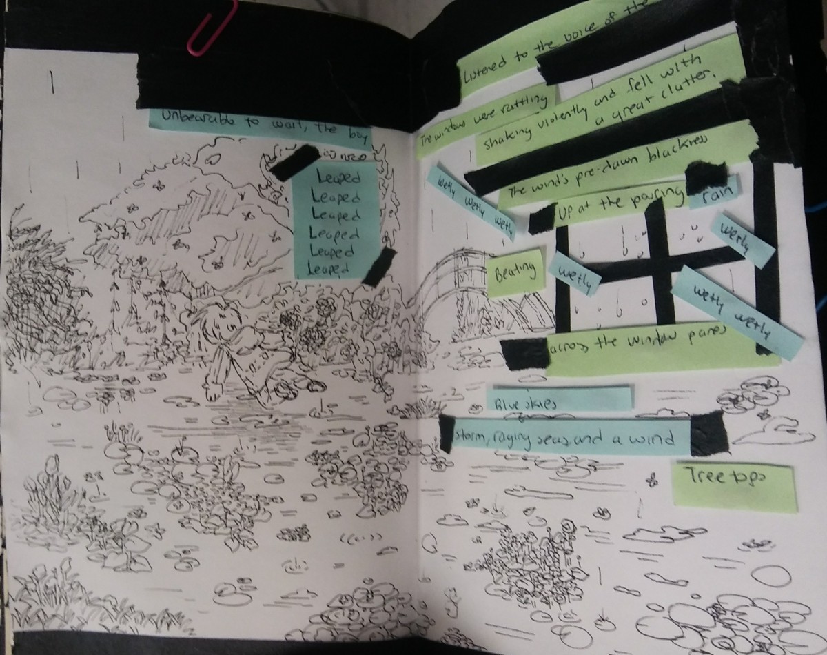
The third spread in the book provides an illustration inspired by Monet Claude to describe the word propinquity (being close to something in time or distance). The materials used was black masking tape, inking pens, printer paper, paper clips, and post-its. The artist intended the concept to be a leap towards freedom through flight.
adjective
of or relating to the sense of smell (Merriam-Webster-Dictionary)
The word was encountered in “The Inclusive Museum” By Sina Bahram
The sentence that it was encountered in was “He found exhibits with audio, olfactory, or tactile components”
The author utilizes this word to say that the museum not only had audio, but smell and things that you could touch/feel. This is important to the paragraph in the article because its essentially saying the guide limited the experience of being in a museum because from a earlier lesson with the ways of seeing video, when looking at paintings or objects your interpretation of them can be shaped through the audio that is played along with it. Because this impacted the author so much she decided that museums aren’t doing enough for disabled people, simply acknowledging the disability is not enough.
This took about 8 hours because I ran into water accidents. Overall even though there’s some bleeding I think this turned out nicely.
The item I chose to substitute with the color wheel was sweets/desserts. I spent the last 15 minutes of the class making this and I successfully finished.
I learned how to create a gradient out of grayscale and how different materials introduced in a composition can catch one’s attention even though it is not the artist’s intention. I feel as if I could have painted the collage better if I tried the Grid Method, however, I was constrained by time and the space wasn’t wide enough for detail. I learned that painting is hard but it isn’t impossible, it took me several tries of fixing the tone and ruining the image in the process. I’ll apply this patience and persistence to the next project. I took the advice of attempting to add detail to the eyes with a finer brush and made the surrounding area around the eyes darker.
This is my broad ranged digital collage. I spent about an hour on this. Doing this digitally was faster than I expected but I simplified a lot due to the fear of running out of materials physically. Other than that I believe getting the shape of it and location was what took a little longer.
The OpenLab is an open-source, digital platform designed to support teaching and learning at City Tech (New York City College of Technology), and to promote student and faculty engagement in the intellectual and social life of the college community.

