Catalogue Entry

The glossument book The Book of Me has entries of vocabulary words learned by the artist, and they’re illustrated in a way of trying to portray the definition. This project was drawing inspiration from Tom Phillips’ The Humument, which was a book filled with blackout poetry.The Book of Me is supposed to represent a concept of being able to use anything as a canvas to convey your artwork.

Another concept that the project drew heavy inspiration is from the comic book style, or even pop art. The use of bold colors and the type of graphics there are in comic books or pop art are seen various times in The Book of Me. Each page has its own mood that it’s expressing by using different color backgrounds and materials that make each layout telling individual stories like in a comic book.

Blackout poetry wasn’t a concept that the artist tried to take away from The Humument, but the concept of having words stand out from the rest of the page is what they took from it.

(NOT FINISHED)

Saturation Studies: Phase 4

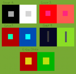
This project taught me a lot about the color wheel in general, and how much of a difference it makes when you change the saturation or value of a color. The painting and the poster taught me more about that, and how tone, saturation, and value can set a type of mood. I struggled a lot with the painting part of this project because it took a lot of times to start over. However, the digital part of this project was pretty easy to me only because of me knowing how to do it. I think I enjoyed this project a little, and it taught me a lot about the differences of mixing colors with not just white and black and actually using different colors.

Phase 1

Phase 2

Phase 3

Saturation Studies: Phase 3

Time: 2 hrs

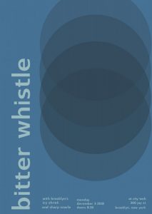
The temperature my group was cool, and we got the swiss poster called Pavement. My group decided to have the bitter whistle as our main word, and as our “featured bands” the names icy shriek, and sharp snarle. For a cool temperature you instantly think of blue, and especially of our words we wanted to have a blue poster. This particular poster didn’t use the font of “Universalis”, like how Professor Spevack’s was. Instead the other swiss font it had was called “Switzera”. The only thing i struggled with was that because it was the Switzera font for some reason I had to adjust the point size to what I thought was exact as the poster because it wasn’t exactly the same. Especially, since the word bitter whistle is longer than pavement.

Saturation Studies: Phase 1


Time: 1 HR

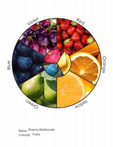
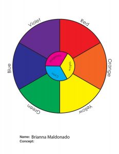
The image on the right is the original color wheel, and my unique color wheel was centered around the concept of fruits. I knew some fruits off the top of my head that fit in the color wheel, especially for the “rare” colors like magenta and cyan. Just so you can know those fruits aren’t just photoshopped to the color you can look up the fruits for magenta & cyan, which are dragonfruit and blue quandong.

Saturation Studies: Phase 4

This Project thought me a lot about warm and cool colors and how to represent them. It also thought me a lot about the different ways to combine colors to achieve each level of saturation and value. I also learned a lot about visual weight, balance, and symmetry. This was a very interesting project, one that I will look back on when creating future work.

Phase:1

Phase:2

Phase:3


Saturation Studies: Phase 3

  1. Garence.jspevackposter1

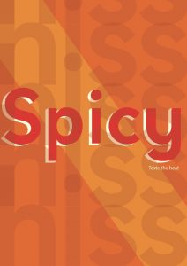
The color temperature or color scheme that was given to my group was Warm. we made a list of words used to describe our color temperature.  The words chosen would be used to create our band name. The words that we chose were Spicy and Hiss. Combined they become ” Spicy Hiss”. I decided to make this poster simple and bold. I chose the color Orange which is a warm color, for the background to give a warm feel. The word spicy should bold and hot, so I chose Hot pink,  a very warm color,  for the word Spicy. When thinking of the word hiss I think of a very settle color, I also want this color to fit in with the poster. I chose a muted Orange color for the word hiss. Together the colors of the poster really give it a warm feel and you can really hear the subtle hiss and taste the flaming hot explosions in your mouth.

Time: 2 hours 45 min


Saturation Studies Phase 4: Deliver

The objective of this project is based on color and combination itself. There is a lot of colors that are mixed between two and depending the value of the color. The most challenging one so far due to this project was phase #3, which is in a group of 3-4, we have a word and we need to describe it with two words of sense. Once we chose our two sense, we would individually work in adobe illustrator (Ai) and redesign with a poster provided for us. I’ve enjoy and learned a lot about coloring, combination and the meaning itself. I am looking forward for the next project.

Phase 1

Phase 2 

Phase 3 

Saturation Studies Phase 3: Develop

The two words that describes warm is “Spicy/ Hiss”. I think it might sound catchy and have a strange taste besides the theme color I chosed in this poster. The word “Spicy” has this 3D feature and I think it has a strong sense of describing warm and the word “Hiss” is placed at the background of the poster, repeating itself vertically with less opacity on the texture. When I think about the word “Hiss”, I would imagine it less visible and directly spread out.

Saturation Studies: Phase 2

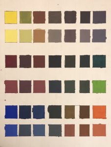
These are guide colors that explains the mixture between two color and relationships.  There are three sets and each set has two rows, the  top is the original color and the bottom is for light colors that white color is added as well. This project is used with a Bristol paper and gouache paint. It took some time to get the function of mixing for a color and to be considerate of the proportion of paint used. To be honest, it was quite stressful but I did quite enjoy mixting and discovering colors.

Duration : 1-2 days (first day- 3-4 hours).