
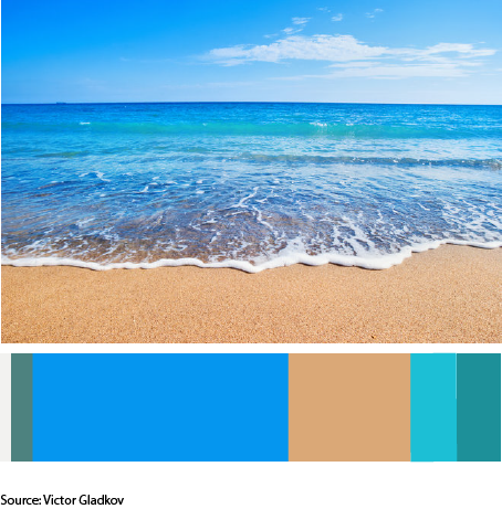
This image is an image taken by Victor Gladkov. My theme for my glossument is opposites and fabrication. So for that I chose the colors like brown, white, and different shades of blue. I feel like the color blue has many opposites and I also feel like brown Is an opposite of blue because light brown is a shade of orange. I also learned that colors can harmonize to create compatibility.
I spent about an hour an a half on this phase of the project.

