Citation
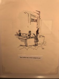
1) For the comic I choose only looking at the illustration doesn’t give you much to think about other than a guy is robbing the bank and thinking why would he be robbing the bank. We know the guy is robbing the bank because we can see he has a mask on the block his face, a gun pointed at the clerk, and in the background their word bank on the window.
2) The illustration gives the comic a more natural, friendly and fun look to it. The comic communicates these ideas differently because if it was done with a graphic designer it would have felt more professional and less fun/inviting. If graphic design was used the artist could have put in more details and more vibrancy into the comic.
3) Within this comic you can’t really tell much about race but what you can tell is maybe the bank robber is in a lower socio-economical class. I say this due to him robbing a bank his mother looking for him, he barely has proper clothes on his body or clothes that look raggedy as if he just got out of bed. I believe the audience for this comic is probably for teens and up I say this because some teens and adults should be able to relate to what the story was saying or at least heard of what the artist was trying to say. I say this because the caption said your mother was in here looking for you and I felt like this had the vibe or feeling that before when the mom was in the bank she was probably looking for her no good son and her talking and telling the clerks how her soon is no good/bad.


