The First Initials Logo Draft
![]()
This first initial logo was just a quick draft to see how my initials would look together. I didn’t want to use slim letters as I would want my name to stand out more. The lines I put in-between in the characters V and N it self was to let me know that if I did decide to use this concept that the lines would signify a cut out where or just a space where the lines are.
The Second Logo Draft
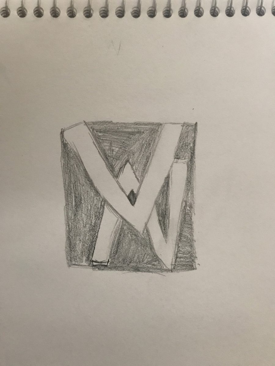
I wanted to see if I could go or be more creative with my initials. So I decided to add them on top of each other. The V being my first initial would go on top of the N to show my first initial being V . I quickly made a box around the initials and just shaded it in to see if I left the initials white would they stand out better and create an effect where it popped out more to viewers. It was a draft so I was not trying to be perfect it just needed to make sense in my perspective so that when I did the final process or was choosing which one would go for the final creation I would know what to do.
The Third Logo Draft
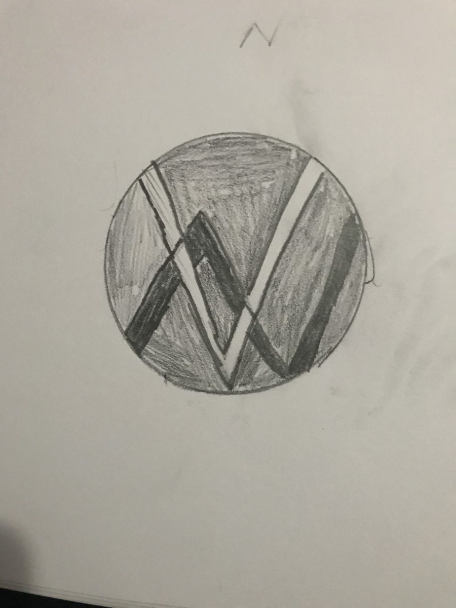
I went with the same concept of the second one in trying to find a way for my initials to pop out more. I ended up changing the way I Layered it out from the second draft because I felt as if The V on top of the N didn’t portray the effect I was going for. So I decided to do another draft to see if I could get an effect where you could see that There was a V but hidden behind the V the Character N popped out . I did this by creating a contrast between the V and the inside of the circle being white and grey/black. Then I created the effect of The N popping out by creating it darker than the background or what was inside the circle itself. This allowed the N to be behind the V but still pop out an appear clearly.
Final Logo
![]()
I ended up using some concepts from both the first design and the third design to create my final logo. I choose the third draft instead of the second because I felt as if the third logo was just an upgrade of the second logo unlike the second logo being completely different from the first. As stated before I wanted my initials to pop out since the V was going to be onto the N and I had like the concept I did With the V in the first logo process so I decided to keep it. I changed the color inside the circle which was initially supposed to be a greyish or black color to a completely different color because using a black or gray I couldn’t not get the effect I wanted. I made the V As big as the circle because I wanted to create the look that the character V was splitting the circle and the color inside into three separate sides. The in made the N hang over the first half of the V to Show that even though The N is mostly behind the V its still as important.

