
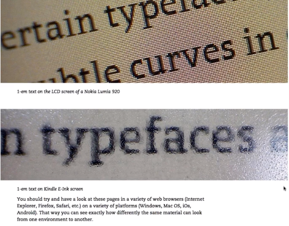
For the webinar assignment, I watched “Pro Tips for Picking Web Fonts” by Dan Rhatigan on the website Montotype. This webinar talks about web fonts and how they operate as well as tips to choose your ideal web font. Dan first talks about choosing your ideal web font based on the the project you are doing; whether it is suitable, functional, and capable for your work. Then around 7 minutes into the webinar, Dan pulls out a screenshot of a typeface comparison (image I posted in beginning of post) that shocked me. He showed the same typeface displayed on 2 different product screens and it looked really different. This taught me that I should look at the typeface on different platforms like mac, windows, and smartphones as well as browsers like chrome, internet explorer, and safari because the same typeface can be displayed completely different depending on the hardware and software of viewers. Dan later said “So you have to make choices and accept that you’re not necessarily in total control of the results, but you need to understand what happens with them” which was really interesting and true about design.
After that, Dan started comparing typefaces of the past. He compared Garamond to Helvetica of how the sizes are different. That’s because they were made for different usages and purposes. Dan then moved on to characteristics of typefaces such as sans-serif and serif fonts as well as the x-height because it can affect how the eye perceives it. The x-height and serifs can control the space the eye perceives and can affect how “readable” the context is.
Afterwards, Dan discusses about the elements you need to take into consideration for choosing the ideal typeface. These elements are size, style, color, and spacing. These elements can really affect your design because the context and typography is a key element. By choosing an ideal font that fits your project, you can allow the viewers to read easily and get the message effectively while allowing your project to look great. This webinar was really informative and taught me a lot about typography’s impact and how it isn’t easy to find the ideal typeface especially with the amount of available typefaces in the internet nowadays.
Webinar Link:
http://go.monotype.com/Picking-Webfonts-June-2_Post-Webinar.html

