 the first piece I walked p to were three separately colored phones. The phones wanted us to pick them up and put them to our ears to listen to a message from the designer. He talked about how they went through different sizes and shapes of the handle to get the right feel when you held it.
The most important thing that I’ll probably take with me forever was an anecdote which i;ll try to remember.
Him and his company designed a clocked, spent weeks on perfecting the design and making sure it came out perfect, most important to them was that it was light weight. They then went to the buyer, in his head he’s thinking she has to and is going to pick his clock because of the weight and the time they put into it. After observing the other one he’s assured she will after all it was a heavy brick compared to his.
She chooses the heaver one to his surprise.
Quality was felt by the consumer in the weight of that clock. It felt more like a sturdy device.
Which can be translated into phones. Lets talk about Apple products and Samsung for instance. People (weather or not you have one of like them you should be able to agree) see quality with something liek an iPhone when you hold it, it can be as thin as a Samsung phone but theres a certain weight that comes from it’s aluminum body that gives it that weight, apposed to the Samsung plastic.
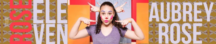
This is important as someone who wants to pursue product design.
So first I created them somewhat random
. 
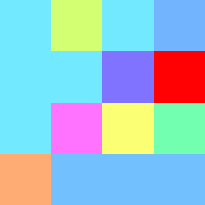
I wanted to add more order dso I did the following

And using all three I created this
*enter dramatic music.*
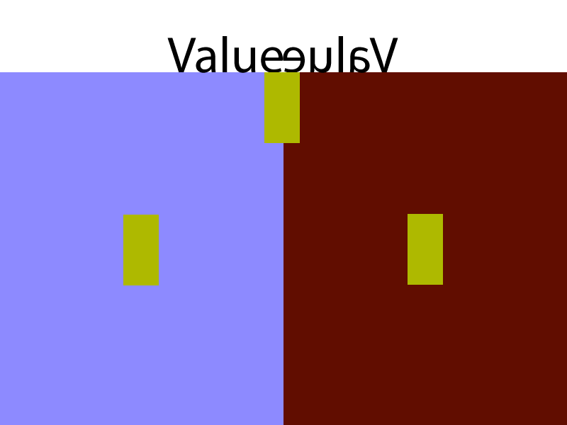
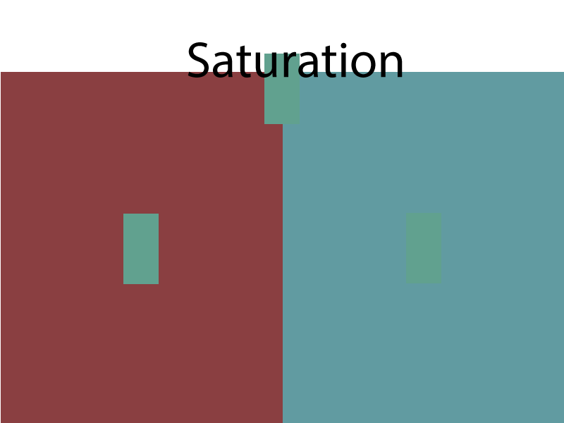
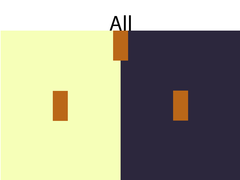
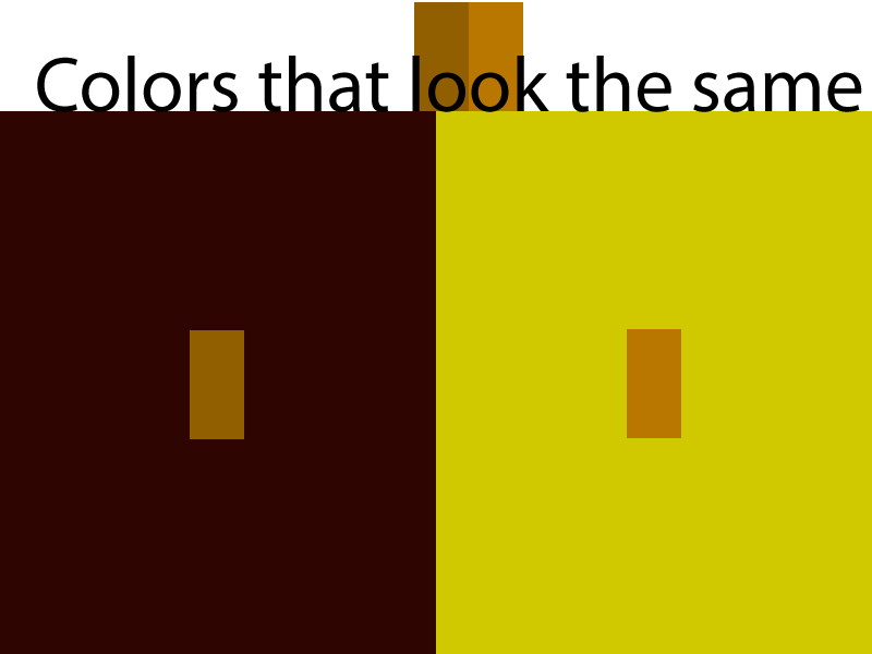
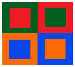
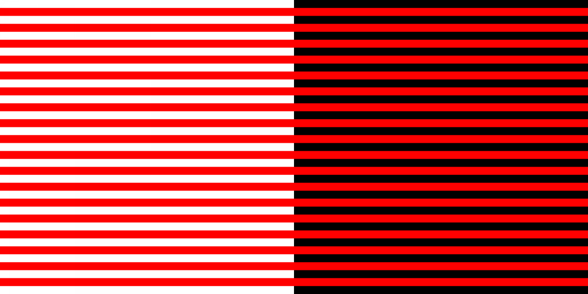
Bezold effect
is an optical illusion, named after a German professor of meteorology, Wilhelm von Bezold (1837–1907), who discovered that a color may appear different depending on its relation to adjacent colors.
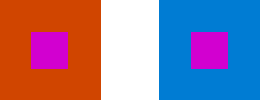
Simultaneous Contrast(I like number two better!)
1. A contrast effect is the enhancement or diminishment, relative to normal, of perception, cognition or related performance as a result of successive (immediately previous) or simultaneous exposure to a stimulus of lesser or greater value in the same dimension.
2. Simultaneous contrast refers to the way in which two different colors affect each other, how one color can change how we perceive the tone and hue of another when placed side by side. The colors themselves don’t change, but we see them as altered. -SOURCE
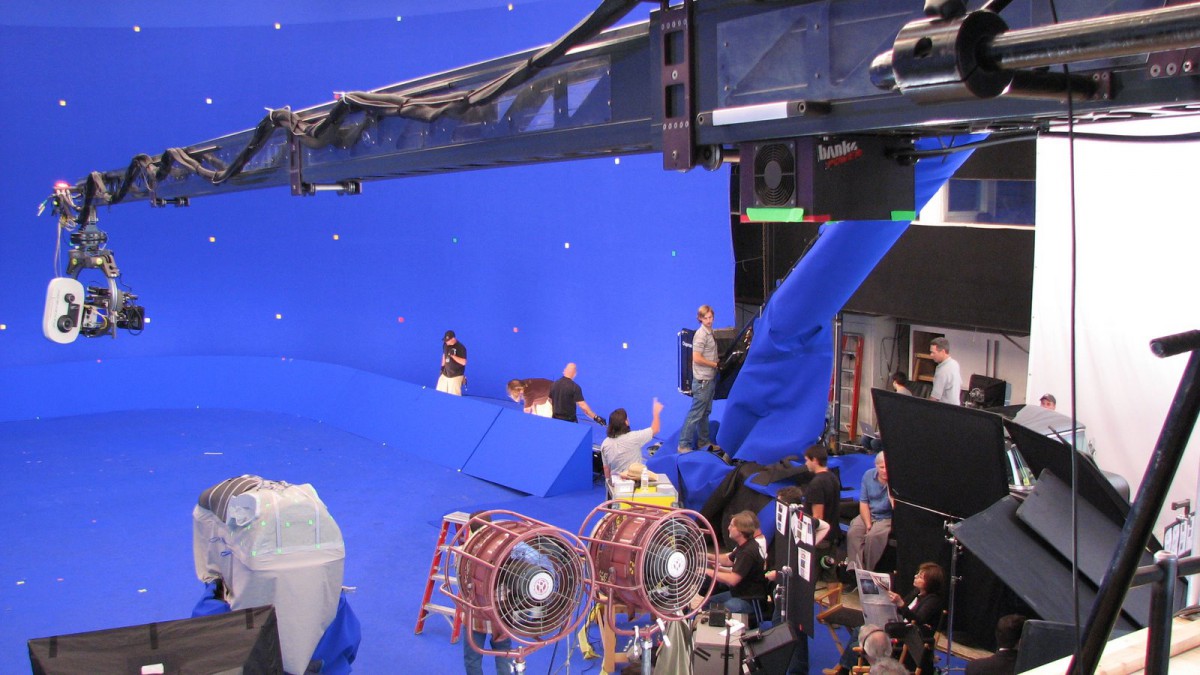
Keyed Color
Also called “chroma key,” it is a technique for superimposing one video image onto another. Widely used to place an interesting scene behind people such as a news reporter on TV, it is also used for creating special effects such as floating a car on the ocean.
My Def
Bezold Effect
Basically when a color looks different beside one color then it does another.
Simultaneous Contrast
I feel like this is similar to the Bezold Effect, making us believe we’re seeing something one way when it’s bee the same all along.
Keyed Color
This is what is used to use as a keypouint for something, often used with video editing.
Bezold
simul contrst
keye color
With my photography I feel like there are always different points where I focus on different aspects. I began obsessed with composition. Then I trotted on to lighting and exposure, styling etc.
Now it’s an over arching aspect, the loudest things visually.
<p style=”color:red”>BOOM! COLOR!!!<p style=”color:red”>
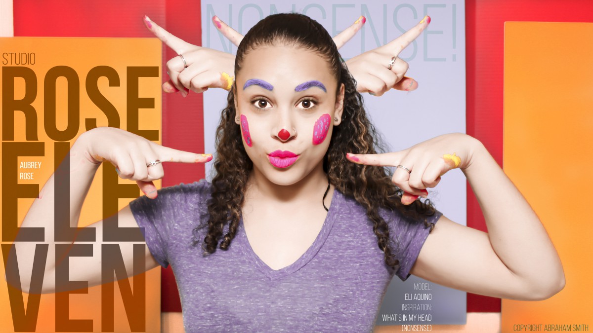
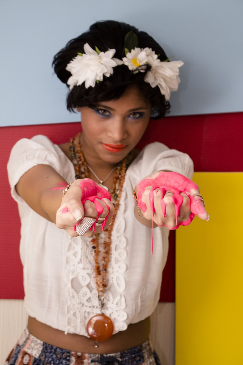
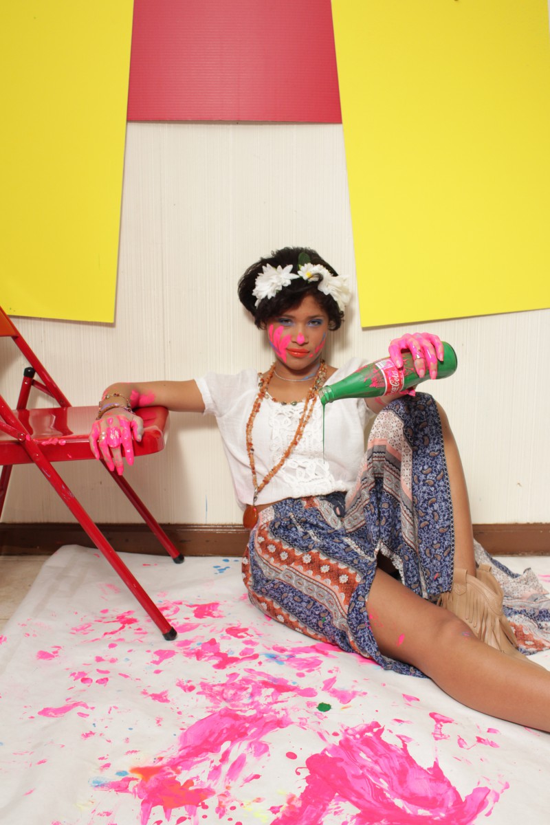
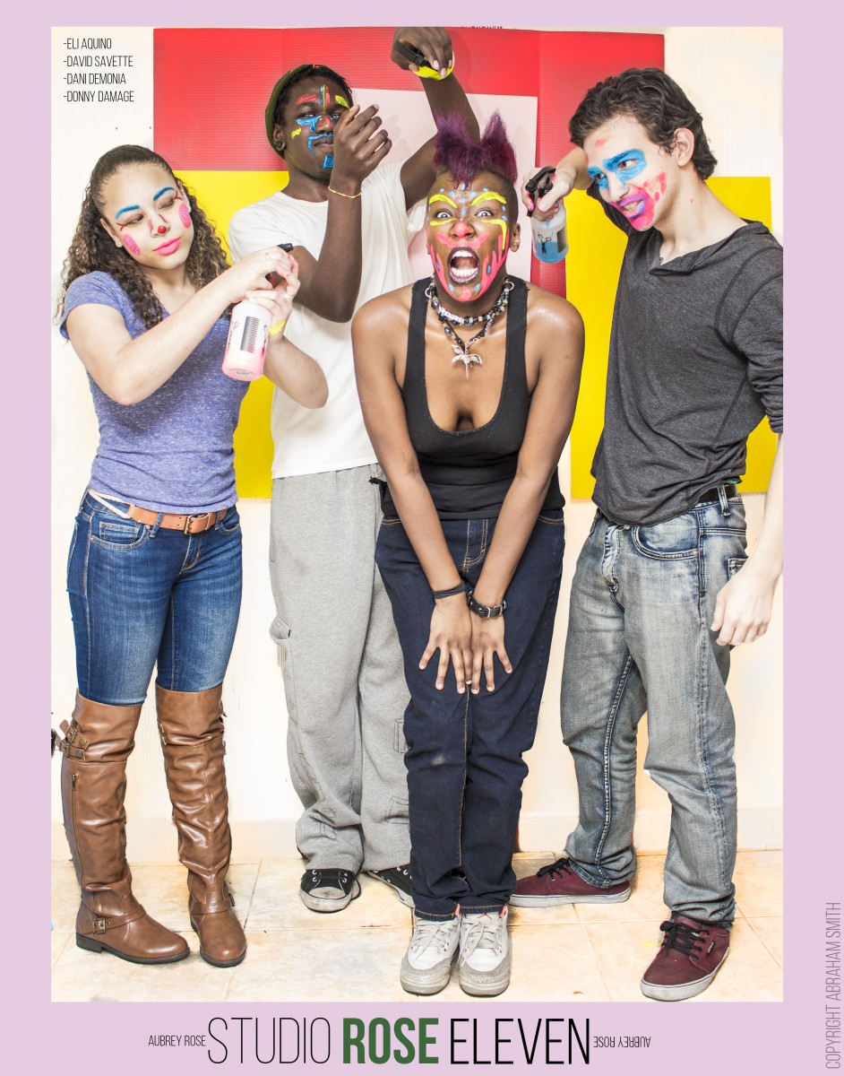
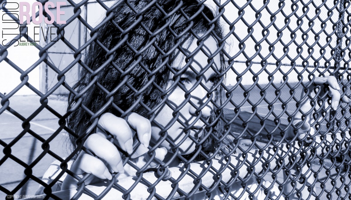
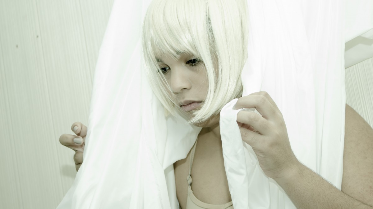
So here’s my work for the last three weeks experimenting with color. What way is better to deal with color other than physically?
Skin safe paint with a coupon from the place I work for super cheap? Is that what you were thinking? Ahh you’re so right. And here are the photos
…
NOW
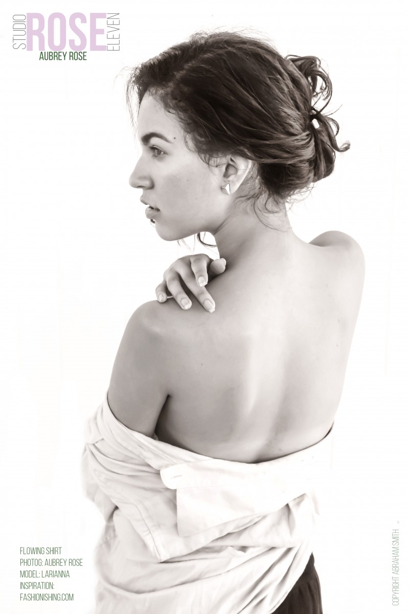
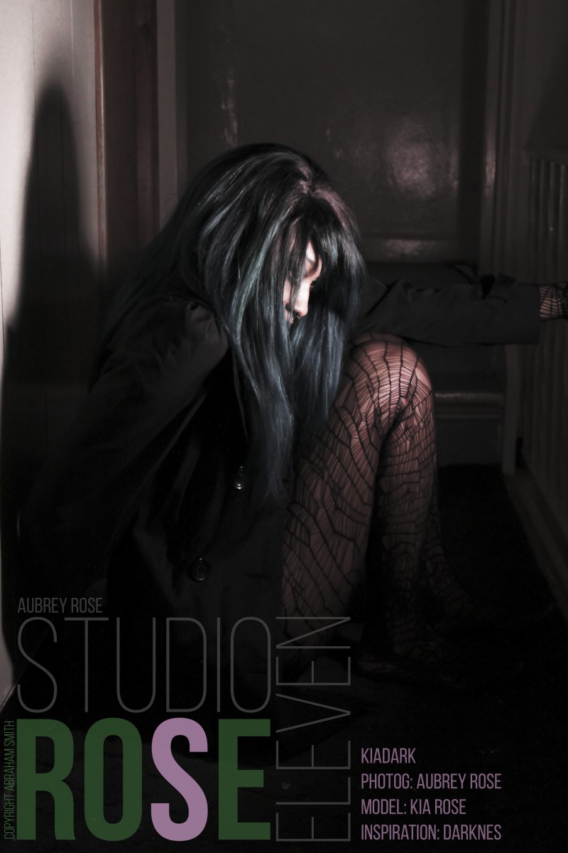
I don’t belive I’ worked with color terribly before. The following are some examples of what I did before.
Experimenting with color when it comes to tones in photography

That is all.
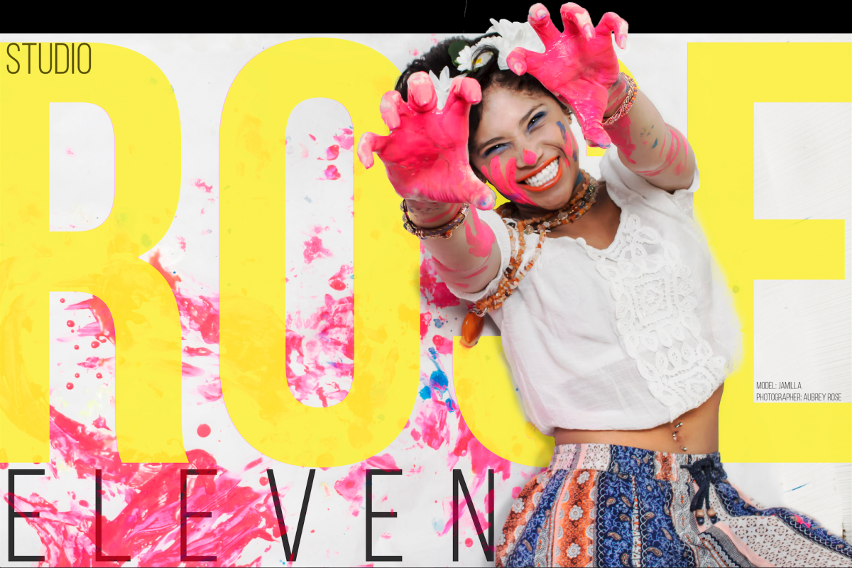
Even the model was excited about color 😛
Journal entry number 16
Prismatic color
Pure hues that represent the colors of the color spectrum at their highest saturation level.
Muted color
Muted colors are colors that are less intense. Colors that have been toned down or softened using black, white or a complimentary color.
Achromatic color
Grays that are created by mixing black and white. Achromatic grays have no evident coloration when seen against a white background. Black and white are also achromatic
Chromatic color
a visual attribute of things that results from the light they emit ortransmit or reflect; “a white color is made up of many different wavelengths of light”
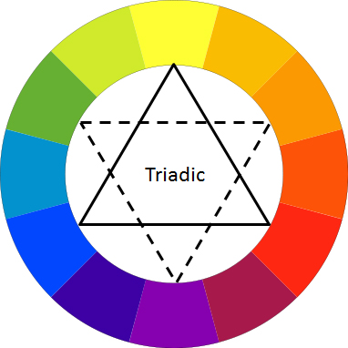
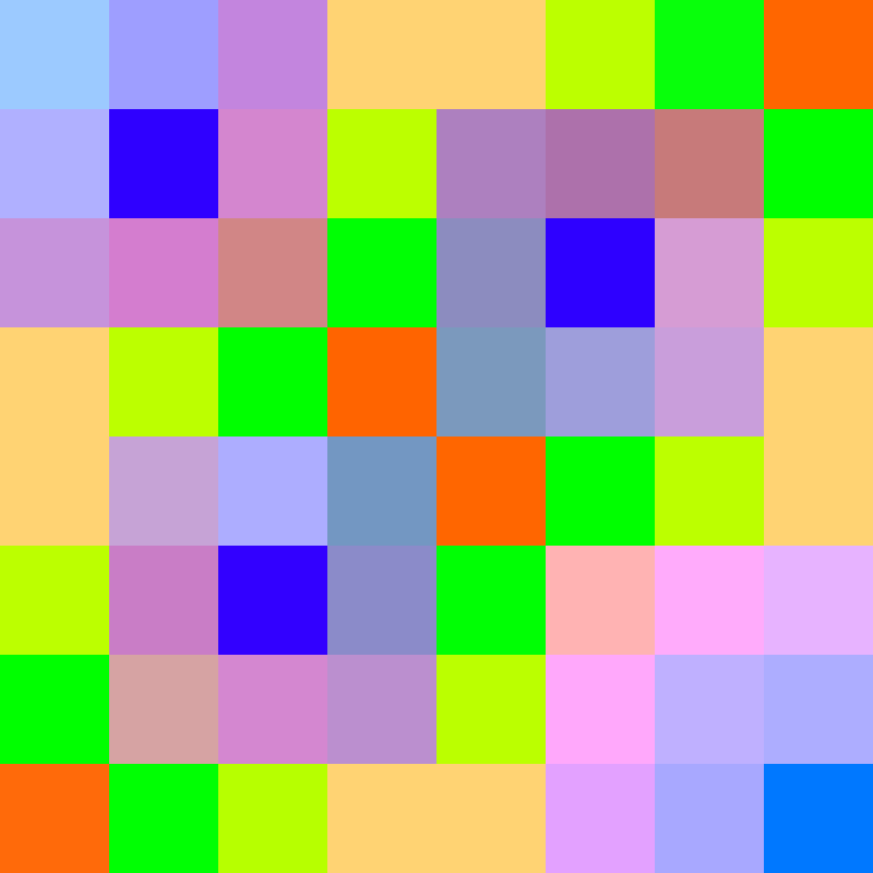
The completely solid triangle points to the Primary colors. While the Transparent of dotted triangle points to the secondary. and in between each point you see the Tertiary hues, created from the combination of the Primary and secondary “Triads”.
The next image shows why RGB are pure colors. Also referred to as additive color, while the CMYK is subtractive.
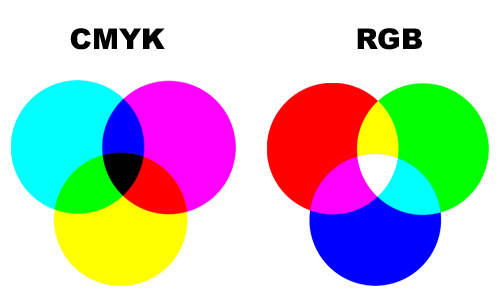
You can see where the colors of CMYK overlap it creates a shade of the colors getting darker. In the RGB you see where the colors overlap they create a tint getting lighter.
It’s interesting but I’m sure not a coincidence that the K in CMYK is representative of black. Adding black to any color creates a shade.
I’ve been taught a tiny bit of color theory and I feel like I understand shade tint additive and subtractive a lot better now.

The OpenLab at City Tech:A place to learn, work, and share
The OpenLab is an open-source, digital platform designed to support teaching and learning at City Tech (New York City College of Technology), and to promote student and faculty engagement in the intellectual and social life of the college community.

