Category Archives: Uncategorized
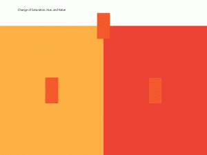
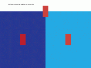
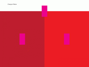
Color interaction exercise
Design Journal #25
Monochromatic
formal — A Monochromatic Color Scheme is created by taking any oneof the twelve Hues from the Basic Color Wheel and repeating it in various Tints, Shades and Tones.
Source —http://color-wheel-artist.com/monochromatic-color.html
informal— when one color is used from the color wheel
Analogous
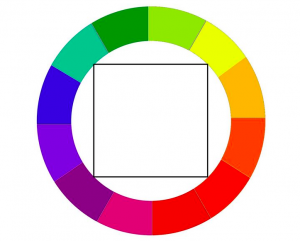
formal– Analogous color schemes use colors that are next to each other on the color wheel. They usually match well and create serene and comfortable designs.
source– http://www.tigercolor.com/color-lab/color-theory/color-harmonies.htm
informal– any one of a group of related colors that are near each other on the color wheel.
Complementary
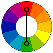
formal– Colors that are opposite each other on the color wheel are considered to be complementary colors.
source– http://www.tigercolor.com/color-lab/color-theory/color-harmonies.htm
informal– the colors those are opposite of each other in the color wheel
Triad
formal– a triadic color scheme uses colors that are evenly spaced around the color wheel.
source– http://www.tigercolor.com/color-lab/color-theory/color-harmonies.htm
informal– three defined colors from the color wheel
Tetrad
formal– A four-hue color system that is balanced based on either a square or rectangle inscribed in the color wheel.
source– https://www.pinterest.com/pin/18718154679331677
informal– when four colors from the color wheel
Design Journal #24
Prismatic color
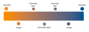
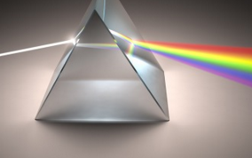
Formal- Prismatic colors are the colors that can be seen when white light goes through a prism.
Source- http://www.yourdictionary.com/prismatic-colors#21mLtK4ZEfZw1UWv.99
Informal- colors are visible when the lights are reflected.
Muted color
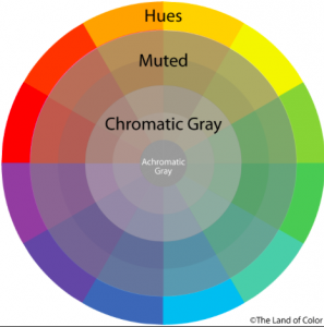
Formal- Muted colors are colors that are less intense.
Source- https://www.google.com/#q=muted+colors+definition
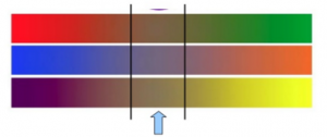
Informal- when two complimentary colors are mixed.
Achromatic gray
Formal- An achromatic gray is a gray color in which the red, green, and blue codes are exactly equal.
Source- https://en.wikipedia.org/wiki/Shades_of_gray
Informal- complimentary colors are exactly gray.
Chromatic gray
Formal- A chromatic gray is a gray color in which the red, green, and blue codes are not exactly equal, but are close to each other, which is what makes it a shade of gray
Source- https://en.wikipedia.org/wiki/Shades_of_gray
Informal- complimentary colors are close to gray but not exactly the same.
Additive color
Formal-Additive color mixing begins with black and ends with white; as more color is added, the result is lighter and tends to white.
Source- http://www.worqx.com/color/color_systems.htm
Informal-when the primary colors are mixed it turns white.
Subtractive color
Formal-Subtractive color mixing means that one begins with white and ends with black; as one adds color, the result gets darker and tends to black.
Source- http://www.worqx.com/color/color_systems.htm
Informal- when the primary colors are mixed it turns black.
Bezold effect
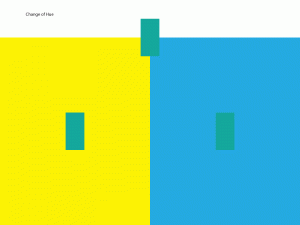
Formal- Bezold Effect, also referred to as the “assimilation effect,” is an optical illusion where a color’s hue or value is affected by the color or colors surrounding it.
Source- http://www.newworldencyclopedia.org/entry/Bezold_Effec
Informal- color is valued in differently with different color.
Color interaction
Formal-Color Interaction. pertains to the idea that color perception is dependent on color relationships. Simultaneous contrast. can be defined as the way colors interact and affect each other.
Source- https://quizlet.com/31644219/color-interaction-flash-cards
Informal- relationship between colors.
About color article (DJ#24)
https://www.nytimes.com/2016/08/13/nyregion/hunting-in-pink-new-york-adds-another-color-for-safety.html?rref=collection%2Ftimestopic%2FColor&_r=1
In this article it tells us that pink is the safest color to wear now under the law in New York. The advocates said was meant to attract more women and girls to a sport dominated by men. I think pink is a color that anyone can wear it without hesitation.
Design Journal #23
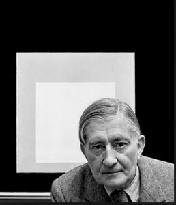
Josef Albers
Josef Albers was born March 19, 1888, Ger.—died March 25, 1976, painter, poet, sculptor, teacher, and theoretician of art, important as an innovator of such styles as Colour Field painting and Op art. He was an American-German artist best known for his iconic color square paintings—the Homage to the Square series, which he began in 1950—as well as for his major contributions to color theory.
Source– https://www.britannica.com/biography/Josef-Alber
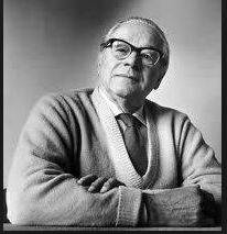
Johannes Itten
Johannes Itten was born in 11 November 1888 and died in 25 March 1967 was a Swiss expressionistpainter, designer, teacher, writer and theorist associated with the Bauhaus(Staatliches Bauhaus) school. Together with German-American painter Lyonel Feininger and German sculptor Gerhard Marcks, under the direction of German architect Walter Gropius, Itten was part of the core of the Weimar Bauhaus.Johannes Itten was one of the first people to define and identify strategies for successful color combinations. Through his research he devised seven methodologies for coordinating colors utilizing the hue’s contrasting properties. These contrasts add other variations with respect to the intensity of the respective hues; i.e. contrasts may be obtained due to light, moderate, or dark value.
Source– https://en.wikipedia.org/wiki/Johannes_Itte
Albert Munsell
Albert Munsell was an artist and professor. At Massachusetts Normal Art School, he taught students about color composition. In 1905, he published A Color Notation, which outlined his color theory. He went on to publish Atlas of the Color Solid and The Munsell Book of Color, both of which elaborated on his system of color. Albert Munsell’s color theory is a system of color comprised of three main components: hue, value, and chroma. The system can be drawn like a cylinder that has circles that ripple outward at various degree measurements.
Source– http://study.com/academy/lesson/albert-munsells-color-theory.htm
Design Journal #22
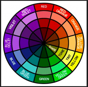
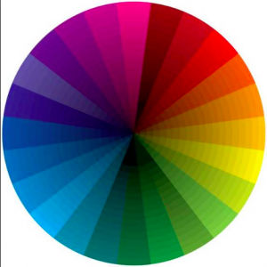
Color wheel
Formal– A color wheel (also referred to as a color circle) is a visual representation of colors arranged according to their chromatic relationship. Begin a color wheel by positioning primary hues equidistant from one another, then create a bridge between primaries using secondary and tertiary colors.
Source– http://www.worqx.com/color/color_wheel.ht
Informal– a circle with different colored sectors used to show the relationship between colors.
Primary triad
Formal– Is so called because, theoretically, all other colors can be mixed from it. It is composed of red, yellow, and blue, which are equidistant from each other on the color wheel.
Source– http://www.flashcardmachine.com/art-vocab1.htm
Informal– when three primary colors are used
Secondary triad
Formal–In subtractive color, orange, green, and violet. They are called secondary because each can be made by combining two primaries.
Source– http://www.flashcardmachine.com/art-vocab1.ht
Informal– when secondary colors are used
Tertiary hues
Formal– Are the combination of a primary color with a secondary color.
Source– http://www.flashcardmachine.com/art-vocab1.ht
Informal- primary and secondary color mixture
CMYK
Formal– The CMYK color model (process color, four color) is a subtractive color model, used in color printing, and is also used to describe the printing process itself. CMYK refers to the four inks used in some color printing: cyan, magenta, yellow and key (black).
Source– https://www.google.com/?client=safari&channel=iphone_bm#channel=iphone_bm&q=cmyk+definition
Informal– when three colors are combined and 4th one is produced. Cyan, Magenta, Yellow and black (key)
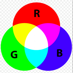
RGB
Formal– RGB (red, green, and blue) refers to a system for representing the colors to be used on a computer display. Red, green, and blue can be combined in various proportions to obtain any color in the visible spectrum.
Source– https://www.google.com/?client=safari&channel=iphone_bm#channel=iphone_bm&q=rgb+definition
Informal– representing red green and blue
Design Journal #21
Color
Formal– the quality of an object or substance with respect to light reflected by the object, usually determined visually by measurement of hue, saturation, and brightness of the reflected light; saturation or chroma
Source– http://www.dictionary.com/browse/color
Informal– the original skin color
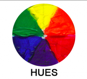
Hue
Formal–a gradation or variety of a color
Source– www.dictionary.com/browse/hue
Informal– tint
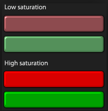
Saturation
Formal– Saturation defines a range from pure color (100%) to gray (0%) at a constant lightness level. A pure color is fully saturated.
Source– http://www.workwithcolor.com/color-properties-definitions-0101.ht
Informal– intense color of an image
Intensity
Formal– Intensity refers to the purity of a hue. Intensity is also known as Chroma or Saturation. The highest intensity or purity of a hue is the hue as it appears in the spectrum or on the color wheel.
Source– https://www.google.com/?client=safari&channel=iphone_bm#channel=iphone_bm&q=intensity+definition+colo
Informal– when a color is pure
NYC Companies ( DJ#19)
Gensler is another company that I would want to work at but most of all I want to work with the people with beautiful talents and skills. This is one of the largest and greatest interior designer. As growing up i always dreamt of coming a designer, whether it is graphic designer, interior, or fashion designer. And yes they are hiring summer interns for 2017.
https://www.gensler.com/careers
The Walt Disney Company – One of my dream jobs of working with them. It amazes me how they design it and work in it. The characters, the story, the theme, it doesn’t only melt kids by adults as well. I always have loved disney channel and i still do, trying to figure out how did they come up with this. They don’t hire interns for summer but thy hire students to work at disney stores.
https://thewaltdisneycompany.com
Dreams Animation – Web Site Design & Marketing Agency NYC –This web design company is one of the top rated in NYC. They have worked with most of the big companies like fitros lay, united nations, farmers etc. and they worked well with them. I want to work with them because of probably they have high rates and good reviews. And they are not hiring any interns for summer.
Design Journal #18
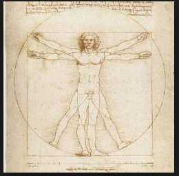
Proportion
formal—> comparative relation between things ormagnitudes as to size, quantity, number, etc.;ratio.
source—> http://www.dictionary.com/browse/proportion
informal—> a part that is shared with something.
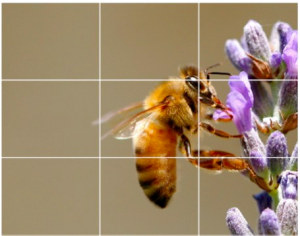
Rule of thirds
formal—> The basic principle behind the rule of thirds is to imagine breaking an image down into thirds, both horizontally and vertically, so that you have 9 parts
source—> https://digital-photography-school.com/rule-of-thirds/
informal—> a subject that has guidelines with intersections.
Golden rule
formal—> It is a compositional rule of thumb that is commonly used in the visual arts today including painting, photography and design. Perhaps the most well know principle of photographic composition is the ‘Rule of Thirds’.
source—> http://www.drawinghowtodraw.com/drawing-lessons/art-design-principles/golden-ration-divine-proportions.html
informal—> geometric compositions which is repeated continuously in different sizes,
