3 examples of movement from Cooper Hewitt

https://collection.cooperhewitt.org/objects/18471071

https://collection.cooperhewitt.org/objects/18615731/with-palette-css4

https://collection.cooperhewitt.org/objects/18575291/with-palette-css4

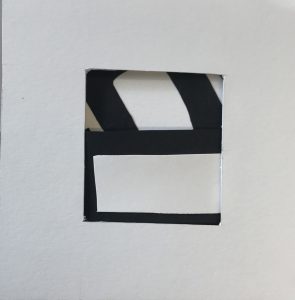
The first picture shows the pattern that its moving like a water. When we put color in the water and it moves along the flow which look similar to it.

The second picture is composed of rectangles which seems like a stair case going round and round and and umbrella falling.

The third picture shows small circles I thinks they are actually designed as rings which are scattered around the entire page moving like bubbles.
3 examples hierarchy

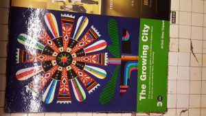
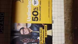
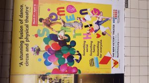
In the first pic when people will see this their eyes will go to the balloons then to the rest of the pic and probably some of them will be interested to browse to know more about it. The second one gives us a sense of art so most of the artist and designer will notice the patterns of it then notice the flower. And last but not least, this pic will be seen by everyone when they will see the work unlimited. Everyone loves unlimited internet so they will see it and probably read more.

Rhythm of Coroflot

http://www.coroflot.com/jjbuck/Denon-DJ-SC5000

http://www.coroflot.com/olka/Robot-harvester

http://www.coroflot.com/Nats/ANCESTRA-1

These are the examples that I found from Coroflot for rhythm. These pictures might be not best examples for rhythm but when you think of the word rhythm you can relate that these pictures actually can be relate to rhythm. Rhythm is like a throb or a pulse which goes in one pattern.

Movement of Coroflot

http://www.coroflot.com/prokofyev/CARGO-CULT

http://www.coroflot.com/komalrathi/Cook-On-The-Go

http://www.coroflot.com/ulisescostilla/Mientras-tanto-en-otro-planeta

I think These are my three strong examples of movement where the picture seems realistic and when you look at it it seems like its moving in real life. Movement is the design element that operates in the four dimension.

The Cooper Hewitt Collection

  1. https://collection.cooperhewitt.org/objects/18658071/with-palette-css4/

This piece of work drew my attention of how it was composed. i think this is successful because of how this design plays game with our mind. Like the coconuts and the faces are composed in such a way that it seems that it is hard to define which are faces and which are coconuts.

2. https://collection.cooperhewitt.org/objects/18575291/with-palette-css4/

This work shows how the rings are scattering around the page with different colors. I like the way is was composed, very simple and nice. Well this piece could be use in a wedding ceremony or an engagement ceremony which ever implies.

3. https://collection.cooperhewitt.org/objects/18466381/with-palette-css4/

This piece of design is used now a days on branded scarf with different colors. And people trend to buy it more as they see this generation is unto this fashion. But still this design looks simple and rich to me.


Texture close up

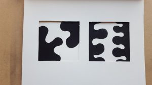
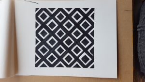
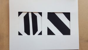
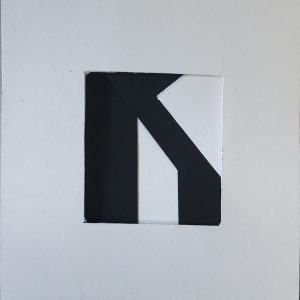
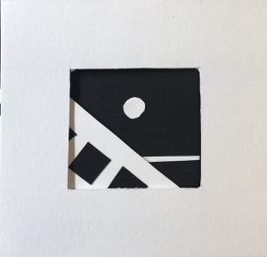
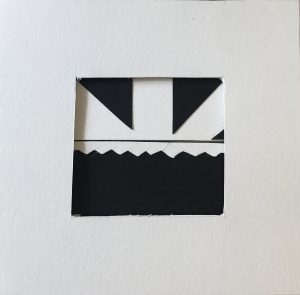
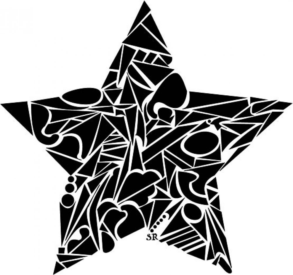
These compositions shows the negative and positive space . Each of then are asymmetrical. The first and last one is not balanced with positive and negative; but the second and third ones are balanced with positive and negative space.

Student work

https://www.instagram.com/rv_robertrojas_f/

He is a student at NYCCT. And i like how he work with art and design. As i see his works it seems like he is advanced in both art and design.

Favorite perk.

One of my most perk is related to museum. As far as I know the museums are very expensive and not all people can fort it. I have visited to most of the art museums in NYC with my student ID. This benefited me by saving my money for school and besides I did my school projects and homework. Probably its not only for CUNY students but also for high school students it’s free entry to most of the museums.

Thumbnails

To start a design with thumbnails sketching is useful because when you try to decide what to put and you are not sure about it. But by thumbnail sketches you can decide and put what you like t make something for you project or work or even you can combine two different thumbnail sketches to make one different design.