Design Journal #21

Color

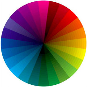
Formal– the quality of an object or substance with respect to light reflected by the object, usually determined visually by measurement of hue, saturation, and brightness of the reflected light; saturation or chroma

Source– http://www.dictionary.com/browse/color

Informal– the original skin color

Hue

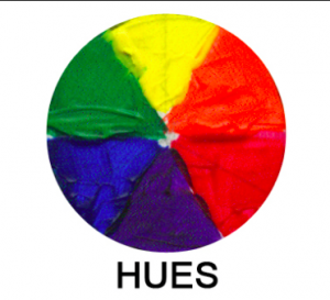
Formal–a gradation or variety of a color

Source– www.dictionary.com/browse/hue

Informal– tint

Saturation

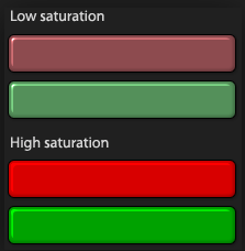
Formal– Saturation defines a range from pure color (100%) to gray (0%) at a constant lightness level. A pure color is fully saturated.

Source– http://www.workwithcolor.com/color-properties-definitions-0101.ht

Informal– intense color of an image

Intensity

Formal– Intensity refers to the purity of a hue. Intensity is also known as Chroma or Saturation. The highest intensity or purity of a hue is the hue as it appears in the spectrum or on the color wheel.

Source– https://www.google.com/?client=safari&channel=iphone_bm#channel=iphone_bm&q=intensity+definition+colo

Informal– when a color is pure
NYC Companies ( DJ#19)

Gensler is another company that I would want to work at but most of all I want to work with the people with beautiful talents and skills. This is one of the largest and greatest interior designer. As growing up i always dreamt of coming a designer, whether it is graphic designer, interior, or fashion designer. And yes they are hiring summer interns for 2017.

https://www.gensler.com/careers

The Walt Disney Company – One of my dream jobs of working with them. It amazes me how they design it and work in it. The characters, the story, the theme, it doesn’t only melt kids by adults as well. I always have loved disney channel and i still do, trying to figure out how did they come up with this. They don’t hire interns for summer but thy hire students to work at disney stores.

https://thewaltdisneycompany.com

Dreams Animation – Web Site Design & Marketing Agency NYC –This web design company is one of the top rated in NYC. They have worked with most of the big companies like fitros lay, united nations, farmers etc. and they worked well with them. I want to work with them because of probably they have high rates and good reviews. And they are not hiring any interns for summer.

Home NEW

Design Journal #18

Proportion

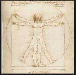
formal—> comparative relation between things ormagnitudes as to size, quantity, number, etc.;ratio.

source—> http://www.dictionary.com/browse/proportion

informal—> a part that is shared with something.

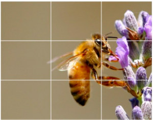
Rule of thirds

formal—> The basic principle behind the rule of thirds is to imagine breaking an image down into thirds, both horizontally and vertically, so that you have 9 parts

source—> https://digital-photography-school.com/rule-of-thirds/

informal—> a subject that has guidelines with intersections.

Golden rule

formal—> It is a compositional rule of thumb that is commonly used in the visual arts today including painting, photography and design. Perhaps the most well know principle of photographic composition is the ‘Rule of Thirds’.

source—> http://www.drawinghowtodraw.com/drawing-lessons/art-design-principles/golden-ration-divine-proportions.html

informal—> geometric compositions which is repeated continuously in different sizes,

Top 3 Companies

Isadora- One of the best web design company. This is one of the company that i would love to work at. I checked their websites and their works its amazing. Even by looking at the home page you can be impressed by them.

Isadora Agency 2024

Gensler is another company that I would want to work at but most of all I want to work with the people with beautiful talents and skills. This is one of the largest and greatest interior designer. As growing up i always dreamt of coming a designer, whether it is graphic designer, interior, or fashion designer.

https://www.gensler.com

The Walt Disney Company – One of my dream jobs of working with them. It amazes me how they design it and work in it. The characters, the story, the theme, it doesn’t only melt kids by adults as well. I always have loved disney channel and i still do, trying to figure out how did they come up with this.

https://thewaltdisneycompany.com


Design Journal #17

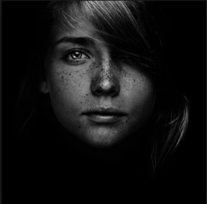
Low Key

formal —> low key color spans the range from mid-tone to black.

Source —> http://www.sensationalcolor.com/understanding-color/theory/high-key-low-key-color#.WOO7FTz3aEc

informal —> low key scheme has dark value of color

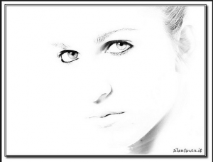
High key

formal —>High key color describes the set of colors that range from mid-tone hues to white.

Source —> http://www.sensationalcolor.com/understanding-color/theory/high-key-low-key-color#.WOO7FTz3aEc

informal —> high key scheme has light value of color.

Narrow range

formal —> less difference in color values

source —>http://www.ldoceonline.com/dictionary/narrow

informal —> when values are congregate

Broad range

formal —> big difference in color values

source —> http://www.ldoceonline.com/dictionary/narrow

informal —>when values are spreaded

Texture density 

formal —> Texture gradient is the distortion in size which closer objects have compared to objects farther away.

source —> http://www.sciencedirect.com/science/article/pii/S0042698901001213

informal —> the objects those are similar

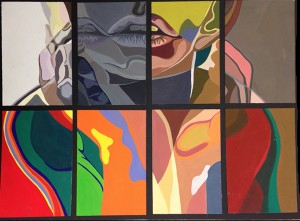
Gouache

formal —>a method of painting using opaque pigments ground in water and thickened with a gluelike substance.

source —> http://www.dickblick.com/categories/gouache/

informal —>solid colors

Design Journal #16

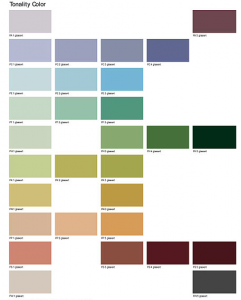
Tonal progression

  1. Formal—> A tonal progression is a succession of color mixtures proceeding from dark to light.

source—> http://www.theryderstudio.com

Informal—>  a color value from dark to light

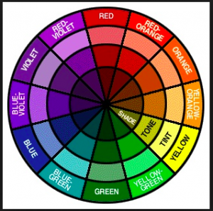
2. Shade

formal—>  a shade is the mixture of a color with black, which reduces lightness.

source—> https://www.thoughtco.com/definition-of-shade-2577728

informal—> a shade is a color with darker color mixed into it.

3. Tint

formal—> a tint is the mixture of a color with white, which increases lightness.

source—> http://arthistory.about.com/cs/glossaries/g/t_tint.htm

informal—> tink s a color mixed with white to make it lighter.

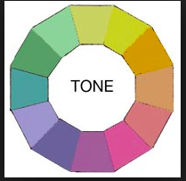
4. Tone

formal—> Tone in an artistic context refers to the light and dark values used to render a realistic object, or to create an abstract composition.

source—> http://color-wheel-artist.com/hue.html

informal—> tone is a quality of color

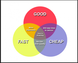
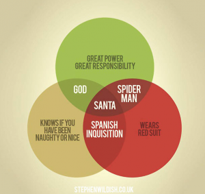
5. Venn diagram

formal—>  A Venn diagram is an illustration of the relationships between and among sets, groups of objects that share something in common. Usually, Venn diagrams are used to depict set intersections.

source—> http://whatis.techtarget.com/definition/Venn-diagram

informal—> A diagram that uses circles to represent sets, in which the relations between the sets are indicated by the arrangement of the circles.


The Cooper Hewitt Collections of Transparency and Layering

https://collection.cooperhewitt.org/objects/18438165/with-palette-css4

This picture has both layering and transparency as it shows the layering one on another with a light  color.

https://collection.cooperhewitt.org/objects/18575291/with-palette-css4

This one shows more of layering than transparency. Here we can see that the printed rings are top of one another with a light transparency showing.

https://collection.cooperhewitt.org/objects/18558329/with-palette-css4

This shows layering; as we can see the pieces of fabrics are put on one another as the end corners are shown. The layering is shown clearly with no doubts.

3 examples of rhythm from Cooper Hewitt

https://collection.cooperhewitt.org/objects/18575291/with-palette-css4

https://collection.cooperhewitt.org/objects/18575297/with-palette-css4

https://collection.cooperhewitt.org/objects/18354121/with-palette-css4

The first picture shows how the element is repeated over and overburdened with different colors which shows the rhythm.

The second picture shows the pattern in same shape but different colors and made as one group. This picture shows more of rhythm than repetition.

The third picture is a power which is arranged both as positive and negative and this shows the rhythm in it.