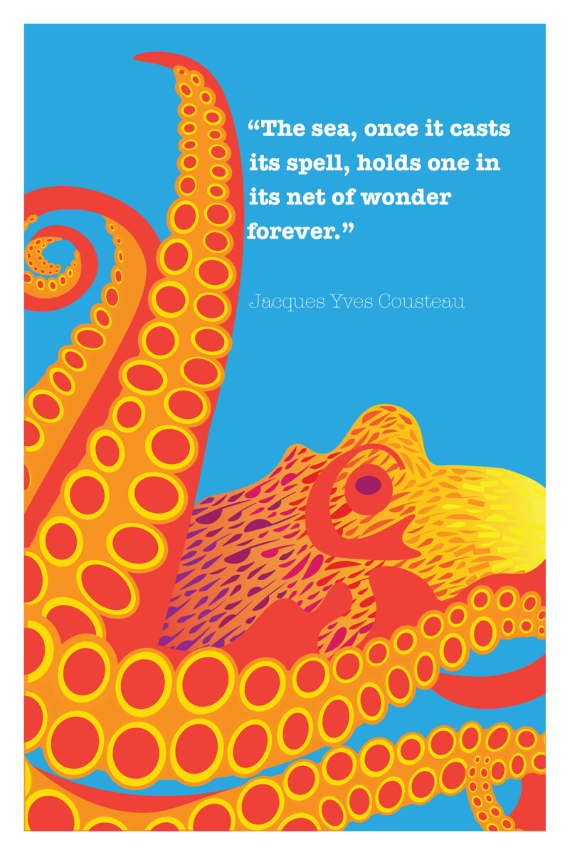
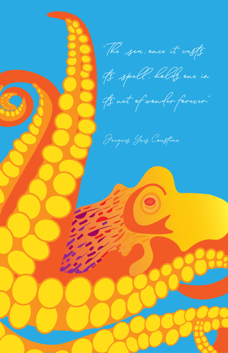
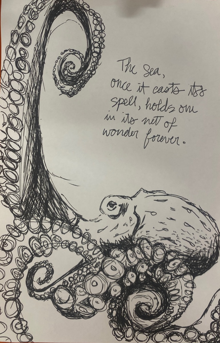
Final

Octopus

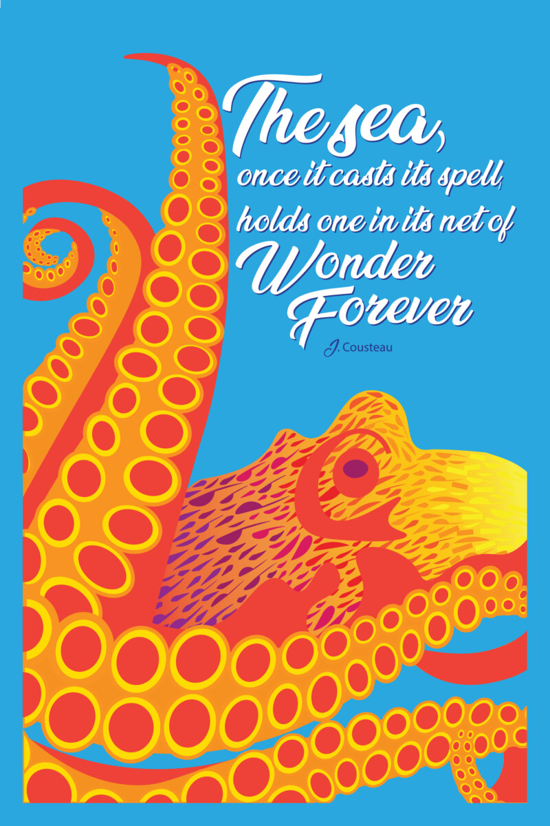
Octopus is an experiment of color, texture, and movement. Using two pairs of complementary colors creates visual interest and attracts the viewer’s attention. The stark blue of the background is a strong balance for the bright yellow, red, and orange of the octopus. The texture of octopus skin and tentacles served as a source of inspiration and is more impactful than flat color. The suction cups of the tentacles create interesting patterns throughout the piece. The movement of the hand-lettered typography mimics the tentacles and balances the illustrative octopus. Dropping the typography down and over one click made the text pop and gave the illusion of it being raised without using the bevel effect.
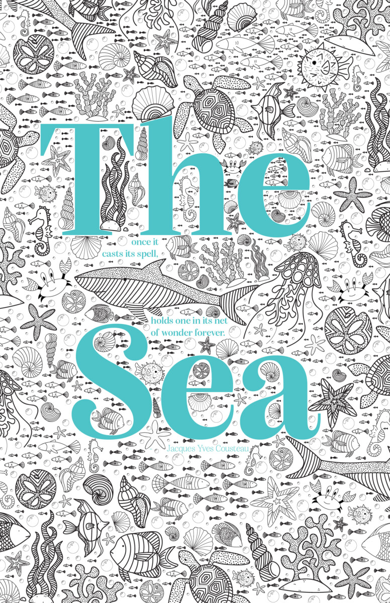
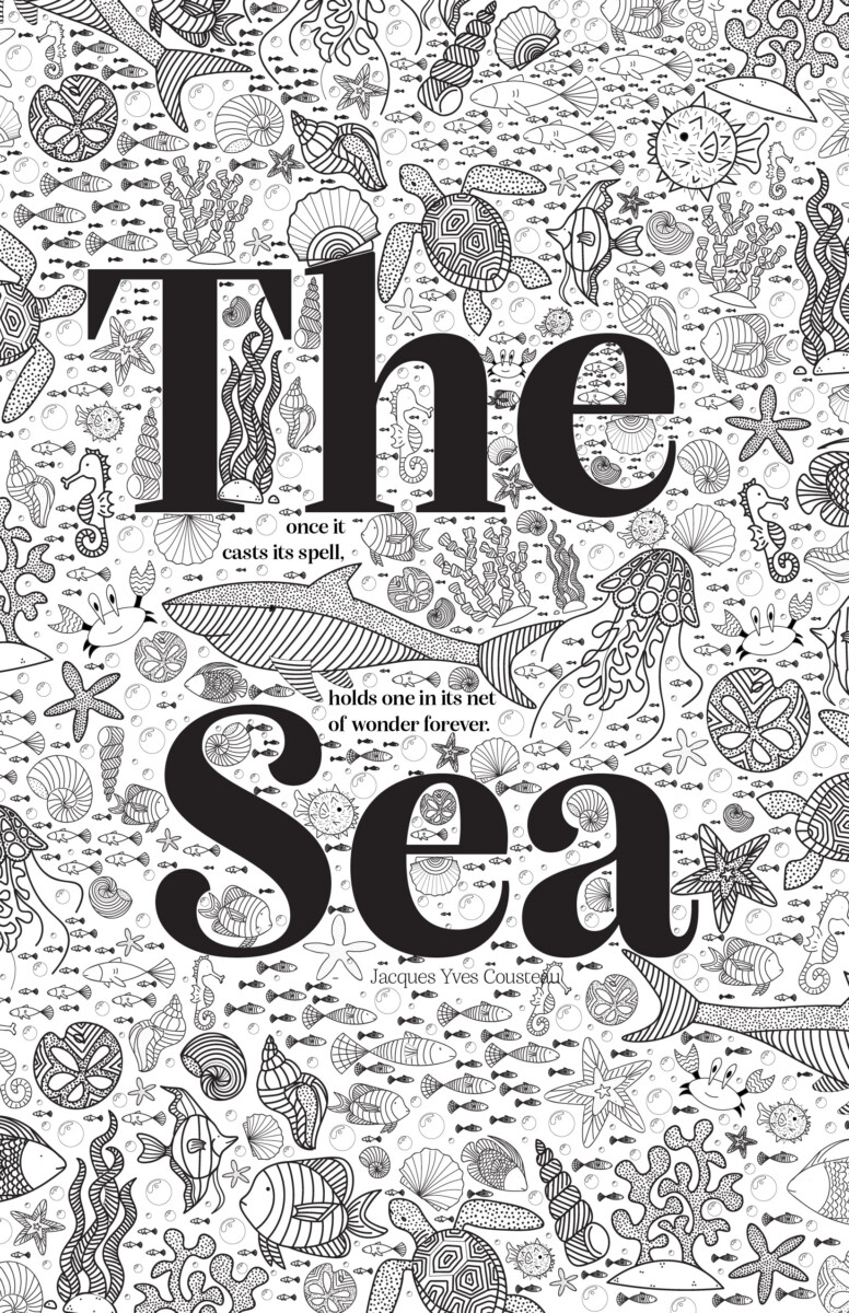

The Sea

The Sea was inspired by adult color books and is intended to print on matte paper to allow the recipient to color in the illustrations s they please. Each of the creatures was hand-drawn and then meticulously placed throughout the piece. Originally, this piece was completely black-and-white; however, the teal was added later to create visual interest and lead the viewers’ eyes around the piece. The pop of color adds visual interest while staying balanced.
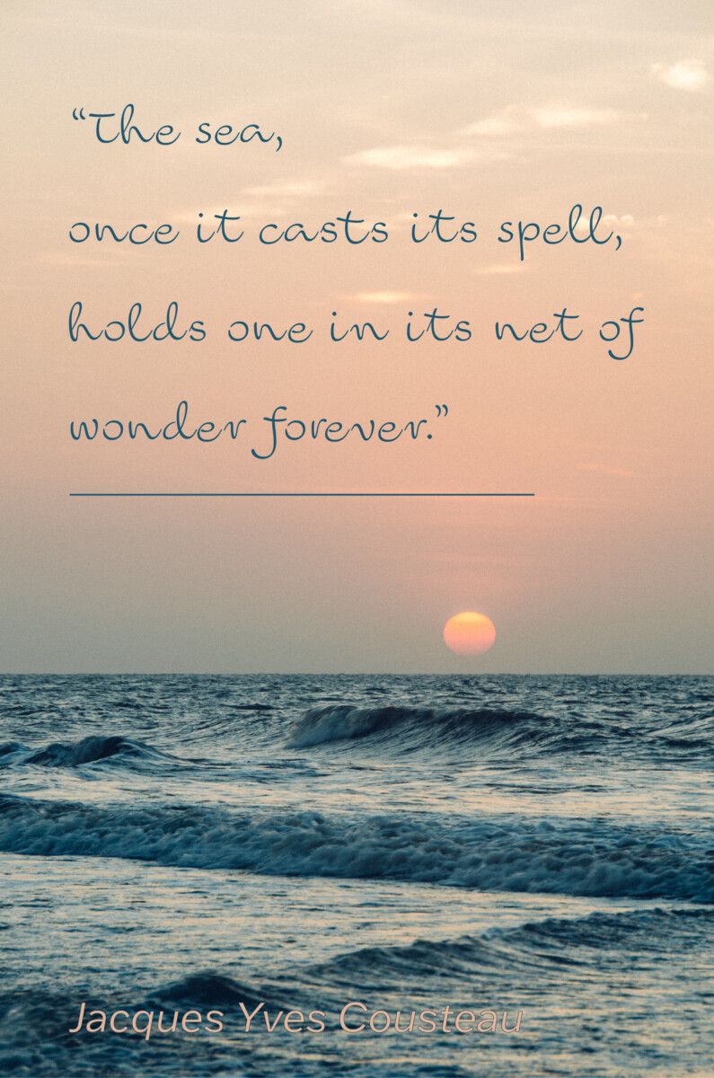
The-Sea-FINAL-RGB

The-Sea-FINAL-CMYK


Ocean

This takes advantage of a photograph with great symmetry and use of the rule of thirds. The goal of the piece was to create playful movement superimposed on an otherwise calm photograph. The contrast of the light-colored hand-lettered type and calm ocean with saturated sunset creates visual interest and balance. The use of the darker text behind the main text makes the quote pop and gives it dimension.

Ocean-FINAL-RGB

Ocean-FINAL-CMYK

Concepts

Download pdf’s below!


Disclaimer

“The Sea” is the raster file rather than the vector file due to the size of the final vector file. If I were to have this printed at a larger size, I would send in the vector file.

Descriptions

“Octopus” is my experiment with color. I wanted to play with a double complementary palette. The typeface I chose is not supposed to be legible to everyone. I wanted to have a message-in-a-bottle type of script to contrast with the color blocking of the creature. The goal was for the color to really be the highlight of the design.

“The Sea” took the longest amount of time and I really wanted to highlight my illustration skills. The quote is supposed to be hidden in the imagery and can only be found when searching for it. I wanted the text to have personality but also blend in with my illustration style. Each of the little critters was drawn digitally and then repeated to create pattern and texture. I want this one to be printed with the ability to color in the white space like an adult coloring book.

“Ocean” was my play on a National Geographic style design. I wanted the type to be readable, legible, and clean. This design features a photo linked here and I felt the color and texture of the water really make this photo visually impactful. I chose Franklin Gothic ATF as the typeface for the whole piece because it is impactful and clean.

Visual Quote Project

“The sea, once it casts its spell, holds one in its net of wonder forever.”
-Jacques Yves Cousteau

  • Borough Five Vintage – Process

    Read More

  • All Type Posters & Social Media Posts

    Digital Book Students design three posters and four social media postings for an art gallery show (PET PEEVES). This project Introduces the use of a typographical grid and the importance of visual hierarchy. Why use a grid? Why follow a format? What are the differences between a grid and a layout? Through visual hierarchy, we will explore scale,…

    Read More

  • Expressive Type

    Digital Book Exposes the student to the creative and sometimes more playful aspect of type and lettering. What are the differences between creating lettering and using existing typefaces? How can we achieve a message using an existing typeface, or how can we, in contrast, experiment with material and resources to create playful lettering?  Click here…

    Read More