1915
NASA, the National Aeronautics and Space Administration, used to be NACA, National Advisory Committee on Aeronautics. The original logo was for NACA in 1915, which eventually became NASA in 1958. The logo was a legible black-on-yellow with a sans-serif font. The goal was to be visible without extra “frills.”
1958-1975
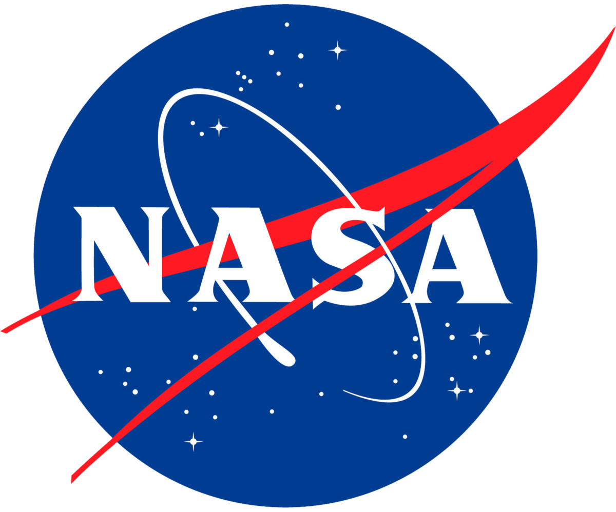
NASA soon moved to the “Meatball” logo from 1958 to 1975. NASA says, “James Modarelli [The head of Lewis’ Research Reports Division] was asked by the executive secretary of NACA to design a logo that could be used for less formal purposes.” Meatball wasn’t popular until 1975, and it got the name l from its round appearance. The logo uses a bold serif typeface on a blue background with a red swoosh and white stars. NASA then started using this logo again in 1992 until the present, but not before moving to the “worm.”
1975-1992
The “Worm” brings in the iconic text we all associate with NASA. The connected red letters are on a plain white background. CNN quoted from Barry, NASA’s chief historian, “The worm was intentionally designed without any stars or any aircraft in it, but just letters, because NASA could then be anything you wanted it to be, including not a space agency.” The red is the same shade used in the previous shade and was designed to have a more “modern” look. This same logo was used later in 2020. Adobe has even created a font called “Nasalization,” which is available on all platforms.
1992-Present Day
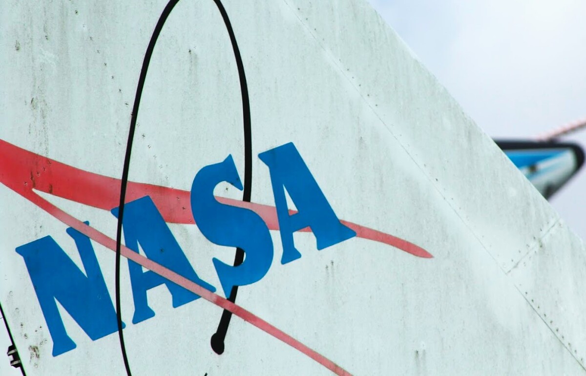
The current logo used is the meatball logo. They reverted to the other logo to show that “the magic is back at NASA.” They talked about all the great things within NASA when the Meatball was initially used (for example, the moon landing). The logo is sometimes altered on aircraft to include a black swoosh and blue text.
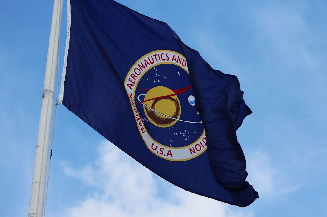
NASA’s Seal
This is the more formal version of Meatball. This logo is used for official documents, while meatball is for everyday use. As I showed in the first photo, you can see this seal for official ceremonies, flags, and documents. This seal isn’t as well known as Worm or Meatball, but it holds excellent significance within the company. It features a red all-caps serif typeface surrounding a black-to-blue gradient, the same red swoosh and stars as Meatball, a yellow orb, a white orb to the right, and a white swoosh orbiting the yellow orb.

Sources
https://www.hatchwise.com/resources/the-complete-history-of-the-nasa-logo
https://amp.cnn.com/cnn/style/article/nasa-worm-logo-scn/index.html
https://history.nasa.gov/meatball.htm
https://www.nasa.gov/audience/forstudents/5-8/features/symbols-of-nasa.html

