
Download pdf’s below!
Disclaimer
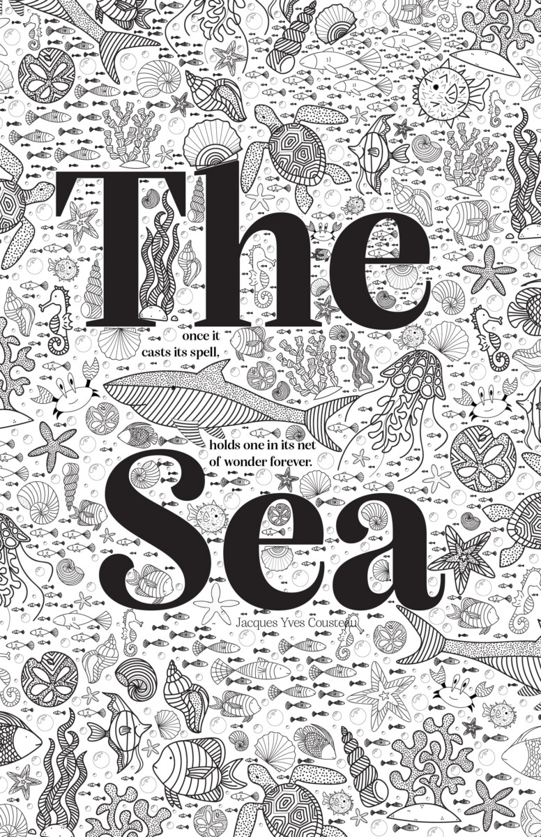
“The Sea” is the raster file rather than the vector file due to the size of the final vector file. If I were to have this printed at a larger size, I would send in the vector file.
Descriptions
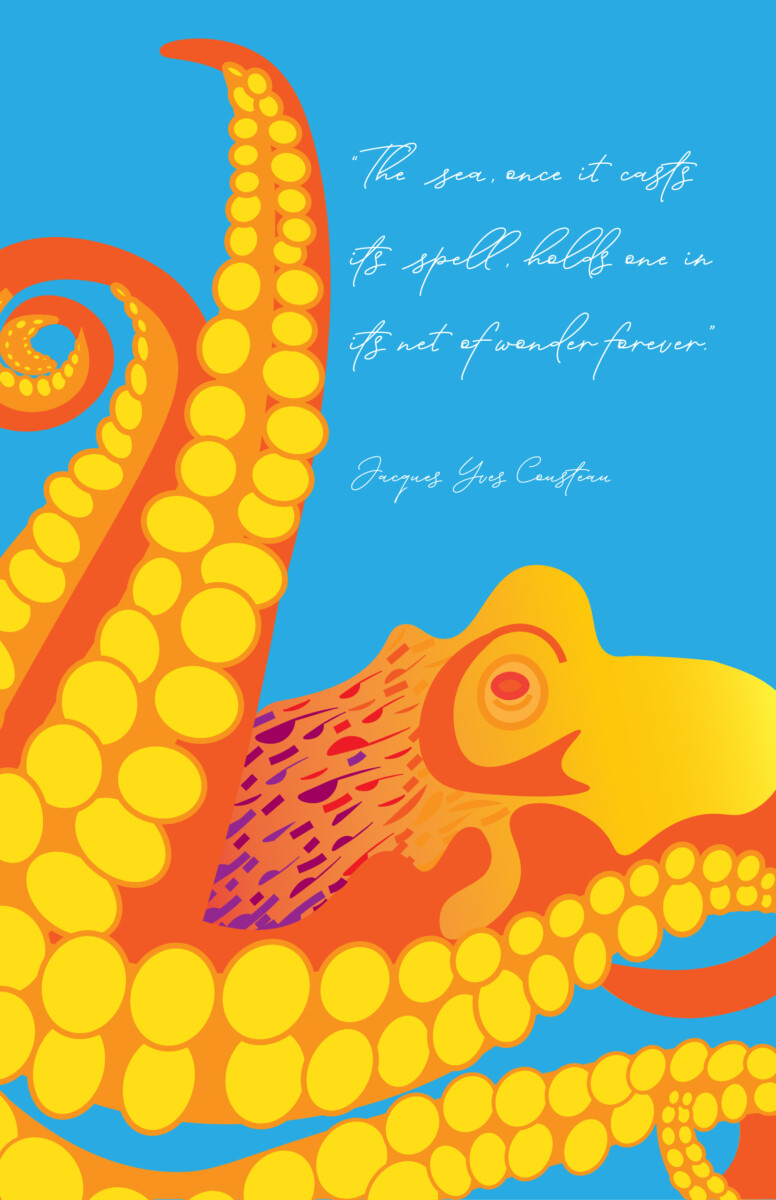
“Octopus” is my experiment with color. I wanted to play with a double complementary palette. The typeface I chose is not supposed to be legible to everyone. I wanted to have a message-in-a-bottle type of script to contrast with the color blocking of the creature. The goal was for the color to really be the highlight of the design.
“The Sea” took the longest amount of time and I really wanted to highlight my illustration skills. The quote is supposed to be hidden in the imagery and can only be found when searching for it. I wanted the text to have personality but also blend in with my illustration style. Each of the little critters was drawn digitally and then repeated to create pattern and texture. I want this one to be printed with the ability to color in the white space like an adult coloring book.
“Ocean” was my play on a National Geographic style design. I wanted the type to be readable, legible, and clean. This design features a photo linked here and I felt the color and texture of the water really make this photo visually impactful. I chose Franklin Gothic ATF as the typeface for the whole piece because it is impactful and clean.

