
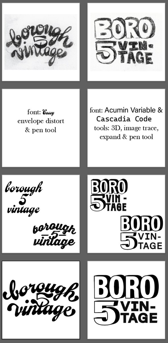
Borough Five Vintage – Process

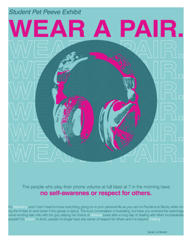
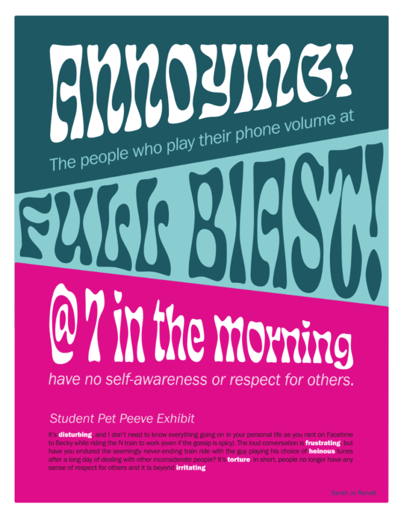
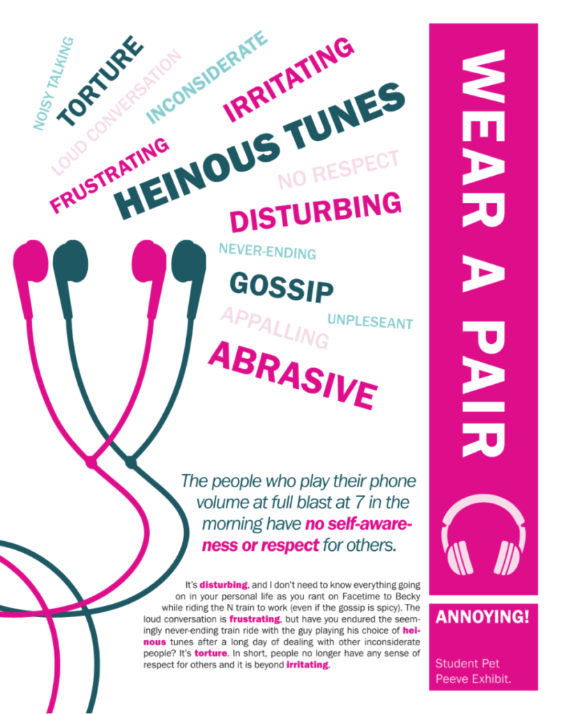
Students design three posters and four social media postings for an art gallery show (PET PEEVES).
This project Introduces the use of a typographical grid and the importance of visual hierarchy. Why use a grid? Why follow a format? What are the differences between a grid and a layout?
Through visual hierarchy, we will explore scale, proportion, negative space, color and legibility, and other essential topics of design and typography.
Click here to view the pdf of my book!

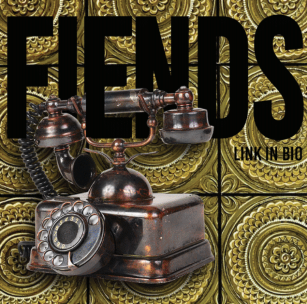
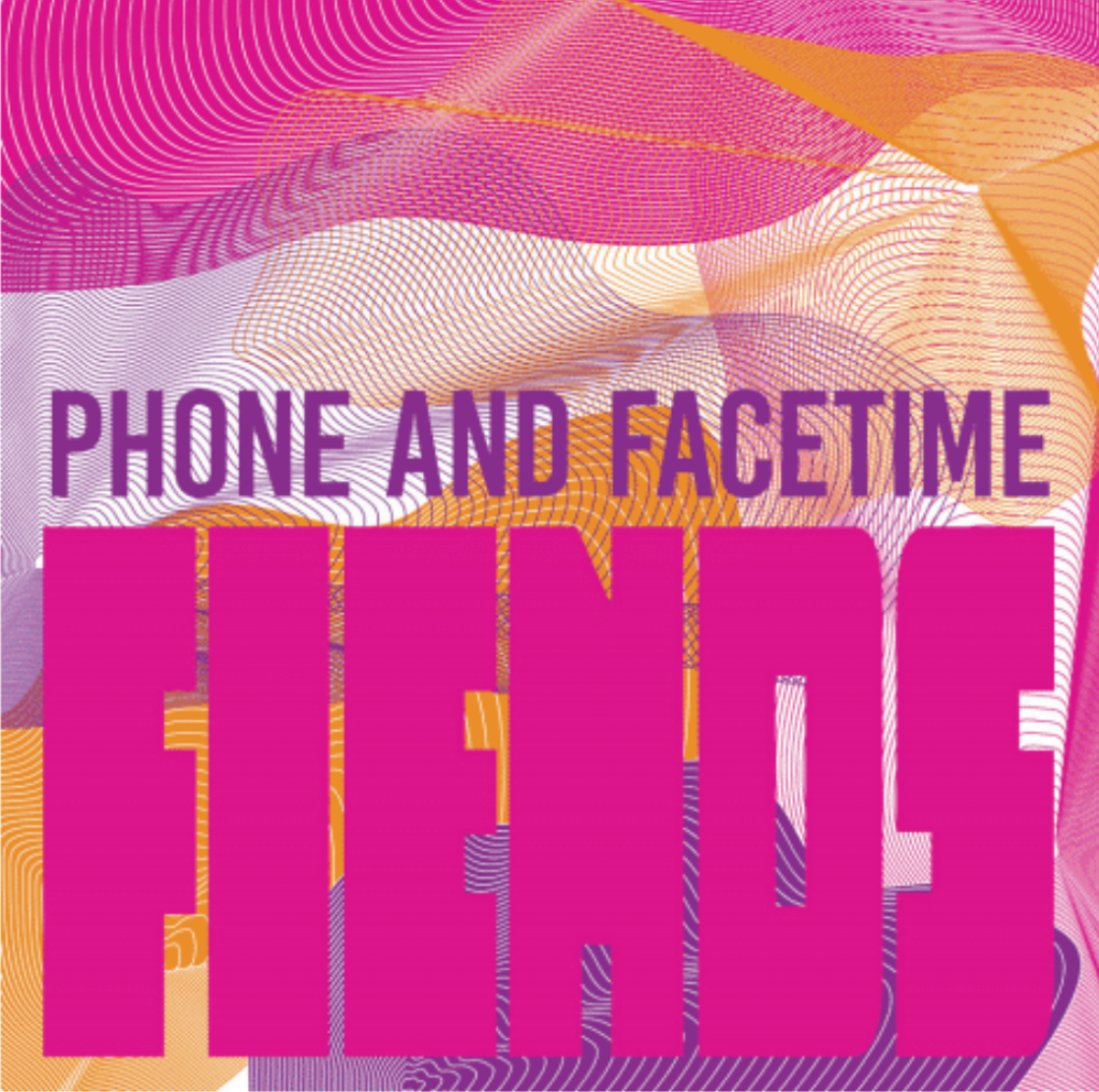
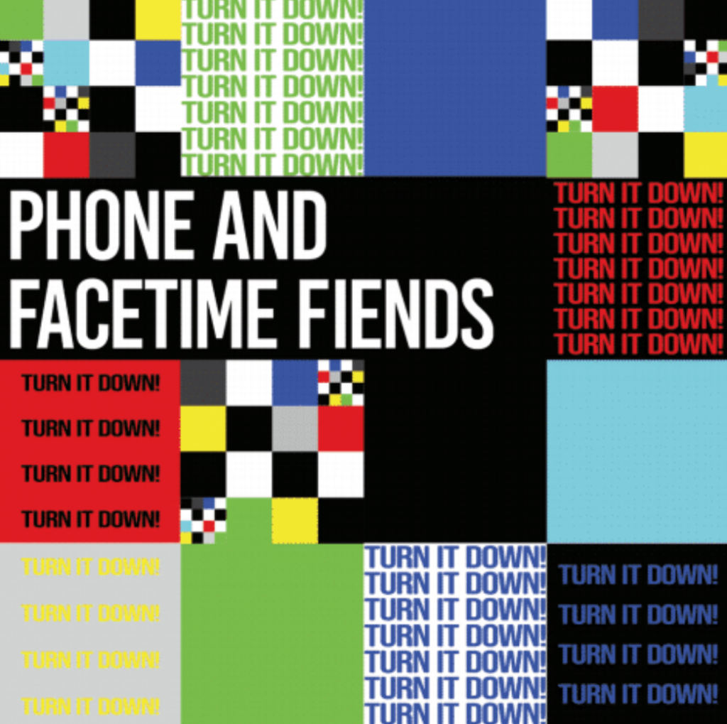
Click here to view my animated gif!

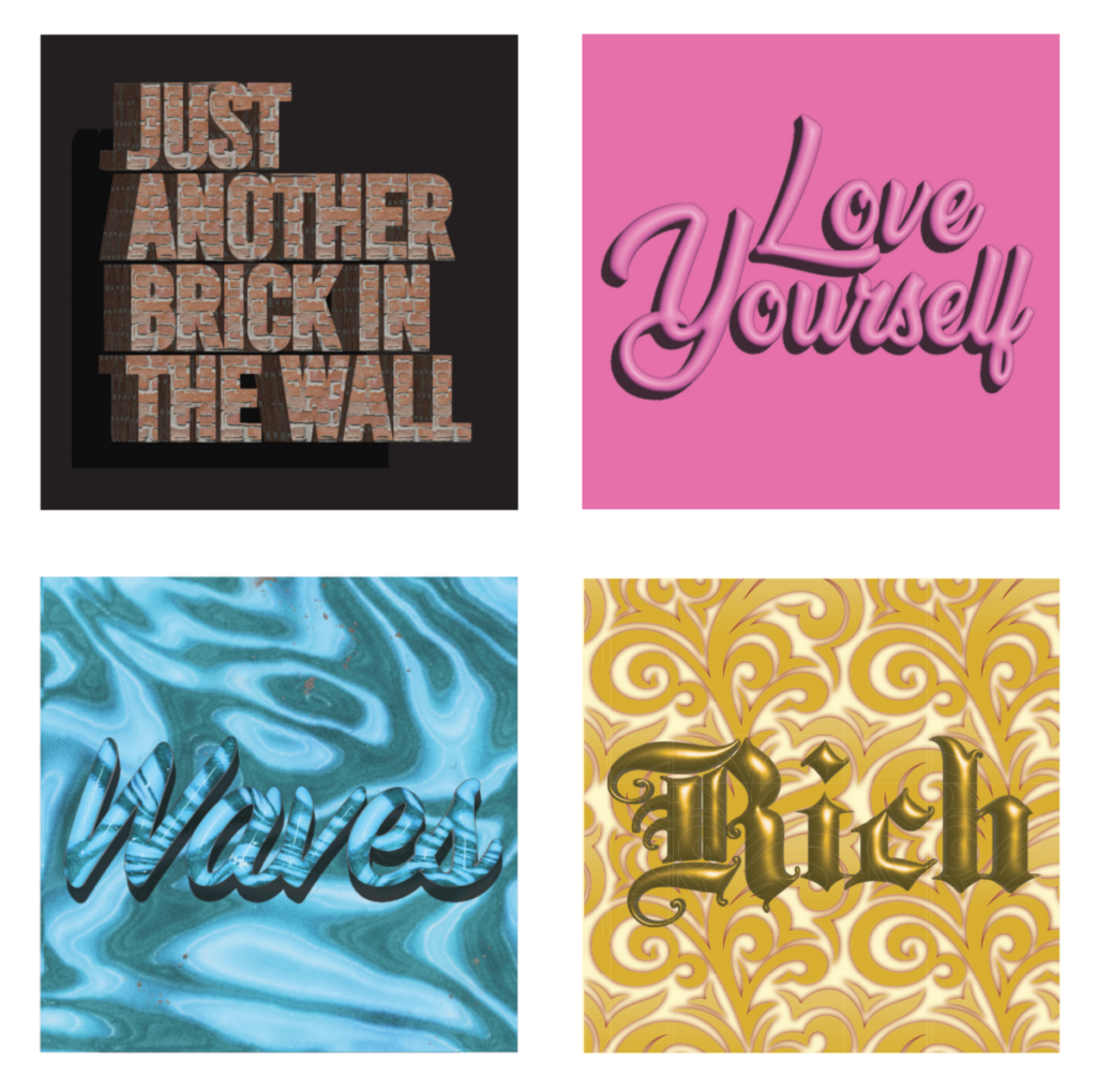
Exposes the student to the creative and sometimes more playful aspect of type and lettering.
What are the differences between creating lettering and using existing typefaces?
How can we achieve a message using an existing typeface, or how can we, in contrast, experiment with material and resources to create playful lettering?
Click here to view the pdf of my book!
Digital Book
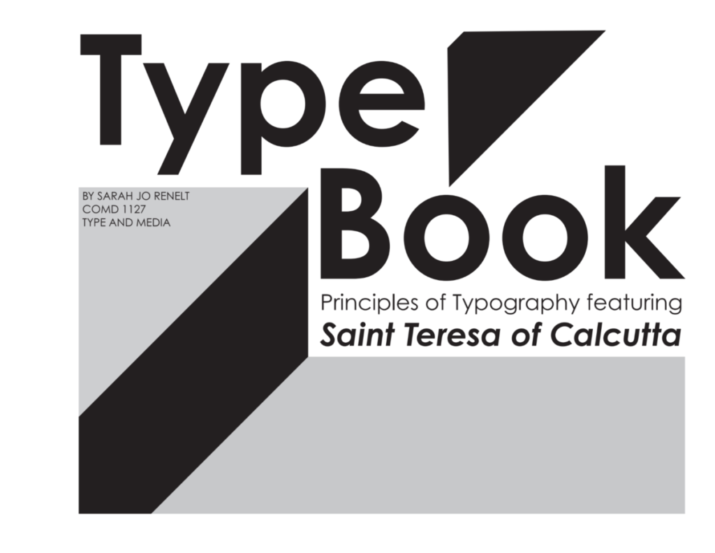
A Type book introducing common type vocabulary: Anatomy of type, variations, arrangement, and spacing, as well as the introductory page composition of industry-standard publication software (Adobe InDesign).
Although this project directly relates to typography, I chose Saint Thereasa of Calcutta and wrote a short biography about her. Her name and bio became the book’s actual content.
Click here to view the pdf of my book!
I made a TikTok video as they are becoming increasingly popular, and it was a format I’m more comfortable with. People are also watching other platforms less and less or using those platforms to watch reposted TikTok videos.

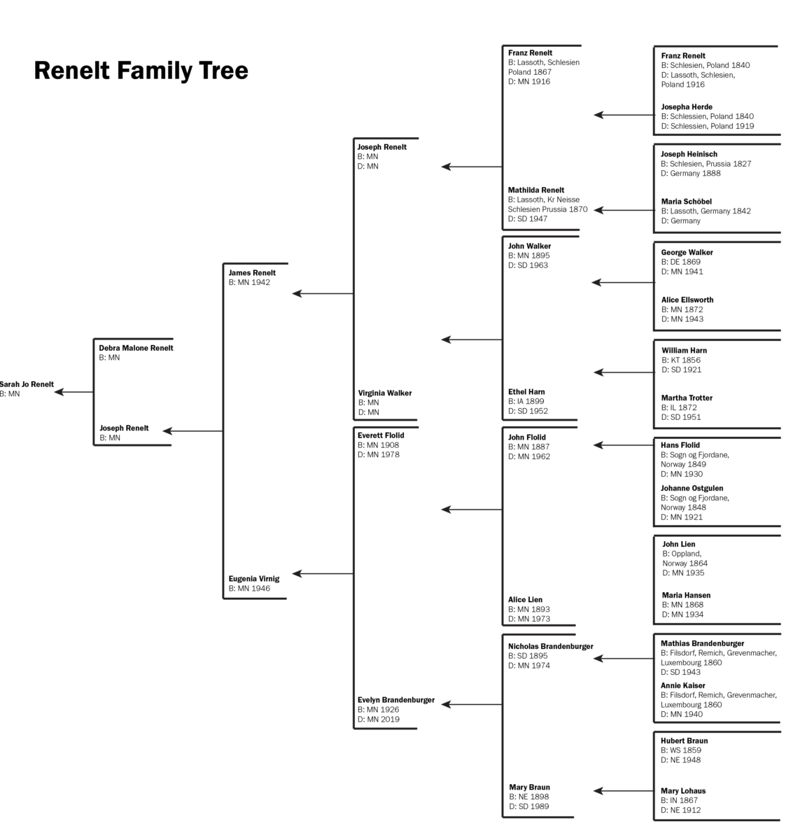
I talked to my grandparents about my heritage as far back as they could go, and they gave me an overwhelming amount of information, so I stuck to four generations in my family tree. I broke it down by my mom’s side (Malone) and my dad’s side (Renelt).
click here to see my final

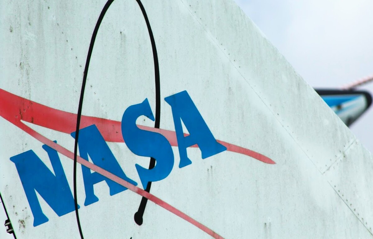
NASA, the National Aeronautics and Space Administration, used to be NACA, National Advisory Committee on Aeronautics. The original logo was for NACA in 1915, which eventually became NASA in 1958. The logo was a legible black-on-yellow with a sans-serif font. The goal was to be visible without extra “frills.”

NASA soon moved to the “Meatball” logo from 1958 to 1975. NASA says, “James Modarelli [The head of Lewis’ Research Reports Division] was asked by the executive secretary of NACA to design a logo that could be used for less formal purposes.” Meatball wasn’t popular until 1975, and it got the name l from its round appearance. The logo uses a bold serif typeface on a blue background with a red swoosh and white stars. NASA then started using this logo again in 1992 until the present, but not before moving to the “worm.”

The “Worm” brings in the iconic text we all associate with NASA. The connected red letters are on a plain white background. CNN quoted from Barry, NASA’s chief historian, “The worm was intentionally designed without any stars or any aircraft in it, but just letters, because NASA could then be anything you wanted it to be, including not a space agency.” The red is the same shade used in the previous shade and was designed to have a more “modern” look. This same logo was used later in 2020. Adobe has even created a font called “Nasalization,” which is available on all platforms.

The current logo used is the meatball logo. They reverted to the other logo to show that “the magic is back at NASA.” They talked about all the great things within NASA when the Meatball was initially used (for example, the moon landing). The logo is sometimes altered on aircraft to include a black swoosh and blue text.
This is the more formal version of Meatball. This logo is used for official documents, while meatball is for everyday use. As I showed in the first photo, you can see this seal for official ceremonies, flags, and documents. This seal isn’t as well known as Worm or Meatball, but it holds excellent significance within the company. It features a red all-caps serif typeface surrounding a black-to-blue gradient, the same red swoosh and stars as Meatball, a yellow orb, a white orb to the right, and a white swoosh orbiting the yellow orb.

https://www.hatchwise.com/resources/the-complete-history-of-the-nasa-logo
https://amp.cnn.com/cnn/style/article/nasa-worm-logo-scn/index.html
https://history.nasa.gov/meatball.htm
https://www.nasa.gov/audience/forstudents/5-8/features/symbols-of-nasa.html
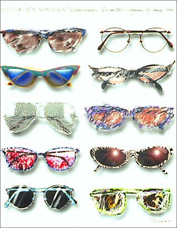
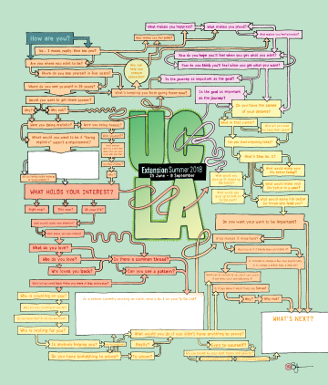

These three covers are my favorites for entirely different reasons.
Starting with the left. The detail and artistic style Keith Bright used are very visually interesting. The use of the script text that looks handwritten is something I also love to do in my designs as well. The balance and symmetry are appealing to me as well.
The middle cover by Stefan Bucher looks organized and balanced as well, but in a different way. It looks more like a data visualization piece, which I enjoy. The use of a color triad makes the work more cohesive as well.
The right cover by Martin Venezky uses color to draw the viewer’s attention to the text rather than first looking at the design. Using the orange versus the black and white makes for a visually captivating piece. This is also something I like to play with in my designs.
The Book of HOV is a free public exhibit at the Brooklyn Public Library. We went during class, walked through the exhibits, and did further research when we got home. I chose not to take photos of the exhibit because I knew I would have access to professional photos after the visit. I wanted to enjoy just being at the exhibit before going back and choosing which part to write about.
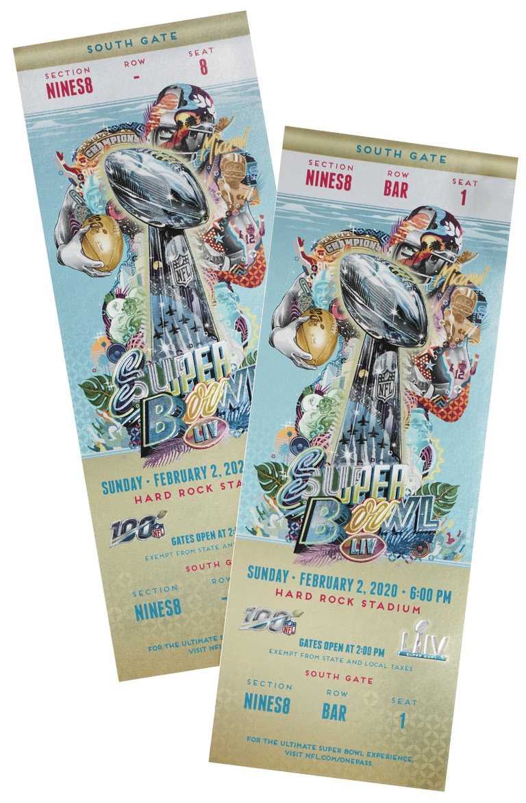
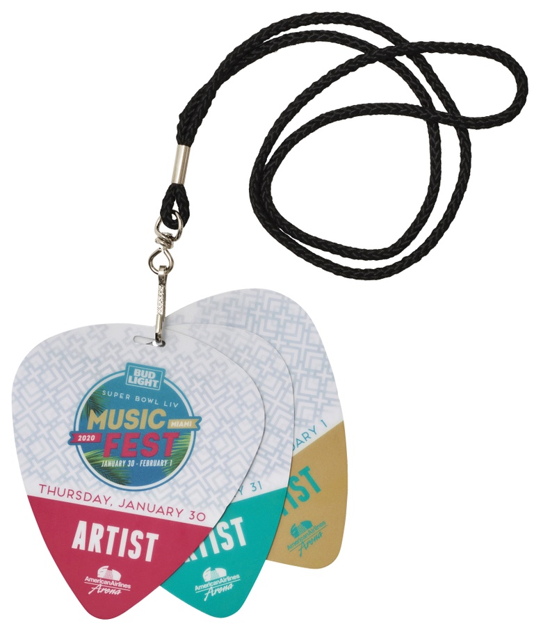

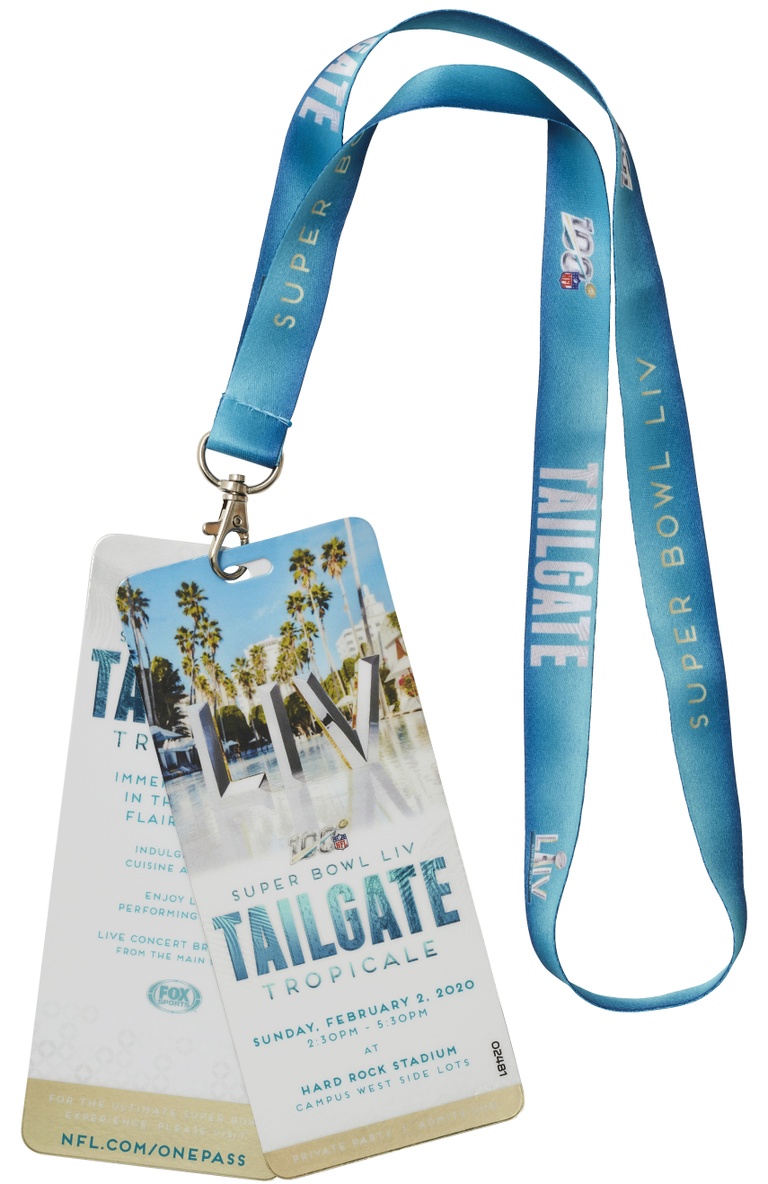
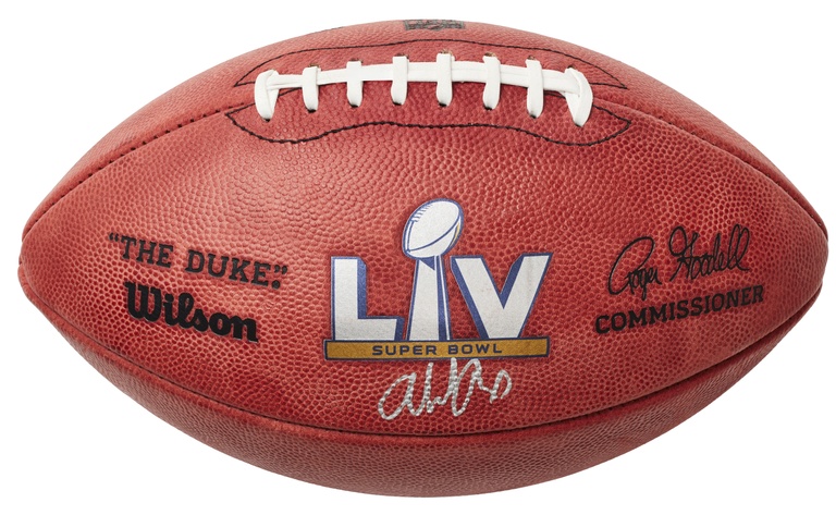
The first thing that caught my eye at the Book of HOV exhibit was the Super Bowl Memorabilia. The colors are fabulous, with magenta, gold, and teal, and the red-brown of the football stands out and is visually impactful.
The patterns of the tickets remind me of the texture of the football but in a more luxe gold color. I also find the first lanyard very interesting because of the shape that makes it look like a guitar pick. The colors the designers chose are fun, tropical, and playful, which I think plays into the desired vibe surrounding the music during the Super Bowl.
The composition of the tickets is particularly impactful and would be something an attendee would keep forever. I particularly like the visual hierarchy of the typography on the ticket. The details behind the Super Bowl trophy have a fun look, and it gives more movement to the trophy.
First a short history of the broad color “blue” and a persuasive presentation to sway you to claim blue as your favorite color.
Close your eyes and imagine the clear sky over a bright and clean ocean. It’s all blue. Blue carries significant natural, spiritual, and medicinal influence throughout history. Blue is everywhere, from the color of Cleopatra’s eyelids to the chemical reactions in chemistry to the walls of hospitals.
Not only was blue used in the Eastern part of the world, but in the Western World as well. Famous paintings depicting the Virgin Mary use Ultramarine-colored paints made from Lapiz Lazuli creating rich blues to show religious importance. Ultramarine Blue was also used in Buddhist paintings to show religious significance. The stone, Lapiz Lazuli, was worth just as much as gold at the time. The value of the material made it even more significant in religious and fine-art painting.
Cerulean Blue was later created using the elements Cobalt and Tin. This color blue always reminds me of the movie “The Devil Wears Prada,” where Andy comes in wearing a cerulean-colored sweater, and Miranda goes on a tangent about the significance of the color’s history. Cerulean was also named the “Color of the Century” in 1999.
As we now know, blue has a long and influential history, but what about Caribbean Blue?
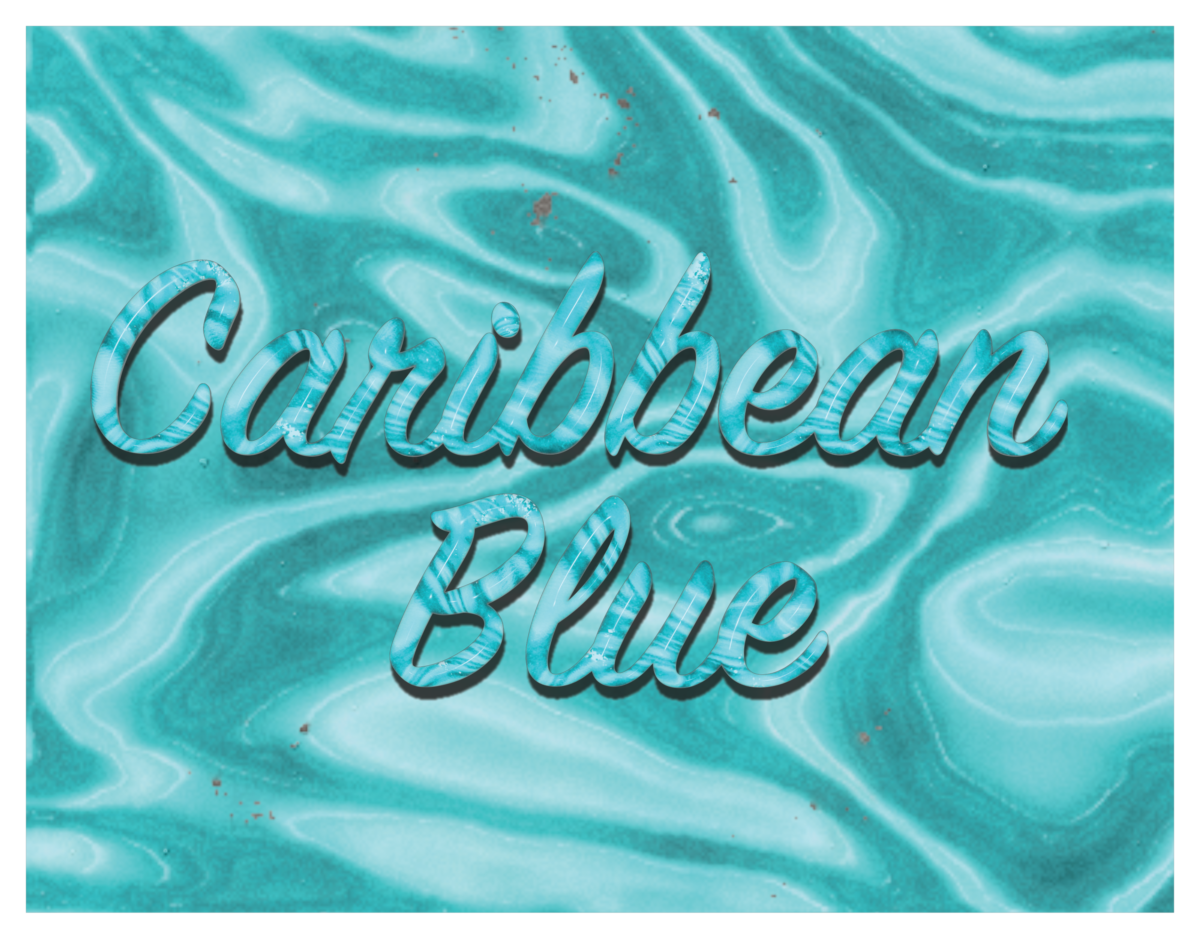
At the beginning of this, I said to close your eyes and imagine the sky and the ocean. Now, focus on the ocean and the waves. The color “Caribbean Blue” is in reference to the clear blue-green tropical water in the Caribbean Sea. There is a range of light to dark Caribbean blue. The light end of the spectrum is reminiscent of shallow tides while dark Caribbean blue looks closer to deep waters miles out from shore.
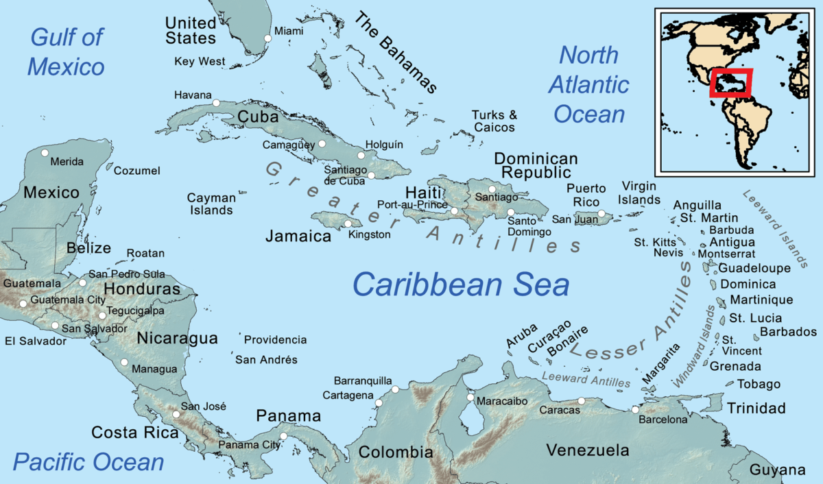
The Caribbean is located North of the Equator in the Tropic of Cancer And East of Central America. This area of the ocean is best known for its incredibly rich culture, food, sights, music, and more. However, I will be focusing on the sights of this area.
I grew up on Saint Croix in the USVI and that’s where I fell in love with water and the color Caribbean blue. Below is a photo of Christensted which was about 10 mins from where I lived.
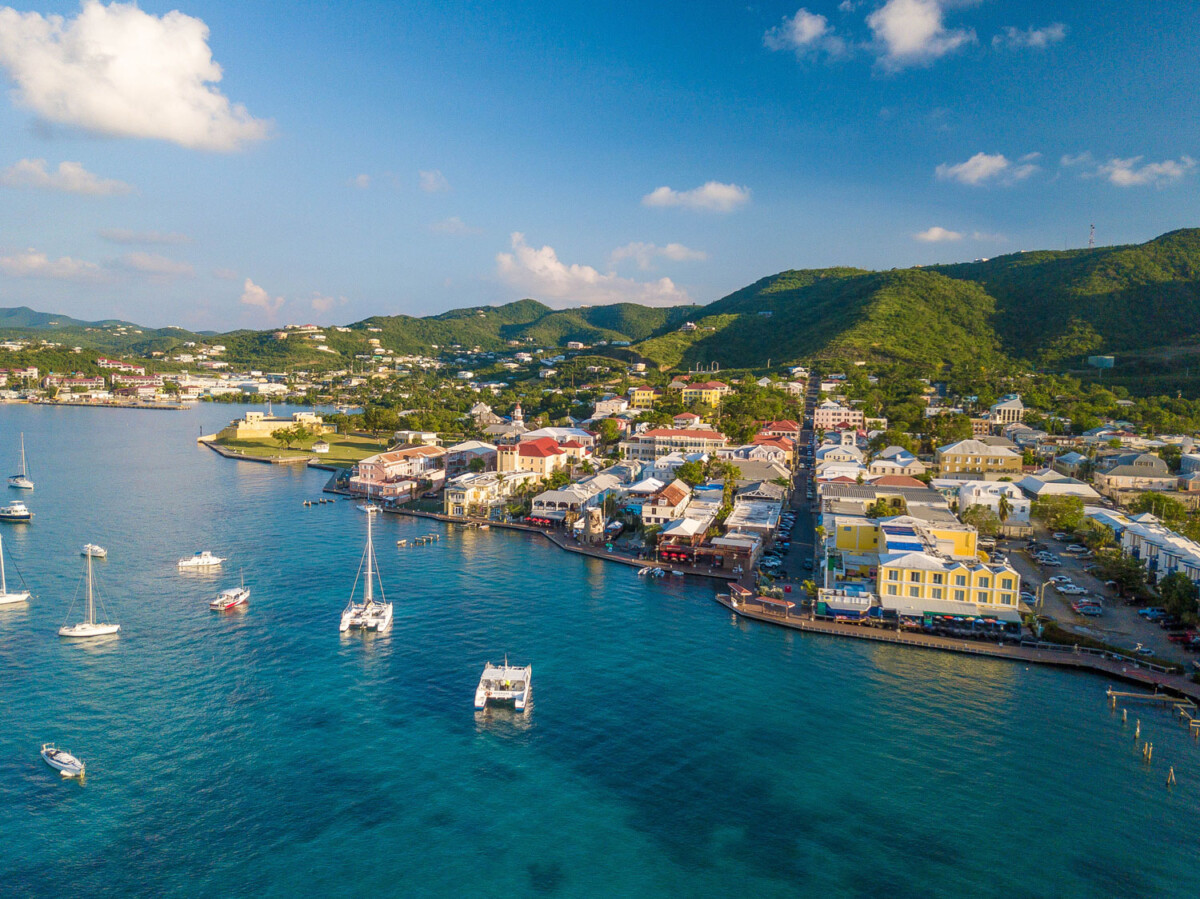
St. Croix was where I learned to swim, paint, write, sing, and everything that brings me happiness now. I very closely associate that color with most of my core childhood memories and a time when I was 100% truly happy. And now after researching, I know that the color creates a calm atmosphere and generally relaxed feelings.
One of my favorite musical artists, Enya, has a song named “Caribbean Blue.” and I have the YouTube video embedded below. Not only is the music stunning but so are the visuals. The use of the 3/4 signature and vocal layering with synth creates a water-like sound. This was just one further reason as to why I chose Caribbean Blue as my focused color.
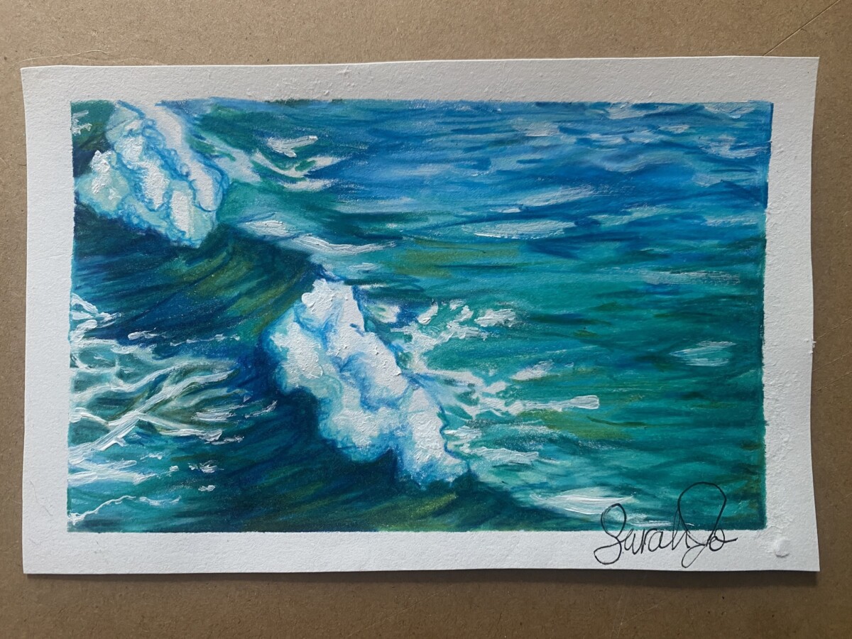
Over the summer I was messing around with color and texture and I created a few pieces using Caribbean blue as the main color is Caribbean Blue. The left is a painted portrait focusing on lighting and contrast. On the right is a colored pencil drawing of waves.

The last part of the project was to create three sketches of Caribbean Blue. My color in another language is “Muir an Cairibe” which is Irish for the Caribbean Sea and is the closest translation for Caribbean Blue. I chose Irish because Enya (the artist behind the song “Caribbean Blue”) is Irish and my family is Irish-American.

The OpenLab is an open-source, digital platform designed to support teaching and learning at City Tech (New York City College of Technology), and to promote student and faculty engagement in the intellectual and social life of the college community.



/Caribbean_general_map-56a38ec03df78cf7727df5b8.png)
