Digital Book
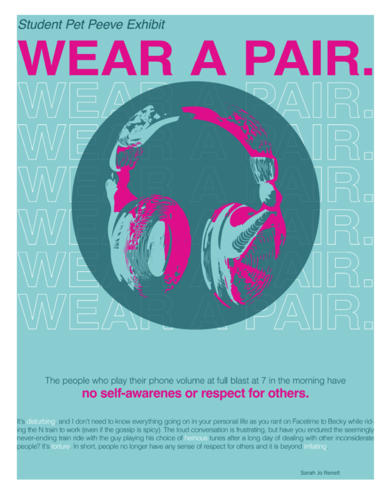
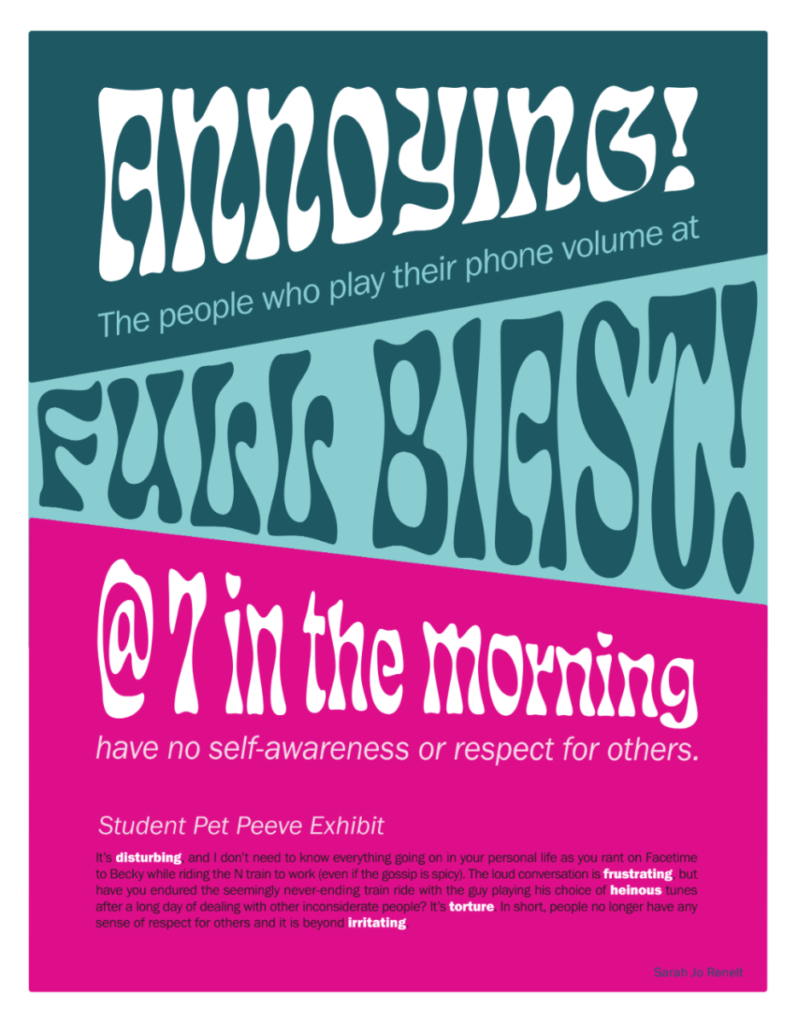
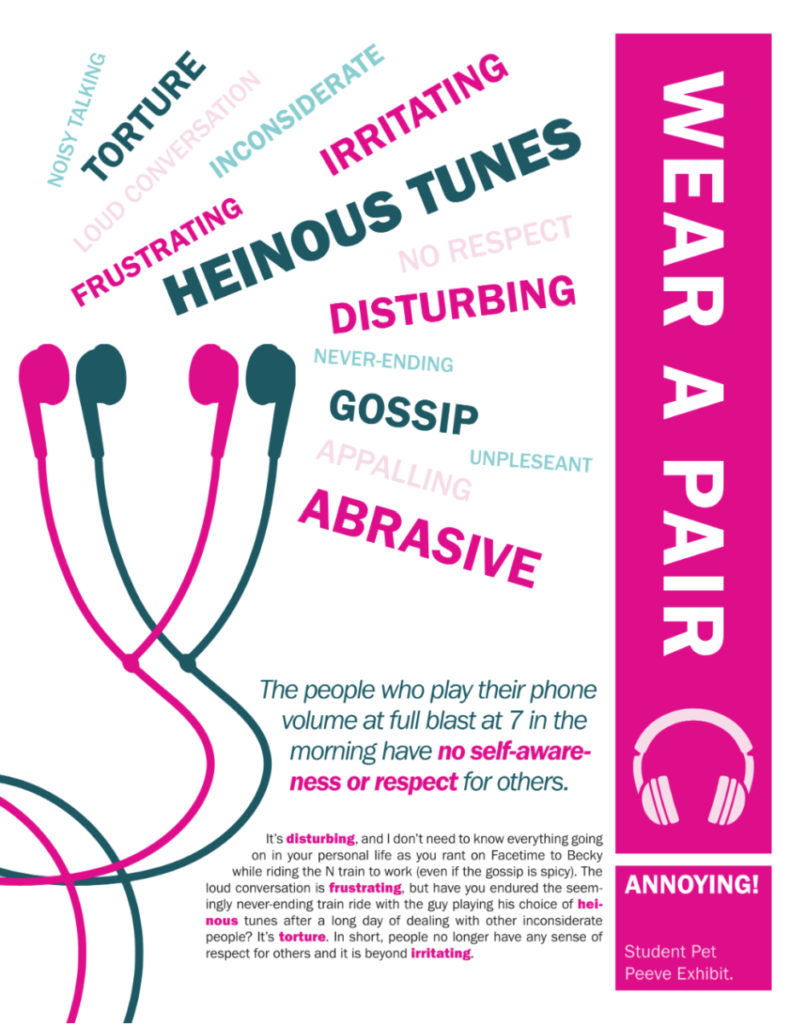
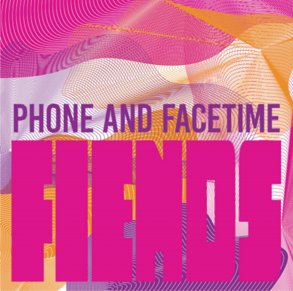
Students design three posters and four social media postings for an art gallery show (PET PEEVES).
This project Introduces the use of a typographical grid and the importance of visual hierarchy. Why use a grid? Why follow a format? What are the differences between a grid and a layout?
Through visual hierarchy, we will explore scale, proportion, negative space, color and legibility, and other essential topics of design and typography.
Click here to view the pdf of my book!
Poster Series
Social Media Posts

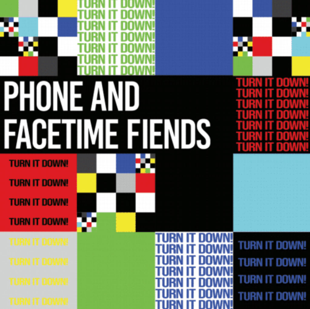
Animated GIF
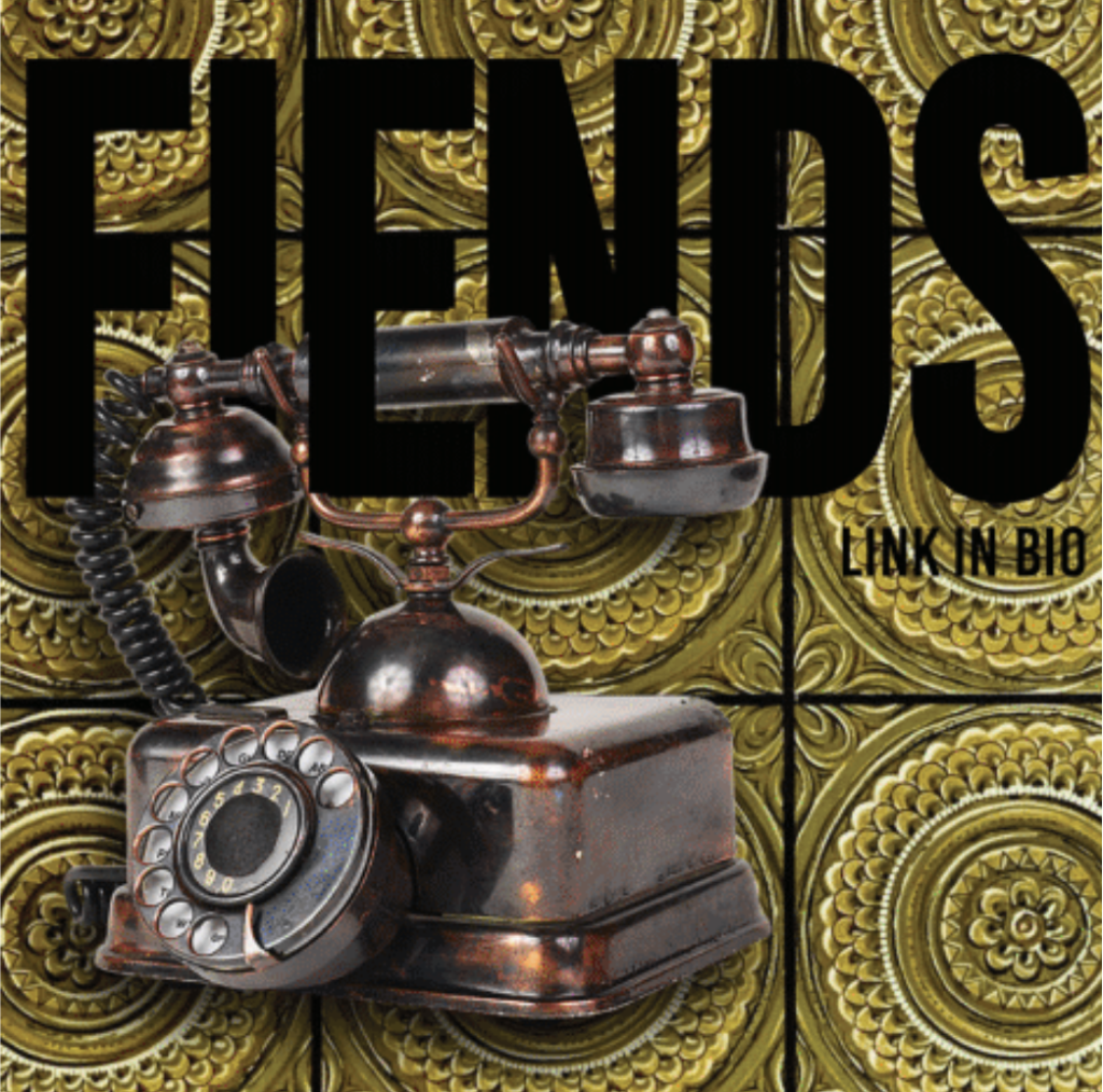
Click here to view my animated gif!
