
These three covers are my favorites for entirely different reasons.
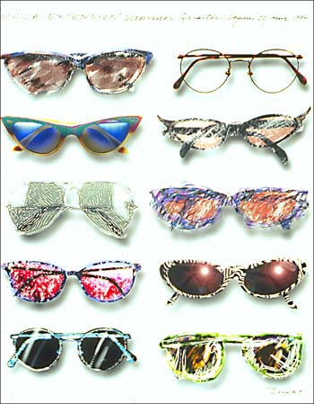
Starting with the left. The detail and artistic style Keith Bright used are very visually interesting. The use of the script text that looks handwritten is something I also love to do in my designs as well. The balance and symmetry are appealing to me as well.
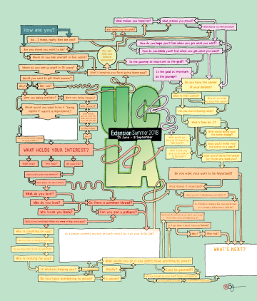
The middle cover by Stefan Bucher looks organized and balanced as well, but in a different way. It looks more like a data visualization piece, which I enjoy. The use of a color triad makes the work more cohesive as well.
The right cover by Martin Venezky uses color to draw the viewer’s attention to the text rather than first looking at the design. Using the orange versus the black and white makes for a visually captivating piece. This is also something I like to play with in my designs.

