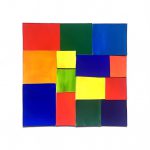
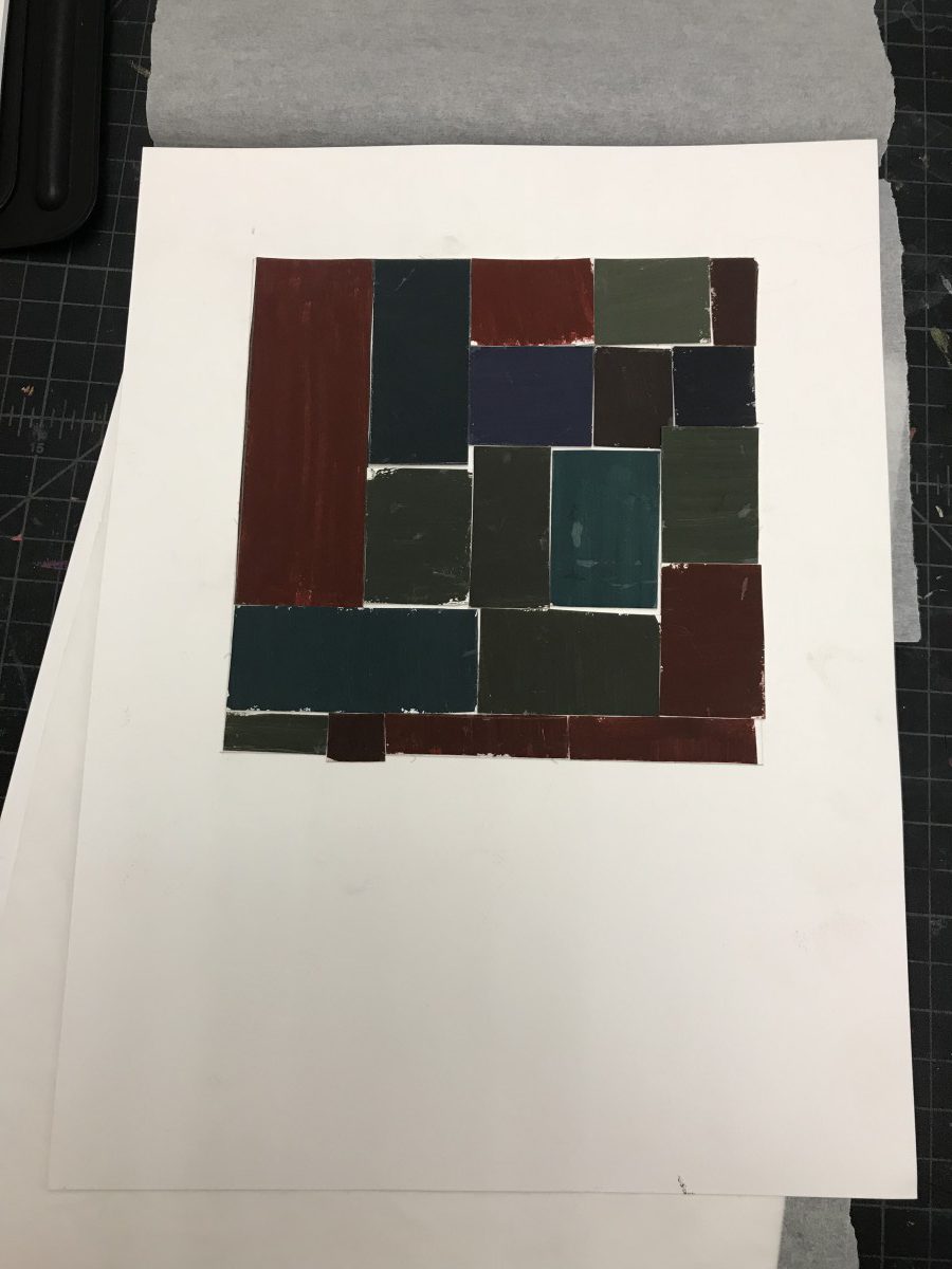
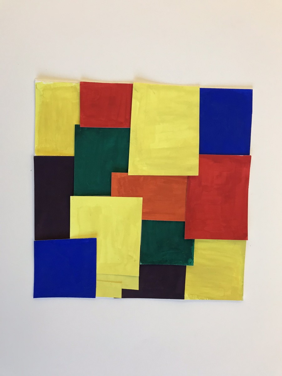
Saturation Studies: Phase 1
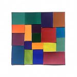
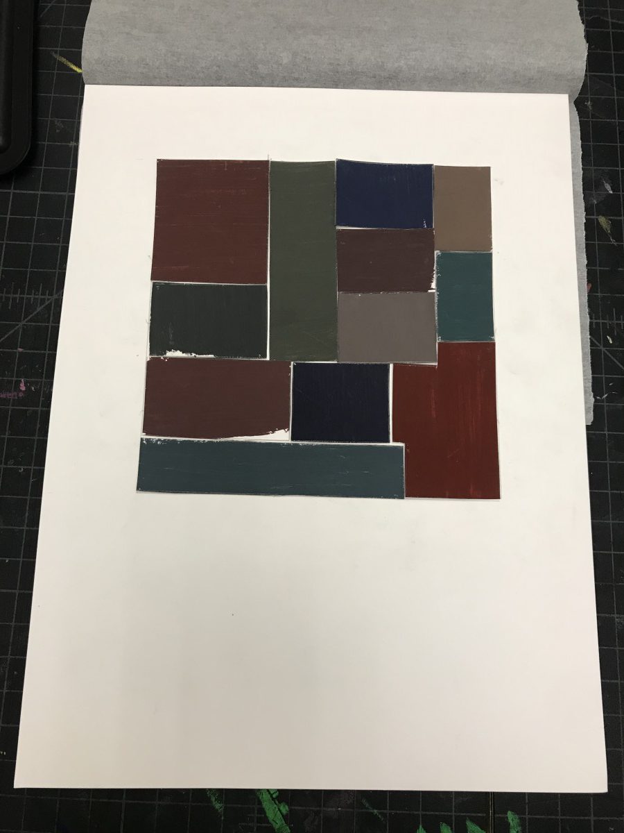
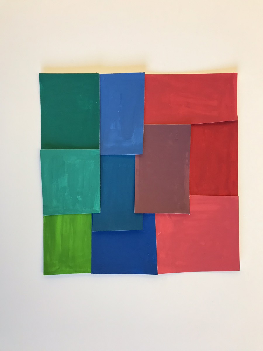
Saturation Studies: Phase 2
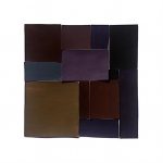
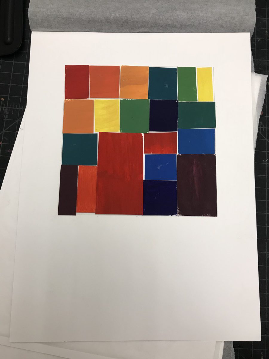
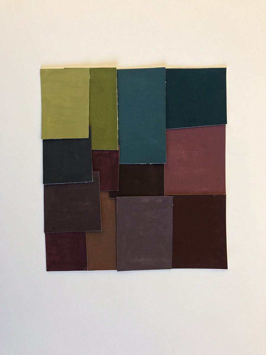
Saturation Studies: Phase 3
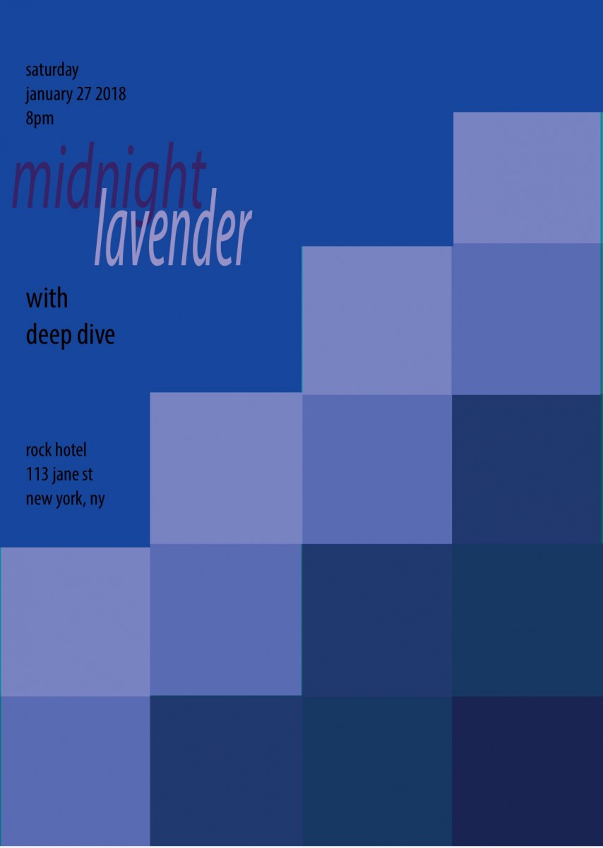
This was the first time I was able to study color as a subject. As an architecture student in the past I was never able to experiment with things like paint or hues and I found it insanely freeing and informative to work with this concept as well as this medium. Since it was my first time using paint, specifically gouache paint, it was a little weird to learn how to use the paint and my craft wasn’t what I expected it to be at times, but the more I practiced the better I got and now I’m determined to use the paint as a medium for things in the future.


Recent Comments