
Dee Jay and Sans color pairing
it was really fun getting to pair up with someone and give each other colors based on the information we learned about them.
Fall 2017 | COMD1100_LC08 | Prof. Spevack
Dee Jay and Sans color pairing
it was really fun getting to pair up with someone and give each other colors based on the information we learned about them.
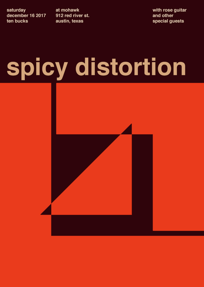
My partner and I chose the Nirvana poster and ended up with the warm color palette. This was a bit of a challenge for me because I had a much clearer image of what I wanted to do with a cool color palette so this was a little push out of my comfort zone. My partner and I actually struggled for a while trying to come up with not only the palette but the name for the band. Once we landed on the word “spicy” as a sensory word for taste, we had to connect it to a type of sound and ended up with “spicy distortion”. Choosing a color palette for the word “spicy” proved simpler than when we tried to just find warm color palettes in general. I also decided to add my own flair on the actual components of the poster by shifting of the inner triangle, because the original design looked too organized for a band with the word “distortion” in it. The info on the revenue was actually kind of cool to search for – I just looked up “50 best concert venues in America” and chose the one that looked the most indie/underground like setting that I felt fit for what I imagined our sound to be. So if you’re ever in Austin, be sure to check out, Spicy Distortion.
Time spent: 2 hours
Band poster
Freestudy Group Poster
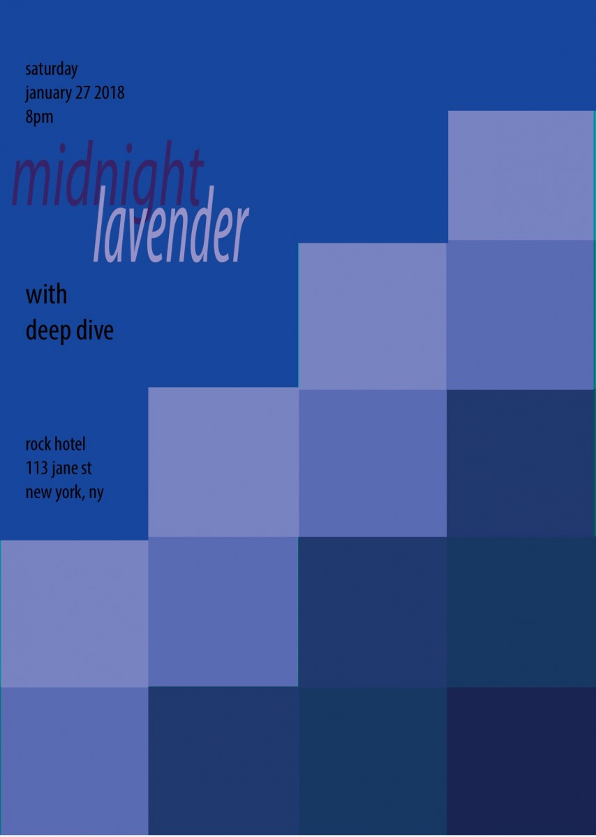
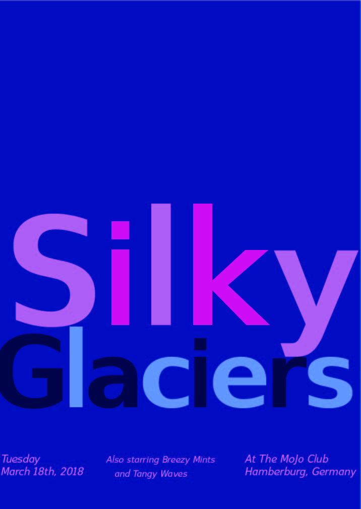
Me an my partner chose the Lush poster and we had to form cool temperature colors. We came up with periwinkle, and violets because they give off a sense of relaxation an calmness. I chose some blues to coincide with my cool temperature of violets. Using our 5 senses, we agreed on many sensory words that would mesh well with cool temperatures. We came up with our leading band name “Silky Glaciers” with or runners up bands being “Breezy Mints” and “Tangy Waves”. My partner mentioned Europe, and we jumped at the opportunity to base or location at a awesome club in Germany called the “Mojo Club”. Its was the perfect place for our “Silky Glaciers” to perform!
Hours worked on 2 1/2 this was fun to create!
![]()
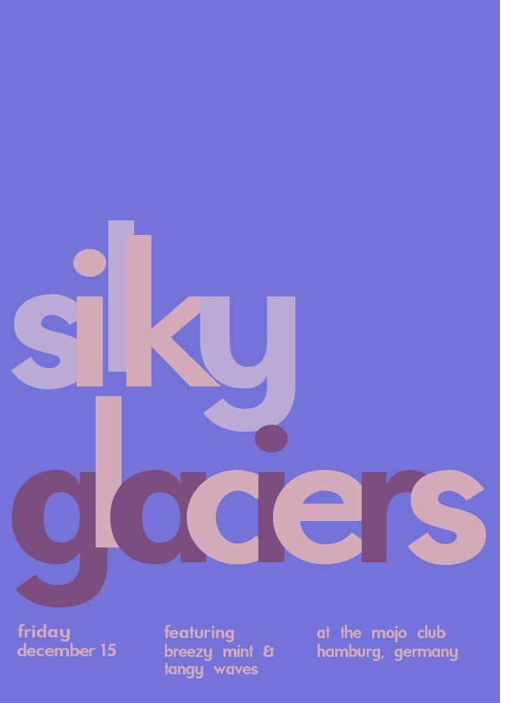
My partner and I chose the LUSH piece along with a COOL color temperature. Purple was the first thing my partner said, and I couldn’t agree more. Then, we came up with sensory words to pair up; we thought of words that reminded us of cold temperatures or shades of periwinkle and violet. From the list of sensory words, we paired three band names—”silky glaciers” our favorite and “breezy mint” accompanied by “tangy waves” were the runners up. We decided upon a European location, and Germany was our choice because who WOULDN’T wanna go to the Mojo Club!
Project #4 only took about an hour and a half (I would love to do another)
Narrow range collage and digital recreation: low key
Broad range collage and painted recreation: low and high key
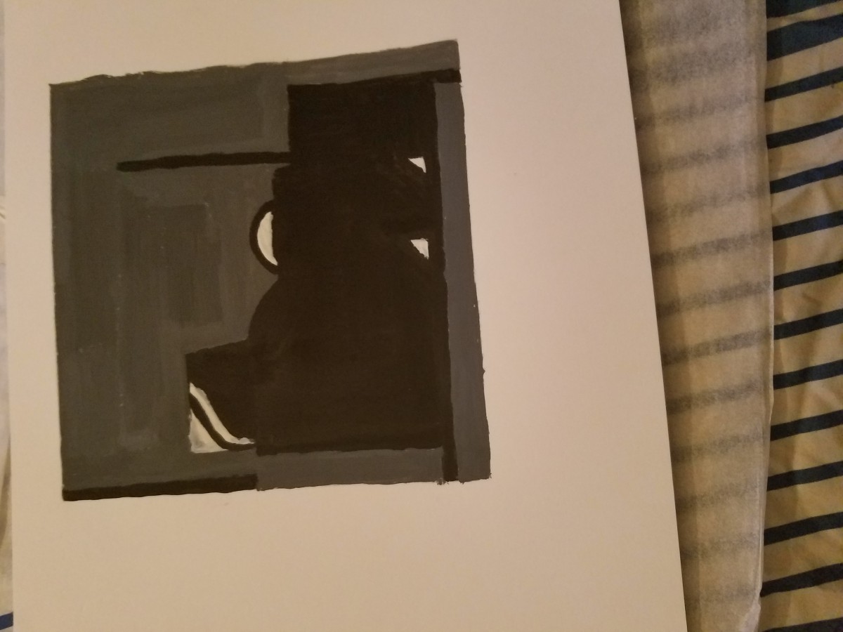
Lowkey
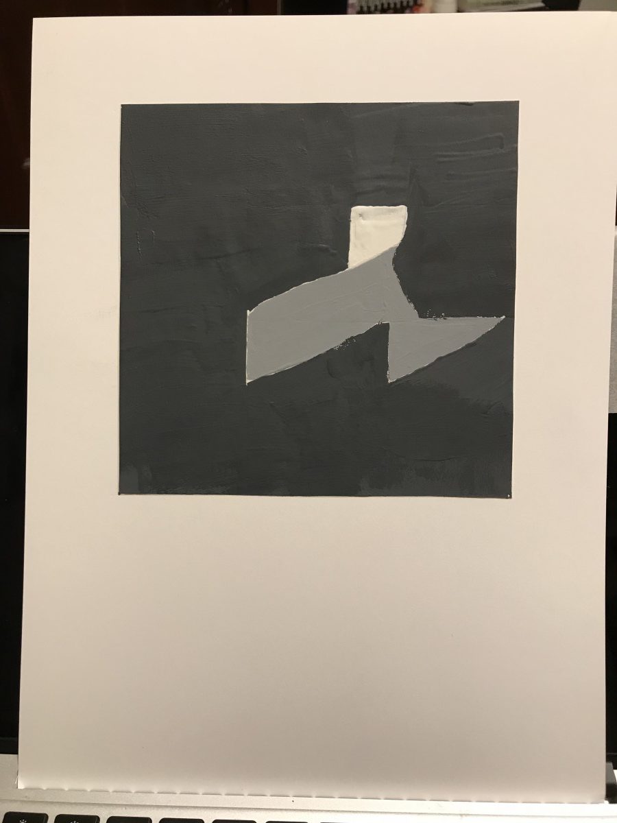
Lowkey-Painted
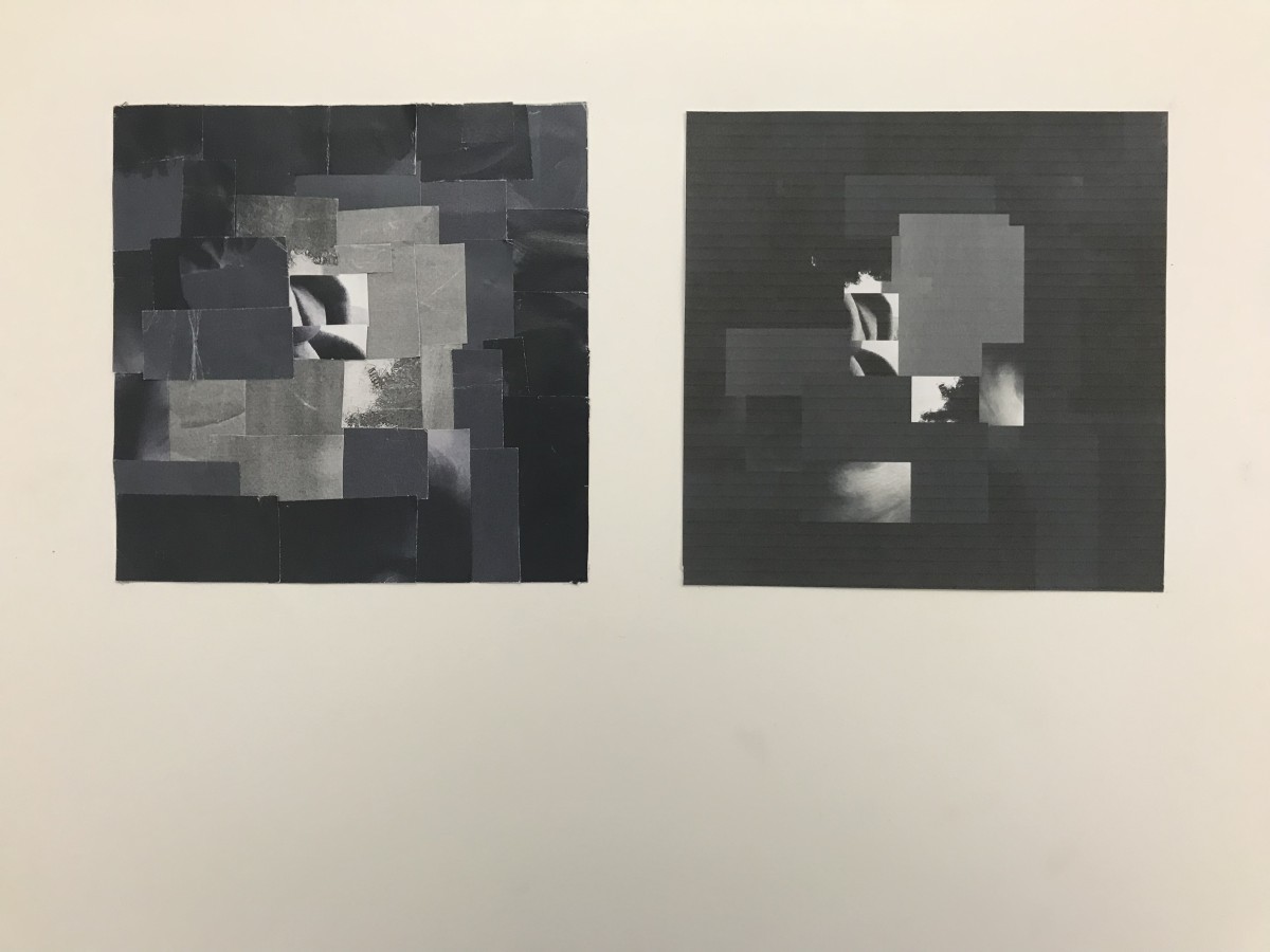
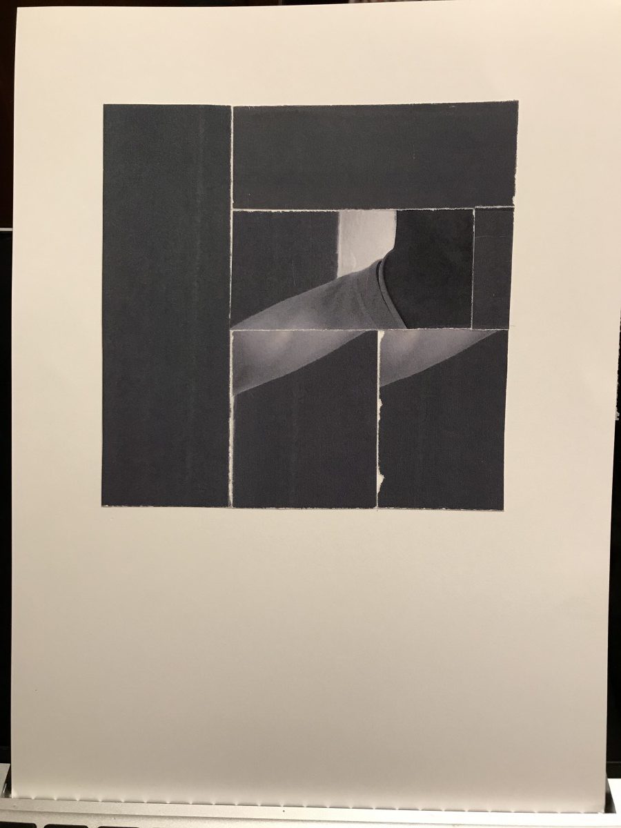
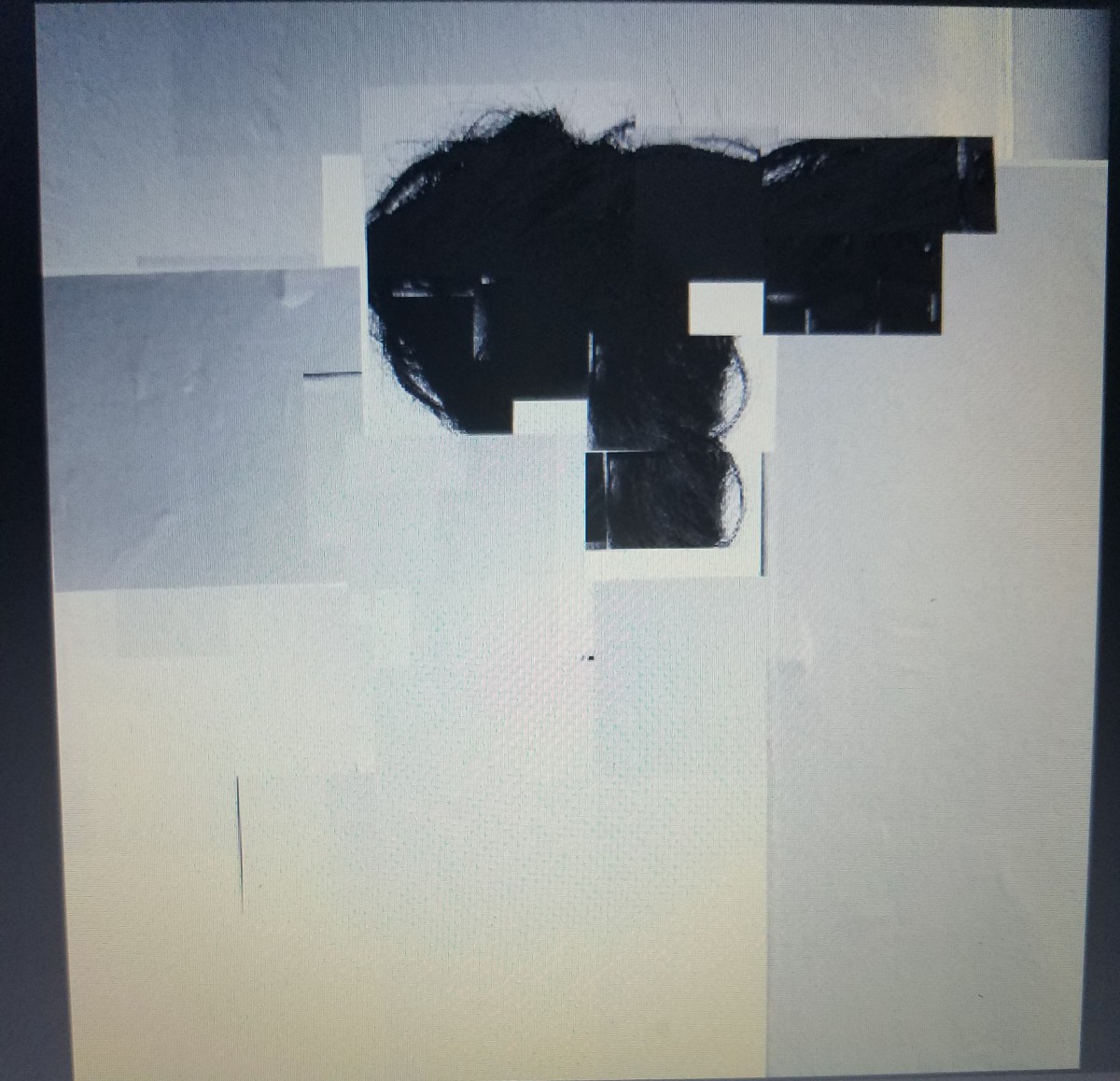
Lowkey pieces created from the dark greys of the photograph taken, cut from parts of the neck to the right shoulder, and major use of the dark walls.
Broad
Broad-PSD
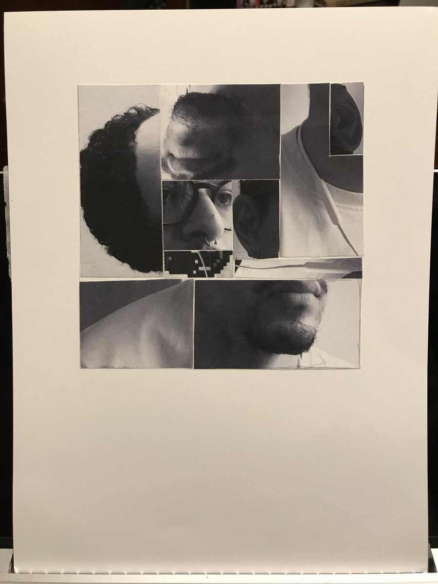
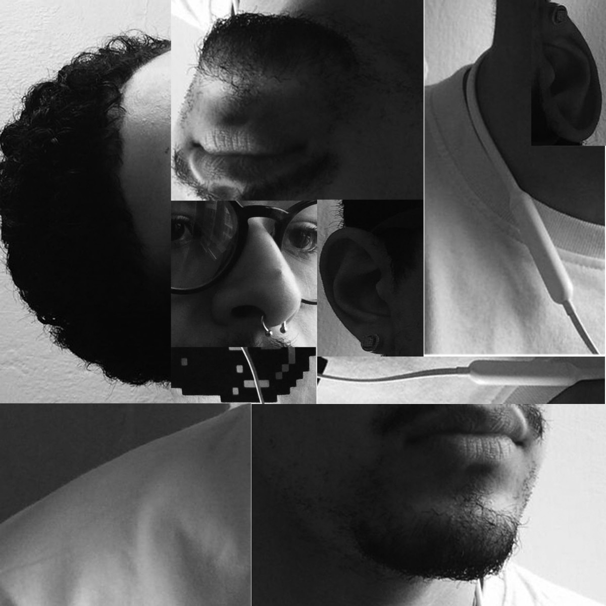
Broad piece created by mixing up parts of the face, such as, the hair, ears, mouth, and nose, with the nose as the focal point.
High Key Narrow Range Digital collage
High Key Narrow Range Collage
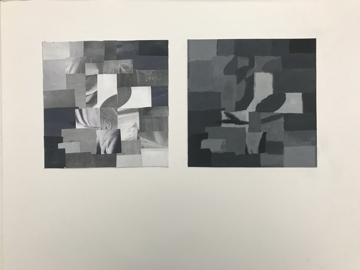
My first two collages are composed of a predominately high key value range. With a broad grayscale of contrast, there is a highlight of white around the focal point of hair. I emphasized with my hair placing it in many different positions and and created a flow of movement.

Low Key Broad Range Collage
Low Key Broad Range Painting
My second two collages are predominately low key value range. There is a broad range of gray, white and black. My hair was also used to emphasize the dark to lighter areas of the collage. There is various shadows of gray blending into black.
Hours worked on 5
https://drive.google.com/file/d/1M_NYp_xNndtNe9oc5gVUiLM_TIg9v5ci/view?usp=sharing
This part of the project was a bit of an adventure for me. After using the version at school and syncing it to a newer version at home my work became corrupted. I was unable to use the work I hard started in class and had to start all over from the beginning. It wasn’t as challenging as I assumed it would be. I learned new techniques on Photoshop, a software that seemed to intimidate me at the beginning. The animation to my composition brought my work to life. An created a visual story between all the elements formed within the Legato/Staccato mashup. I used the pan motion and and rotated the elements that needed more attention due to its size or position. I also faded all the elements and used high and low opacity not to lose some of the elements as they panned up, down or across.
7+ hours I worked on this project
The animation was honestly really tough because I really wanted to blend and mix properly so things sounded fluid, but in the end, I’m fine with how it turned out for my first piece of animation. From this project, I’ve learned to master timing and patience. The thing that really stuck to me was the fact that I worked on this for over 7 hours just trying to get all the work to play out smoothly. I only used the instrumental for this piece of Runaway by Kanye West, but I used two different versions of the song to mix together. (Also, I have no idea why that left corner of stars is darker than the rest of the drawing…)
Enjoy!
© 2024 COMD1100 : STUDENT BLOG
Theme by Anders Noren — Up ↑
The OpenLab is an open-source, digital platform designed to support teaching and learning at City Tech (New York City College of Technology), and to promote student and faculty engagement in the intellectual and social life of the college community.


Recent Comments