Fall 2017 | COMD1100_LC08 | Prof. Spevack

Category: COMD1100 Project #6 (Page 2 of 3)

Color Harmony: Phase 2

In this phase, I used my cherry blossoms from Microsoft Paint I drew a year ago. With my drawing, I created my color inventory which mainly involves only a few two color progressions, mainly the cherry blossoms. I tried my best to create a proportional color inventory as possible. This includes most of the colors that I drew.

Color Harmony: Phase 4

First of all, thank you Professor Spevack for your knowledge and patience with the class. I am grateful to have had you this semester, and to have learned so many new things about the artistic world around me. I have learned so many new fancy art words, new ways to look at figures and colors, and new ideas & concepts, which has changed my perception of how to think and use detail, how to assemble a project, and how to use new art tools.

For this project, we were taught how to use colors together—proportionally—in comparison to our last project, where we used colors to compare.

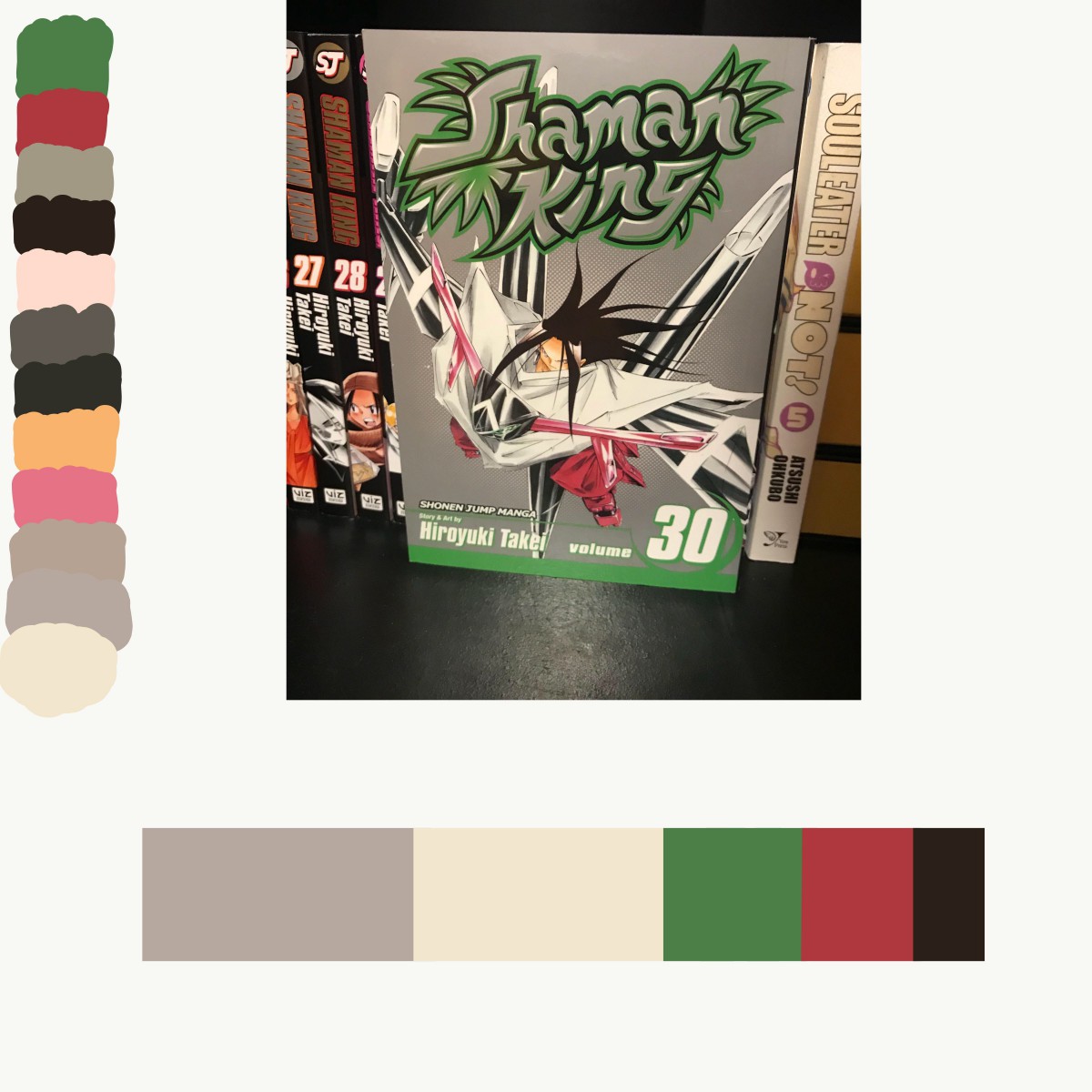
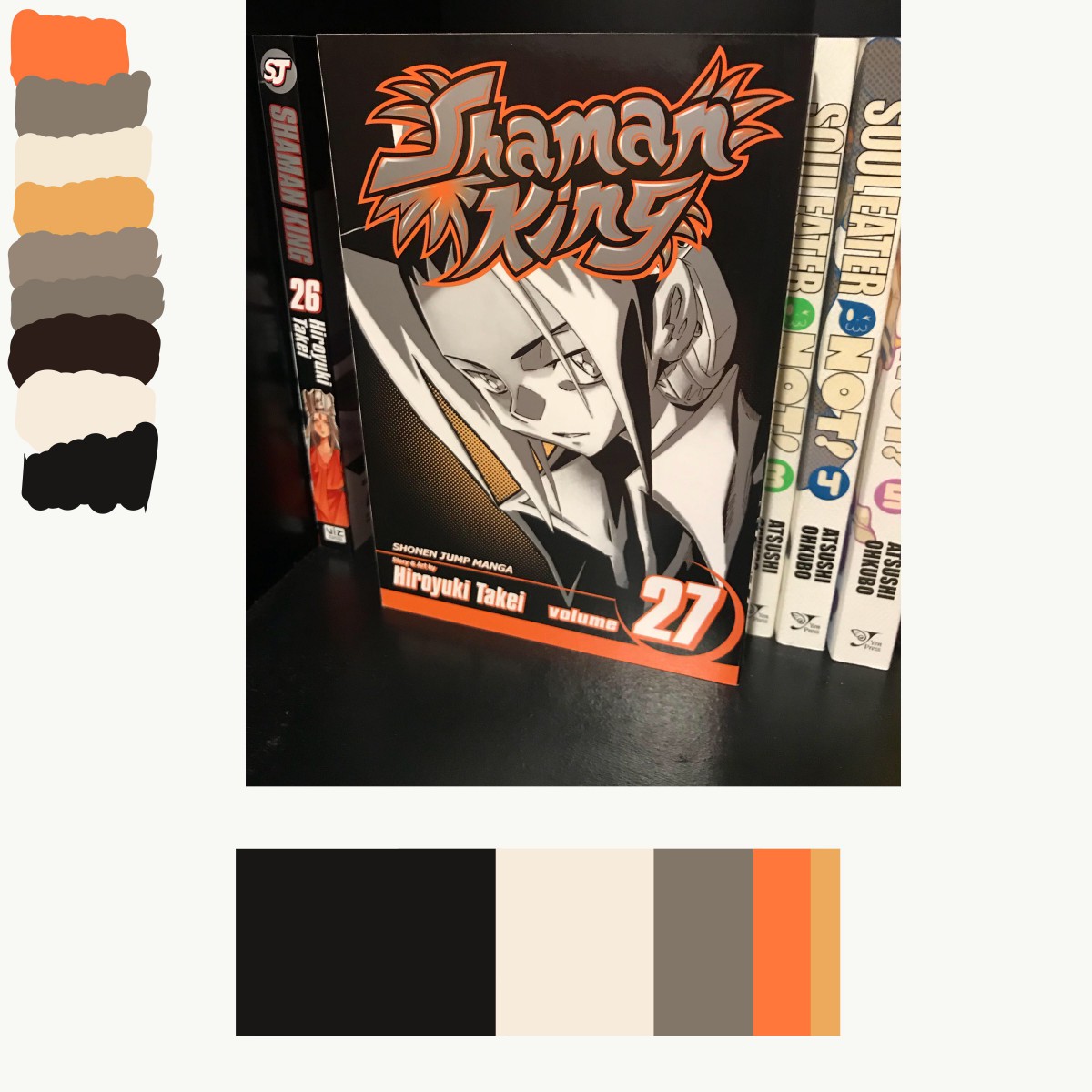
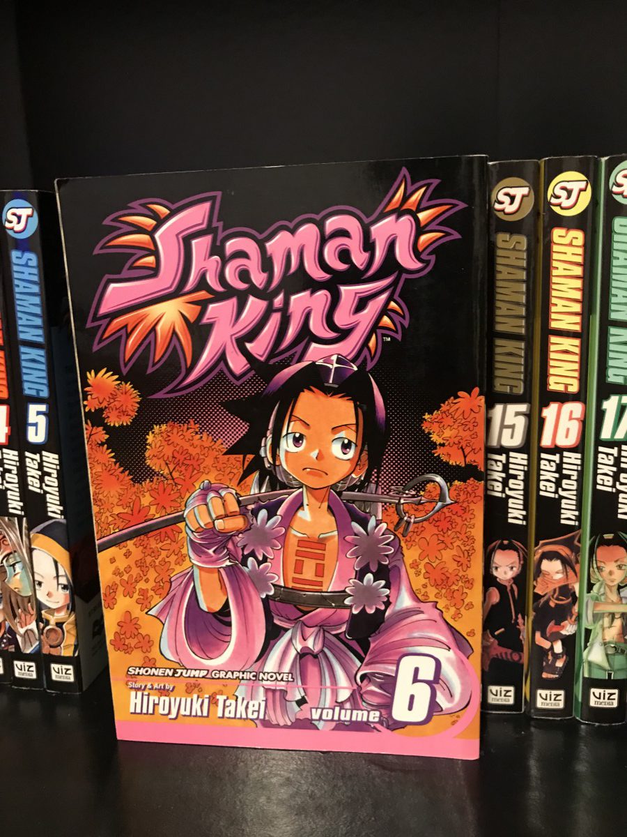
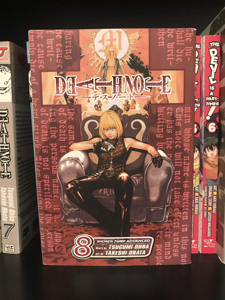
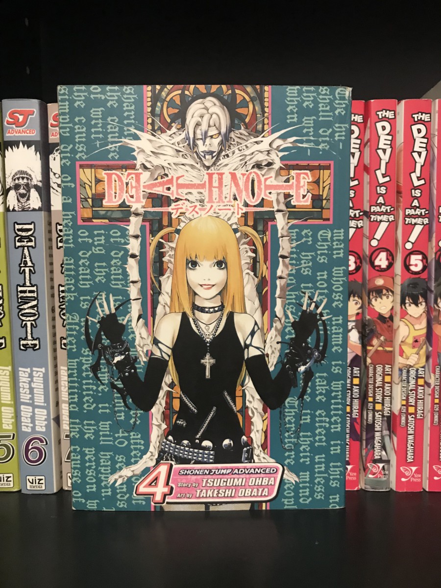
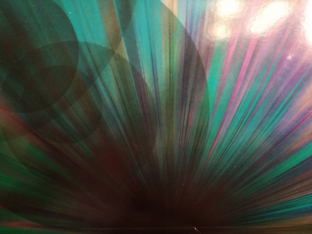
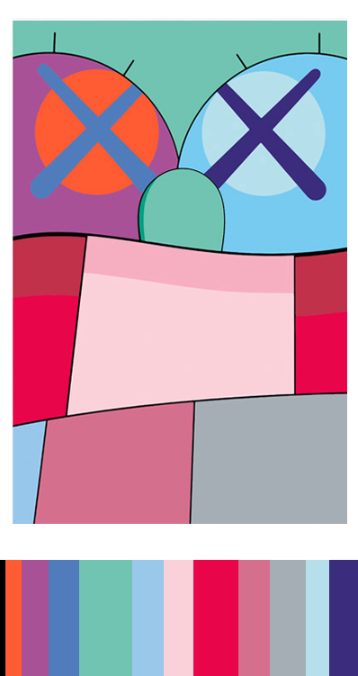
Phase 1 had us looking for progression of colors in nature or within our immediate surroundings. I used the manga books on my bookcase, and got the chance to re-admire the artwork of my older books. Phase 2 was were the extra fun part starts; we captured the colors of an image and created a lengthy title for a rectangle of colors (proportional color inventory). I really enjoyed this part of the project, I even said out loud, “I could do this all day!”

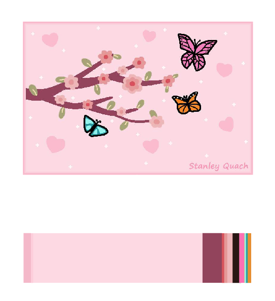
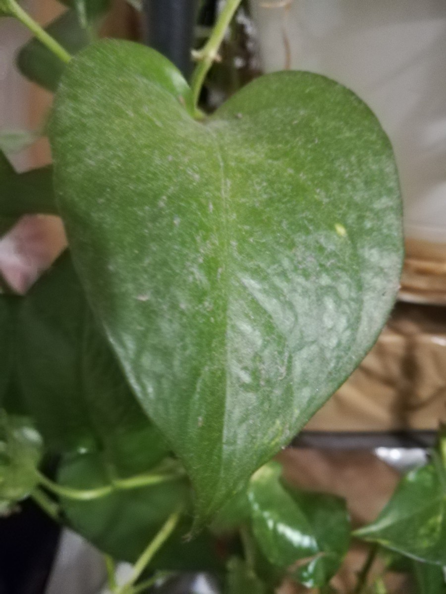
Phase 3 — though optional, it deserves to be done. I created a natural scenery using the same proportions of my image from phase 2. It made me really think on how to execute this piece using the same amount of color as the inventory created.

Through this project, I’ve learned new colors (which is always awesome) and a new way to see a change between colors and shade (black) or tint (white).


*Added note: All this work and creative designing has rekindled my love for art. Thank you!!

Color Harmony: Phase 3

For this piece, I drew a natural scene of a wolf, walking along-side a river, by a mountain range, with a night sky, and the moon peaking behind the mountains.

From the proportional color inventory used in phase 2, I saw water—lots of water—and a night sky. I thought about natural scenaries that included being near a river or a lake, and created an image in my head of a mountainous region using the muted purple. I used the darkest color in my inventory as a silhouette color on the wolf figure, to demonstrate shade progression.

Time worked: half an hour

Color Harmony: Phase 2

For my largely worded color box, I used volume 3 of Death Note from my bookcase.

Proportial Color Inventory

From this graphic novel, I captured every color I could find in even the closest details, but for my color box I used the 5 most definite colors. From this phase of the project, I went on a whirlwind of “color finding”and created three more pieces (below). I REALLY enjoyed this phase of the project because it gave me a reason to take all my books off the shelves and admire, and capture, the artwork and colors as if they were all brand new. From this step of the project, I learned, and brainstormed, the use of colors I’ve already seen in future artwork; I will DEFINITELY be using all these new colors in future projects!!

Hours worked: more than 1, less than 2

Color Harmony: Phase 1

For my pieces, I used manga (japanese graphic novels) from my bookcase to showcase the color progressions. I’ve always loved the colors in cover art of any manga, but now that I’m seeing them in a different light, I appreciate them even more now!

Shade Progression (Black to Orange & Pink)

Using volume 6 of Shaman King, I’m demonstrating the shade progression of black to color. You can really notice the progression around the middle of the character, where the black is blending into the pink and just behind the orange foliage.

Two-Color Progression (Burgundy to Brown)

Volume 8 of Death Note; the dominant burgundy color progresses to the sub-dominant values of brown, which exhibits a 2-color progression.

Tint Progression (Lake Green to White)

And volume 4 of Death Note displays a tint progression with the blue-green lake color progressing to white.

20 minute work

Color Harmony: Phase 1

Shade Progression (Black to Tint Blue)

This was a picture I took on some interesting English textbook from middle school. It seems like a wild book of tint blue and black, but the progression starts in the middle bottom to spread out to the top.

Tint Progression (White to Green)

This was a simple picture I found. The progression changes from White at the right to turning Green when looking left.

Two-color progression (Dark Pink to Tint Pink)

This was a really hard part to find any Two-color progression and I chose this. The Cherry Blossoms has the progression change from dark pink at the middle of some flowers into turning tint pink when spreading out from the middle.

Color Harmony: Phase 1

Shade Progression

Photo of my sons hair goes black to different shades of cool hues, deep purple an blue.

Two color Progression

I found this poster in the school. Its a shows the sun up close.  Sun rays progressing from yellow to orange the further the rays expand.


Tint progression

I took this on 59th street on the side of the time warner building. The buildings create a shade around the skyline. Making everything on the outside of the photo dark an enhancing the blue hues. The contrast from the sunlight makes a tint. Having tge sky go from blue to white.


Did my best at creating photos with progression

Hours worked on 1 1/2


Color Harmony: Phase 4

This project was the one project that really helped me out a lot in terms of understanding color. Especially phase 2 because I got to learn how to create a color inventory and understand what it meant to separate color. Also phase 1 taught me about color progression and the way color sits next to each other in different ways like tint or shade.

https://openlab.citytech.cuny.edu/spevackcomd1100fa2017/2017/12/16/color-harmony-phase-1-2/

https://openlab.citytech.cuny.edu/spevackcomd1100fa2017/2017/12/17/color-harmony-phase-2/

Color Harmony: Phase 2

This is a composition by one of my favorite artist KAWS. He experiments with a lot of different cartoon characters and a large array of colors, he is known for drawing an “x” over the eyes over commercial characters and characters of his own. I thought this piece would go good with this project because it deals with color harmony and color interaction a lot with usually 2 complimentary colors standing next to each other, and of course the large amount of color inventory in the photo.


Color Harmony: Phase 1

Two Color Progression – Red to Purple

The head of the monster represents the red color , with the purple pants as a complement to the primary color of the picture.

Shade Progression – Black to Orange

The inside of the hand is bright orange but as it spreads out it leads to a darker shade eventually to black

Tint Progression – Blue to white

The focal point of the picture is the blue circle on top, but it has a white circle surrounding the blue and leaves you with an all white background.

Hours Worked – 70 mins

« Older posts Newer posts »