Fall 2017 | COMD1100_LC08 | Prof. Spevack

Category: COMD1100 Project #5 (Page 3 of 4)

Color Interaction Pairings: Phase 3

Shawn and Marcel


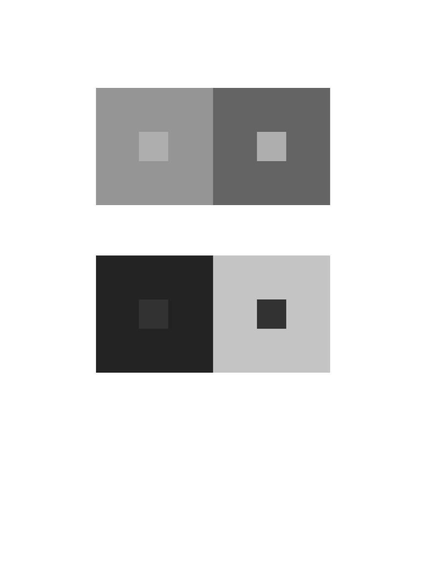
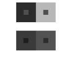
From Shawn’s calm, low voice, and mellow, sleepy personality, I perceived his color to be a blue chromatic gray. Shawn’s came up with an orange chromatic gray as a joke of my hatred of orange.

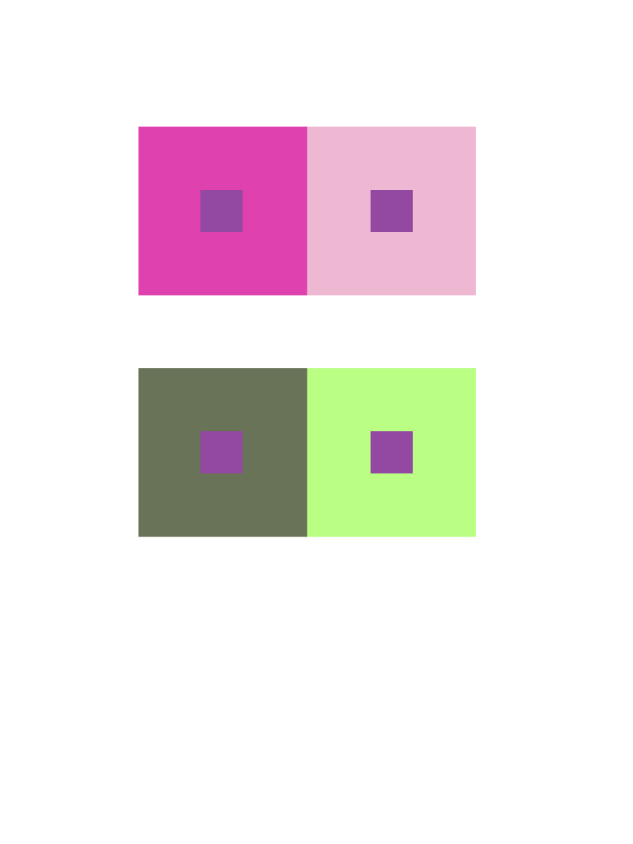
We shared the brick red color from capturing the color of his notebook, and turning it into a chromatic gray value.

Time worked: 1.5 Hours

Color Interaction Pairings: Phase 1

The article” The Magic and Logic of Color : How Josef Albers Revolutionized Visual Culture and the Art of Seeing” on Josef Albers and Interaction of Color gave a detailed description on how one perceives color.  He states “In visual perception a color is almost never seen as it really is — as it physically is. This fact makes color the most relative medium in art”. Albers approach to interaction of color was practice before theory. With the class experiment we started with practice,  Trail and error. Using the ipads we practiced using colors, some high in value or low saturation.  We had to use two colors to make one color either become brighter, lighter or the same in pairs. Some of the colors after adding white, or black I couldnt see how the colors  change and with some I could. This experiment really played tricks on my eyes.   Using complementary colors of primary colors helped me see more of a change in hue an value.

Color Interaction Pairings: Phase 1

While doing research on color Interactions and how certain colors can change and create optical illusions depending on the colors used and I think that’s pretty cool. For example in an article I read it states, “First, it should be learned that one and the same color evokes innumerable readings. Instead of mechanically applying or merely implying laws and rules of color harmony, distinct color effects are produced-through recognition of the interaction of color-by making, for instance, two very different colors look alike, or nearly alike.”  This is what I was talking about when I said certain colors can create this visual tricks and play with your brain.  I think tis whole color Interaction thing is pretty cool and I will definitely take a closer look at in the future.

Color Interaction Pairings: Phase 1

Okay, so I watched the video of Anoka Faruqee’s presentation. Faruqee said Albers wanted his students to see colors in context, as in, compared to one another, because that’s how we see things; there’s no natural range of colors mapped out on a grid—we see them compared to each other in layers or side by side. THIS IS AWESOME!! It’s a great way to really SHOW differences in shades of colors, especially since a shade of any hue would look completely different in someone else’s eyes. I appreciate Albers for teaching in this manner. I get to see even MORE colors. I’m pretty sure I said ‘whoa’ more than 5 times throughout the video, when Faruqee presented the studies of Albers’ students’ works and revealed that the shapes that were meant to look different were actually the same. The conversion of Albers’ guidebook into an app is ingenious.

Color Interaction Parings: Phase 1

Today we studied Josef Albers and his experiments in color relationships are used throughout the world in the study of design and color. One of the cool things about this study was how you through switching through different hues and values and saturations you were able to see which combinations created more intense interactions. At first we studied with simple things like the rectangles and squares that had the same color on the inside square/rectangle but varying colors on the outside ones, but the ones that I really enjoyed were the more complex ones where you were able to create color combinations that created illusions. There would be one main color in the middle that overlapped two colors on the top and bottom. Then, a final color would go on top of the main color to show a split across the whole image. Through changing the difference in value and hue, you could make it look like the main color was actually two different colors against the top and bottom ones. Such color interactions are extremely interesting when you look at them in the context of design because a simple change in one color could make another look completely different when it goes through the human eye. We also used this app called Huedoku which was actually more complicated than I thought. It was cool to see two colored that you didn’t think were related suddenly be a combination of two colors and you have this moment like “wow I didn’t know that’s how you could get that color”.

Time spent: about 30 mins

Color Interaction Pairings: Phase 2


« Older posts Newer posts »