During my research I’ve conducted a chuck full of information containing color and the logic behind it. Josef Albers said “In visual perception a color is almost never seen as it really is — as it physically is. This fact makes color the most relative medium in art. ” This means all colors are visually different but physically the same, If you were to see a blue stop sign the only difference is that it would visually strike as a difference but if you hold it near a red stop sign you wouldn’t be able to tell the difference especially with your eyes closed.
Category: COMD1100 Project #5 (Page 2 of 4)
Hours worked:1
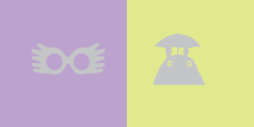
With eccentric glasses to the left (her perception of me)
& a quirky Totoro silhouette serving as my symbolization Darlene,
this color interaction serves as a perfect representation regarding both Darlene’s and my personality.
Hours worked: 1
-

- Wave/Atom
My partner and I Caleb Alwood, configured our icons according to our mind sets. I found Caleb’s mindset to be small and condensed but very smart and has a lot of potential. He found my mindset to be very free flowing and easily influenced like a beach wave.
Overall with this project, this is one of the most interesting topics to learn about color. This is especially that it’s so weird and cool that I see colors different, especially when the same colors overlap with a different background color.
Take a look at the previous phases I had done overall for Project #5:

This is a project that I worked with Tracy. The left side is suppose to represent me (in this case, Stan), while the right side represents Tracy.
This project took roughly a total of 2 to 3 hours to complete this; especially this is one of my first few times using Illustrator and it took a while to find the perfect sketch to draw the middle.
https://openlab.citytech.cuny.edu/spevackcomd1100fa2017/2017/12/11/color-interaction-pairings-phase-1-2/
https://openlab.citytech.cuny.edu/spevackcomd1100fa2017/2017/12/07/color-interaction-pairings-phase-2/
https://openlab.citytech.cuny.edu/spevackcomd1100fa2017/2017/12/11/color-interaction-pairings-phase-3/
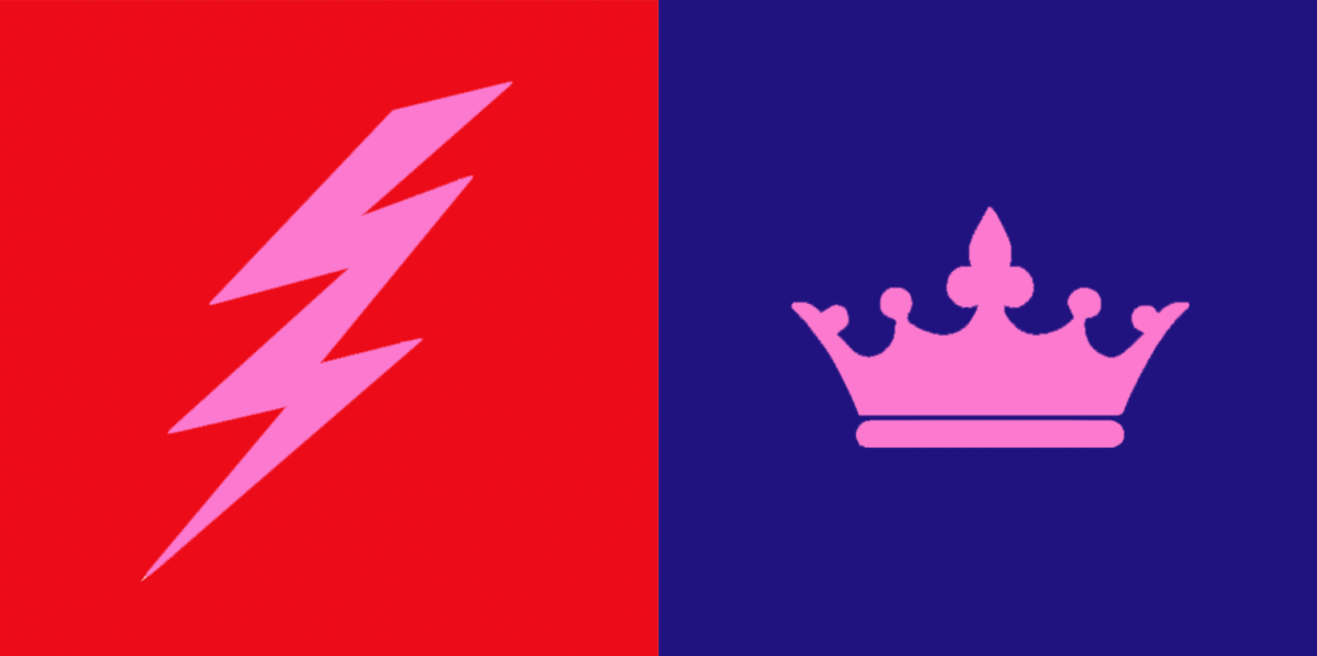
This project was rather quick but it was because my partner and I had very solid ideas of the colors we had in mind for each other. My partner was Ebony and she immediately thought of me as being a bright red for my energetic, outgoing and passionate personality. When she asked me what symbol was a good representation of myself I said the sun, but when she suggested lighting because of its electrifying presence that made you pay attention to it right in that moment, I was both flattered and fully convinced that it matched me way better. For Ebony I has always seen her as a very strong and well grounded person but one that carried themselves with elegance. She still had a very cool and playful personality, so I saw a deep blue-violet as a color that represented all these things. I suggested the symbol of the crown not only because deep blues and violets are usually associated with both power and elegance but also because I felt that it paralleled the lighting bolt in the theme of power. Both colors are very saturated and bold even though one is on the warm side of the wheel and the other is on the cool side, and the symbols both represented a powerful commanding presence, one in a loud, immediate way and the other in a firm and authoritative way.
The color interaction of this piece had to do with the a change in hue but not value, for the background colors. The effect on the common color, pink, was that against the red background it appeared to be cooler in contrast while on the blue it appeared to be warmer. This is because the very prismatic hues create the illusion of the icon having the “filter” of their complementary color. Against the red, the lighting bolt appears more green/cool. Against the blue, the crown appears more orange/warm.
Time spent: 1 hour
During research, Color Interactions is the idea of using the same color in the middle and leaving background color for our eyes to see the color slightly different than usual. “In visual perception a color is almost never seen as it really is — as it physically is. This fact makes color the most relative medium in art”, said by Josef Albers. It has to do with the “The relativity of color, a color has many faces, and one color can be made to appear as two different colors.” When looking at it you may see that the middle color isn’t the same, but it is actually the same color. This is because our eyes sees it differently when it comes with background colors. It all has to do with our vision and colors.
This project was a great experience! The idea of comparing colors on top of each other, as found out through learning about Josef Albers’ studies. Albers’ studies were then converted into an iPad app, and from the presentation I watched in Phase 1, the app proves to educate future artists about the interaction of colors. Through Phase 2, we learned how to turn one color into two through the use of an interaction between different colors.
Phase 3 was fun to work on, especially when bouncing ideas off of a partner. Through an interview with my partner, I learned how to emulate an idea through the use of color and personifying the color by comparing it to a personality.


Recent Comments