Fall 2017 | COMD1100_LC08 | Prof. Spevack

Category: COMD1100 Project #5 (Page 1 of 4)

Color Interaction Pairings: Phase 4

Color Interaction Parings: Phase 1

Color Interaction Parings: Phase 2

Color Interaction Pairings: Phase 3

This project had to do a lot with the illusions that colors can make and I feel like the best part about it was seeing not only what kind of tricks we could play on our own eyes but also the combinations that other people chose and how they chose to pair colors up to make illusions. Something I liked about this project was Phase 3 when we were paired up and had to work together to not only make a color/symbol pair that represented a different person, but create one that fit with ours. It was really cool to see the other people’s images of you represented in color and symbols. I wish we had more time to work with that app during Phase 1. I feel like there was a lot more I could have learned through those apps and I am looking forward to getting them for myself.

Color Interaction Pairings: Phase 4

https://openlab.citytech.cuny.edu/spevackcomd1100fa2017/2017/12/11/colorpairings-phase-1-3/

 https://openlab.citytech.cuny.edu/spevackcomd1100fa2017/2017/12/10/color-interaction-pairings-phase-2-5/

https://openlab.citytech.cuny.edu/spevackcomd1100fa2017/2017/12/18/color-interaction-pairings-phase-3-7/


This project made me really use my eye muscles. At first it was difficult to see a change in value or hue. After training my eyes,  and knowing more about the theory of color, it was easier to identify. This skill will definitely help me out in the future projects and gives me a more open mind when it comes to color. Everything isn’t always what it seems, Thanks Professor Jenna.

Color Interactions Phase #4

Phase 1


Phase 2


Phase 3


Throughout all 3 phases, I’ve learned to look at colors in greater depths I never knew were possible to reach. Like any muscle, the eye can be trained as well. I’m glad I have learned this skill and will continue to develop it into various layers that will open doors for my creativity and bring great success when I’m out in the graphic design world. Thank you professor!

Color Interaction Pairings: Phase 3


Using red to describe my partners vibrant, confident personality and a lightning bolt because I see her as a strong individual who stands out. She used this deep blue to describe me as strong and stable adding a crown to express that I also stand out. We noticed yet very different people both of us give off a strong energy. We led with that mostly. We altered the symbols color an created a saturated color we both agreed on. Against the primary blue hue background the symbol came off warmer and with the red primary hue background a more lavender hue. Both background hues are pure prismatic hues that aren’t complements but work well with one another and makes it possible to see the contrast of the symbols. Great project!


Hours worked 1 1/2

Color Interactions Phase #1

Article:

                        Through my reading I have found Josef Albers to be a man of wonder and mystery with profound understanding and an ever-lasting fascination towards color.

  • Albers not only made numerous contributions to graphic design but gave the world perspective on how to view colors in depth.


  • According to a piece written on brain pickings , Alber’s book, Interaction of Color  provides illuminating visual exercises and mind-bending optical illusions and remains an indispensable blueprint to the art of seeing.” 


  • What I found really fascinating was the fact that Albers didn’t have much interest in giving his students the rules of color, but rather provide them with tools to see colors with vision they never knew they had.


  • I found a couple of quotes from Albers, that I deeply resonated with which allowed me to connect with him on another level. 


  • “Easy to know that diamonds are precious. Good to learn that rubies have depth, but more to see that pebbles are miraculous.”  


  • “A thing is never seen as it really is.

                             Both quotes hold truths regarding the capability of our vision and how Albers used his to the greatest of his ability, especially when dealing with color.


Video :

                             In the video, Anoka Faruqee gives an excellent presentation on color interaction. She proceeds to comparing a myriad of colors, ultimately deceiving her audience (and myself included).


  • At one point, there were two boxes of the same shade of pink (or so I thought), that are both surrounded with different colored backgrounds.


  • The removal of each background diminished the illusion, revealing that while one box was indeed pink, the other was actually blue.


  • Later in the video, Faruqee mentions Alber’s teachings of optical color mixture, explaining that when bits of color are small enough and closer together our eyes will optically mix the two (or more) colors.


  • In this instance there were two brick walls made of the same shade of red but the black mortar made the red seem darker while the white mortar on the opposing wall makes the overall picture seem lighter.
  • I also learned that color can change in accordance to lighting conditions, i.e., low light which rids a painting of contrast while harsh lighting highlights it. 


  • Other painters before Alber’s time were mentioned for their use of color interaction in their works as well. One painter, Edward Degas defined painting with the following quote:


  •              “Painting is the ability to surround a Venetian red so it looks like a Vermilion“.


Color Interaction parings : Phase 3

In this project my partner and I asked each other questions in order to get a feel of what type of personalities we had and how we would interpret each other. For my partner I  already had the color in my head before we even started asking each other questions. I had chosen the color blue to represent her but I did not know what type of blue i should have used, soon after talking and asking questions I had come up with a chromatic blue to represent her because while speaking to her i had the image of the ocean and waves that rush to the shore and leave soon after. it matched her personality because she likes things that are fast paced. As for the butterfly, i think it matches her because it symbolizes nature. In which we both have in common and it is also really fast when it takes flight. while making the butterfly i decided to make  the design of the wings into a semi geometric  shapes because i remembered how she liked music that had a staccato rhythm.  In the end we decided to use a muted pink with a lot of white to represent us because in some aspects we are both neutral to things and we like to keep things peaceful.

time worked: 5 hrs

Color Interaction Pairings: Phase 4

Overall this project was really fun as well. I enjoyed working in photoshop for phase 2 the most mainly because it really felt like I knew what I was doing. Working with complements eventually led to me being able to make one color look like two different colors which was extremely satisfying. I remember constantly checking if I put the right color in the center only to see that it was the same color.

Color Interaction Pairings: Phase 3

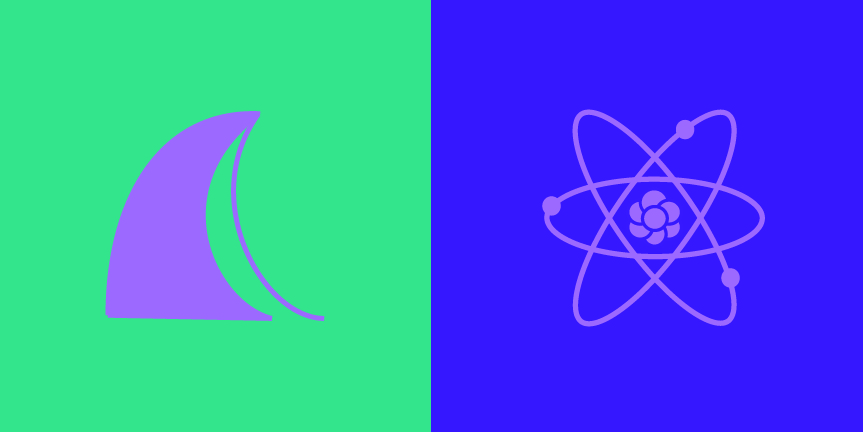
Wave/Atom

For this project me and my partner Mike brainstormed by listing out our traits and basic info about our lives; where we’re from, our families etc. One trait that followed us both was that we were both creative which we defined as a lighter violet color. Based on my traits I was defined as a blue-violet and I chose a light green for Mike. The background of my icon makes the similar color we chose seem even cooler than it is, and the opposite is true with Mike’s icon where green makes the violet appear much brighter and warmer.

Color Interaction Pairings: Phase 1

When I used the Color Interactions application I couldn’t really understand the concepts but after reading the various articles I grasped the basic concept. I observed that a color placed with it’s complement makes the complement of the center color show slightly. I also noticed that working with compliments with the outer colors can make the center color look like a different color entirely.

Color Interaction Pairings: Phase 4

During this project, i’ve truly understood the logic of color and how they interact with each other when standing next to one another. Phase 2 was the phase that helped learn the most in this topic, i’ve always come across those optical illusions where the relativity of color is shown. And now that I got to experience how to make one of those, it helped me learn a lot about color.

https://openlab.citytech.cuny.edu/spevackcomd1100fa2017/2017/12/16/color-interaction-pairings-phase-1-5/

https://openlab.citytech.cuny.edu/spevackcomd1100fa2017/2017/12/07/color-interaction-pairings-phase-2-3/

https://openlab.citytech.cuny.edu/spevackcomd1100fa2017/2017/12/14/color-interaction-pairings-phase-3-5/


« Older posts