Fall 2017 | COMD1100_LC08 | Prof. Spevack

Category: COMD1100 Project #3 (Page 4 of 4)

Value-Added Portraits Phase 3

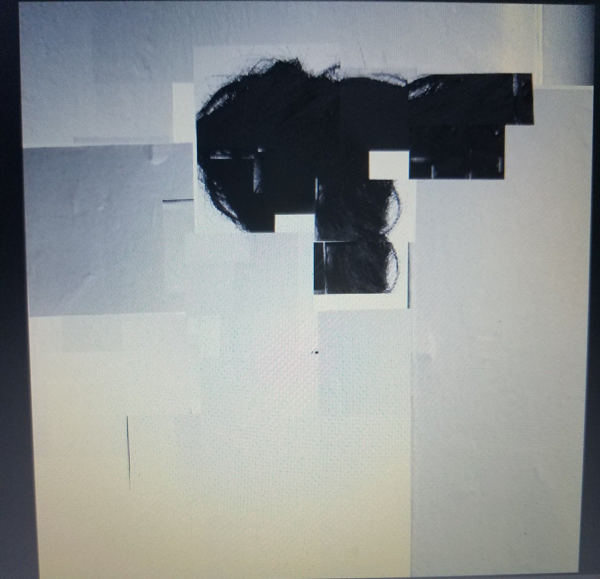
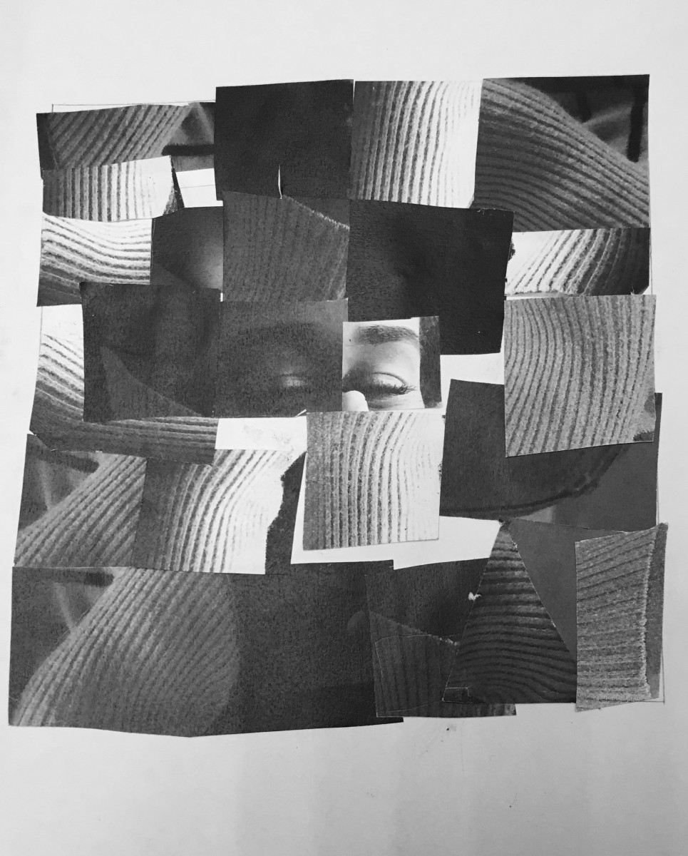
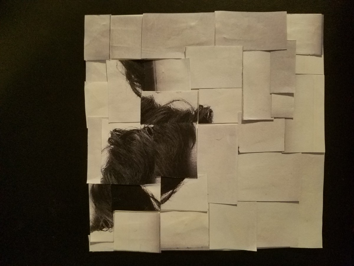
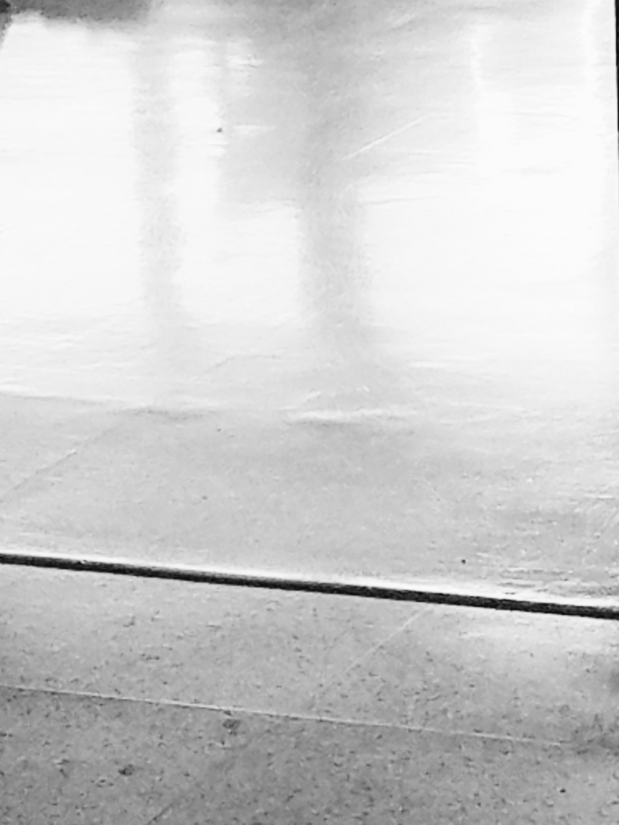
High Key Narrow Range Digital collage

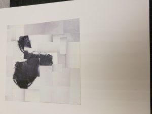
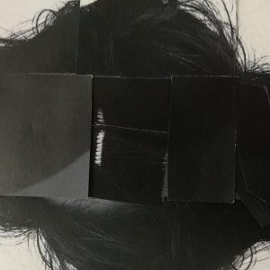
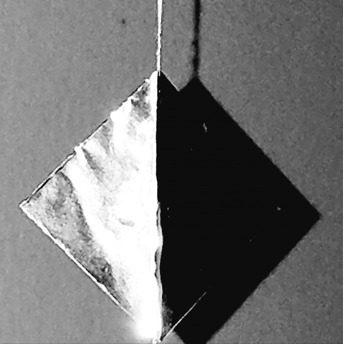
High Key Narrow Range Collage

My first two collages are composed of a predominately high key value range. With a broad grayscale of contrast, there is a  highlight of white around the focal point of hair.  I emphasized with my hair placing it in many different positions and  and created a flow of movement.


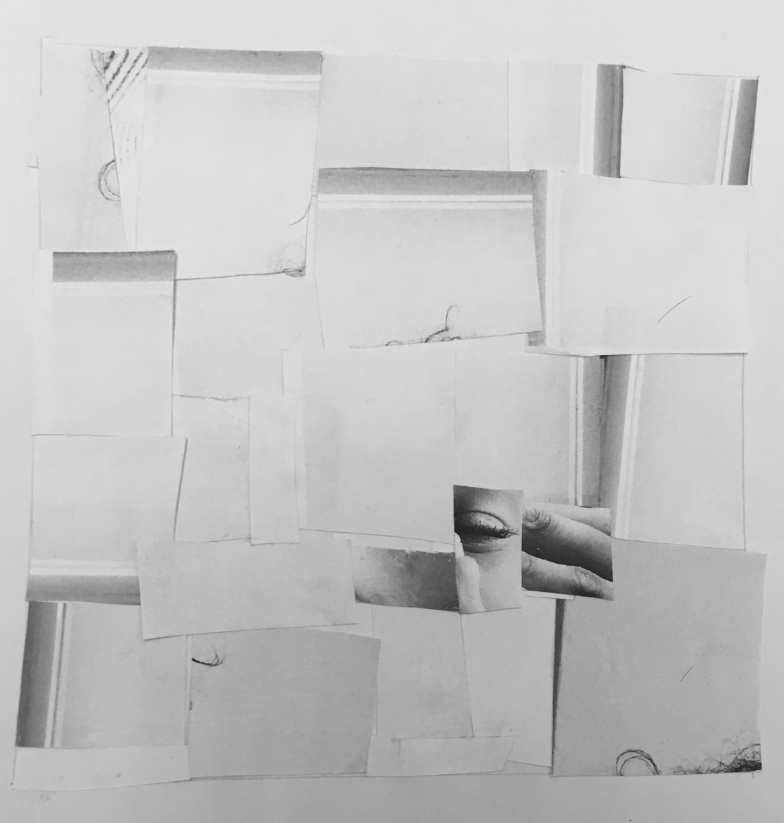
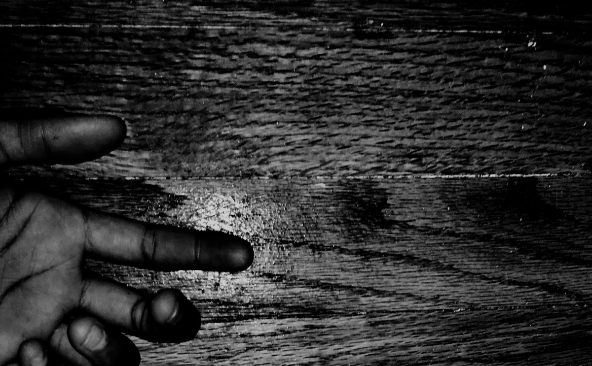
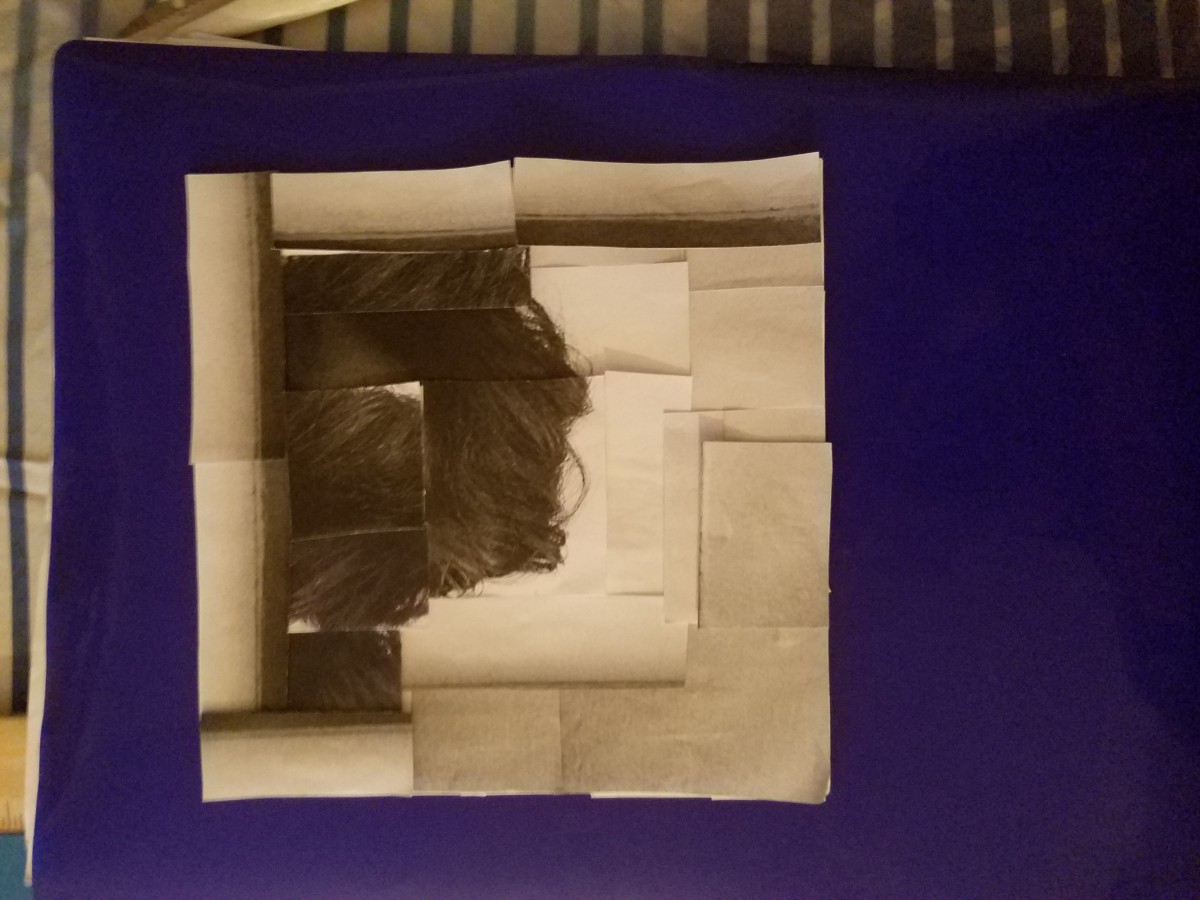
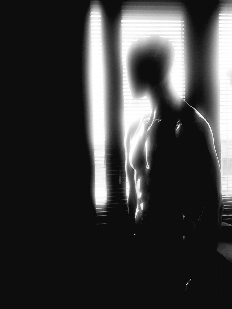
Low Key Broad Range Collage

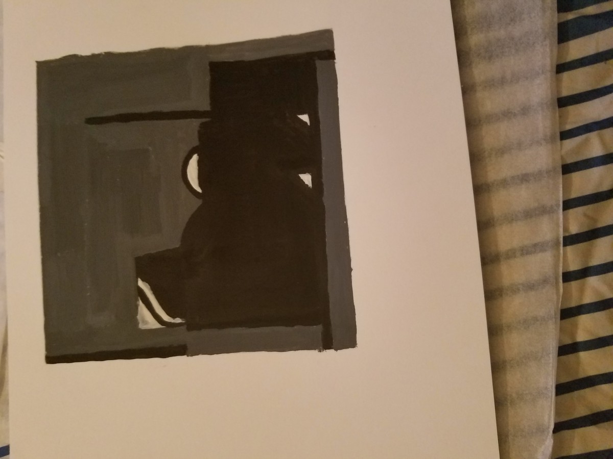
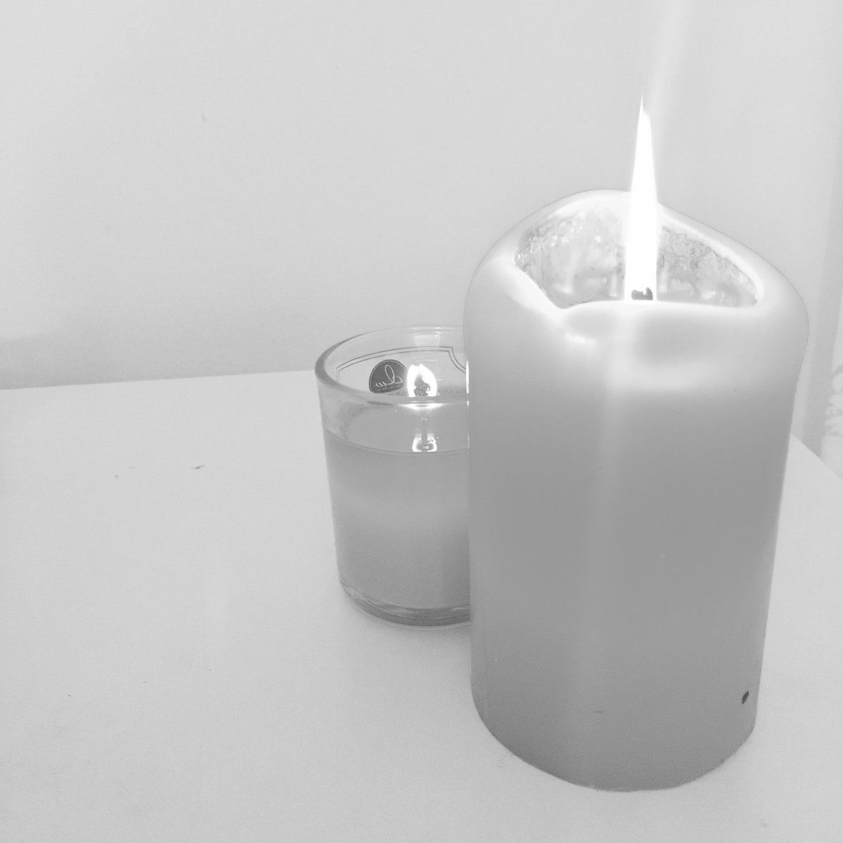
Low Key Broad Range Painting


My second two collages are predominately low key value range. There is a broad range of gray, white and black. My hair was also used to emphasize the dark to lighter areas of the collage. There is various shadows of gray blending into black.


Hours worked on 5

Value-Added Portraits: Phase 1


This photo sets the mood, at the CANDLE lit table, for high-key Campbell’s soup. The highlight and shadow mixture make for the perfect balance of tranquility. And though the focal point may be the front candle, exuding dominance with greater height, not to mention literally outshining the other, less bright candle hiding behind it, I feel the smaller candle is just as significant. Human beings wouldn’t be unable to make certain distinctions without contrast. How would you know that you’re tall, if you’ve never been around anyone shorter than you? If sunlight never existed, we’d all be in darkness…(and i’d sleep 100X more than I already do and fail at life). Contrast is important and I feel having the smaller candle behind the bigger one puts me at peace. Though the front candle may seem intimidating compared to the other, I also get a sense of protection from it. Almost as if it’s guarding or protecting the smaller candle. Now, I may not necessarily rejoice or become super happy when I see this photo at first glance but it does bring me to a calm peaceful place. And if you didn’t already know, it’s one of the best feelings a human being a experience.


The darker image on the other HAND, creates an entirely different recipe for value, with just a few low-KEY ingredients.  The specimen’s hand on the floor, which may or may not be mine, sets a perfect dark tone with a style of tenebrism. And shortly after capturing the photo, I was a bit taken aback by the naturally profound sense of loneliness it conveys. The flash from my camera light was able to unintentionally create a minor, yet essential, shadow and highlight relationship between the object and background. And I found the shadows creeping from under the hand and slightly towards it on the wooden floors really helped to translate an eerie atmosphere. Though, I do regret not shooting this at night so that the photo may have been composed with a much stronger Chiaroscuro. But at the same time, it makes me feel like whomever that hand belonged to could hold out for just a bit longer. Only to realize that this beautiful image, mainly engulfed in darkness, wouldn’t be visible without a little light.


Value-Added Portraits: Phase 2

High Key Narrow Range

My collage is predominantly light making it High Key. I used white an a small amount of gray. Using my hair as a focal point I created movement. The absence of more colors of black, white, and gray creates a achromaic value. Which is a narrow range with most of the collage being light.


Low Key Broad Range

With this collage its more on a grayscale, creating a chromaic value. Low Key an predominately dark, broad range of black, white, and gray. I used my hair for this collage also.  The movement of the hair guides you to the lighter areas, of white and grays.


Hours worked on 1 1/2


Value-Added Portraits: Phase 1

Lowkey Value


My subject is a lamp I have posted on the corner of my room, by the window. The low light of the rainy day clouding the sky made it possible to create this effect. From the light source, on the right side, you can see the formation of the lamp which creates a highlight around the edge of the bulb sockets. The shadow starting to form from the pole of the lamp, makes the third bulb socket almost disappear into the shadow.

Highkey Value


The subject of this piece is the white paper bag. This piece demonstrates a narrow range of highkey value because of the predominantly white piece and background, with slight gray and a darker, close-to black floor. In this piece, you can differentiate the subject from the background from the majority of the highlight directed at the subject itself.

Value Added Portraits: Phase 1


Predominately light

The predominantly light was from the classroom floor across from our class. I saw how the left side of the building, was also giving off great lighting  on the floor.  Creating highlight all across the floor with very light shadows trailing throu.  Once changed to grayscale it became a broad range of light gray achromatic value.  The contrast the brightness of the highlight, is the hierarchy of the smooth detailed floor.  Reminds me of a bright early morning after someone pulls the curtains back.


Predominately dark

The predominantly dark figure is the paper mobile in the back of the classroom. I really liked the geometric shape of a diamond split in two. When I altered the photo, and filtered it to grayscale, it created a narrow range of low key black and gray hues. The left side of the object  has a highlight from the sunlight shining from the window. It also gives off a blurry glare at the bottom. The hightlight makes the shiny triangle the focal point. The right side has a shadow that extends with the object being against a gray wall on a chromaic value. The image is sheek giving off a sense of relaxation.  It’s bright on one side an dark on the other.  It looks like it can be a shield of some sort.

This took me 1  1/2 hrs


Value Added Portraits: Phase 1

  • Low-Key Image
    This is a picture of the mannequin near the back of the room. I chose this image because I knew with the greyscale filter it’d turn into a predominately dark image. The broad range, low-key value of the image sets somewhat of a dramatic tone onto it, almost as if the figure in the image is gazing out of the window. The torso of the mannequin is receiving the most light from the window, and as a result there is a highlight on the left side of the figure. This image consists of both Closed-Value and Open-Value elements, there are areas that are clearly isolated, and there are parts that have somewhat of a hazy effect on them due to the light source. The head of the mannequin is composed of different values which makes the figure less isolated from the light, At the same time, there is also a shadow effect on both the torso and the head of the mannequin due to part of the mannequin blocking out the light. Most of the Shadow/Highlight relationships go from light to dark and have a very broad range. The image is expressed in a dramatic way due to the position of the figure and the lighting.

High-Key Image
This image is much less complex than the last one, but the image is a narrow range, high-key image. The values of this image are predominately white but there are shades of grey that join with the white of the image but are also clearly isolated so there are both open and closed value elements in this image as well. There is no dynamic lighting that makes this photo very interesting, so the tone for this image could be described as bland. The figure also projects a shadow due to the light not being able to reach behind the eraser.

Value-Added Portraits: Phase 1

Low Key Image

This image is set in the middle to show the attention of the item, namely a box of peppermint gum. The large title ICE in the gum is mainly the reason to display the hierarchy of this whole image. It is surrounded with black empty space, creating the value to become darker. The fact that there are rings over the image can also represent that the gum has to do with business, namely if the item sells well or if the demand for gum is high.

High Key Image

This image is displayed in a bright white sky, allowing the value to become lighter and into a high key. The hierarchy is the building, which colors roughly high dark to catch the attention of this image. The way that the colors get darker as the building goes more to the right and down can display how it faces away from the bright sky. It can also give some sight of a shadow of the building.

Newer posts »