Fall 2017 | COMD1100_LC08 | Prof. Spevack

Author: Stan (Page 2 of 3)

Saturation Studies: Phase 4

Overall in this project,  it is quite interesting to learn about different types of colors, especially chromatic gray and muted colors.  It’s kinda sad that I had a lot of busy time I had to do in the previous weeks which is why my muted and prismatic art in Phase 2 has a shorter size collage.  But regardless, I had learned how I can create and experiment with primary and secondary colors and turn them into chromatic grays and muted colors.

Feel free to view my phases below of my progress in Saturation Studies.
Phase 1

Phase 2

Phase 3

Saturation Studies: Phase 3

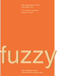
My partner Sage and I were working on a  Swiss Style Band Poster featuring these categories: The Bikini Poster and using the metaphor of warm that uses colors of orange and yellow.  We had  at least 20 different ideas of  band ideas that relate to  our categories. By far, the band name that we used is Fuzzy Suns. In this poster, I applied a similar structure from the Bikini Poster to this with plenty of color and word changes. I use the color orange to represent the metaphor of warm and applied muted orange and chromatic  gray  of orange into our poster  to keep the subject of the band name. Overall, this took us  3 hours to complete this phase.

Saturation Studies: Phase 2

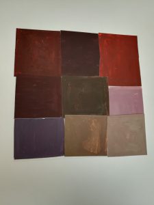
 Chromatic Gray

 Muted

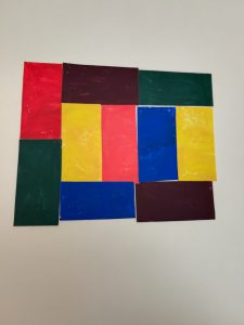
 Prismatic


This was one of the longest phase I made, mainly due to the fact that I  have to mix a ton of colors, especially the chromatic gray colors. Here is the main progress I done:

Chromatic Gray:  I first creating secondary colors like Orange. Then I use my secondary color to be mixed with the primary color, according to their complement from the color wheel. Then I create at least 9 squares and create them into a collage, making a 6×6 collage.

Prismatic: It’s simple, I  just created pure colors in squares. This includes both primary and secondary colors. However, due to the amount of busy time I had, I can only make a  5×5 collage.

Muted: Similar to Prismatic, but I applied some white paint in each pure color.  However, due to the amount of busy time I had, I can only make a  5×5 collage.

This took me 5 hours during my progress in this phase.

Saturation Studies: Phase 1

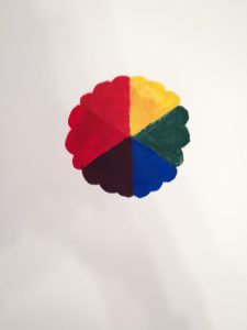
This was a simple color wheel I created. It has been a long time since I ever paint in my lifetime, which is  why certain colors seem to be mixed up or  weird. But overall, I had done my best to make a color wheel that makes sense.


Time done in this phase: 1 1/2 hours.

Proof Exhibition: Field Trip

 #1

 #2

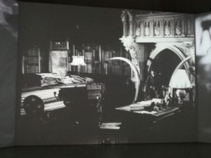
Artwork #1 was made by Franciso De Goya Y Lucientes While Artwork #2 was made by Sergei Eisenstein. In Artwork #1, painting is mainly applied to his drawing while Sergei Eisenstein uses film as a presentation for his work. In my opinion Artwork #1 has a strong contrast between good versus evil while Artwork #2 has an unusual idea with a room being calm while a car crashing in the film as well.

Value-Added Portraits: Phase 4

Overall in this project, I had created some great ideas, especially with a picture of a hairball in my Narrow-Range artwork. However, it kinda looks like Board due to a large amount of white space, but I have to keep it 6×6 which kinda sucks that I can’t zoom it in. As with my board artwork, it kinda went decent, though it’s a disclaimer that I haven’t painted for over 8 years and I’m bad at mixing colors.

Feel free to view my previous phases to see how my project has turned out.

Value-Added Portraits: Phase 3

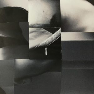
Broad-Range Collage

Broad-Range Painting

For my Broad painting, I tried my best to paint similar to the original (or collage). Overall, it kinda matches well between the collage and the painting I made.

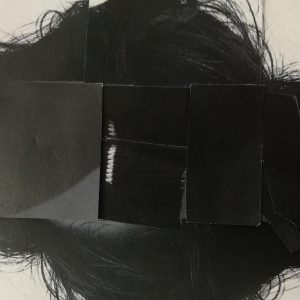
Narrow-Range Digital Collage

Narrow-Range Collage

To be honest, this looks like broad, but due to the fact it has to be 6×6 and that I want to picture it like a hairball, I wanted to zoom it in so that it can turn into a Narrow-Range picture. But I had done this phase for a long time and this is all I got.

This phase took a total of 8 hours to do.

Value-Added Portraits: Phase 1

Low Key Image

This image is set in the middle to show the attention of the item, namely a box of peppermint gum. The large title ICE in the gum is mainly the reason to display the hierarchy of this whole image. It is surrounded with black empty space, creating the value to become darker. The fact that there are rings over the image can also represent that the gum has to do with business, namely if the item sells well or if the demand for gum is high.

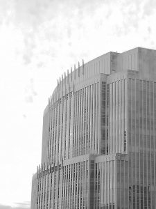
High Key Image

This image is displayed in a bright white sky, allowing the value to become lighter and into a high key. The hierarchy is the building, which colors roughly high dark to catch the attention of this image. The way that the colors get darker as the building goes more to the right and down can display how it faces away from the bright sky. It can also give some sight of a shadow of the building.

« Older posts Newer posts »