Category: Digital Media Foundations

My Small Video Bio

Who am I?

My Name Is Susan Nava. I am Traditional Artist and a Digital Artist beginner as I’m learning how to draw art using Procreate on Ipad. Here I’m Showing my Sketchbook is one of my most Treasured Possession because It expresses my love and passion for Fine Arts or Art Related ever since when I was a little girl. I’m sharing some of my Figure sketches from one of the references on Pinterest. Then there’s one Pokemon Fanart I drew, and a Night Ocean I Colored with Three Copic Sketch Markers to use for Cool and Tranquility colors of a Night Ocean Breeze view as imagery. I am looking forward to studying Communication Design here at New York City College of Technology either to become an Illustrator or an Animator in the Future. I can’t wait to see what it’s like to use advanced Softwares that Graphic Designers use for their Advertising for Billboards, Magazines, Posters, or Creating their Animation on using Advanced Tools for Coloring and the ratio of the Animation. I’m Impressed on my 30-second Video, and I was pretty calm working on this mini Bio Video for a preview of my portfolio.

Thank you and Stay Safe, Everyone!

Biography

Hello, I am Susan Nava, A 25-year-old student majoring in Graphic Design at New York City College of Technology. I’m still researching whether I want to be an Illustrator or an Animator in the Future. I mostly love to draw Fanart, but I also like to learn new techniques, tools, and skills in Drawing and sketching or to try new things related to the Visual Arts and Design Field. In my Spare Time, I love to draw Traditional Art and learn how to draw Digital Art on my IPad. I also love playing video games a lot in my spare time, and I capture my gameplay footage and upload it on my Twitter. At first, I wasn’t sure what major I wanted to study when I first entered my Previous College at Kingsborough Community College. I was trying to get into the Nursing field at first, but I realized that this wasn’t for me, so I completely lost interest. But when I looked at Communication Design information, I discovered that I show more passion for Graphic Design to work on Illustrations or Animations as my future goal rather than becoming a nurse.

I started drawing when I was young when every kid loves to doodle in their spare time. Before a sketchbook, all I could ever illustrate was looseleaf paper with Crayola crayons, colored pencils, or markers. Now that I’m older, I could save money to purchase new art materials such as Bristol, Sketchpad, Marker Paper, fineliners, India ink, brushes, and alcohol-based markers to try out. I would create my character designs.

Making Animation was tricky for my pre-teenage to learn at first timer. Still, I never gave up on it because I remember having fun watching the hilarious old animations I drew on my Nintendo DSi by using Flipnote Studio, watching lots of animated shows/movies, and other animations from Animator Influencers on Youtube as an inspiration. 

Now that I’m enrolled in Communication Design at New York City College of Technology, I will look forward to learning using advanced software like Adobe Photoshop, Illustrator, Animator, or other Softwares Designers to use their techniques to work on their projects like illustration, animation, web designing, photography, etc.

Three years passed, and I was stuck on Typography, Web Design, Illustration, or Animation as my major design interests during the sophomore review. Then I realized Illustration and Animation are what I am passionate about for my future goal for my design career. I hadn’t taken animation courses yet because seats were full when I was registering in August and didn’t get a chance to take an animation course, but I would love to take them next semester in Spring 2023, and so do other illustration courses like the narrative illustration for my portfolio.


Introduction:

JR is a French artist who was born in Paris, France, on February 22, 1983, and started his love and Passion towards Art since the beginning of his teenage years with graffiti art. He took one of his photos of his Subway Graffiti Art as a test from one of the Cameras he founded at a Subway Station. That is where his Perception of Street Art started to change into Photography by working on one of his Projects about the Riots that broke out in Banlieue(A Suburb area in Paris) by printing up large prints of the residents in Banlieue in 2004. He owns the most extensive gallery in the world where he exhibits freely in public streets and works in both art and act of commitment, freedom, identity, and limit in both the staff, visitors, and the rest of folks out there. In 2007, the JR plan to work on the largest illegal project was placing huge portraits bypassing two cities from Palestinian and Israeli, where they have separation walls surrounding them. JR’s works become worldwide and have made it into big cities such as Cartagena, Shanghai, and Los Angeles because of how his works stood out for their culture, history, and memory for a particular location.

The Gun Chronicles:

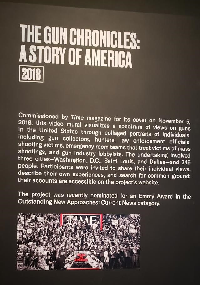
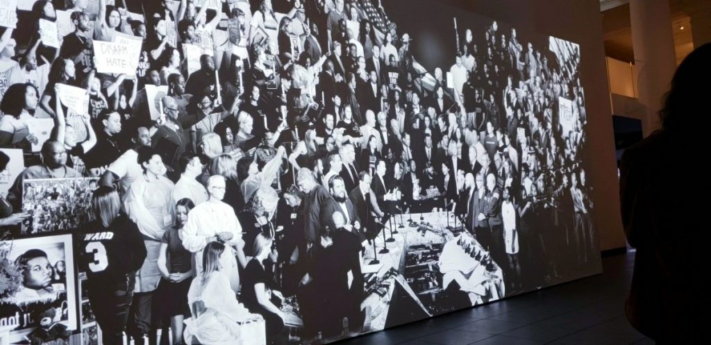
As we enter into the Great Hall on the 1st Floor at Brooklyn Museum Field Trip. The JR Section amuses me of how JR has a strong, passionate love for both the Art and the Social Engagement where people share their valid reasons on why they either agree or disagree on a severe topic JR wanted to talk about, like the Gun Chronicles for an example. This video right here was one of JR’s Projects he commissioned by Time Magazine for its cover on November, 5th 2018, where it visualizes a spectrum of citizens discussing their own opinions about Guns in the United States as one of his serious civil topics. Here we have Shooting Victims, Shooting Victim relatives who lost their loved one from a mass shooting, Emergency Room teams that treat victims of mass shooting events, gun collectors, hunters, law enforcement officials, and gun industry lobbyists, and he discusses one by one on how the Guns affected them on both. JR invites one citizen at a time in his studio, discuss whether Gun laws should be banned or not and then have them make a pose of their arguments and takes a photo of civilians and make a collage for his preview on his main Project by printing photos out and pinning them all together. 

After

The Story behind Google’s Logo Design

Introduction:

Google is an extensive search engine company that it’s known to be one of the world’s most popular search engine to look up some specific topics, cloud computing, advertising, etc. When we take a good closer look at the logo at its appearance, we sometimes have questions about who are the designers of the logo’s typeface? What’s the whole history behind it? Why did they choose these four colors Blue, Red, Yellow, and Green for their font colors? How does Google come up with their various designs of modifications for their logo during holidays or special events? 

Google’s first name:

These two tech designers designed google’s logo, Larry Page and Sergey Brin while studying at Computer Science at Stanford University. They both met at their same Computer Science Course and discussed each other about the beta version’s name of their backlinks project. So it was first called “Backrub” in 1996. The reason the name changed from Backrub! To Google, because it was too large for the university’s servers, and that’s how they come up with a mathematical term as number 1 raised by 100 “Googol.”


Original Design through the Present:

Sergey Bin’s beta design for Backrub was in an alphabetical-like font with some Blue, Yellow, Green, and Red with some visible shadows. Later in 1997, they changed the name and its fonts into a bold spaced-out outline, which didn’t grab an audience’s attention at first, but big companies like Windows 95 and Pepsi were interested in this style of font and a typeface. In 1998, the fonts kept the same palette and the colors too, but this time, the letter G became an upper case, and the colors were dull, and it’s starting to become more popular alongside the LEGO and McDonald’s Logo.

Later in 1999, There aren’t that many differences between the typeface and the font, but the colors were rearranging, and its typeface was in a glossy form, and they predicted that this is their final title they will use it for the future. In 2010, the logo changed its design a little into a better outline that is barely visible from its font.

Until in 2013, you can see the logo changed again as there were no shadows this time, and the outlines removed. The colors of this design became a more smooth effect, and the font style used in Serif. In 2015 – through the present, the font changed into more bold letters with rounded edges with a two-dimensional flatter effect.

Color and Font Size:

They no longer use Serif as a typeface and a font, which that’s interesting to see. They even developed a new logo for a smaller-screen size for mobile devices. Its typeface showed as a sans-serif, and colors morphed together to add an optimistic feeling of the logo. The colors that the Creators Choose weren’t randomly, they choose Blue, Red, Yellow, and Green as an eye-catching, and it would portray the company as simple.

Conclusion:

In the end, Google sure has inspired most of us around the world as it went from their small search webpage into one of the most successful search engines ever to own huge companies such as Youtube for an example. Their design went from a blanded large bold letters into a simplified single-story font. The colors remain the same palette this day, but the pattern changes from Blue, Red, Yellow, Blue, Green, and Red. I was shocked the first time when I found out that they named their search engine after a mathematical term. Now you see Google being advertised right before the video your currently watching on Youtube.

Credit to these sources:

  1. The True Story Behind Google’s First Name: Backrub
  2. Google was Once Named BackRub
  3. Google Logo History | Evologo [Evolution of Logo]
  4. Who Designed the Google Logo? Brandingmag
  5. Meaning Google Logo and Symbol | History, and Evolution
  6. Google Logos throughout History
  7. Google’s Logo Design and History – How It’s Changed over 20 Years.