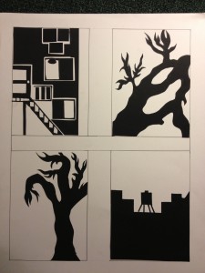
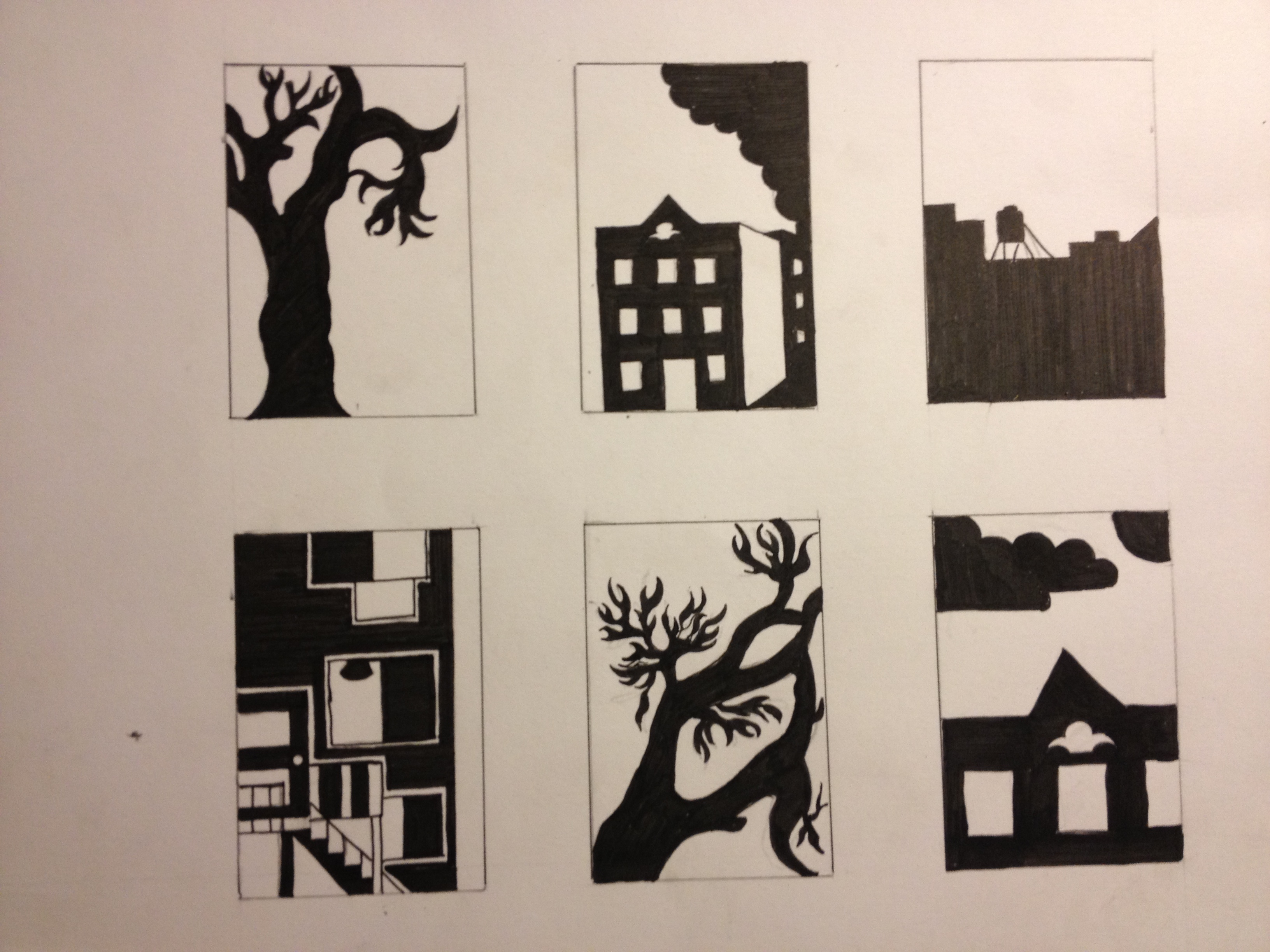
The “View from my window” project was a challenge. I loved this project because it gave me a chance to learn a different side of designs. Using the material that were given, I knew it will be a challenge. Our first step was to sketch 12 thumbnail sketches of views from my window. This was a big problem for me because i didn’t have windows in my room believe it or not. It didn’t stop me from drawing though. I took picture of my roommates’ window’s view then sketched few thumbnails. The second and third two projects were my favorite i admit. The 6 inked- thumbnail on 9 by 12 bristol was a fun project where i was able to express and extend my imagination and still have a unity and economized space and materials that was in use. Last but not least was the 4 thumbnail cut-outs on 18 by 24 bristol which i loved and feared at the same time. I loved it because this was a very refreshing and challenging part and fearful because i had to use the blades. I finished this whole project around 3:30 am, I was not sleepy at all when i started the project and i couldn’t stop until i finished it. I don’t expect a big grade on this project because i had my ups and downs but i could live whatever my professor thinks i deserve.


It looks really good, most thumbnails i see are ambiguous. I like how you cut out the paper and made it perfectly match with the thumbnails.
I like it a lot, it looks really professional, nicely executed and it expresses itself to the viewer in a very straight-forward and reactive way. And I agree with Koch above me, most of the thumbnails I see are ambiguous nowadays.
I really like your work because you can clearly tell which ones are ambiguous and which ones are stable, I also like that were creative and made one of the thumbnails unique. It looks like a room when its actually the side of a building with stairs.
Your View from My Window project was one of my favorites. I love the detail you used on your tree’s. Your ambiguous figure ground piece where you used the stairs and windows, made it very interesting to the eye and successful to the definition of ambiguous, just by the change between black and white. The 6 thumbnails work could have used a few more stable pieces. Overall very successful. Nice Job !!