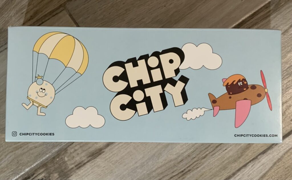
- CHIP CITY (cookies brand)
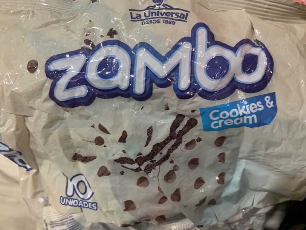
- ZAMBO ( International Cookies)
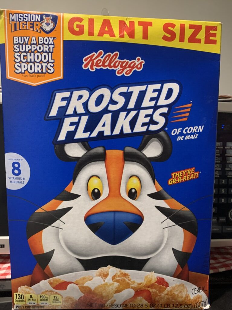
- FROASTED FLAKES ( Cereal Box)
What do you notice about the typography?
The first image is of a brand created from a variety of cookies CHIP CITY, where they use bold … Read More
D.Shanbhag | D037


What do you notice about the typography?
The first image is of a brand created from a variety of cookies CHIP CITY, where they use bold … Read More
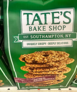
“Brookside” is centered in a serif font, conveying a sense of elegance and tradition. Supporting text such as “DARK CHOCOLATE” and “Pomegranate Flavor” uses smaller fonts, with the latter in red
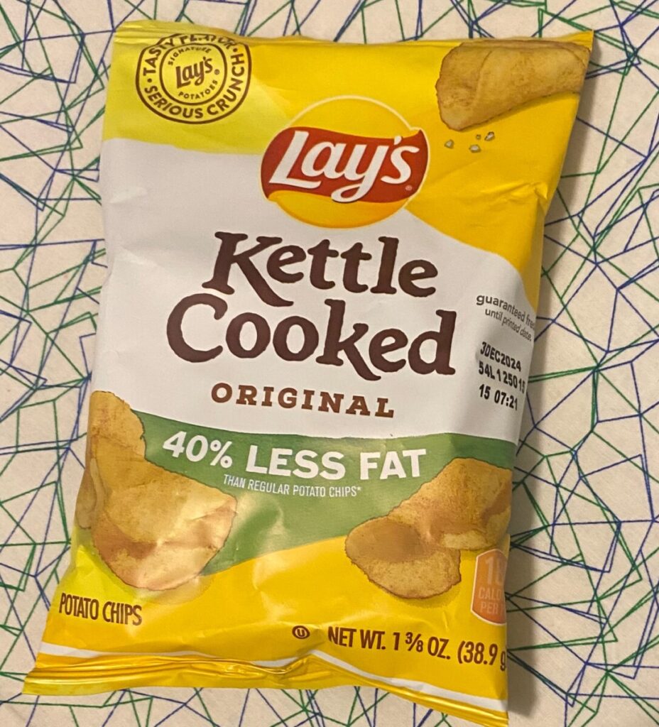
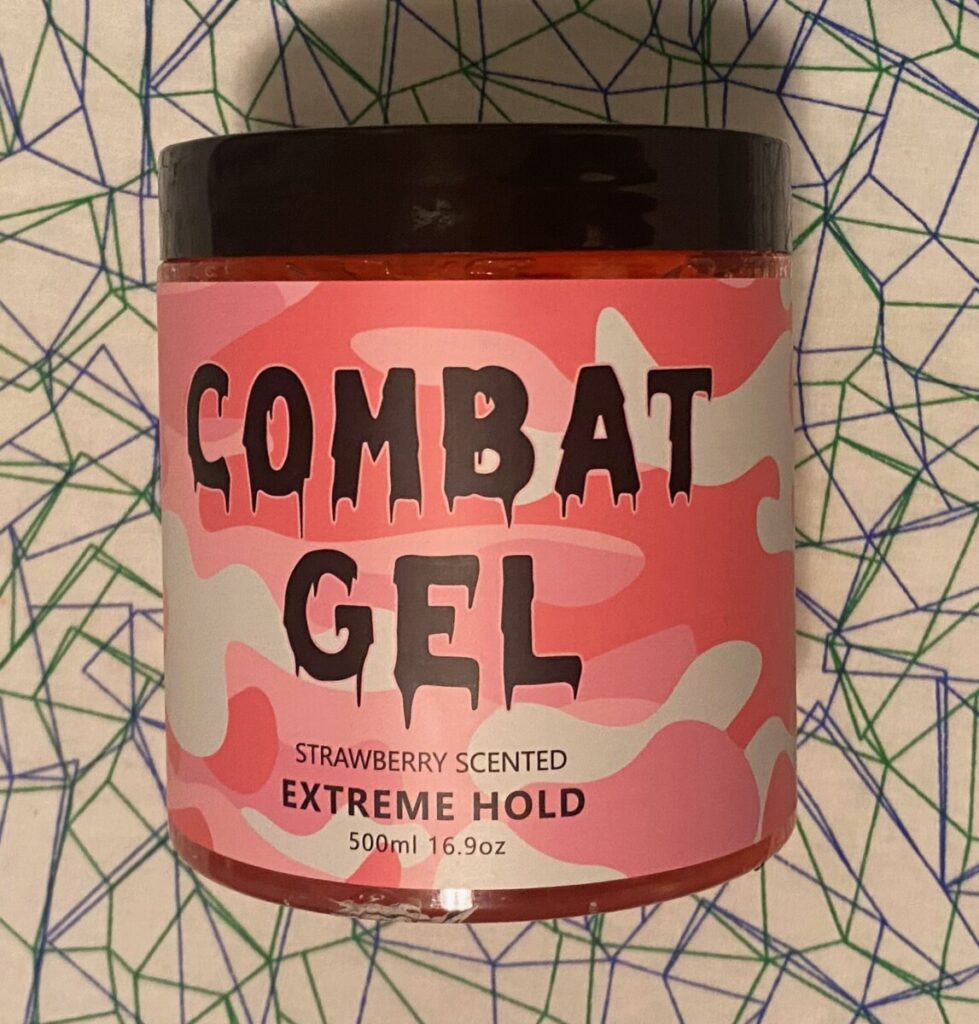
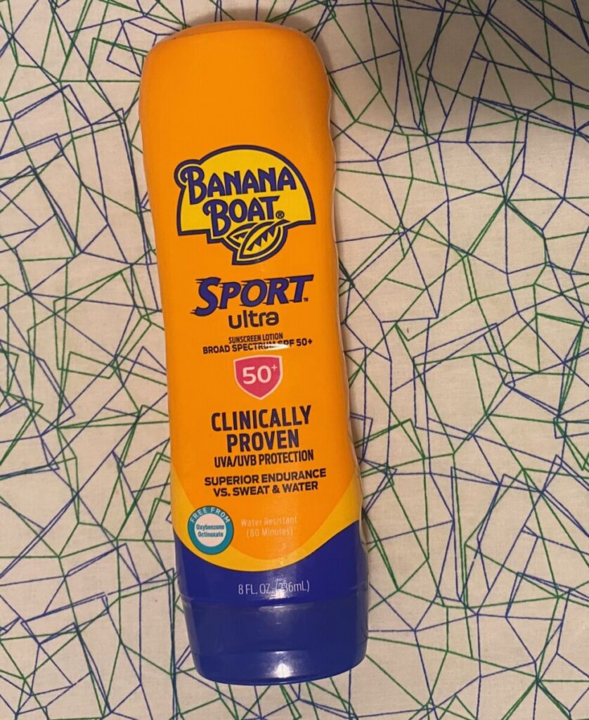
What I noticed about the typeface is that depending on the product it has a san serif type but the chip bag. In the Chip bag it has many different type but what standout is the title with a serif … Read More
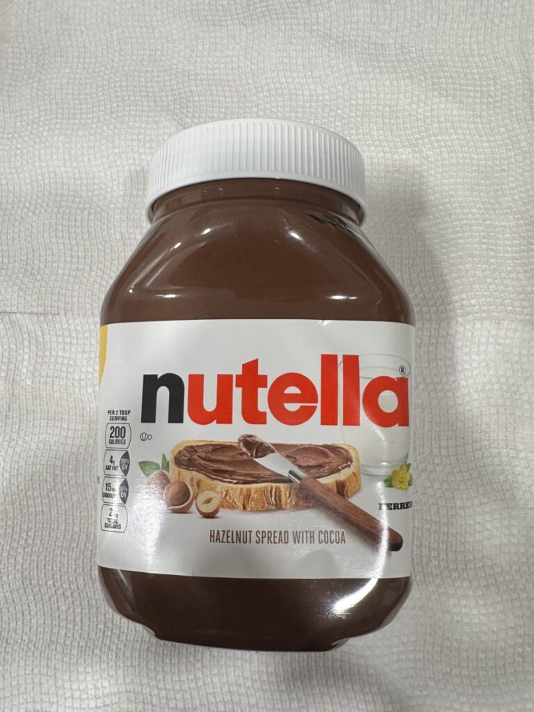
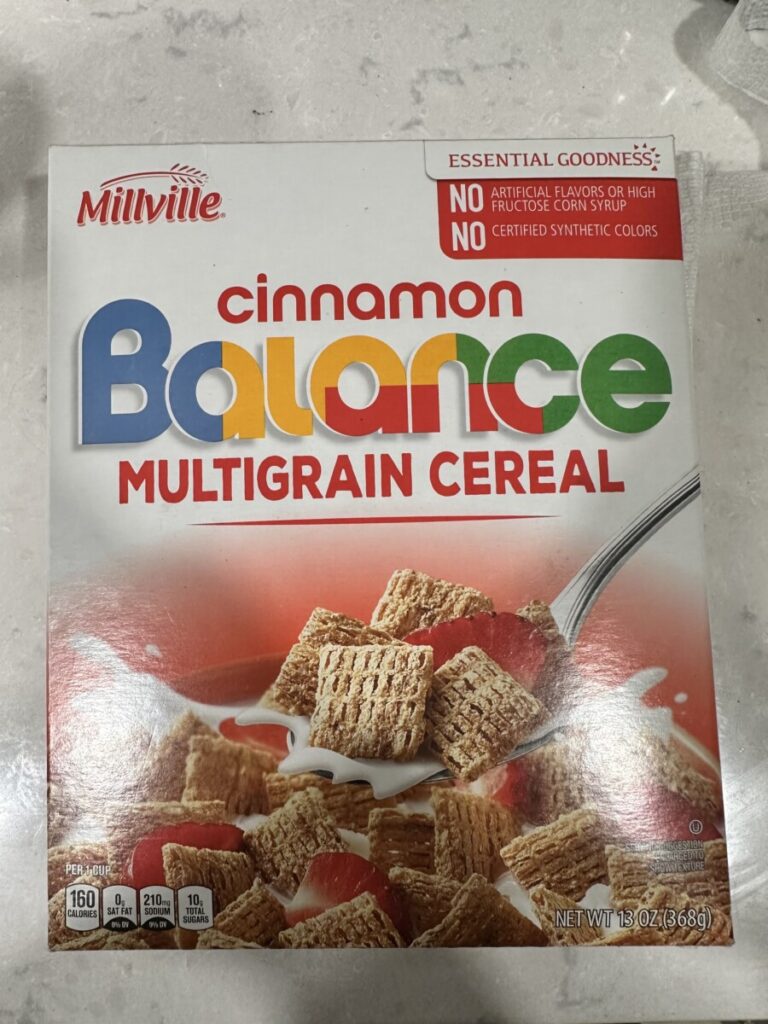
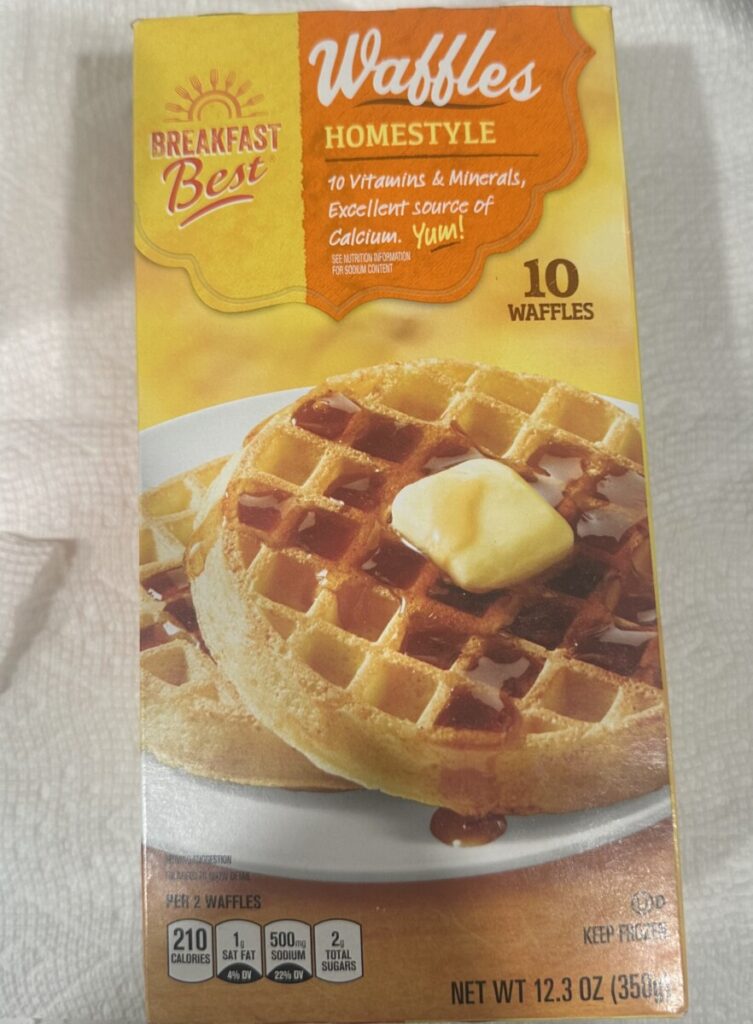
I notice many different qualities about the type in each food packaging. Starting with the Nutella type, it features a bold friendly font. The type used in the Nutella packaging is a sans-serif font. Nutella using a … Read More
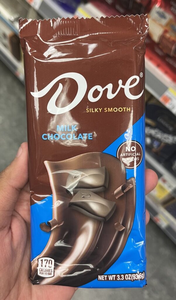
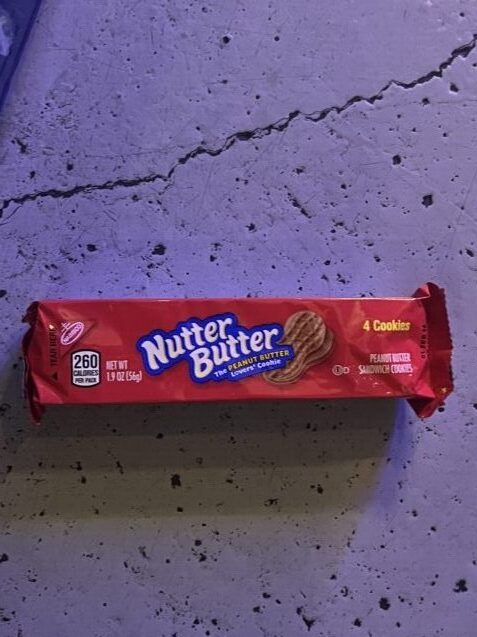

What caught my eye was how these typefaces look so familiar to what i’ve learned so far yet they are also very different. The word “Dove” on the candy bar reminds me of two different classifications. The words “Nutter Butter” … Read More
© 2025 COMD 1127—Type and Media, Fall '24
Theme by Anders Noren — Up ↑