


I notice many different qualities about the type in each food packaging. Starting with the Nutella type, it features a bold friendly font. The type used in the Nutella packaging is a sans-serif font. Nutella using a … Read More
D.Shanbhag | D037


I notice many different qualities about the type in each food packaging. Starting with the Nutella type, it features a bold friendly font. The type used in the Nutella packaging is a sans-serif font. Nutella using a … Read More

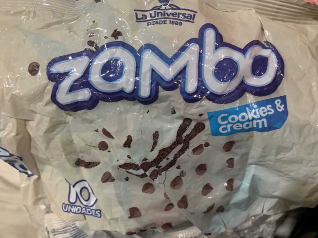

What do you notice about the typography?
The first image is of a brand created from a variety of cookies CHIP CITY, where they use bold … Read More
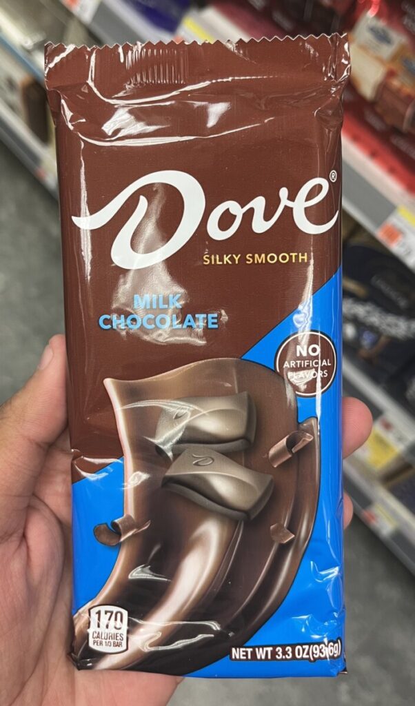
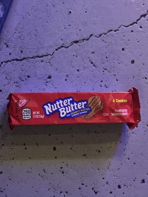

What caught my eye was how these typefaces look so familiar to what i’ve learned so far yet they are also very different. The word “Dove” on the candy bar reminds me of two different classifications. The words “Nutter Butter” … Read More


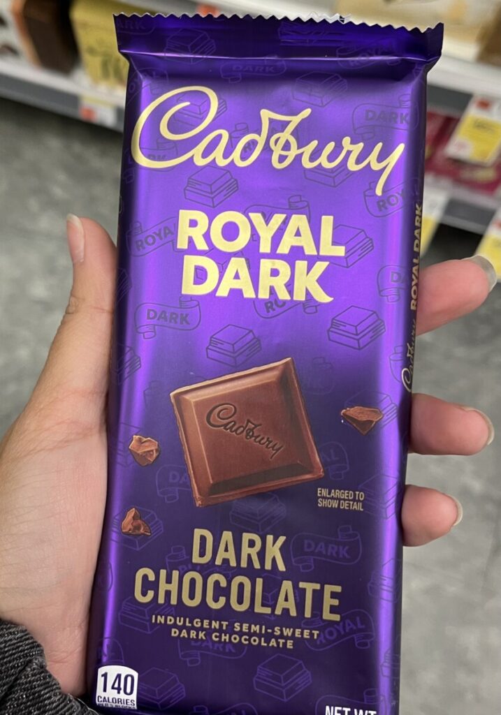
I noticed that for each of these the typeface used for the title of these products are used strategically based on their themes. The cookies use this display font that goes hand and hand with the theme of the packaging, … Read More

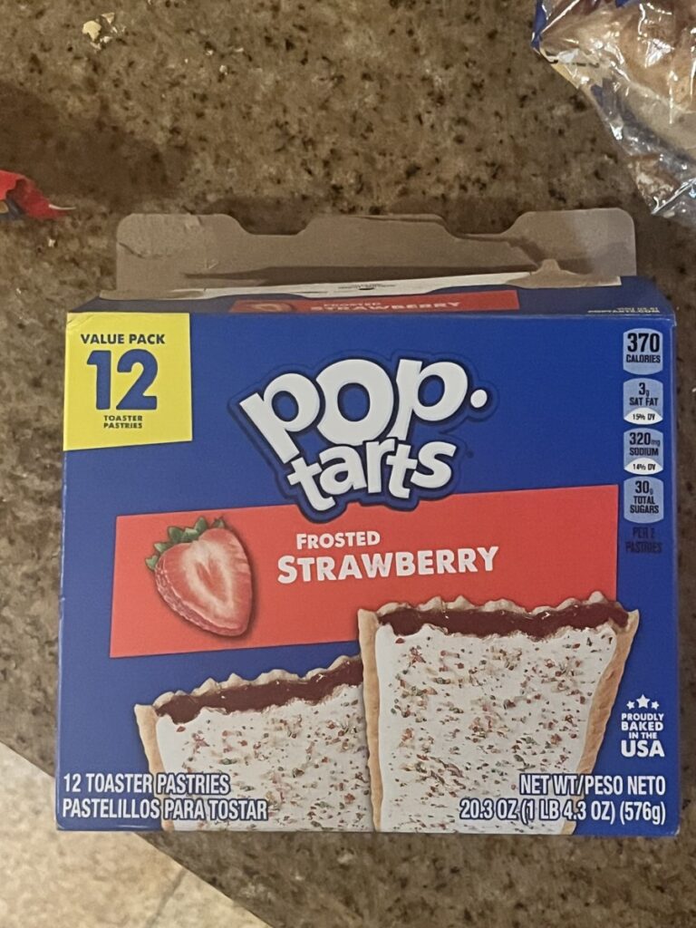

I noticed that sometimes the type face can change on the titles and subtitles on the box/can. Also the size can change to exaggerate the most important parts of the food. The cereal box uses a serif type face while … Read More
© 2024 COMD 1127—Type and Media, Fall '24
Theme by Anders Noren — Up ↑