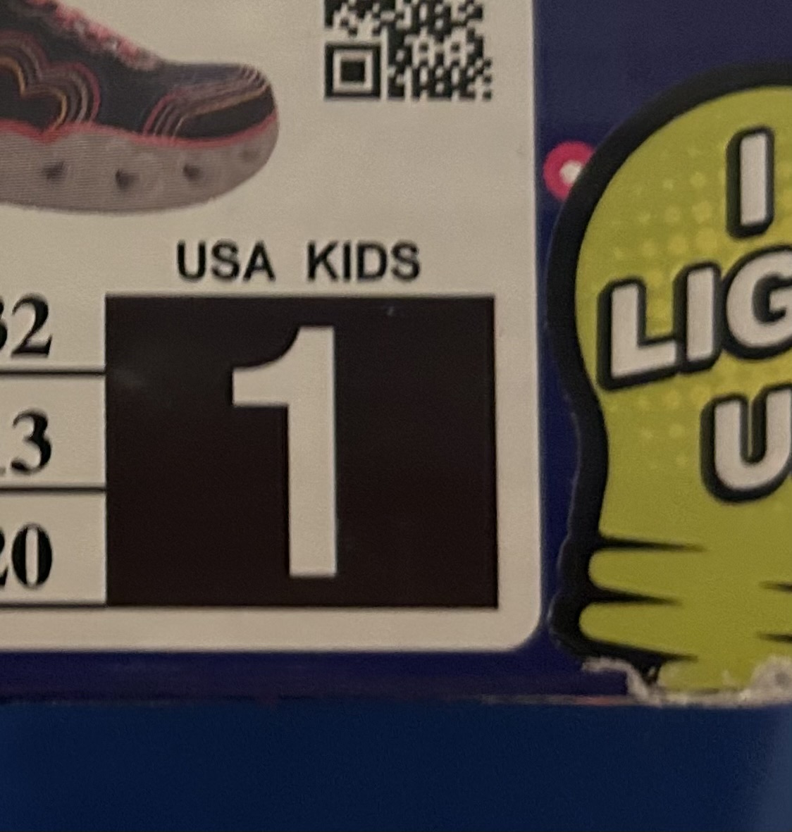
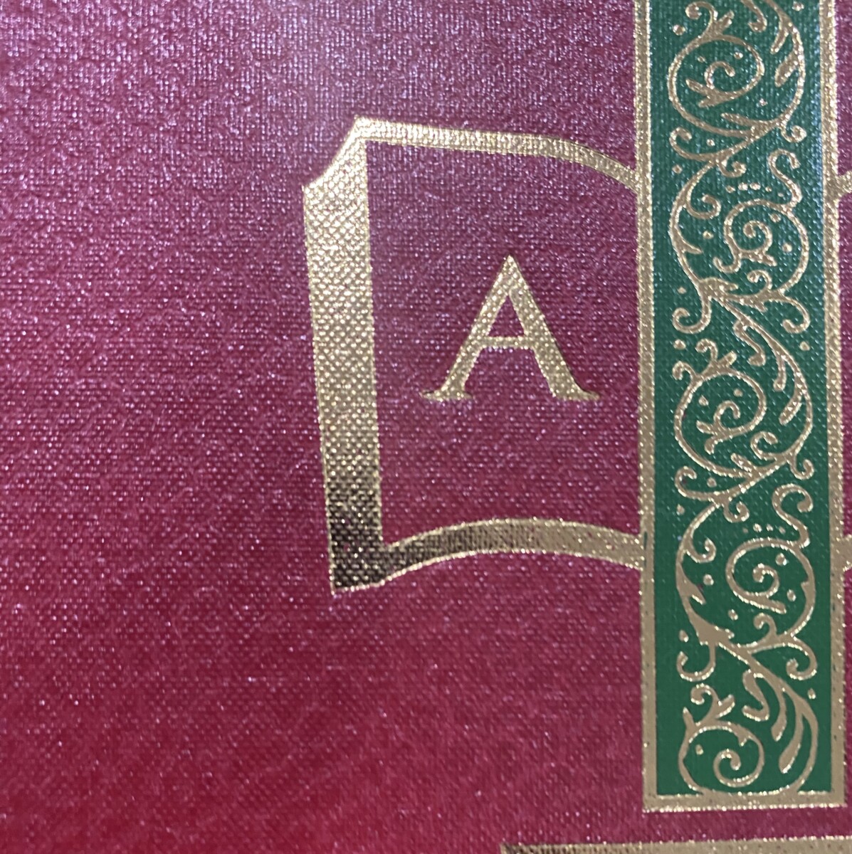
The photo of the number “1” shows me that the pictured number is a sans-serif typeface. The photo of the letter “A” shows me that the pictured letter is a serif typeface.
I think a sans-serif typeface is befitting for the pictured number because, as shown in the photo, the number “1” is used to display information in relation to something involving children or kids. The sans-serif typeface used is simple, clean, and minimalistic which would help both parents and children, the consumers/viewers, to save time when it comes to decision-making, especially businesses or spaces involving children may get hectic and busy. The contrast between the negative space and positive space also helps.
The serif typeface is befitting for the letter “A” shown in the second photo because it seems that the letter is on a book cover. Books usually use serif typefaces as the public has become most accustomed to reading books in serif typefaces. Because of this reason, it is widely believed that serif typefaces are more easily recognizable or “easier-to-read.”
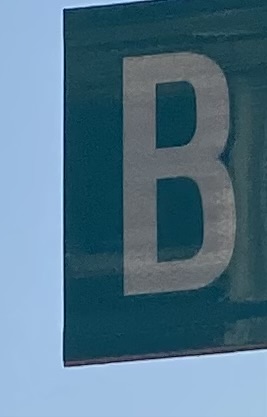
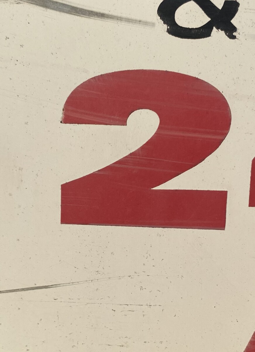
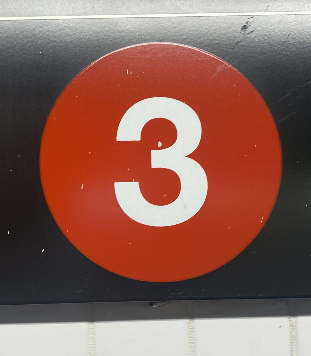
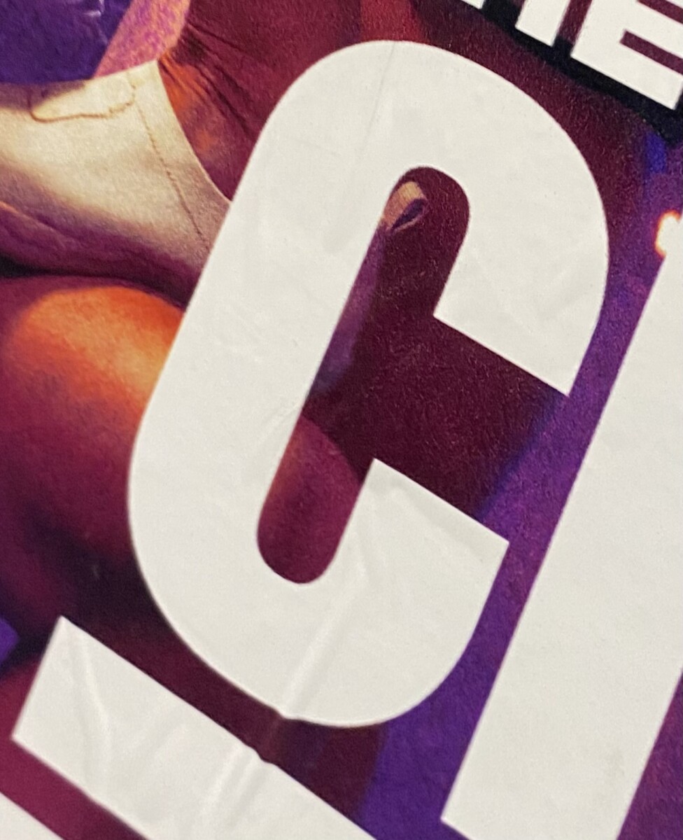
It seems that both letter c and number 3 are san-serif. Number 3 is the classic type you see on the train station signs. The letter c is very thick and bold. It is a very neutral type that could be used in many different things. It works for posters, signs, etc.
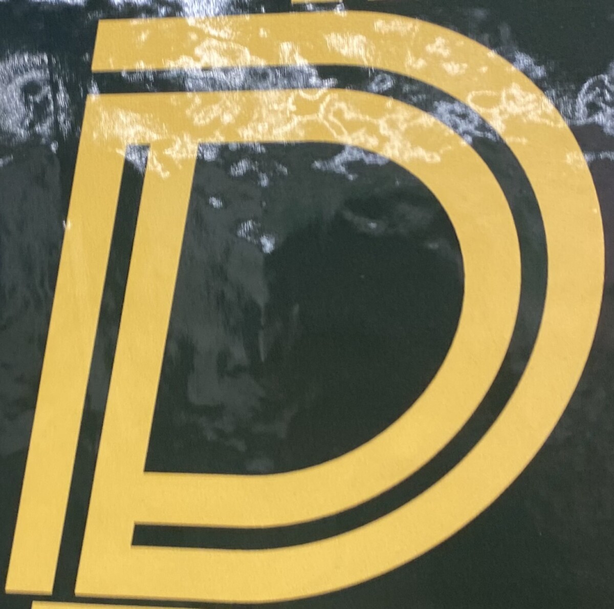
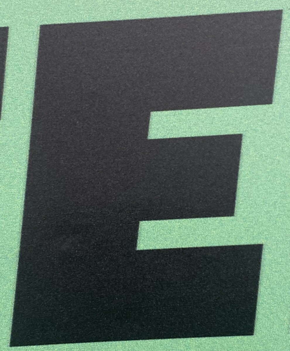
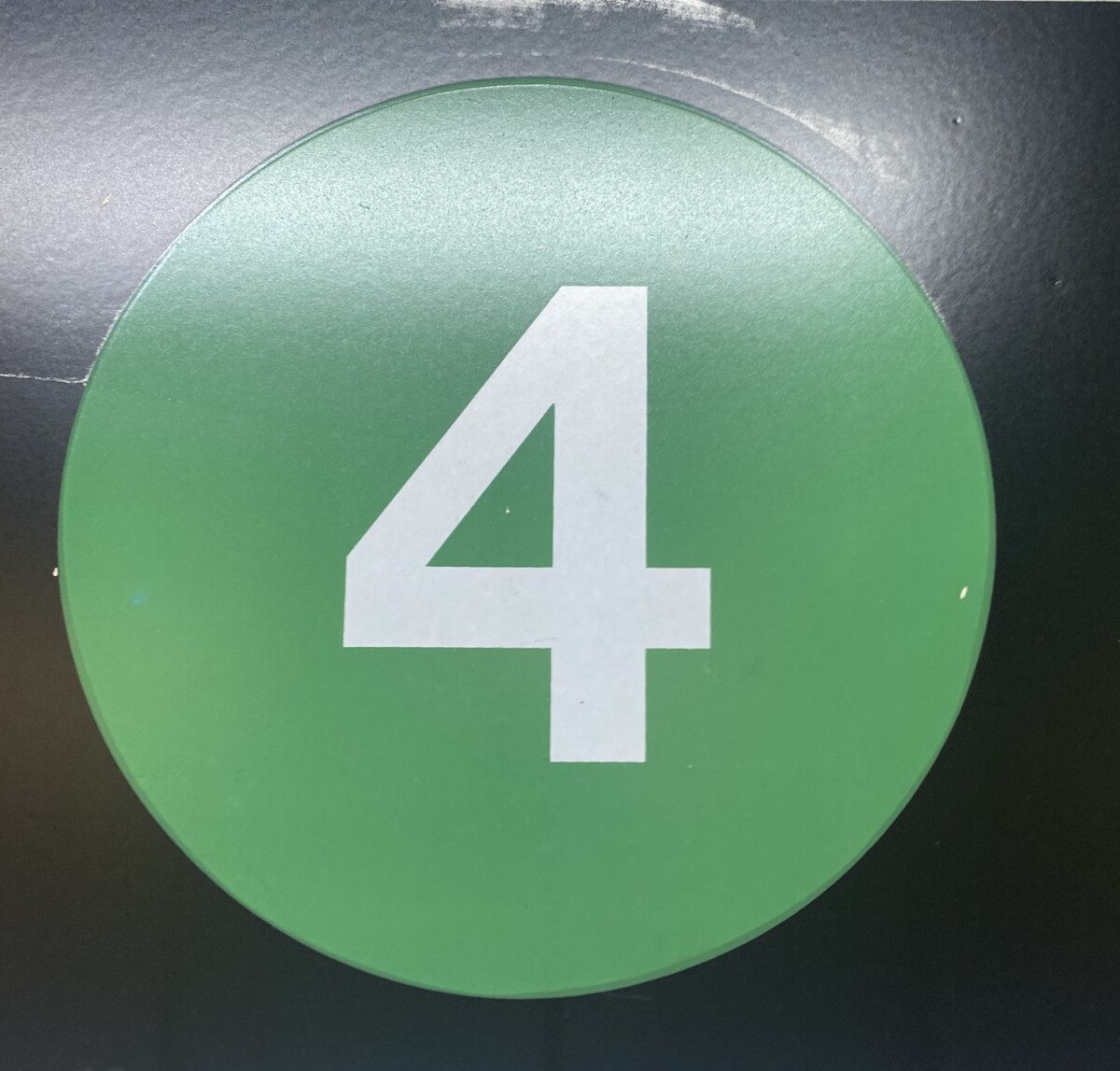
I see that the D and E are both bold sans serif. The D especially sticks out as it also has the design aspect of the strip that is within the letter. Both are good to advertise something. The 4 is very classic and recognizable, you can tell it is from the subway system because of it’s style.


The photo of the number “1” shows me that the pictured number is a sans-serif typeface. The photo of the letter “A” shows me that the pictured letter is a serif typeface.
I think a sans-serif typeface is befitting for the pictured number because, as shown in the photo, the number “1” is used to display information in relation to something involving children or kids. The sans-serif typeface used is simple, clean, and minimalistic which would help both parents and children, the consumers/viewers, to save time when it comes to decision-making, especially businesses or spaces involving children may get hectic and busy. The contrast between the negative space and positive space also helps.
The serif typeface is befitting for the letter “A” shown in the second photo because it seems that the letter is on a book cover. Books usually use serif typefaces as the public has become most accustomed to reading books in serif typefaces. Because of this reason, it is widely believed that serif typefaces are more easily recognizable or “easier-to-read.”
It seems that both letter c and number 3 are san-serif. Number 3 is the classic type you see on the train station signs. The letter c is very thick and bold. It is a very neutral type that could be used in many different things. It works for posters, signs, etc.
I see that the D and E are both bold sans serif. The D especially sticks out as it also has the design aspect of the strip that is within the letter. Both are good to advertise something. The 4 is very classic and recognizable, you can tell it is from the subway system because of it’s style.