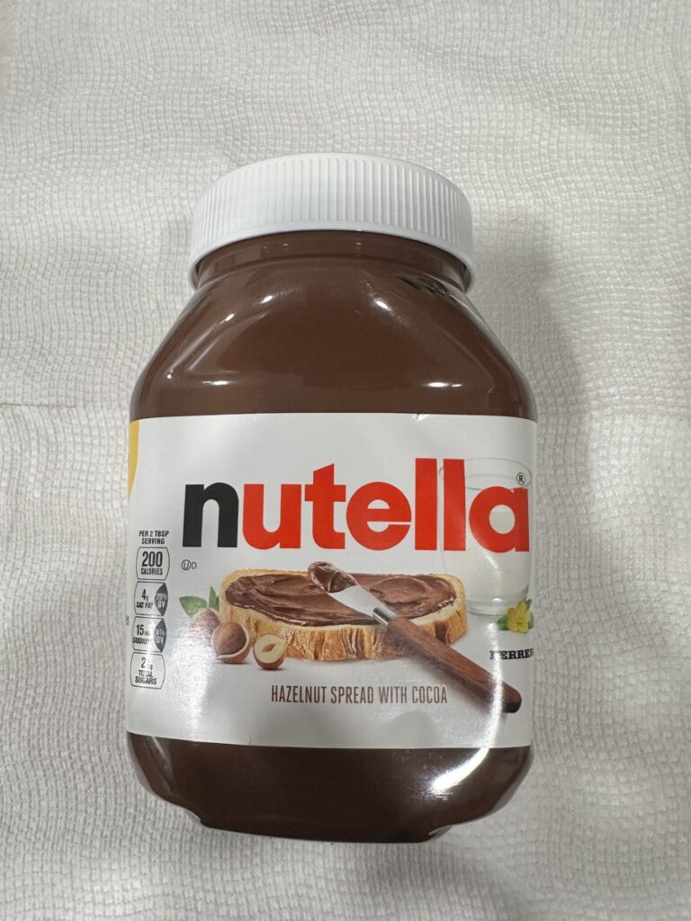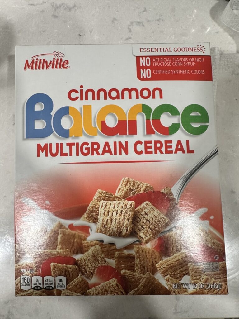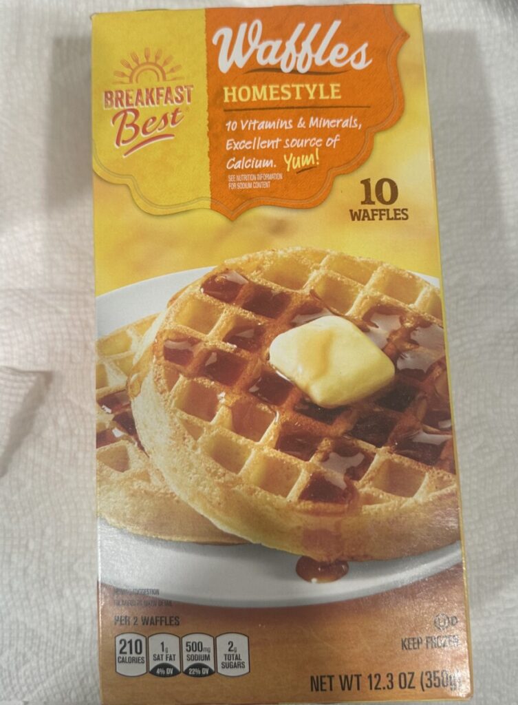


I notice many different qualities about the type in each food packaging. Starting with the Nutella type, it features a bold friendly font. The type used in the Nutella packaging is a sans-serif font. Nutella using a sans-serif font for its packaging gives the spread a clean and modern look. As for the Millville Cinnamon Balance Cereal, it also showcases a clean modern font as well. This font is clear and easy to read and the use of the colors on the packaging brings a sense of indulgence. Finally, as for the Breakfast Best Homestyle Waffles, it uses a script font as its header which allows the box to stand out but not take up too much attention off the photo of the product.
In both the cereal box and the nutella spread, the “Balance” and the “Nutella” are placed upward but centered on the label, both in bold fonts. While on the waffle box, the text is placed at the very top. In all three packages, the nutrition facts surround the header of each label. Finally, all three text arrangements catch the eye of the consumer due to large texts.
With the type of packaging, it differs from what we learned in class so far because we only learned about type usage vs type usage with a marketing standpoint. The type usage in all packages are well thought out and play an important role due to the color usage as well. However, I believe it differs from what we learned in class because all the types in the packages are correlated with a photograph to sell the items. The way the waffles, cereal and spread is shown on the packages also bring that sense of enjoyment. Both the text and photographs in each packaging go hand and hand.


Leave a Reply