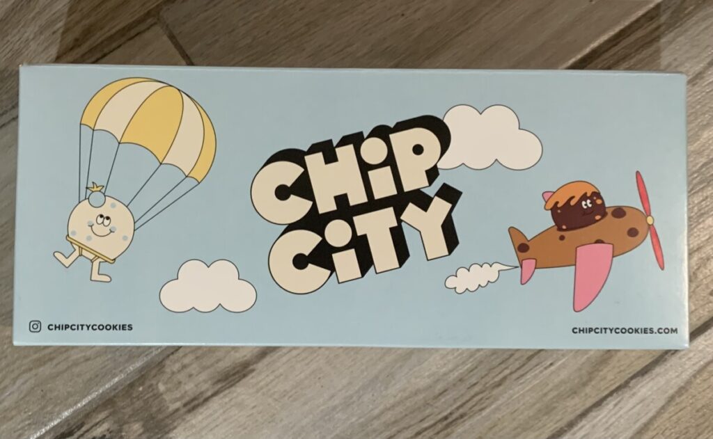


- CHIP CITY (cookies brand)
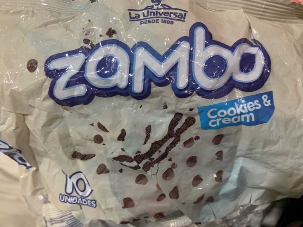
- ZAMBO ( International Cookies)
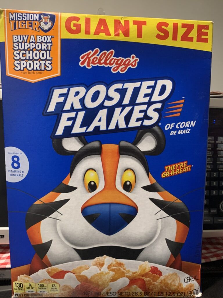
- FROASTED FLAKES ( Cereal Box)
What do you notice about the typography?
The first image is of a brand created from a variety of cookies CHIP CITY, where they use bold sans serif fonts, while the letters show shadows. In addition, the text is placed in the center of the box, creating emphasis on the brand name. A sky is created next to icons and includes the theme: cookies. And in the corners there are some details to find the brand’s stores with a similar typography (bold sans serif) without shadows so that the reader can understand it.
The second image is of a bag of cookies from a Latin brand from my country Ecuador, also sold in countries like Colombia derived from ”LA UNIVERSAL”, whose letters are in the central part but in a smaller text since here the name of the product stands out more: the cookies are called “ZAMBO” whose font is rounded with two colors to emphasize and contrast to draw attention. In addition, the background color of the box is much lighter than the text in the center for the same reason, created with the purpose of highlighting the name of the cookies, the same typography used to specify the quantity of cookies in the box and the detail of the flavor of the cookies.
The third image is of a well-known cereal brand, Kellogg’s, as well as the well-known cereal FROSTED FLAKES, whose letters are Serif Bold to highlight the name of the cereal, being white, that is, a tone opposite to the blue background to contrast and even with the tiger in the background, in addition to the fact that the letters are very straight and of a perfect size to stand out.
How is the typography organized?
- CHIP CITY: Located in the center of the box in an inclined manner adjusted to the size of the box and to stand out along with the shadow of the text.
- ZAMBO: the name of the cookies is centered, with striking colors to contrast between the background and the text.
- FROASTED FLAKES: Located on the top of the box with a lighter color unlike the bottom of the cereal box, whose typography is serif, very straight and simple.
In my opinion it is not very different from what we have done so far, what I can highlight is that the creation of a brand or the visual content of a product is a little more complicated and tedious, where more tools, more applications and programs are needed to create something like this having a theme, which we do not learn in its entirety, we go little by little, for now focusing on typography and different typefaces.


Leave a Reply