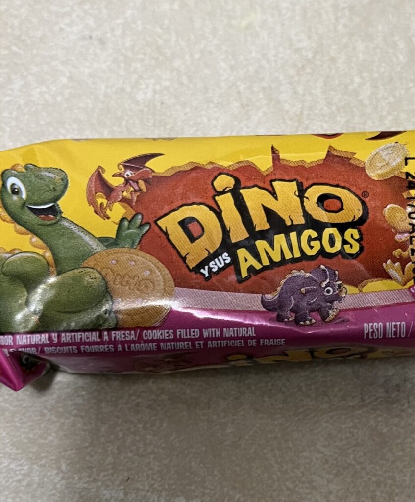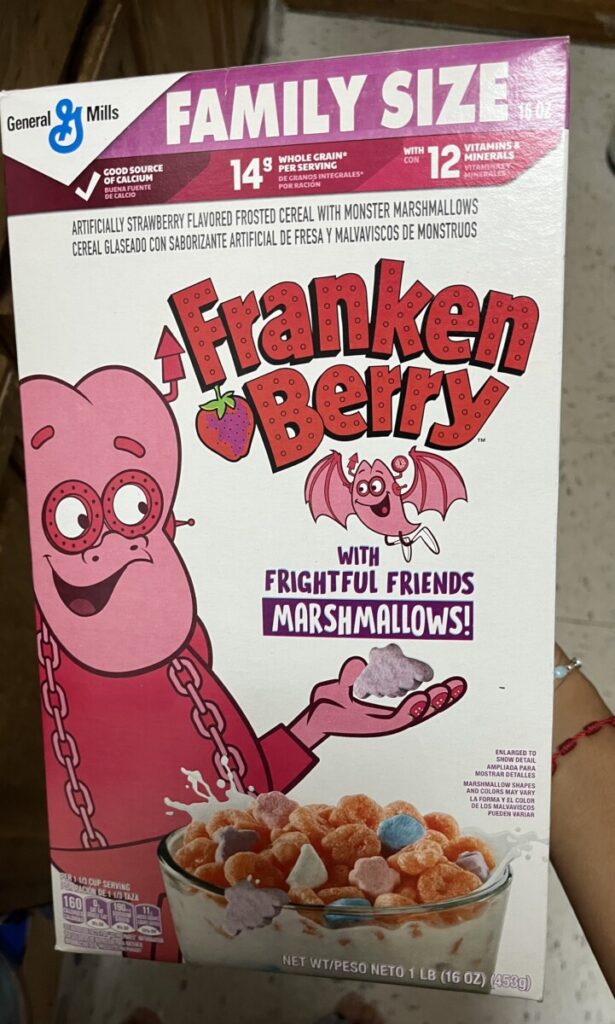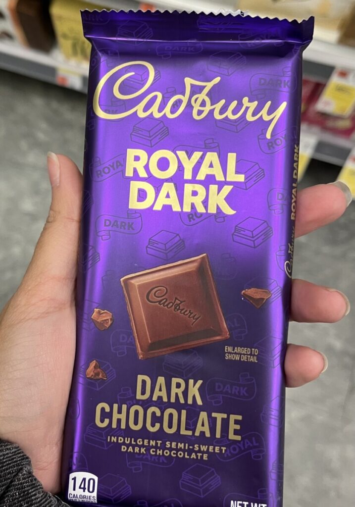


I noticed that for each of these the typeface used for the title of these products are used strategically based on their themes. The cookies use this display font that goes hand and hand with the theme of the packaging, giving it a kid friendly prehistoric dinosaur look. The cereal box uses this display font to relate to the franken stein monster in the packaging and also tell the audience that it is strawberry flavored. The brand name for the candy bar gives a fancy and high quality feel because of its use of script and use of gold lettering alongside its purple background.
The type in the cookies and cereal box are both on a curved path. The curve for the cookies is more apparent to be towards the left. While the cereal box has a more slight curve compared to the cookie packaging and uses kerning to make some letters touch each other such as B and E. The candy bar arranges the type on a straight line across the packaging with even spacing along the connected letters.
The cookie packaging differs for what we have done because it shows how scale can be used on a path, making the words “y sus” smaller than “Amigos”. The cereal box shows how odd kerning can be used successful and on purpose in type. The cady bar is different from anything we’ve done because it shows how connecting letters can also help make an image, like how the d and b are connected to make what looks like a music note.


Leave a Reply