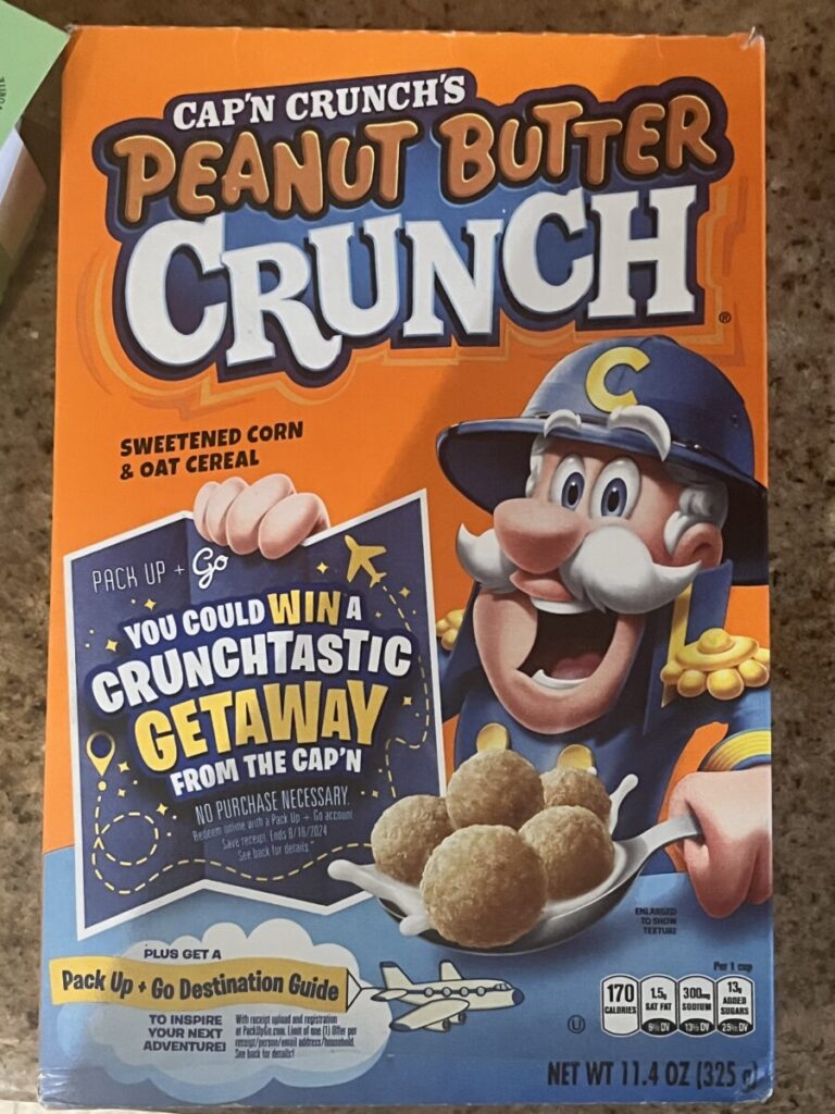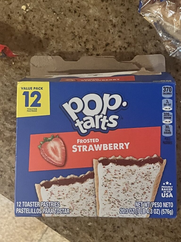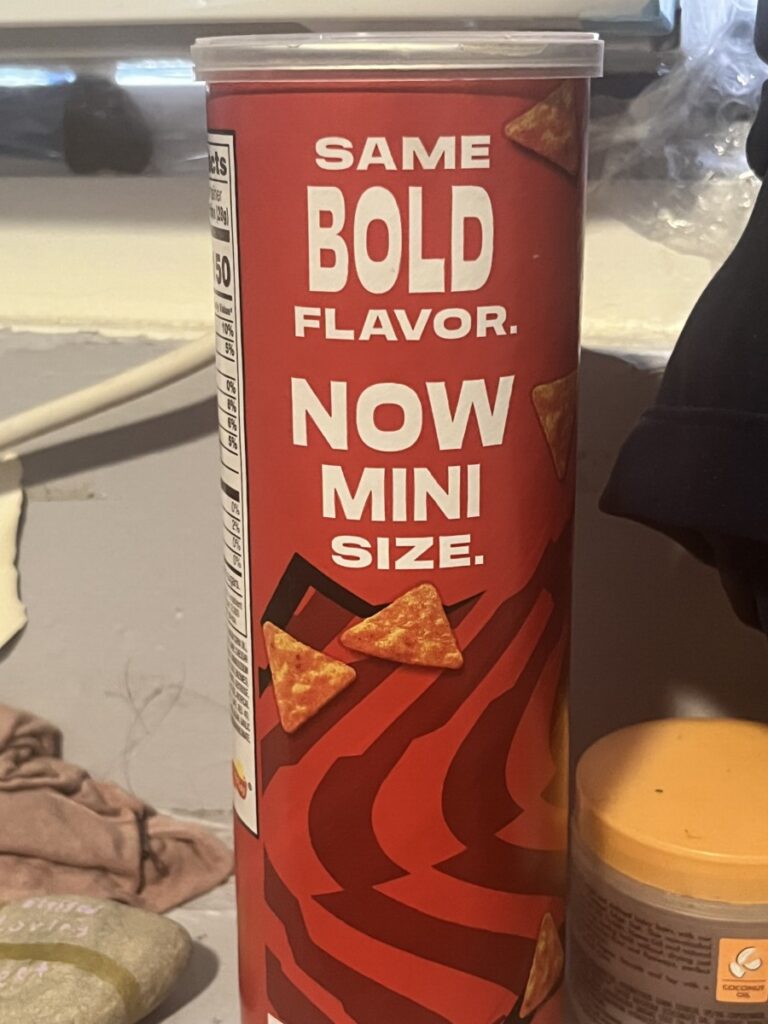


I noticed that sometimes the type face can change on the titles and subtitles on the box/can. Also the size can change to exaggerate the most important parts of the food. The cereal box uses a serif type face while the pop tarts box and doritos can uses a sans serif type face.
The type is arranged vertically. I noticed that on the cereal box, the letters have tight tracking and don’t align with each other horizontally since some letters are shifted up and others are shifted down. On the pop tarts box, the words overlap each other and have a slight tilt.
This is different from what we’ve done so far because they have letters overlapping each other and we usually have words equally touching the x-height.


Leave a Reply