COMD 4900 Week 7 Reading

The readings intrigued me and what I took from them is that I need to be more careful about the work I produce. For about 2 years I have been taking freelance commissions and one service I’m constantly asked to complete by my clients requires photo manipulation. While I use stock photography while given free reign on a design, I have often used photography provided by my clients which they did not own the rights to. I would like to keep myself to a certain level of integrity when working for people to avoid issues in the future. As Amanda Ray states, there are no industry guidelines for designers, but I believe guidelines should be given. Designers should be educated on what they are doing and what they are providing to their clients to avoid hurting themself or their clients. Workers without any level of integrity, in my opinion, just lead to a more problematic business model. This is why the copyright article really spoke to me. The article made me understand that I need to become more familiar with copyright and free use laws in order to deliver the best work. While I was familiar with most of the laws within the article, I believe it’s possible I may have infringed upon rights before by illustrating photos. 


My dilemma is actually quite similar to the Fairey Hope poster. In the case of Fairey’s hope poster, I think his poster should fall under fair use laws. I could understand getting in trouble for using someone’s likeness, for example if Obama were to directly create a legal issue with Fairey, however I think simply using a pose from a picture should be protected. Fairey clearly did not trace the photo and changed essentially every aspect of the photo. The hope poster contains different coloring, typography and graphic elements. I think the settlement is ultimately fair as both parties have been credited and make profit, but I’d argue that if a designer manipulates a photo skillfully enough, they should receive the lion share of the split profits.

COMD 4900 Networking Event 1

For my networking event I attended a meeting by creative mornings on October 1st with the theme “dare yourself.” The event kicked off in a very lively manner, first greeting all the guests and with a music performance. After the performance we we’re allowed to communicate with the musician, Ana Barajas. Moving forward the speakers teamed up with a coffee company to deliver breakfast to a viewer and recorded the live reaction. From here the event started with a speech on being daring with your work  and everyone was prompted to speak with another viewer in a breakout room about one of our weaknesses in design. It was nice to interact with others and give my opinion as well as hear similar struggles other designers keep to themselves. When we got back to the main room we discussed our various passions and if we still incorporate them into our work among other things. What I took from the event was that you should always try to remain passionate and pick yourself up when you become stuck rather than stay that way.

COMD 4900 Internship blog 11

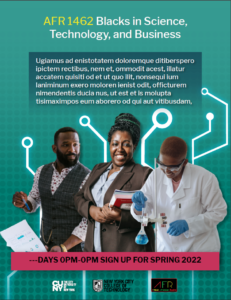
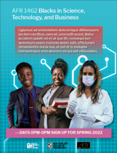
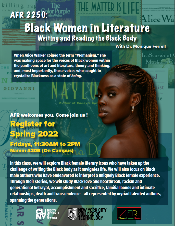
Over this week I completed the flyer with Dr. Ferdinand luckily only took a few email exchanges and one revision. For my original draft I included two different versions of a similar layout because I was confident the client would be satisfied and luckily I turned out to be correct.

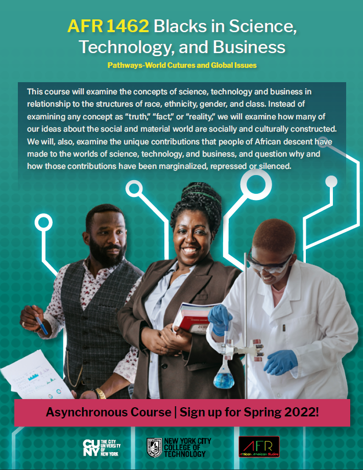
The different layouts contained different color schemes and pictures. I unfortunately had to cut most of the images I picked out originally from being put into the design as they were not energetic enough. Ultimately, me, the client, and my supervisor agreed on the first layout being the strongest so I made a simple revision by adding a description of the class as it was not provided to me originally. After handing the flyer in I was asked for feedback in our weekly meeting and I was critiqued for the sizing of the images. I agreed with the critique and changed it for my portfolio. Another critique I was given is that I should use the white logo for city tech based on the background color so I will also be making that change.


COMD 4900 Internship blog 10

This week I worked on developing another flyer for the African department of citytech working with Dr. Ferdinand. The flyer is for AFR 1462 Blacks in Science, Technology, and Business. The brief I was given was simply to make another promotional flyer akin to my prior work with the client except by collecting images of black scientists, technologists and professionals.

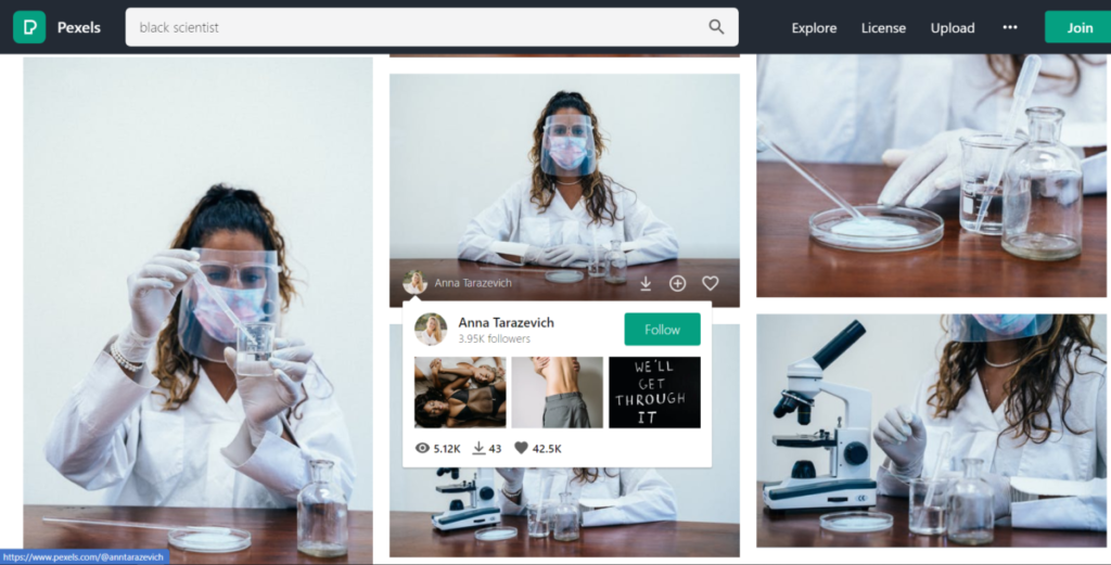
Since everything at Faculty Commons represents the college as a whole, it of course, as with any design job, is problematic to simply steal photos. To avoid this, I used Pexels.com which is my go to for free stock photography. Unfortunately it is hard to find any truly free stock photo sites so I always use this one when I can. With this being the only site I use for free stock photos I often hit walls searching for very specific photos This can sometimes lead to a long process of searching and then locking in on different search keywords to find exactly what I am looking for.

All in all I only  managed to find about 10 photos which matched my specifications on top of having a good angle to design for. I then imported the photos into Photoshop to make the backgrounds transparent for each image to start my design process in Indesign.

Below I attached some cutouts I created as well as a look at Pexels.

COMD 4900 Internship blog 9

Following up from last week I revised the black women in literature flyer. For the revision I had to readmit text from the client into the design as I changed the initial text heavy class description. To fix this issue I worked on the leading and font extensively as well as the hierarchy. Additionally I had to search for more stock photos as the clients did not like the original one I had for the design. After two revisions the clients were very pleased with the result. I ended up giving them two versions of the final design as they never specified which stock photo they preferred when I revised the original.

COMD 4900 Internship blog 8

After the meeting from last week I worked on deliverable 1, which was the black women in literature flyer. I created four drafts for the clients(Normally my internship limits us to three drafts per revision, but I promised to digitize the clients thumbnail.) While designing I ended up liking three of the designs so I received feedback from my colleagues and they determined the second draft was the most popular among them. The client however, decided on the first layout which was fine to me as I felt the drafts were similar. Rather than following their initial template for the design that listed the books, I instead created a background collage of the reading material and then placed filters and opaque colors on top as I felt it was more visually pleasing. 

The drafts can be viewed below.

AFR2250-D

COMD 4900 Internship blog 7

This week saw me meeting with two Doctors from the African department of the college for a discussion about two deliverables.

Deliverable 1- A flyer promoting the black women in literature class. The idea for this flyer was to get an image of a black woman with dreadlocks looking fiercely at the viewer to portray seriousness while including a collection of the reading material in the background. This project was given high priority seeing as spring enrollment starts soon. 

Deliverable 2- A website banner for the African department site which contains a collage of professors and historical black figures. The idea for this one is that by hovering over or clicking each individual you can receive background information on them. This project was given a loose deadline so for now I am simply going to explore what I can do and if I will have to incorporate web design.

For deliverable 1 I was given a pre designed thumbnail from the clients and I informed them that I will try my best to keep the same thought process in my design.


Clients Thumbnail:

The circles represent where the photos of the reading material should appear. Image preview

COMD 4900 Internship blog 6

In addition to brainstorming to rebrand the college’s social media, the Faculty Commons Design Team is now thinking about whether we should brand ourselves. We are considering a campaign where we make improvements behind the scenes and advertise what we have done more heavily. We are currently considering how to brand ourselves differently on our own site alongside the school’s social media. We are considering highlighting each designer separately and changes we have made to help the college which will promote our own portfolios and professional social media. One interesting idea a teammate had in our weekly zoom meeting was that we could each design a meet the artist post. Luckily I have one handy that I drew last semester as a class project.
Though we would need to make more professional versions, I think it would be a good idea to make these. I feel that including these alongside our portfolio to introduce ourselves may help potential clients to request specific designers on our team whose work and design style align with their vision when requesting a project. I also think it could engage students to look into applying with us or become inspired by the work of their classmates. We will discuss this issue further in individual meetings. This week we were also all tasked with adding social media components to our current client projects. I am awaiting my next two projects, but currently I am working on the faculty publication support program which helps faculty to publish their writing. By looking at schools’ social media, I have learned that people generally interact more with real life photos than design or illustration. Due to this I thought it would be good to perhaps take a photo of someone who has used the program alongside a confession in the instagram description. Another idea I considered was having a step by step of how the publication process works across 5 Instagram slides. That or making a tutorial video as to how the process works. To accompany the brainstorming I made a very simple thumbnail of how a basic post would be displayed.

COMD 4900 Internship blog 5

Unlike my usual semesters, I haven’t worked with many clients on my own yet. Rather than an individual project, we are working on brainstorming to improve the college’s social media representation as a team. We are currently mostly focused on Instagram and I have made a few discoveries by looking over other colleges social media as well as ours. Highlights- Instagram story highlights could benefit our social media by including urgent news without having to scroll through tons of photos on the page. Visibility- Visually, the schools social media uses too much blue which is the schools color. I believe many designers are prone to representing the school in designs, but due to this thought different posts lose their identity and become visually boring and confusing. They get lost and seen as unimportant amongst similarly designed posts. Student Engagement- We could potentially increase student engagement by highlighting the achievements of current students or alumni in story posts. The pearl building tv’s which used to advertise student designers inspired me to think like this. Aside from this brainstorming, I do have one project where I am working on an OpenLab site for the faculty publication support program. It is a program that helps the school’s faculty to publish their writing officially. I have been working on this project for two semesters now, due to many changes in vision and time constraints even though it is just a logo. Essentially now I am just changing the current website’s theme as it does not allow logos. I prototyped a few different website themes to see how well the primitive version of the logo will look.

COMD 4900 Internship blog 4

I spent this week working on the banner for the Faculty Commons Monthly banner. This is used as promotional artwork for Faculty Commons monthly newsletter. We are currently working on creating monthly art for the newsletter to create interest for the readers. Though I am not the project lead for these monthly designs I worked on it because the team member assigned to it is not with us for the semester yet. She already created a design for the month in advance, but we received a complaint citing representation issues within the design. I was tasked with resolving the representation issue. For reference here is her original design:
I met with the original designer and we discussed our thoughts on the matter. We both figured that the representation was a tricky topic to deal with and that in its current form, the design didn’t particularly have a problem as the characters had no skin color and a variation of hairstyles. Despite this, I did see that there was the opportunity to add more characters for representation and fix some hairstyles. Additionally, I figured even though some of the characters’ hairstyles were used by many races, they looked like they could be wrongly perceived to represent caucasians in specific as the models were colored white with mostly straight hair. Due to this I decided to also change the skin colors, but since I did not want them to be too representative of race (which would likely cause another complaint) I instead gave the characters inhuman skin colors.
Ultimately, the change was liked and has gone live at this point.