
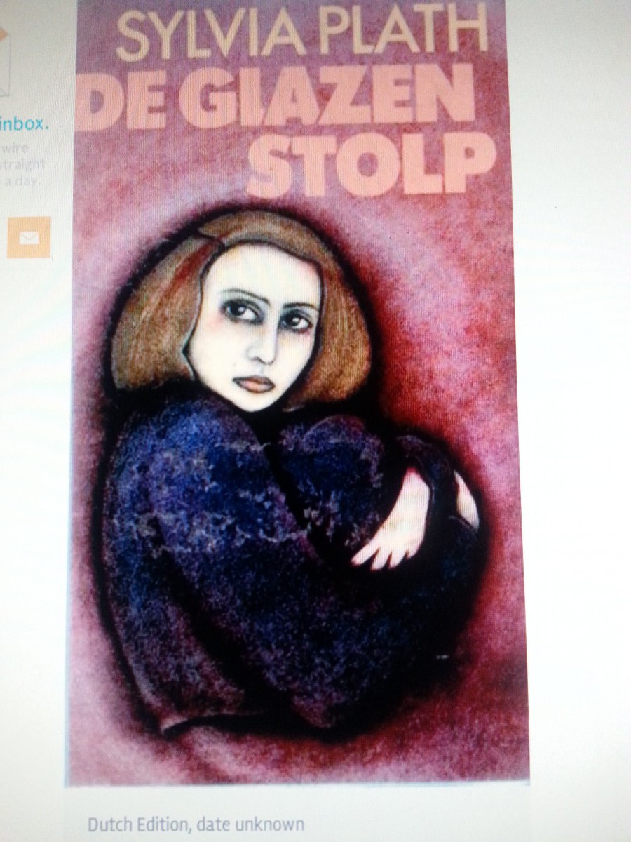
Dutch Edition

American 2009
The Bell Jar by Sylvia Plath is a novel about a young woman’s descent into depression and mental illness. It is the story of Esther Greenwood a nineteen year-old woman that actually seemed to be quite lucky. She went to a good university, had a loving mother, an aspiring doctor as a boyfriend, she even won a contest and a trip to New York with a famous women’s magazine. Even with all of that she felt different and unhappy and trapped. She behaved erratically developed a different identity and desired to commit suicide. This story reflects the own life of the author as well, who not too long after publishing the book succeeded in her last attempt and commited suicide. It is evident that this novel is fairly morbid and deep, and it is also a world famous novel.This novel has been translated to many different languages and the cover art has been very different for each country. It is noticeable that each country has a different take on what cover is most befitting to this novel. Some cover arts are like the one from the Dutch edition of the novel; titled, De Giazen Stolp This cover shows a woman in long black clothing slumped on the ground and hugging her knees to her chest while looking up. This cover art idea could be extracted from the section just before Esther goes to the mental hospital, where she decides to crawl into a hole in her basement while overdosing on pills. This cover clearly shows that the book is about the darkness and struggles of a young woman. It is an appropriate for anyone wondering what this novel holds behind that cover. Other covers for this book, American covers in particular, decide to go in a different direction with their designs. The cover from the publishers “Faber and Faber” from the year 2009 take a lighter approach to the cover design. This version shows a woman with a model figure in an non-distinctive white strapless gown with seemingly long hair gathered in a low bun. After knowing exactly what the book is about, this cover seems rather innapropriate. This looks more like a novel about a bride at her wedding. It can only be imagined that this cover idea came from the beginning of the novel where Esther is still in New York living the dream of every other girl her age. Because this version of the novel is somewhat current, it can be inferred that the company went with this friendlier idea to encourage more sales with a younger, more modern generation. There is a famous saying that goes, “you cannot judge a book by it’s cover.” Though this is true, there should be a limit to how far off the subject of a novel the cover art should stray. To those who have not read that book, they would be mislead; and to those who have read it, they will be disgruntled to say the least.

