During this video experience, I’ve learned that life has become difficult to deal with. The challenges I faced were editing and not being able to record an entire video in one shot. When coming across the editing, it was a complicated process since I’ve made lots of mistakes in the original video itself. Gathering my thoughts and actually saying them as planned was also a huge challenge especially when being interviewed in front of the camera.
Lego is known as a worldwide toy company. Lego was founded in 1932 by Ole Kirk Christiansen in Billund, Denmark. Throughout the years, Lego has made many changes to its logo. The production of Lego began in the late 1940s, consisting of many colorful interlocking plastic bricks which could be assembled to build many different objects such as buildings, cars, pets and robots.
“In 1934, the first logo was created by the LEGO Group. It was used on correspondence, shipping labels and other printed materials, but not on toys.
With this in mind, “ the name ‘LEGO’ is an abbreviation of the two Danish words “leg godt”, meaning “play well”. (Source 1) The logo itself, it’s an excellent combination of various meaningful colors such as red, yellow, black, and white. These vibrant colors were meant to give a fun, child-friendly vibe as the company was growing.
“This logo first appeared on the System i Leg sets. The original logo appears to be hand drawn and is different on various boxes from early 1955.”
In fact, the LEGO logo is one of the most fashionable and instantly recognizable logos in the toy industry. It has withstood six phases since it’s presentation back in the 1930s. As for the evolution of logos, typography plays a very significant role in the creation of a logo. When we talk about color, it consumes everything because it catches the audience’s eyes. Without color there would be no meaning to everything around us and no emotional value.
In the 1940s, the words “Billund” and “Denmark” were added to the logo, in which the company’s main focus became an isometric perspective.
“1950-1954This logo was introduced with The first plastic toys.”
At a slow pace, the logo started becoming a lot more known for its bricks throughout it’s era. The logo was redesigned yet again in 1948 in which the words “Billund” and “Denmark” were taken off completely and “LEGO” was given more of a playful and friendlier look. The extraordinary bright red background was introduced to the logo later in 1954, as a way to favor and easily catch the eye of a child.
The combination of white, yellow, red, and black has been present in the Lego logo since the 1960s. The complexity is supposed to remind of the basic colors of the Lego blocks themselves that were first manufactured by the company. In 1973, when the company started to manufacture products for the US, the logo then remained a standardized logo. The 1973 wordmark provided white characters with a black and yellow outline on the background in order to signify the looks of the brand name itself. Nowadays LEGO has become one of the world’s goto logos for featured, partnerships and aspiration.
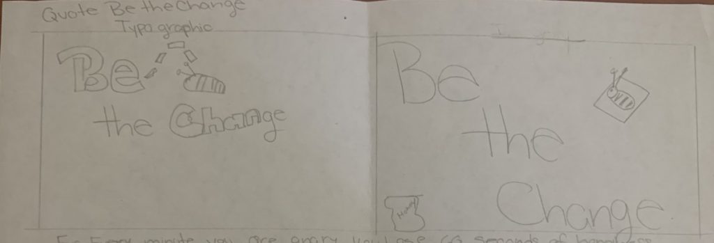
The assignment was to create a postcard visual quote. The size requirements were 8.5″X 5.47″. I chose the quote “be the change”. This quote speaks to me because change is a good thing. Change allows for growth.
Quote Design 1
For this postcard, I wanted to illustrate movement. The illustration of the movements show in two ways. The dashed lines show the movement of the bee. Change has lines of movement going through it to illustrate the start of change.
Quote Design 2
For this postcard, my thought process was to keep it simple. When making a change in my life I start small. Using a simply design can convey the simplicity of change.