Band and Olufsen is a high-end company that designs electronics that wants to create advertisements that will allow them to blend in with existing culture and popularity. Students worked to come up with creative advertisements to help Bang and Olufsen being able to fit in with the existing culture.
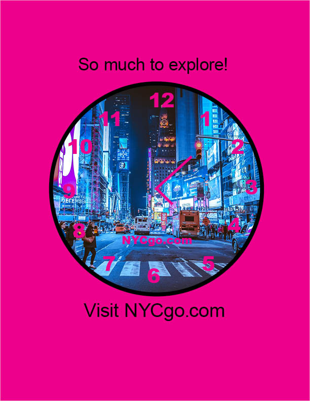
Students were asked to create a campaign advertising for visitors to use nycgo.com to plan their visit to New York City. The goal was to create eye-catching advertisements to help visitors make the most of their visit by using nycgo.com to plan the time spent in New York City wisely.
Students were asked to create a video of all the sketches drawn throughout the duration of the semester. My goal was to create a clear video displaying the sketches that I drew throughout the semester to show the process before presenting the final products.
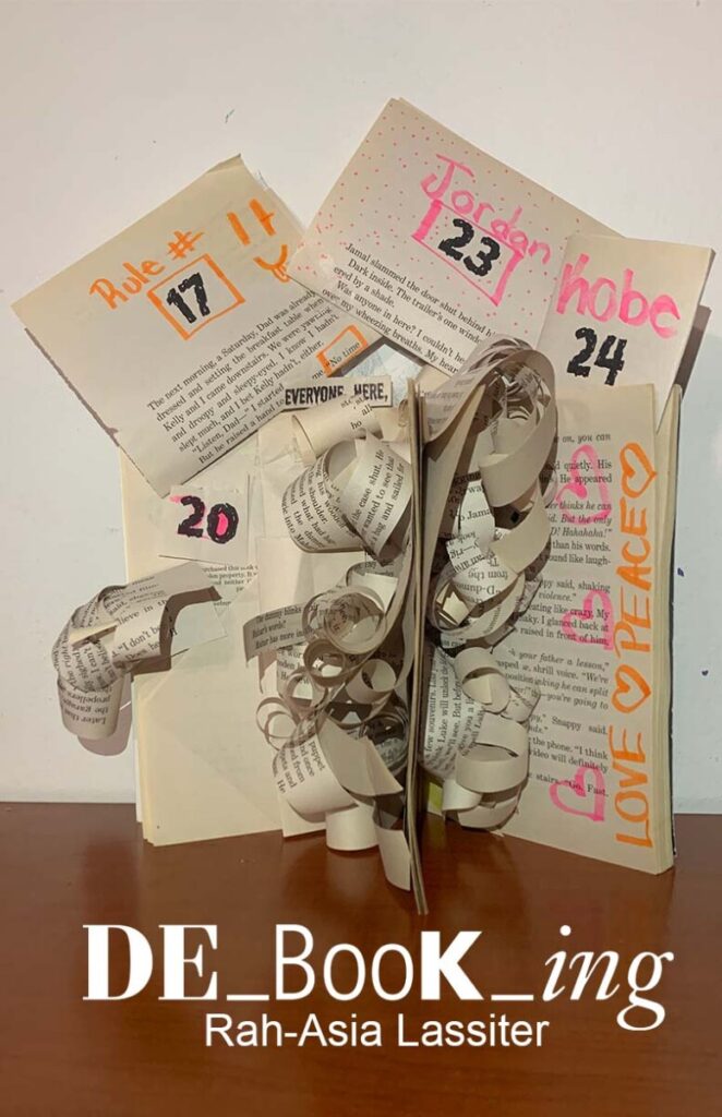
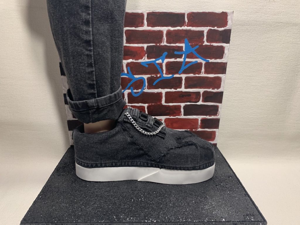
In this project, students were asked to come up with a creative way to reconstruct a book. My goal for reconstructing my book was to use the pages to create hidden meanings. I used text from the pages as well as handwritten words to create hidden meanings
The Ursula C. Schwerin Library gave students an opportunity to create a campaign that promotes the services the library provides that students aren’t aware of. The students worked in a group to create a series of posters that included a tv screen poster, a postcard, and an Instagram post. The goal was to create eye-catching posters that will grab the attention of students and inform them of the services at the same time.
During this video experience, I’ve learned that life has become difficult to deal with. The challenges I faced were editing and not being able to record an entire video in one shot. When coming across the editing, it was a complicated process since I’ve made lots of mistakes in the original video itself. Gathering my thoughts and actually saying them as planned was also a huge challenge especially when being interviewed in front of the camera.
Lego is known as a worldwide toy company. Lego was founded in 1932 by Ole Kirk Christiansen in Billund, Denmark. Throughout the years, Lego has made many changes to its logo. The production of Lego began in the late 1940s, consisting of many colorful interlocking plastic bricks which could be assembled to build many different objects such as buildings, cars, pets and robots.
“In 1934, the first logo was created by the LEGO Group. It was used on correspondence, shipping labels and other printed materials, but not on toys.
With this in mind, “ the name ‘LEGO’ is an abbreviation of the two Danish words “leg godt”, meaning “play well”. (Source 1) The logo itself, it’s an excellent combination of various meaningful colors such as red, yellow, black, and white. These vibrant colors were meant to give a fun, child-friendly vibe as the company was growing.
“This logo first appeared on the System i Leg sets. The original logo appears to be hand drawn and is different on various boxes from early 1955.”
In fact, the LEGO logo is one of the most fashionable and instantly recognizable logos in the toy industry. It has withstood six phases since it’s presentation back in the 1930s. As for the evolution of logos, typography plays a very significant role in the creation of a logo. When we talk about color, it consumes everything because it catches the audience’s eyes. Without color there would be no meaning to everything around us and no emotional value.
In the 1940s, the words “Billund” and “Denmark” were added to the logo, in which the company’s main focus became an isometric perspective.
“1950-1954This logo was introduced with The first plastic toys.”
At a slow pace, the logo started becoming a lot more known for its bricks throughout it’s era. The logo was redesigned yet again in 1948 in which the words “Billund” and “Denmark” were taken off completely and “LEGO” was given more of a playful and friendlier look. The extraordinary bright red background was introduced to the logo later in 1954, as a way to favor and easily catch the eye of a child.
The combination of white, yellow, red, and black has been present in the Lego logo since the 1960s. The complexity is supposed to remind of the basic colors of the Lego blocks themselves that were first manufactured by the company. In 1973, when the company started to manufacture products for the US, the logo then remained a standardized logo. The 1973 wordmark provided white characters with a black and yellow outline on the background in order to signify the looks of the brand name itself. Nowadays LEGO has become one of the world’s goto logos for featured, partnerships and aspiration.
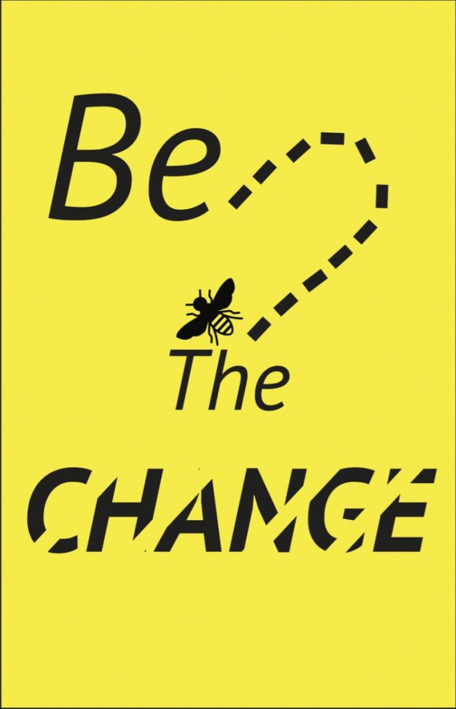
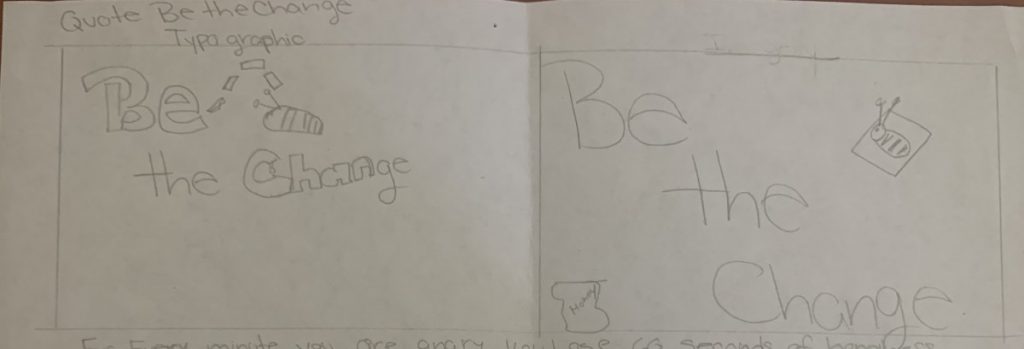
The assignment was to create a postcard visual quote. The size requirements were 8.5″X 5.47″. I chose the quote “be the change”. This quote speaks to me because change is a good thing. Change allows for growth.
Quote Design 1
For this postcard, I wanted to illustrate movement. The illustration of the movements show in two ways. The dashed lines show the movement of the bee. Change has lines of movement going through it to illustrate the start of change.
Quote Design 2
For this postcard, my thought process was to keep it simple. When making a change in my life I start small. Using a simply design can convey the simplicity of change.
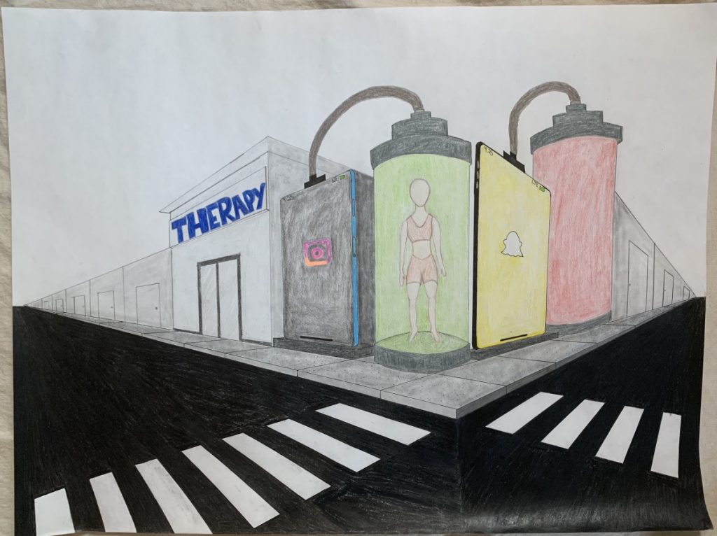
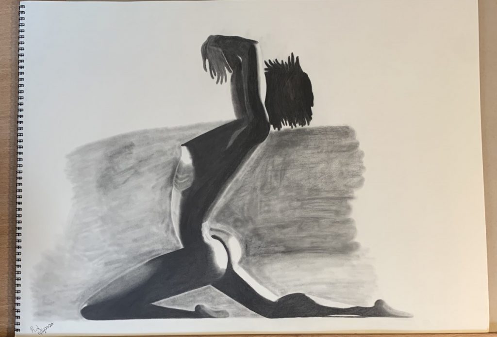
Nulla quis lorem ut libero malesuada feugiat. Curabitur non nulla sit amet nisl tempus convallis quis ac lectus. Quisque velit nisi, pretium ut lacinia in, elementum id enim. Nulla porttitor accumsan tincidunt.
Reflection
Donec rutrum congue leo eget malesuada. Curabitur non nulla sit amet nisl tempus convallis quis ac lectus. Curabitur aliquet quam id dui posuere blandit. Quisque velit nisi, pretium ut lacinia in, elementum id enim. Quisque velit nisi, pretium ut lacinia in, elementum id enim. Nulla porttitor accumsan tincidunt. Vivamus magna justo, lacinia eget consectetur sed, convallis at tellus. Vivamus suscipit tortor eget felis porttitor volutpat. Mauris blandit aliquet elit, eget tincidunt nibh pulvinar a. Vestibulum ac diam sit amet quam vehicula elementum sed sit amet dui.