2nd half of class New: Travel poster Purpose: Get my attention and show me how great travel is.
New Project: Travel Poster size- 10w x16H
Print this out and pin it up on the board for the class to review.
Bring in class- 1or 2 version printed- all vector.
Hand letter- Headline
1. Escape to Venice Italy.
or
2. Australia Calls you.
Pick a Font style that matches one of these places- please add decorative elements- illustrations or photos are optional. Do not go over 3 colors. USE illustrator or indesign.
This is the last project. Nothing will be excepted after next class. Will give you your grades next class.
Please due any edits for shake station. Next class is the last class for any Shake Station projects to be handed in. After class 12, no shake station projects will be accepted.
use this photo for 1 of the pages of your spread- 8.5×11. The other page you will deisgn the headline: Queen of Latin Music– Make this headline exciting, MODERN and fun/her style.
Add body copy with fonts on the headline page.
She has record-breaking achievements, engaging live performances, and innovative projects highlights why Shakira remains an unparalleled force in the entertainment world. What is next for her.
work with InDesign ONLY. when done, find a magazine mock up and place the spread in there.
Make sure that the design of the samples pages is complete:
Follow margins, use guides.
The design for title, author and paragraphs (1 and 2, etc) should be finalized
Consider text transitions or lead text /drop caps/raised caps for the first paragraph. How does these affect first words?
Indents for next paragraph (should not be too big)
folios (page numbers>centered or outside)
add a running head/footer if you want to have one. Usually the name of the book.
The text is now divided in three main categories (chapters). Jewelry, Eclectic, Photos. Create a chapter Opener.
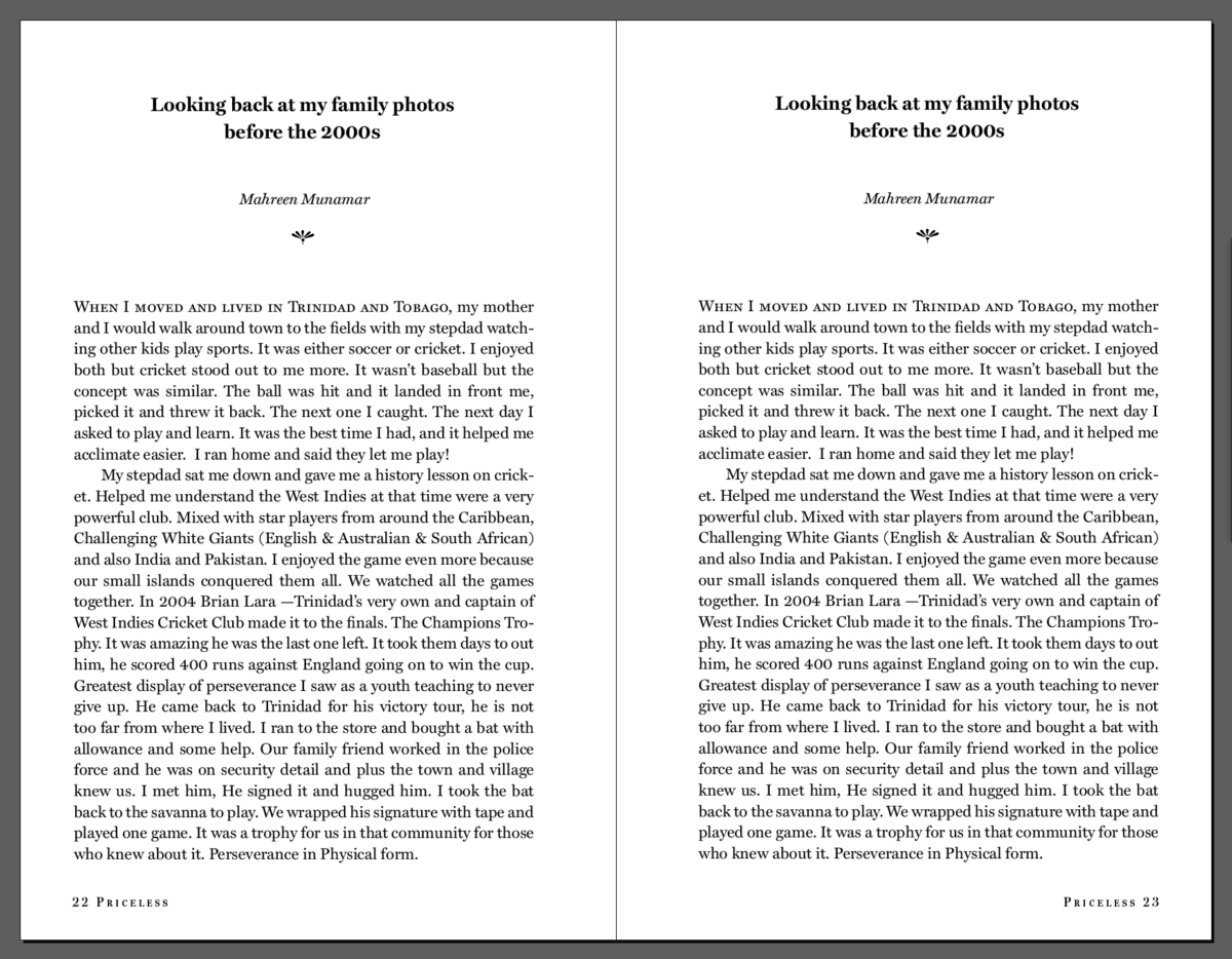
Here is my spread (sample pages). I decided to have a centered heading and author. My body copy is justified. There is small caps leading text on the first paragraph, and a small indent on the second paragraph. I am using one typeface family with its variations of bold and italic
I also created a chapter opener for the section called Jewelry.
Below, I created a different version too
For this version I am using two typefaces and their families
PARTICIPATION ACTIVITY During class FINALIZE these pages today during class.
Once DONE you will generate STYLE sheets. You will have to consider left and right style sheets if the pages mirror each other.
DEMO
Take a screenshot with guides on and paragraph and characters style boxes visible
Add your image as a JPG:
“yourlastname_firstname_PA_April11_styles_sample”
Add to DROPBOX
Studio Time: Work on corrections for next week
______________________________
DUE next class:
PROJECT 1 PDF (interactive PDF if working with Indesign)
Last name_BFV_Project1
Place in DROPBOX
Sample pages with style sheets absolutely finished before class.
Print will follow printer’s spreads, rather than logical order of reading
CLASS Last day remarks 🙂
by Prof G
NOTE: Graphic Assignments are always due the day before class at 11:30 pm, and must be placed in class DROPBOX drive unless indicated otherwise. Assignments done or uploaded during class time on the day that they are due are marked as late.
Participation Activities are due during class and are named and posted as indicated by instructor.
If you owe ANY of the assignments for this semester: They must be submitted by next week.
GRADES are not changing. This is only for those who owe any missing piece. F (with value) grade stands.
Print will follow printer’s spreads, rather than logical order of reading
CLASS Last day remarks 🙂
by Prof G
NOTE: Graphic Assignments are always due the day before class at 11:30 pm, and must be placed in class DROPBOX drive unless indicated otherwise. Assignments done or uploaded during class time on the day that they are due are marked as late.
Participation Activities are due during class and are named and posted as indicated by instructor.
Explores design and type sensibilities, challenging students to strengthen their creative and visual aesthetics. With emphasis on sensitivity to type, exercises integrate type within a variety of different mediums including page layouts as well as kinetic design.