Contents
Class Info
- Date: October 24, 2024
- Meeting Info: 2:15 to 5:35
P 114
Homework: Tote Bag- 3 differnt designs
One side of bag- use copy: GRILLED IS OUR FAVORITE FLAVOR and logo.
OPTION: can do a 2 sided bag- logo on one side and copy on another.
3 differnt art directions. Use style guide but can add some new artwork to the tote bag that can work with the style guide or support your idea.
I have a psd mock up for you to use, please print out all 3 and review in class, also place pdfs of 3 in your folder so I can grade them.
https://www.mockupworld.co/free/tote-bag-mockup
Topics
- Banners – Class critique and edits
- Basic Motion
Participation activity> During Class
After Effects: First Looks at type in motion
1. After Effects Basics TRANSFORM tools
Position/Scale/Opacity/Rotation/Anchor Point

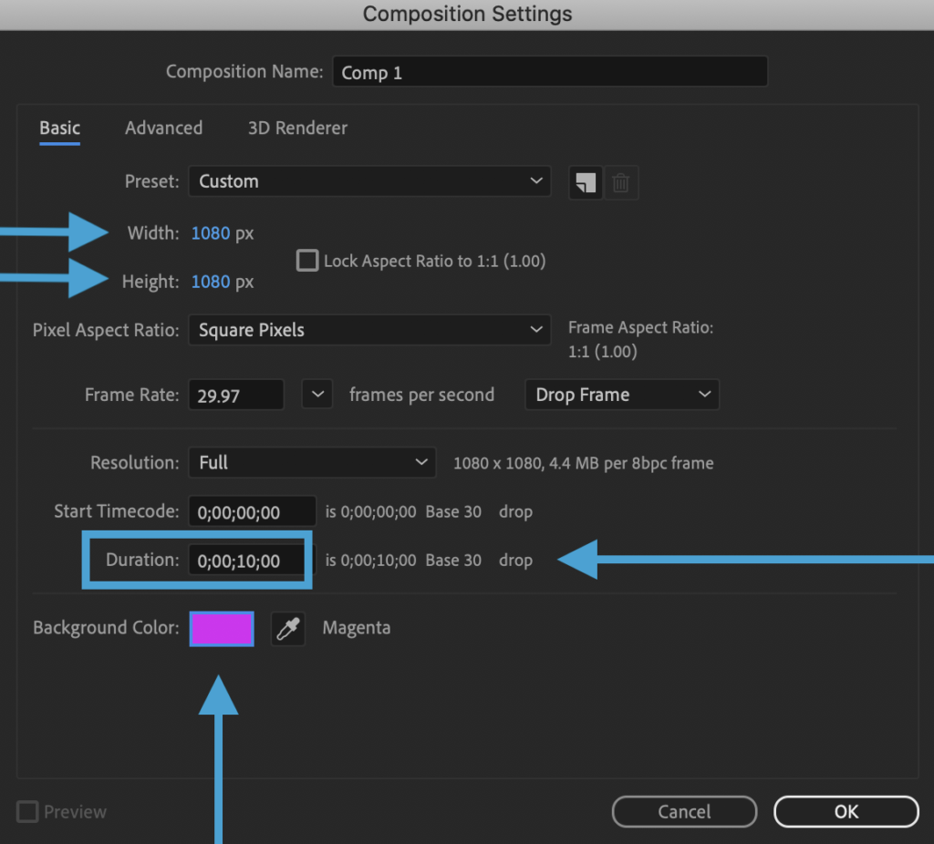
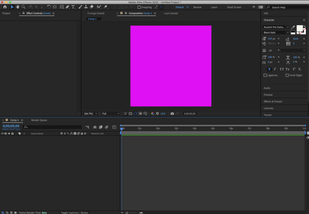
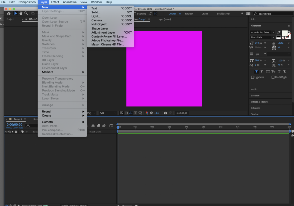
again
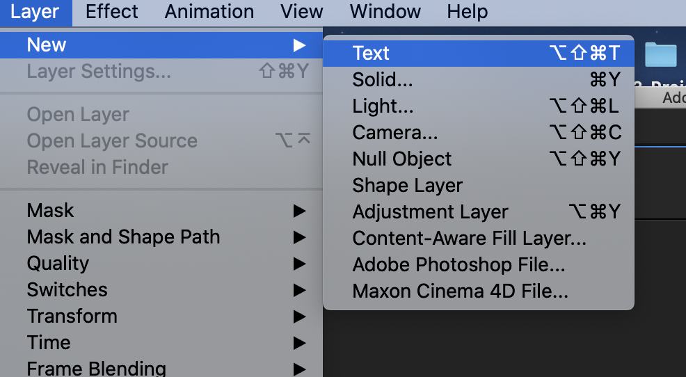
Go to LAYER>NEW>TEXT> Add a second word
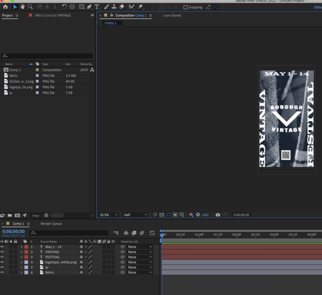
Make sure that you have two layers

I have two layers (COMD3505 and TUESDAY. Select Typeface, size, variable such as weight or posture)
NOTE: THE ANCHOR POINT determines where things move from. By default it is placed lower left of the layer.
If you need to move your anchor point to the center. Click on the layer hold command and double click on the pan behind icon


No need to upload. I’ll go around the classroom check for completion.
Homework: Vendor poster> NEXT STEPS
POSTER in Motion
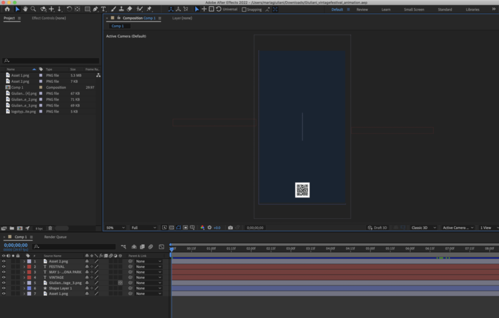
We will create an animated version of our poster.
Let’s first go to Illustrator and collect our assets. Create a PNG (with transparent bkgd of your logotype. You can create a white only version too (see my example).
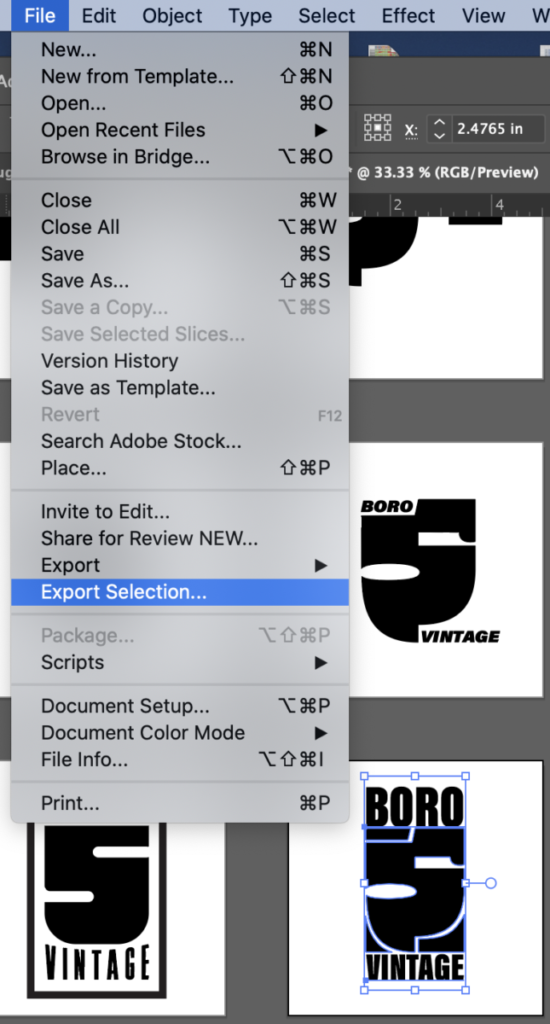
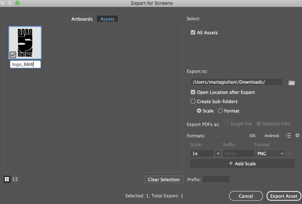
You can also bring photographs or QR codes if necessary
There are ways to bring the entire composition from Illustrator to After Effects, but for this one, we will create our type directly in AE. Know the typefaces of your posters as you will use again.
Create new COMPOSITION
GOOD typography is the most important element. Pay attention to details.
This will be a companion poster for our printed versions. It will be heavily influenced by it but not exactly the same. Work on a simpler version, since it will be animated, we will not list the the vendors
In addition to all typographic and design consideration (grid/alignment/hierarchy/ contrast/kerning/tracking, case, others), you must also think of legibility as it relates to time
Include the following:
- headline: Come to the shake station Food Festival
- Logotype
- Oct 1 to 14
- At Willamsburg, Brooklyn
- Body copy: More info on Vendors participating.
- Art work if necessary
- Use the same fonts/colors from poster.
Size is 1080 x 1920 pixels
At least 2 transformations
Length:10 seconds max
full or limited colors
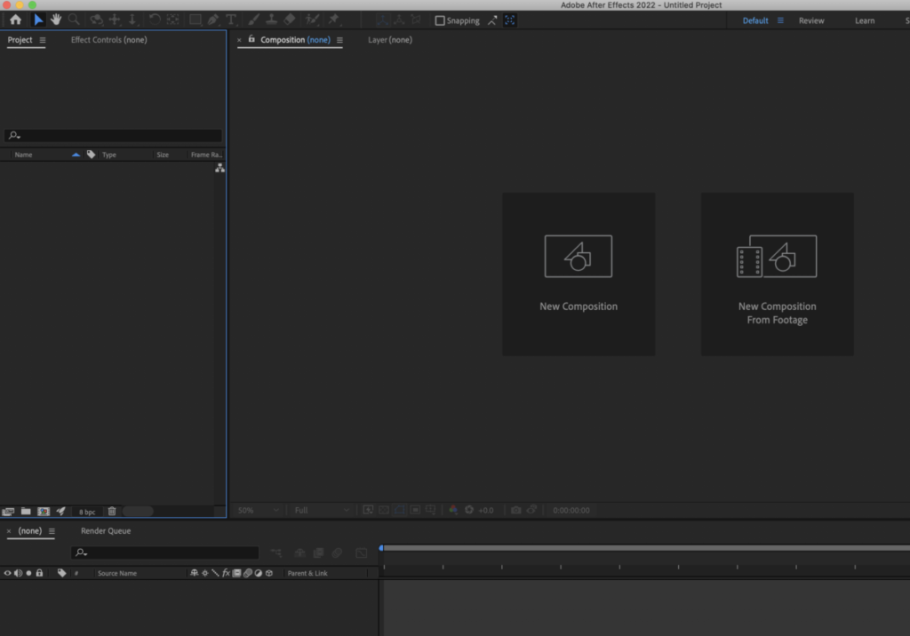
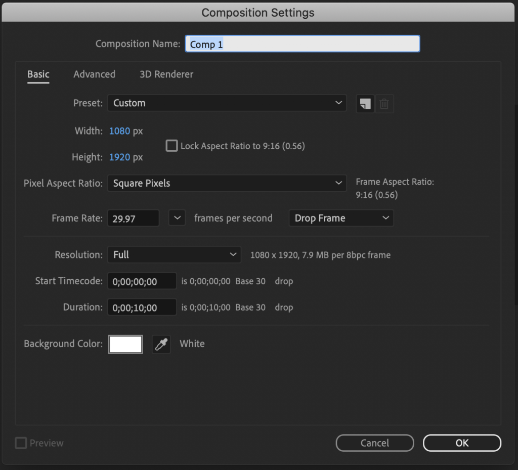
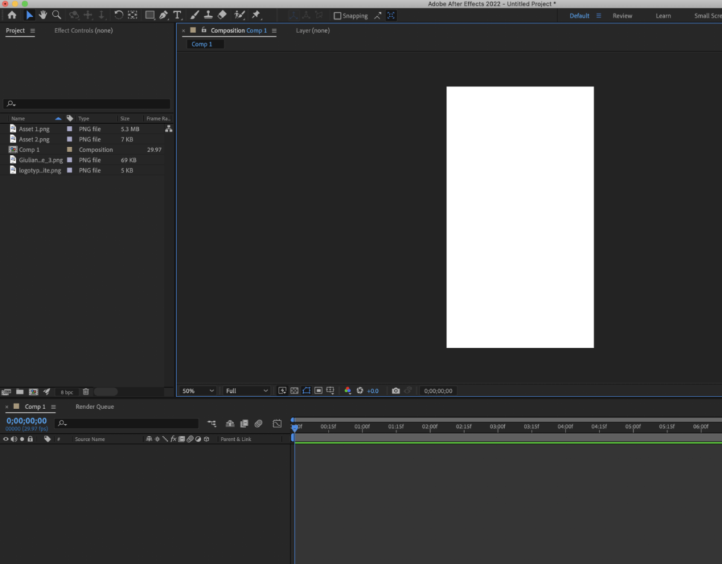
_________________________________________________________________________________
How to render:
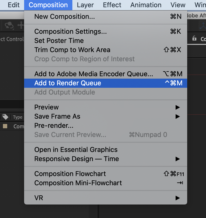

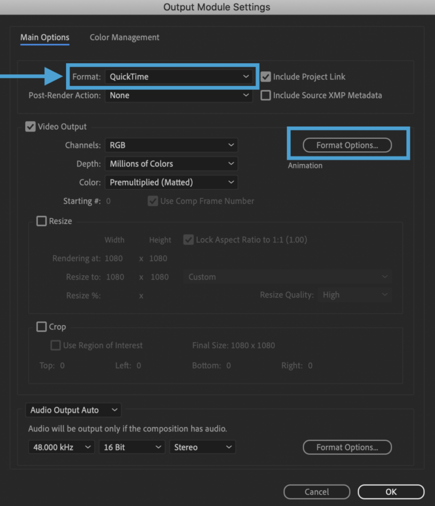
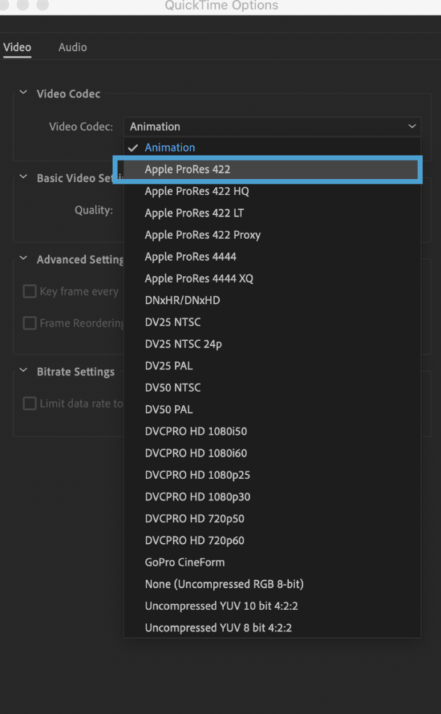


To make a compressed version. Open in QUICKTIME
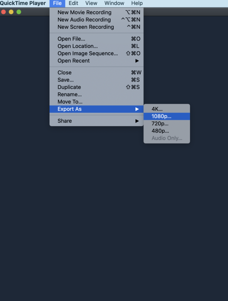
Once in QuickTime go file Export as 1080. This will be a compressed version of the .MOV (This is the one that you will give me as assignment)
Due next class
Make an animation(qicktime) for your Vendor poster and update any edits for the menu, prinout and hand in next class.
These will be graded. Adjust to make more typographical
Place quicktime movie in your folder on dropbox for me to grade.
lastname_banners_final
AND
Compressed animated poster (see above info on how to render and compressed
lastname_compressed_poster1.mov
Place in Dropbox
______________________________
Print will follow printer’s spreads, rather than logical order of reading
CLASS Last day remarks 🙂
by Prof G
NOTE:
Graphic Assignments are always due the day before class at 11:30 pm, and must be placed in class DROPBOX drive unless indicated otherwise. Assignments done or uploaded during class time on the day that they are due are marked as late.
Participation Activities are due during class and are named and posted as indicated by instructor.


Leave a Reply