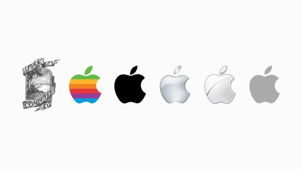
1976–1977: The Original Apple Logo: Ronald Wayne created the original Apple logo, which featured a meticulous picture of Sir Isaac Newton seated beneath an apple tree. The logo a complicated picture with Newton holding an apple that was about to fall, representing learning and discovery. This logo was swiftly changed, though.
Src : https://www.crowdspring.com/blog/apple-logo/#:~:text=The%20original%20Apple%20logo%2C%20designed,ribbon%20wrapping%20around%20the%20image.
1977–1998: Rob Janoff created the Rainbow Apple Logo, which went on to become the company’s most recognizable and iconic emblem. It showed an apple with rainbow stripes that had a bite out of it. The company’s goal to introduce color and innovation to the computing industry was signified by the rainbow stripes, which were an homage to the vibrant displays found in the early Apple II computers. To make sure people didn’t mistake the apple for a cherry, the bite in the apple was included.
src : https://www.crowdspring.com/blog/apple-logo/#:~:text=The%20original%20Apple%20logo%2C%20designed,ribbon%20wrapping%20around%20the%20image.
1998–Present: Apple Logo in monochrome With Steve Jobs back at the helm and the business experiencing growth, Apple had a major rebranding. A change in design philosophy was signaled by the replacement of the rainbow-colored emblem with a clean, monochrome counterpart. The new logo was more in line with Apple’s changing image and was made to suit with contemporary aesthetics. It was straightforward and clean. Since since, this iteration of the bitten apple emblem has served as the company’s visual signature.
The fundamental idea behind the Apple logo—a bitten apple that represents knowledge, creativity, and the company’s quest of technological sophistication while remaining simple—has persisted through all of its changes.
src : https://www.crowdspring.com/blog/apple-logo/#:~:text=The%20original%20Apple%20logo%2C%20designed,ribbon%20wrapping%20around%20the%20image


Leave a Reply