OpenLab Logo
Home
About
People
Courses
Projects
Clubs
Portfolios
Help
Toggle navigation
My OpenLab
Home
About
People
Courses
Projects
Clubs
Portfolios
Help
Sign Up
Log In
Skip to the content
Toggle mobile menu
Toggle search field
Search for:
ePortfolio Profile
Home
About me
ePortfolio Profile
Home
About me
September 6, 2023
/
Parth Patel
/
0 Comments
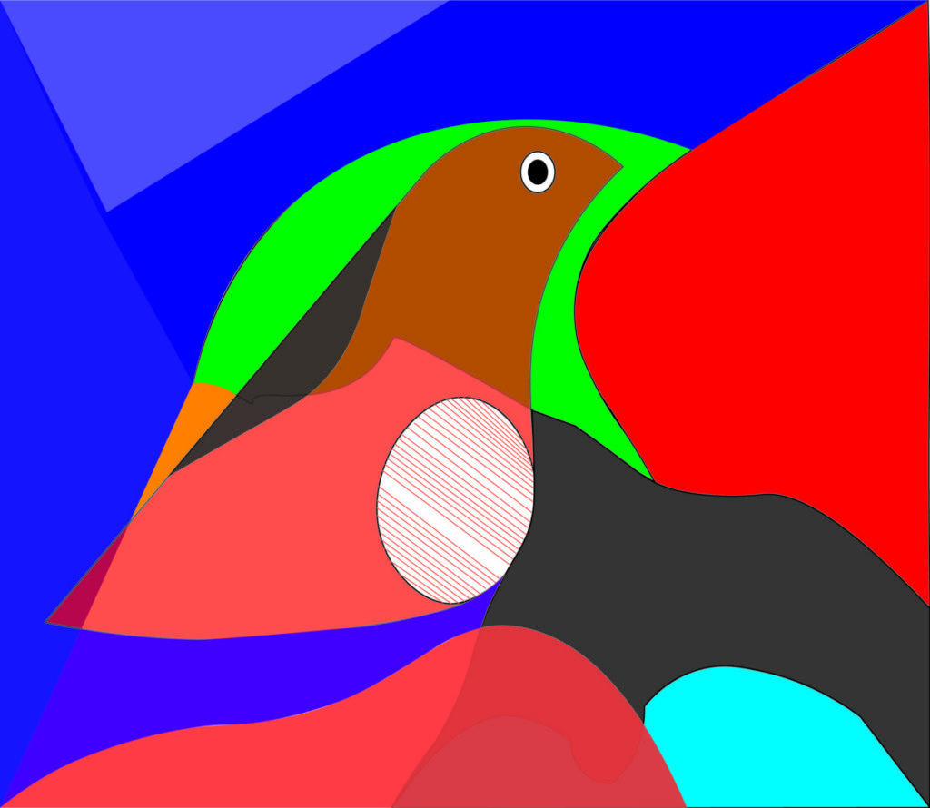
Pigeon Love
March 27, 2023
/
Parth Patel
/
0 Comments
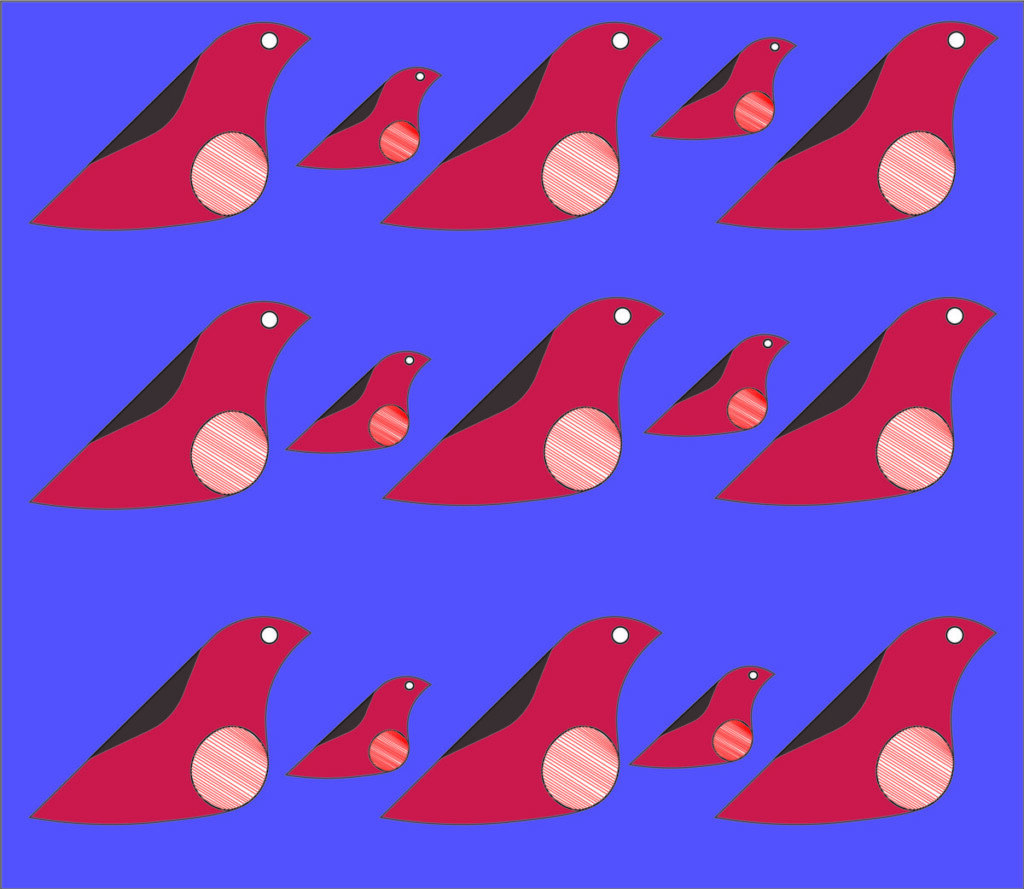
Guy With The Red Dot
March 27, 2023
/
Parth Patel
/
0 Comments
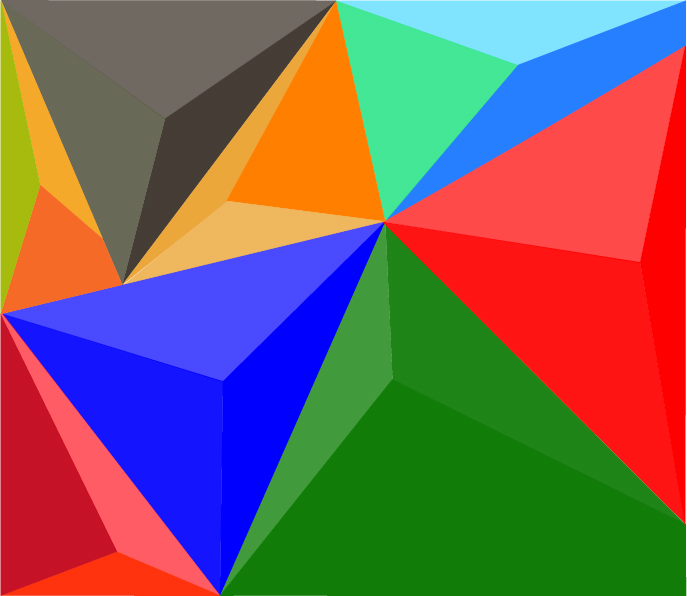
Triangle Chaos
March 24, 2023
/
Parth Patel
/
0 Comments
© 2024
Theme by
Anders Noren
—
Up ↑
Open Search
Search the OpenLab
Submit