Parth Patel
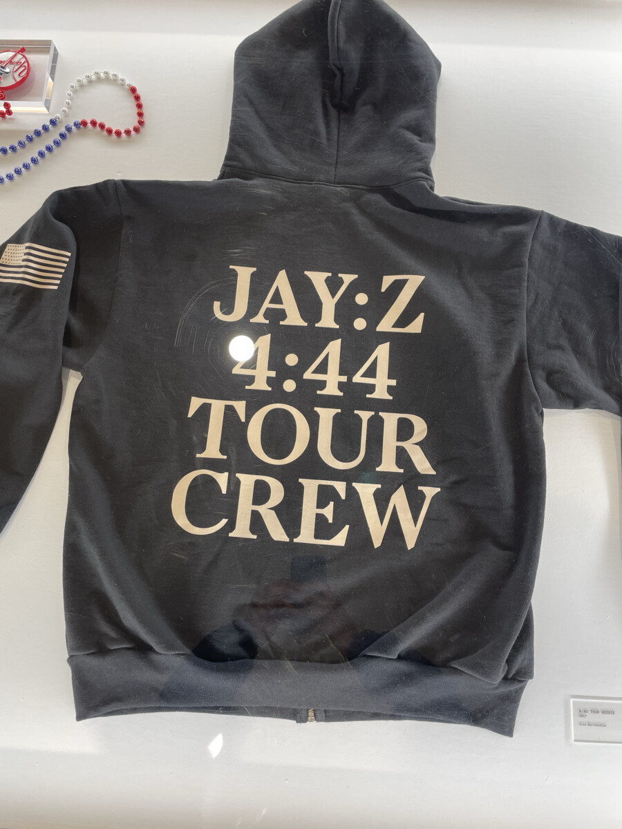
This Art piece was in one of the rooms they had which shows the hoodie of Jay-z’s toor which took place from Oct 27, 2017 and ended on Dec 21, 2017. In the context of coming up with the name was “I woke up, literally, at 4:44 in the morning, 4:44 a.m., to write this song,” Jay-z recalled. I really like the color of the t shirt and how the designer used sans serif family type face which attracts a person’s attention and the designer also kept the design as minimalist as possible.
And i can relate to this designer because i’m a big fan of keeping things minimalist because it helps viewer to see the content with much ease. And most important thing which is color i really liked the colors which is golden on matte black. Minimalism, when applied effectively, indeed allows viewers to engage more deeply with the essence of the content.
It strips away distractions and lets the core message or design shine through. It seems the designer of this piece understood this principle well, creating something that resonates with your appreciation for simplicity and elegance. Moreover, the color scheme of golden on matte black is quite striking. Gold often conveys luxury, success, and prestige, while matte black exudes sophistication and elegance. This combination creates a visually appealing contrast that draws attention while maintaining a sense of refinement. The deliberate choice of colors not only adds to the aesthetic appeal but also contributes to the overall symbolism and mood evoked by the artwork.
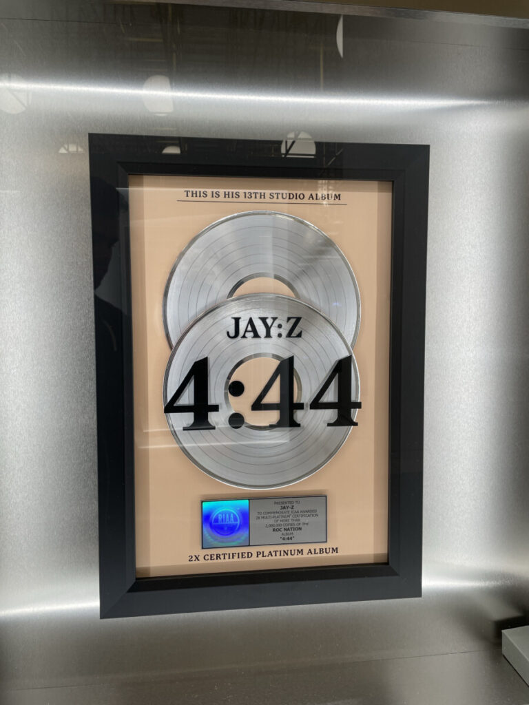
At first glance, the poster may seem straightforward—a stark, black-and-white design featuring the album’s title, “4:44,” in bold typography against a clean background. However, it’s within this simplicity that the poster’s power lies. The use of a monochromatic palette and a simple yet bold sans-serif typeface echoes the album’s stripped-down, raw nature.
The choice of the title, “4:44,” holds immense significance. It’s derived from the time Jay-Z woke up in the morning, a moment that symbolizes clarity, introspection, and awakening. The poster, in a way, serves as a visual representation of that moment—a moment of truth and vulnerability captured in the album’s lyrical content.
Additionally, the absence of any elaborate imagery or distractions in the poster directs the focus solely on the title itself. This intentional simplicity encourages the viewer to delve deeper into the meaning behind “4:44,” fostering curiosity and inviting interpretation.
Beyond its visual appeal, the poster acts as a precursor, hinting at the depth and introspection awaiting listeners within the album. It sets the tone for what audiences can expect—a candid and introspective exploration of Jay-Z’s experiences, relationships, and personal growth.
Overall, the “4:44” album poster is a masterclass in minimalist design. It not only serves as a promotional tool but also embodies the essence of the album’s themes, inviting viewers to explore the depth and introspection embedded in Jay-Z’s music.
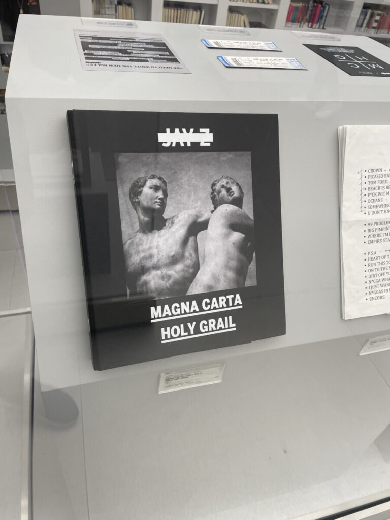
The design of this limited edition boxset would likely embody the essence of Jay Z’s “Magna Carta Holy Grail” album. Given the collaboration with Third Man Records, known for their inventive and often unconventional designs, the boxset might feature innovative packaging. This could involve unique materials, intricate artwork, or perhaps a distinctive shape or form for the box itself.
The artwork and visual elements on the vinyl sleeves and labels might echo the themes explored in the album. This could include references to power, wealth, or societal commentary, which are prevalent in Jay Z’s music. The color palette and typography could also be meticulously chosen to evoke a specific mood or atmosphere, aligning with the album’s tone.
Moreover, limited edition box sets often come with exclusive content like lyric sheets, posters, or artwork prints that further enhance the overall design. These elements aim to create a cohesive and immersive experience for fans beyond just the music.
Jay Z, being heavily involved in the artistic direction of his projects, would likely have a significant say in the overall design concept. His vision for the album’s themes, message, and imagery would play a pivotal role in shaping the design elements of the boxset.
The album’s art director or a creative team, possibly working closely with Jay Z, would translate these ideas into visual concepts. They might brainstorm on how to encapsulate the essence of “Magna Carta Holy Grail” visually. This could involve brainstorming sessions, mood boards, and iterations of designs to find the perfect representation of the album’s ethos.
Additionally, if Third Man Records was involved, their design philosophy might also influence the overall aesthetic. The label is known for its unique and sometimes avant-garde approach to design and packaging, often pushing the boundaries of traditional album presentation.
The designer or design team would focus on incorporating symbolic imagery, typography, color schemes, and possibly innovative materials to create a visually striking and thematically resonant package. They might aim to capture Jay Z’s artistic expression while also ensuring that the design aligns with the ethos of Third Man Records.
Overall, the process likely involved a collaboration among various creative forces, all working toward creating a design that not only represents the album but also stands out as a unique and collectible piece for fans and music enthusiasts.


Leave a Reply