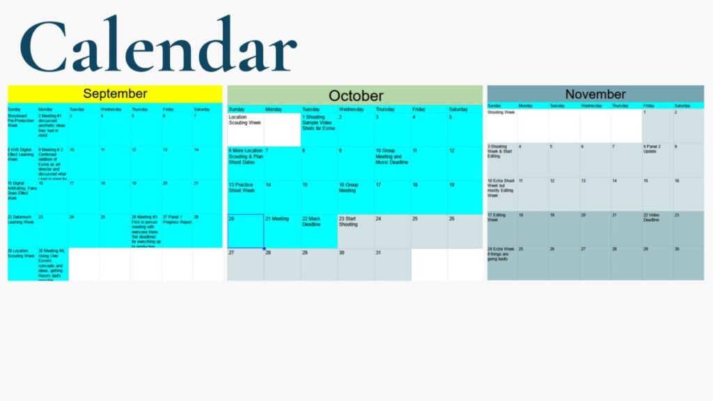
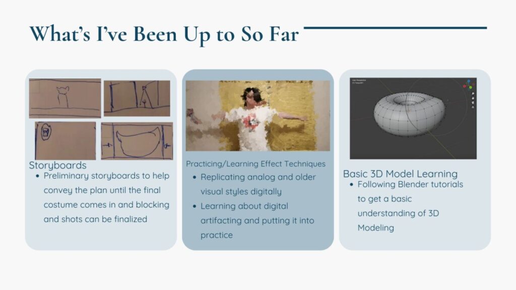
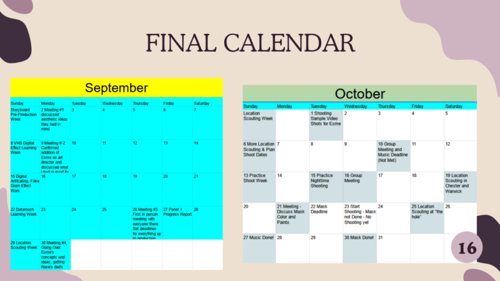
Here is my planned calendar as of the first progress report:

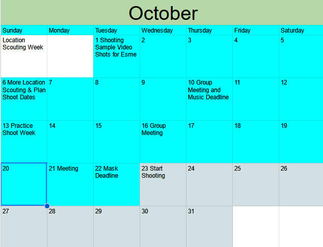
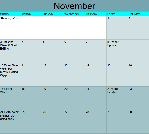
And this is how it turned out after everything was finished:
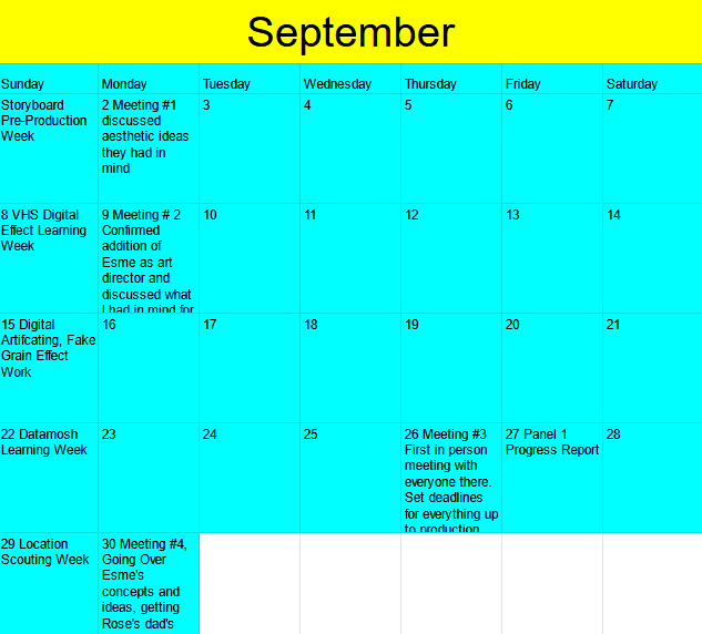
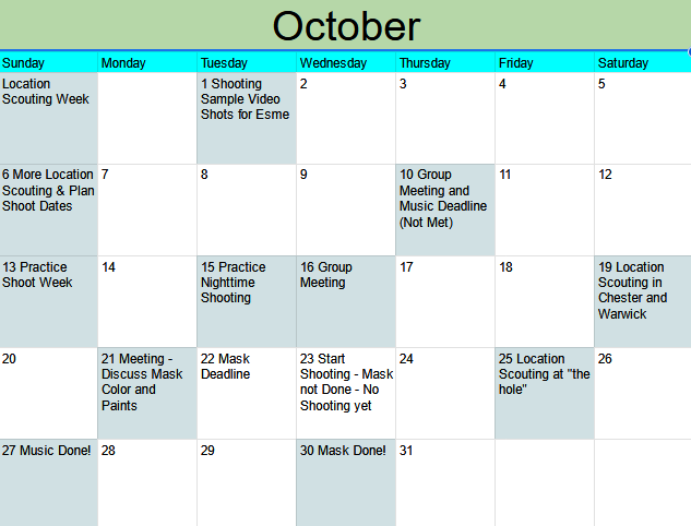
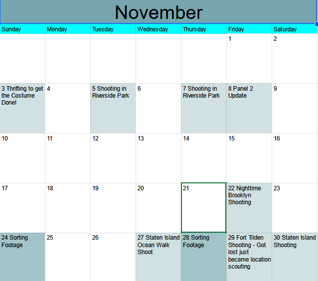

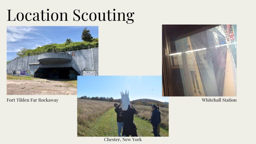
Situations like illnesses, weather, and collaborator deadlines not getting met continued to push the schedule further and further back. Also, the camera having electronic issues definitely made shooting take longer than necessary as well. I was still glad to finish with a day to spare, but that’s a little too close for comfort than I would have liked.
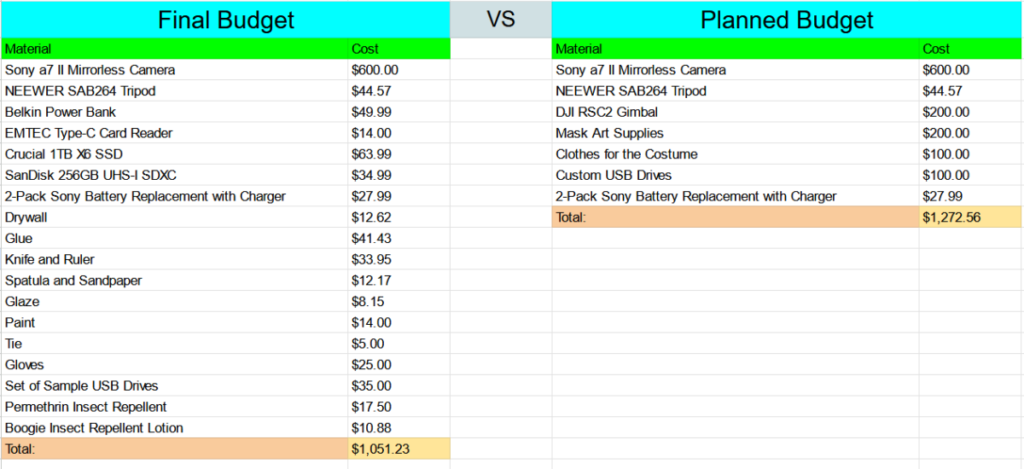
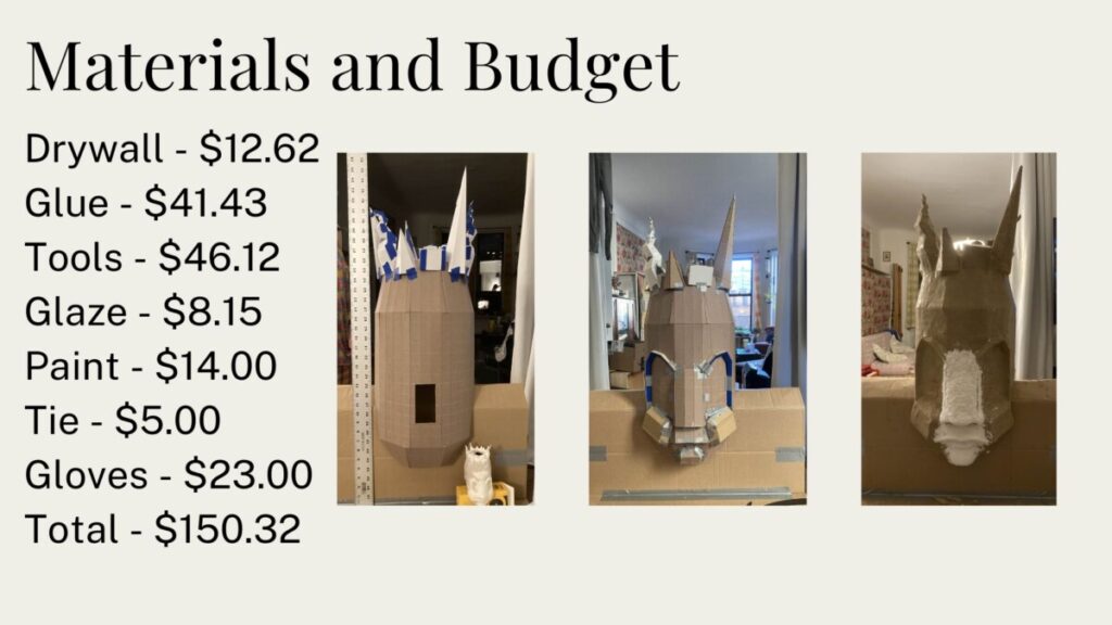
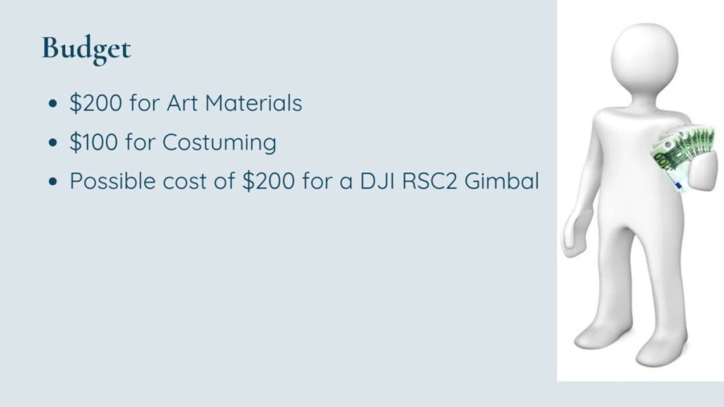
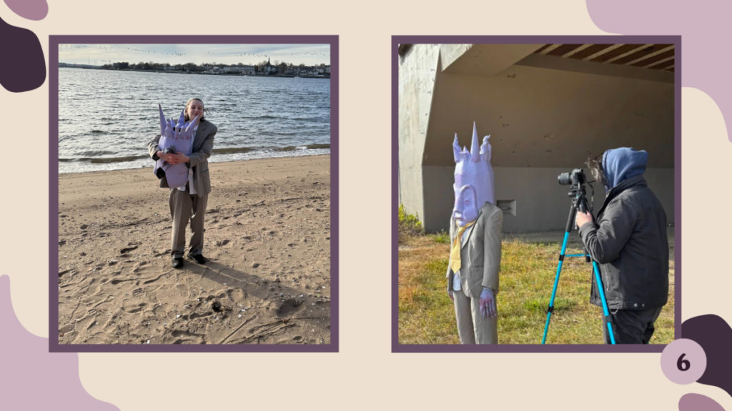
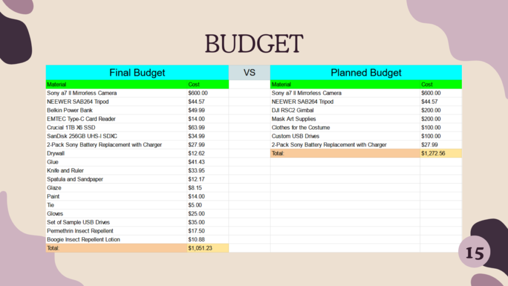
In the end, the final budget was a couple hundred less than the planned budget due to not needing to buy a gimbal; needing as much money for the costume and mask; and not buying a final batch of custom USB Drives. However, I had not accounted for transportation and with filming in four different boroughs, going upstate, location scouting, and traveling to even have meetings meant a significant amount of money was spent on travel. I think even if I had made an estimate for transportation before the start of the project, we would have eclipsed it. I know now to definitely meticulously keep track of the cost of travel as well on any future projects.
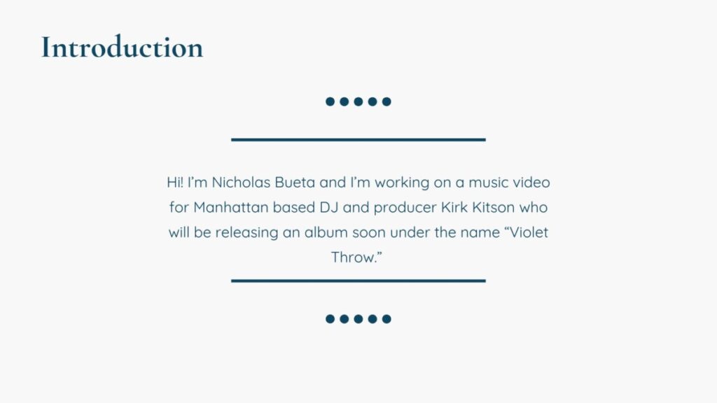
Hello! If you’re reading this then you’re on the post that will help redirect you to every page related to my culmination project!
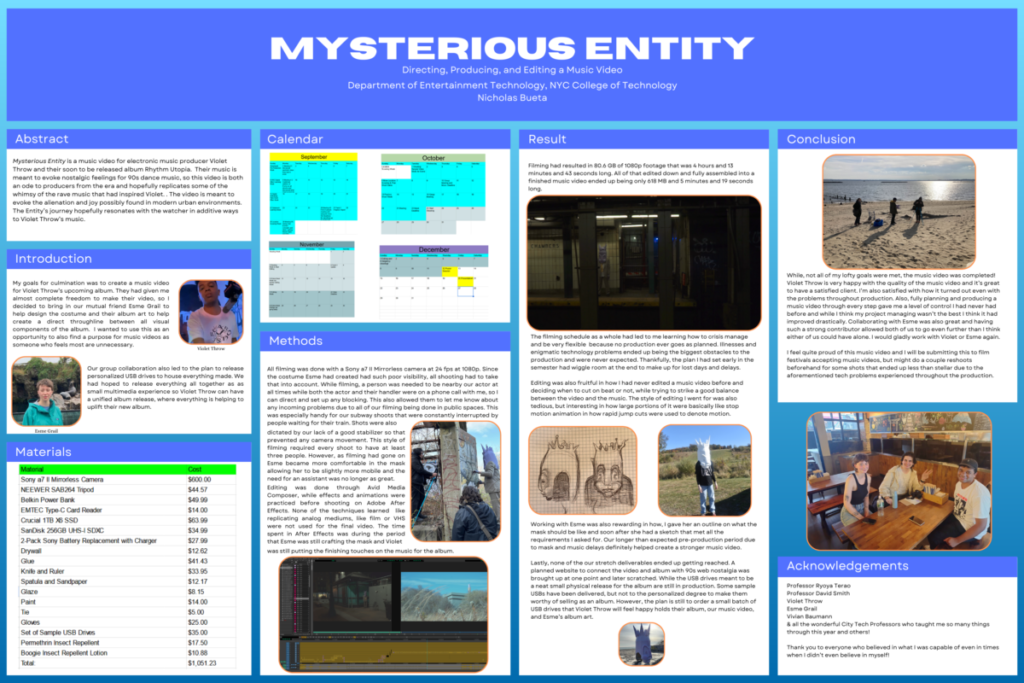
Due to OpenLab file size limitations and compression the poster may be too low quality, so you can find a full resolution .png linked on my Google Drive right HERE
